Have you ever felt torn between a handful of intriguing design ideas and just wish you could "preview" the end result of both choices at the same time? That's what interior visualizers do every day – and their work is so fun to see! In this post, the designer Duc TayOne explores two different Art Deco interiors within the context of a singular layout. Because Art Deco is already a fairly rare style in contemporary decor, it's exciting to see multiple interpretations side by side. So if you've been thinking about adding a touch of 20s-era decadence to your digs, this just might be the post you've been waiting for!
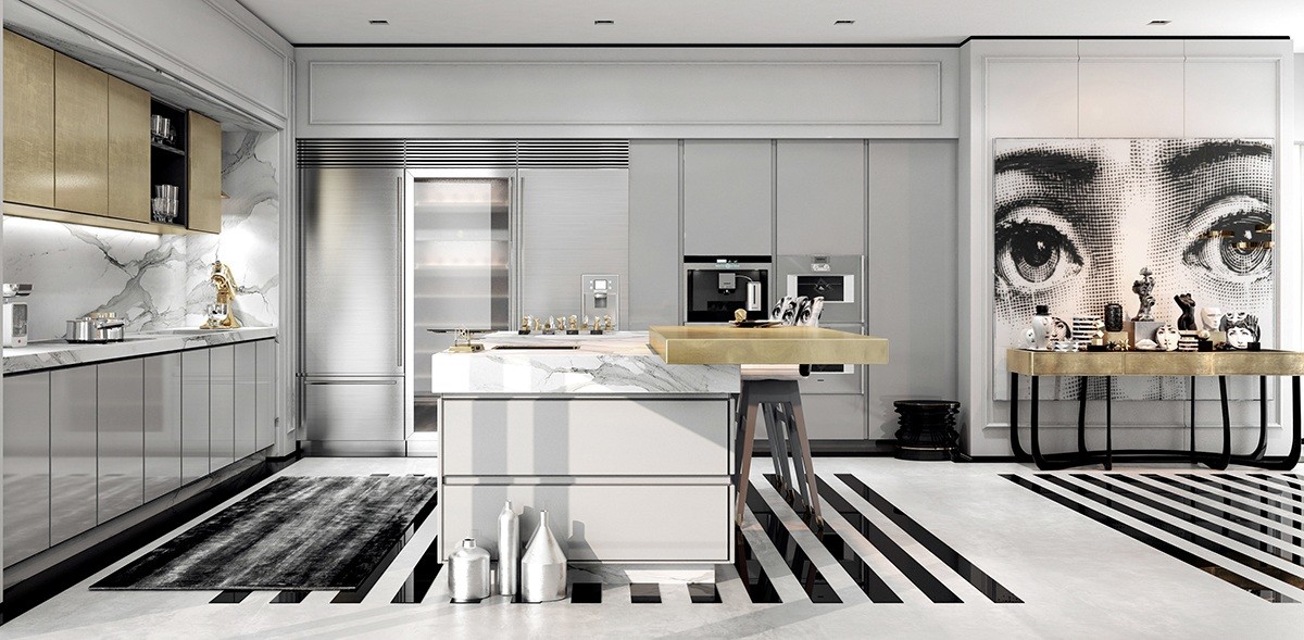
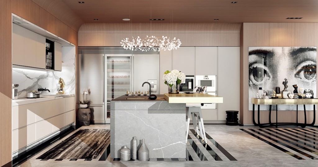
Let's start with kitchen. This stylish space features a highly updated approach to Art Deco, contrasting modern black and white stripes with luxury materials like brass and marble. An oversized print immediately locks eyes with the viewer and utilizes a cool Renaissance-meets-pop-art style.
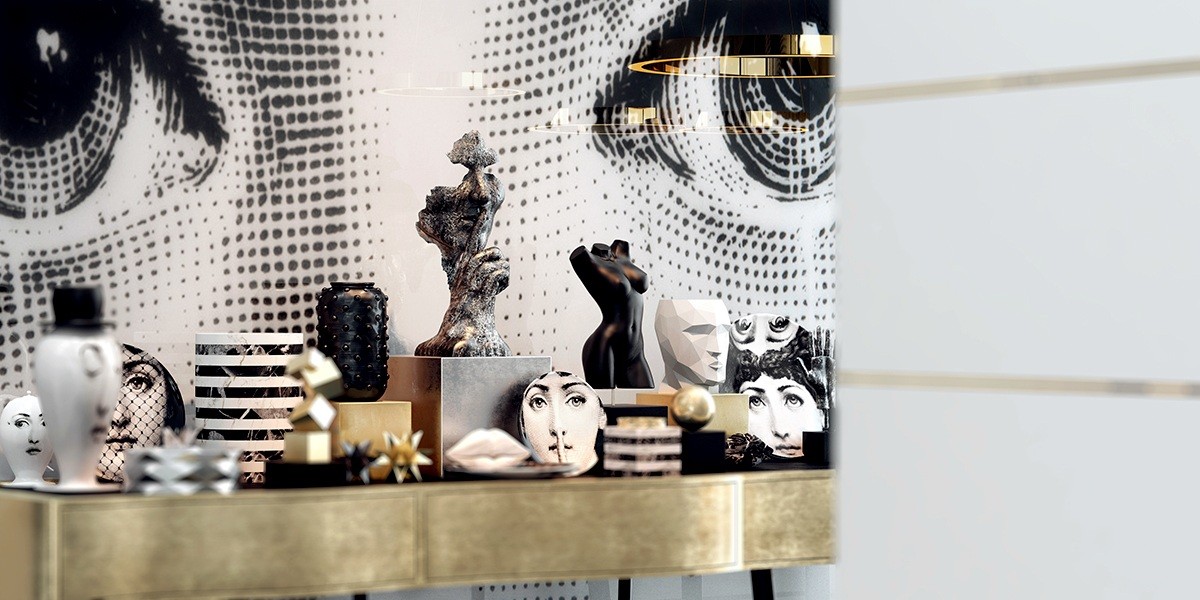
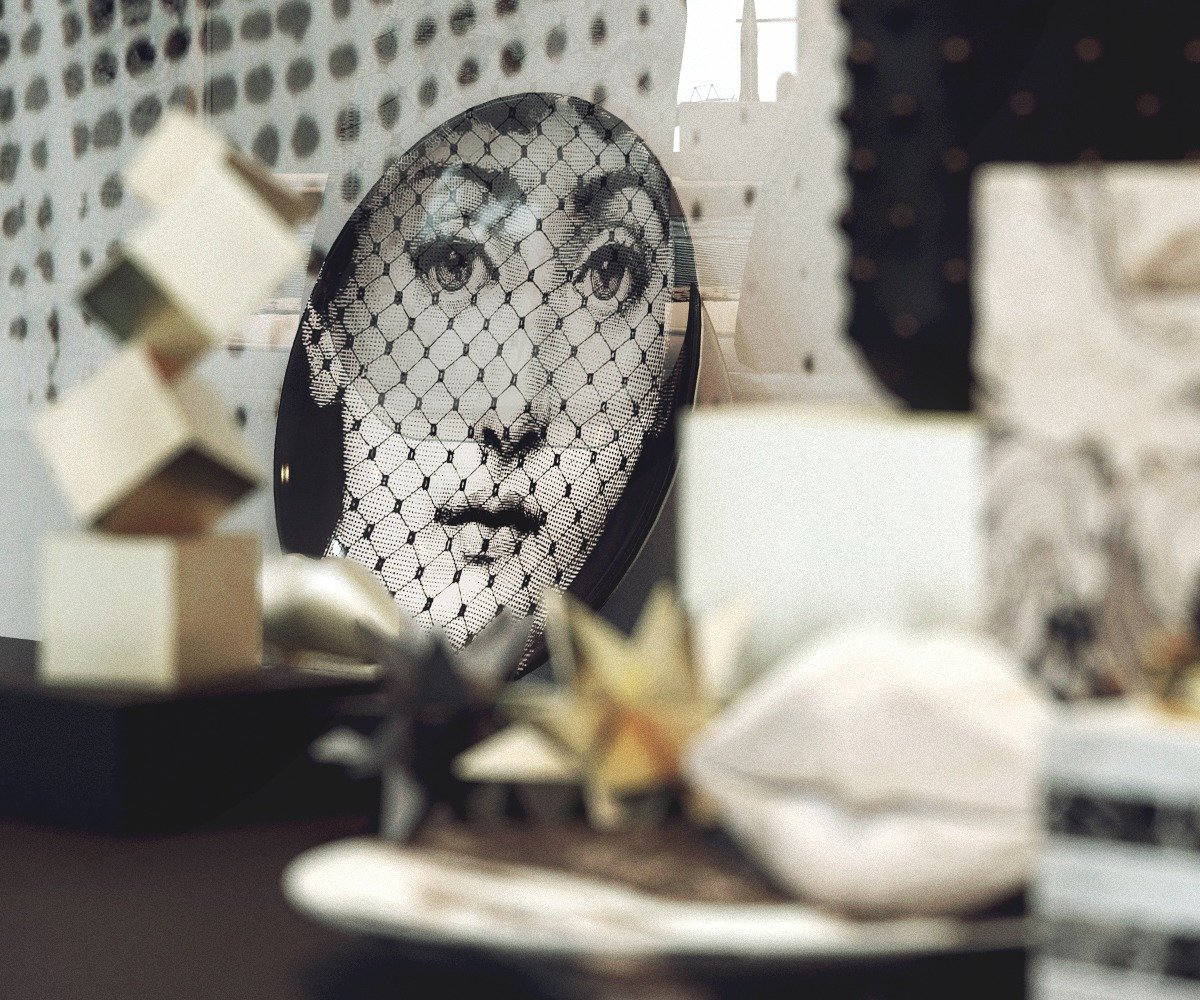
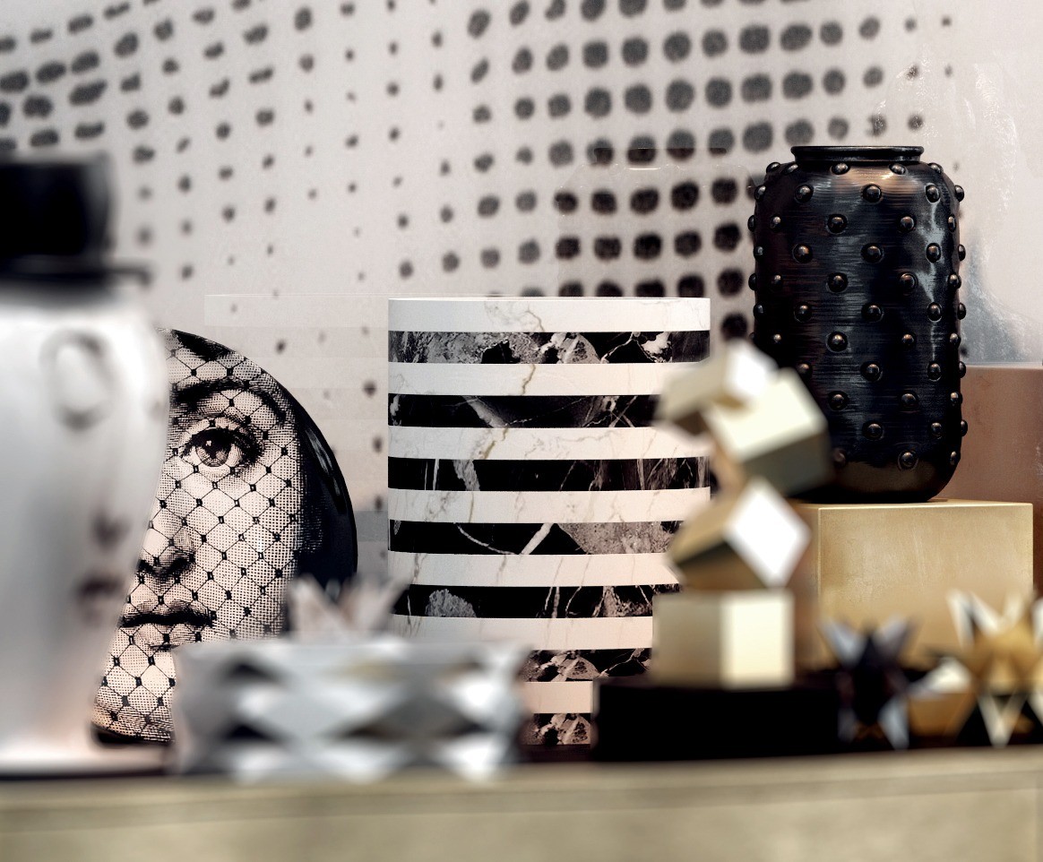
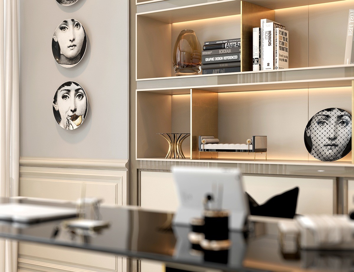
The plates are from the Tema E Variazioni collection by Piero Fornasetti. Each features the distinctive visage of opera singer and noted socialite Lina Cavalieri, a subject that captured the fascination of Piero throughout his artistic career.
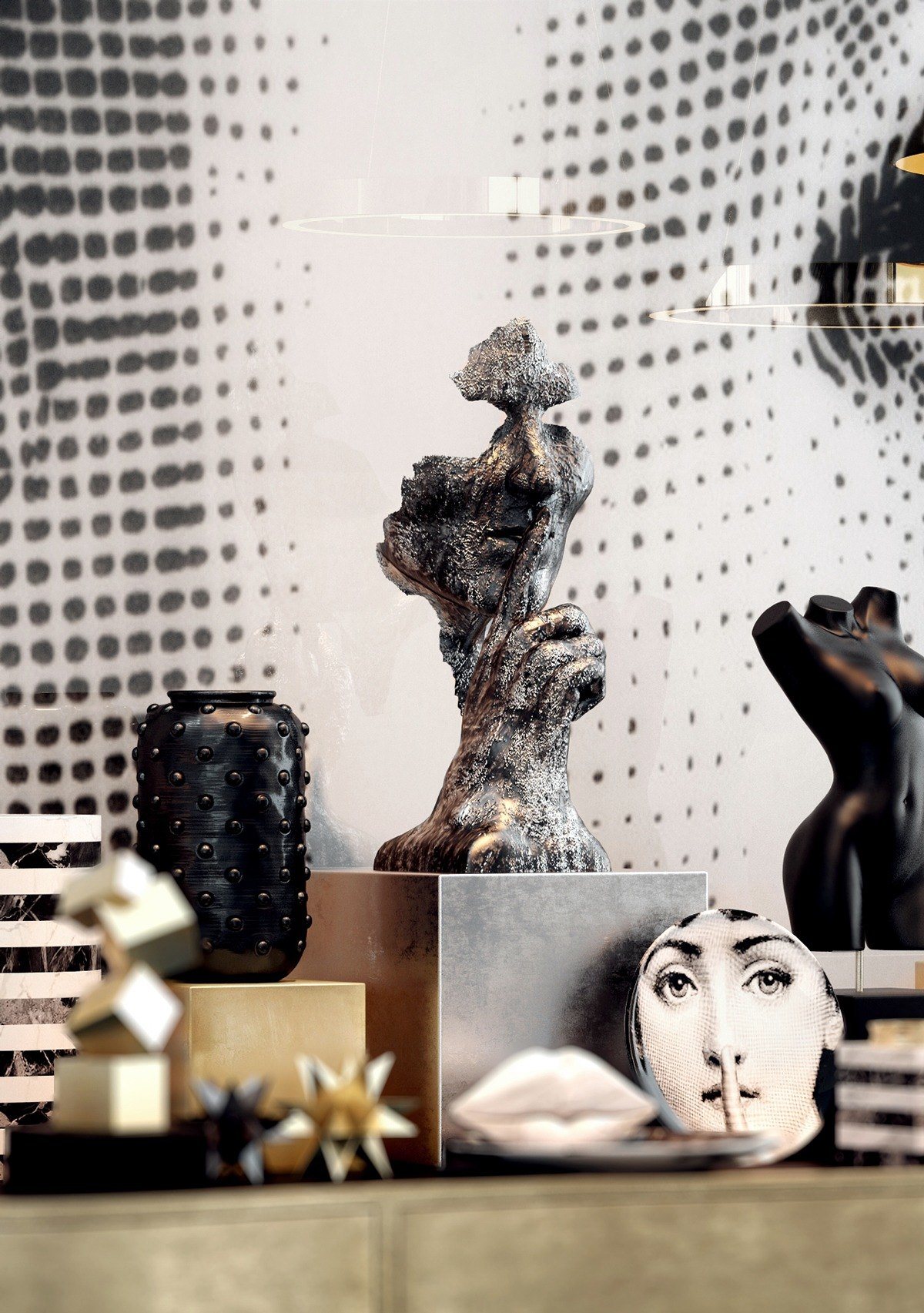
A collection of objets d'art creates a miniature gallery any guest would love to peruse. The striped marble vases are from the Melange collection by Kelly Wearstler and the white calacatta lips are part of the Classic Little Kiss line by the same designer.

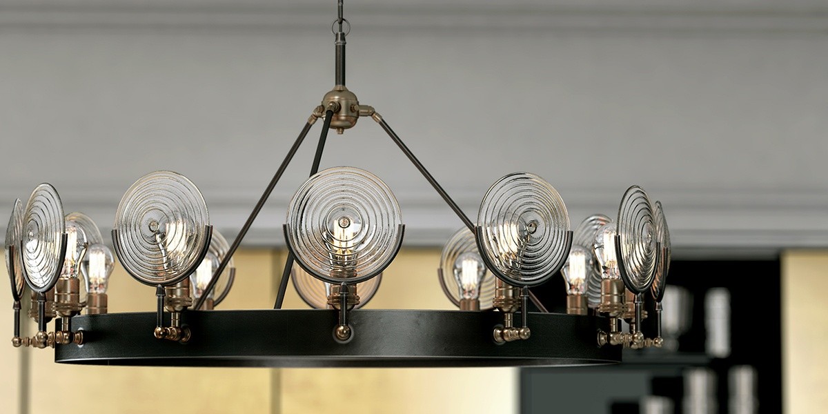
And here is the same kitchen, visualized with a softer palette of rose-tinted wood. The furniture and decorations remain largely the same but the curvaceous touches seem to make a world of difference. This version might even be considered to sit more on the Art Nouveau side, especially with the addition of a flowery ring chandelier.
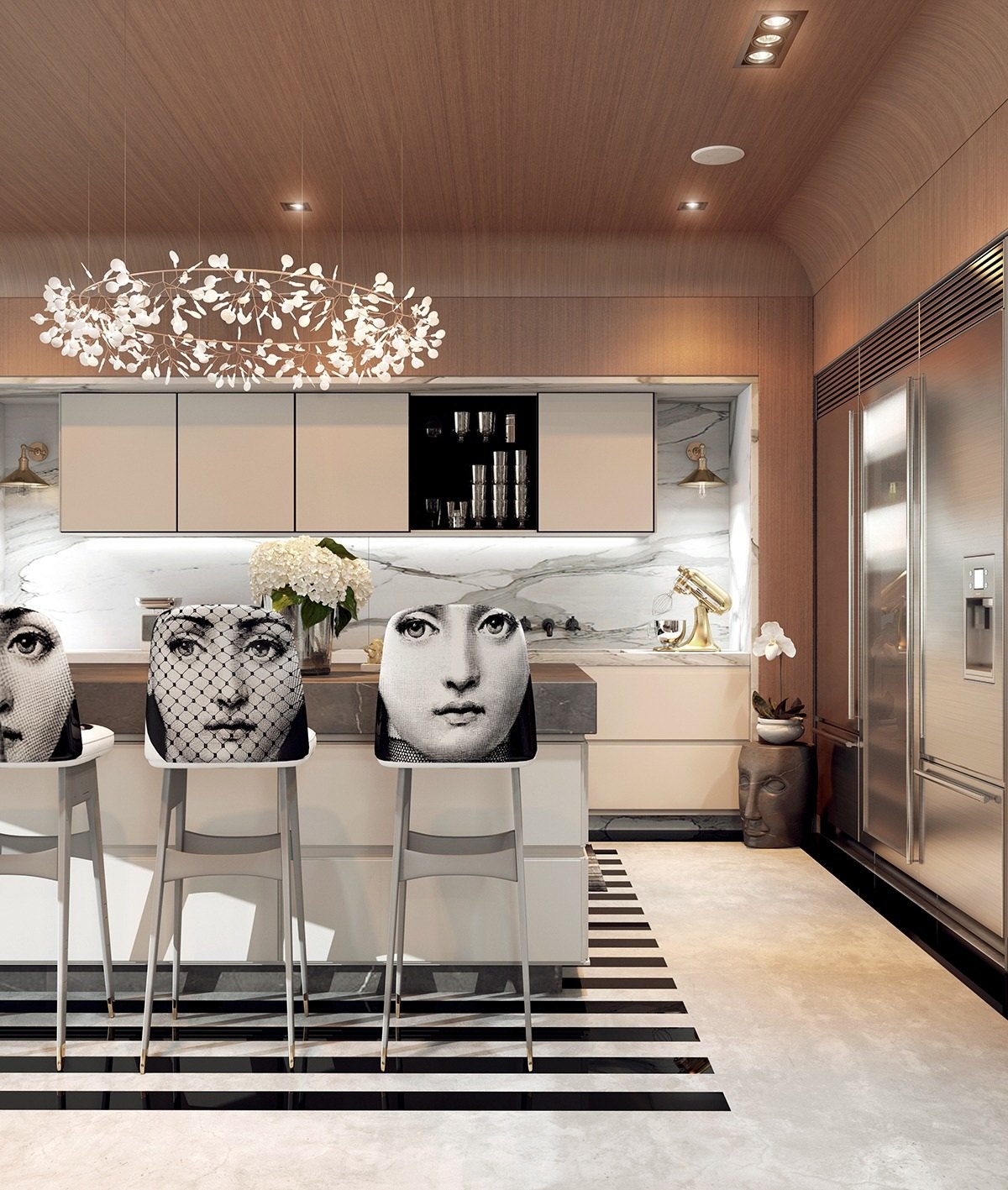
Another gorgeous series of prints from Piero Fornasetti – since breakfast stools are one of the few pieces of furniture almost guaranteed a 360 degree view, it only makes sense to ensure they look fabulous from any angle.
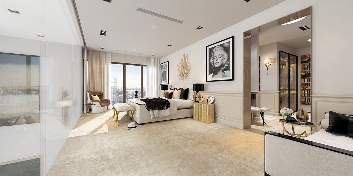
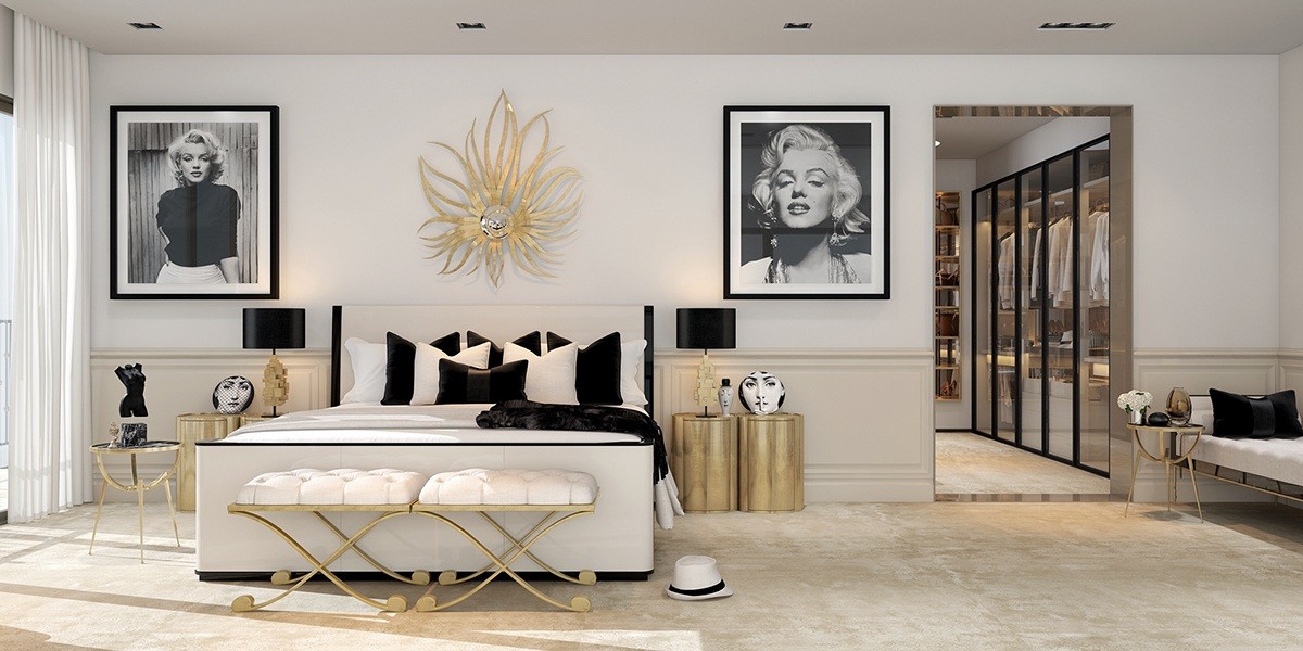
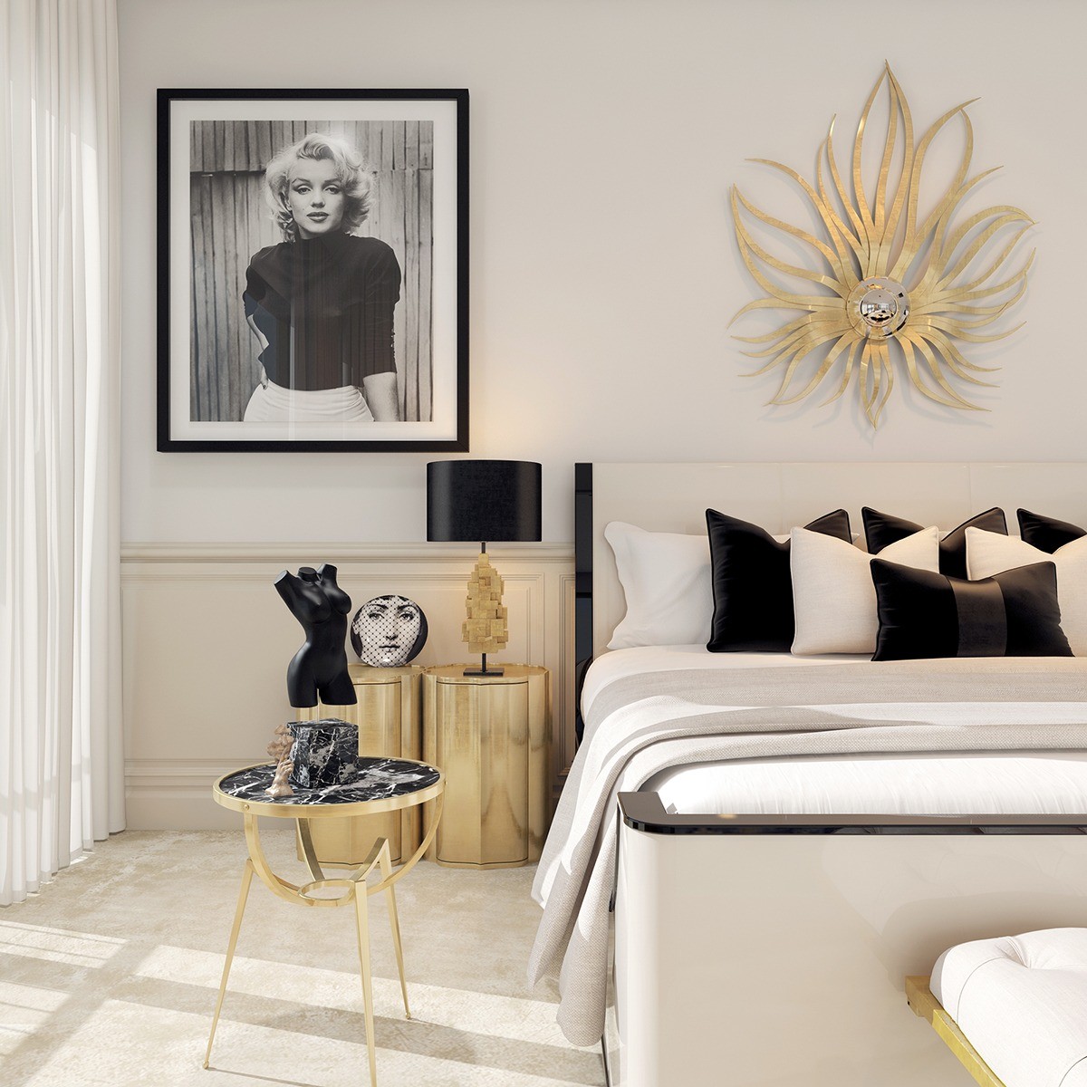
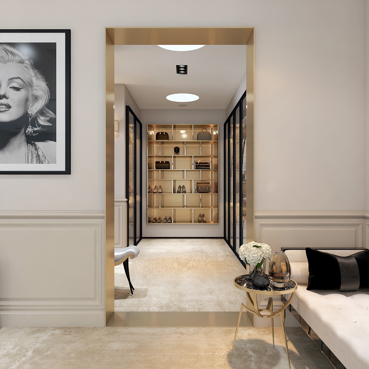
The bedroom is light and playfully decorated with iconic portraits of Marilyn Monroe, a personification of the golden age of Art Deco style.
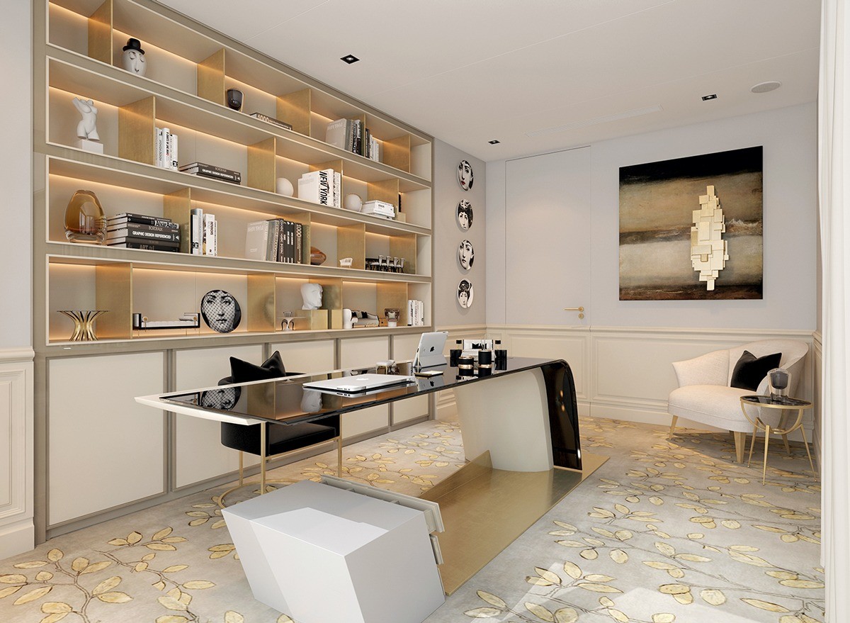
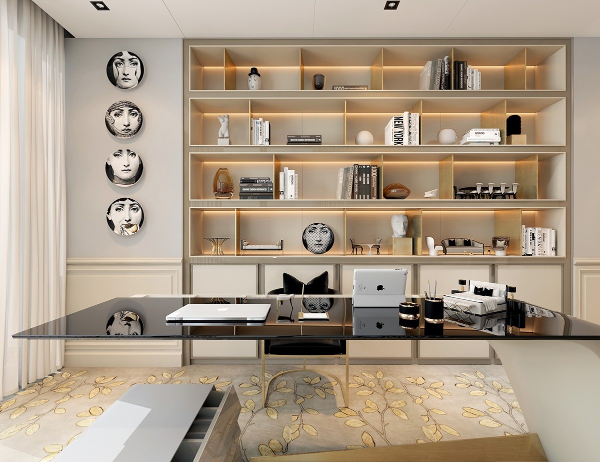
More artistic collectibles are smartly displayed in the office. That innovative cantilever desk is also worth a mention! It's a nice ultra-modern contrast to the delicate floral carpet.
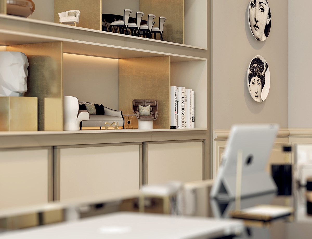
Miniaturized versions of furniture from all throughout the house occupy places of honor in the display cubbies.
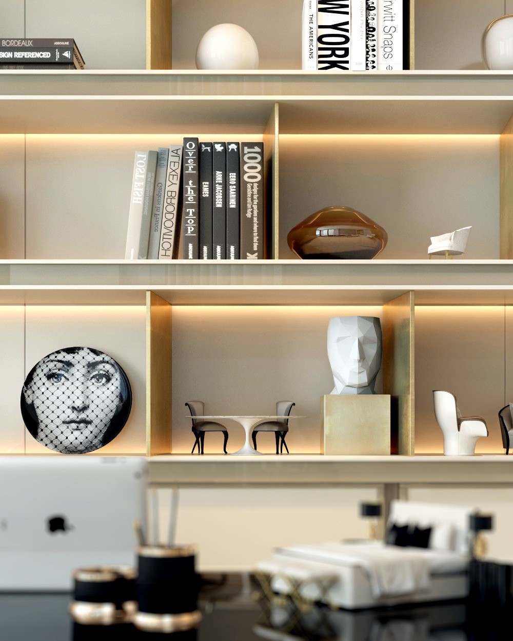
A few of the pieces featured in the background include chairs from Christopher Guy, including Eureka (bottom left) and Musette (upper right).
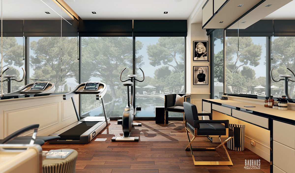
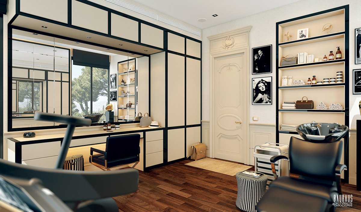
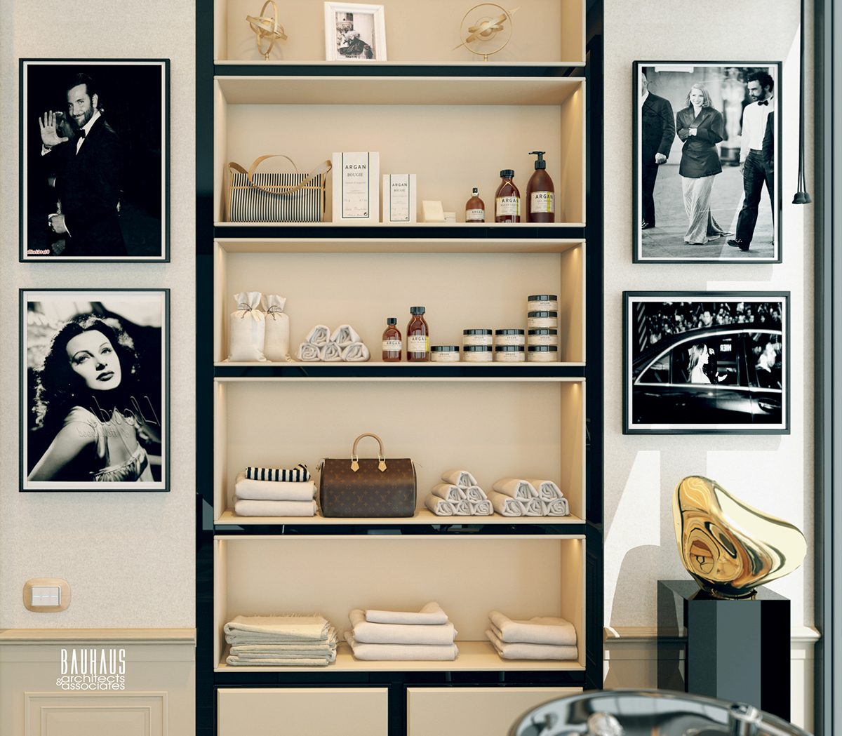
The modest gym shares its room with a dressing vanity. Expansive mirrors traverse either side of the room to make it feel so much larger.
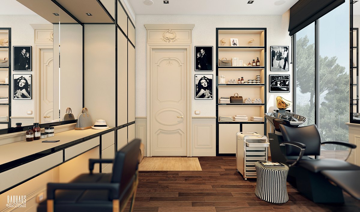
Portraits of celebrities hang alongside the shelving unit to inspire the occupants in all things fitness and style.
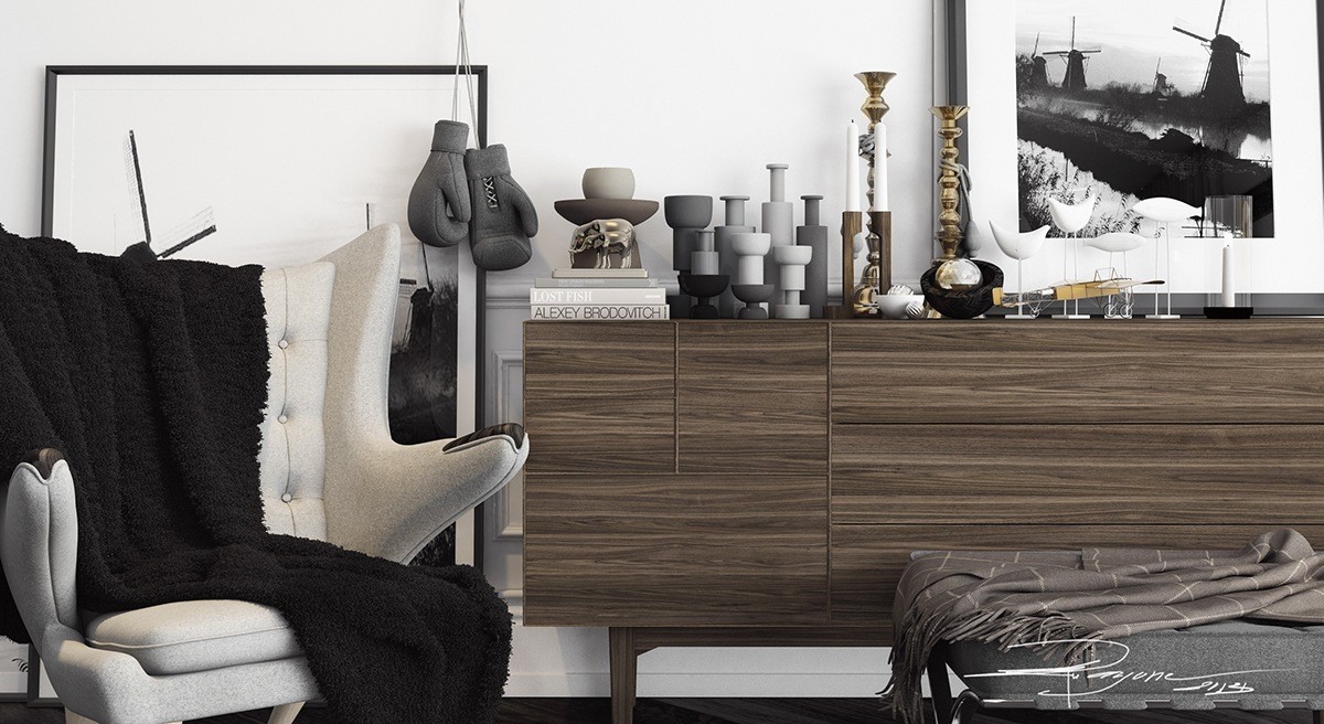
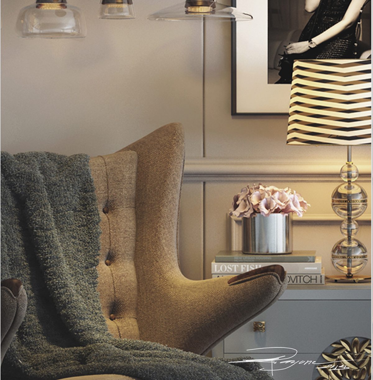
This time, we are treated to two different takes on the same bedroom, both centered on the iconic Teddy Bear Chair by Hans J. Wegner. This first bedroom takes a monochromatic approach with natural accents and a lovely collection of candleholders.
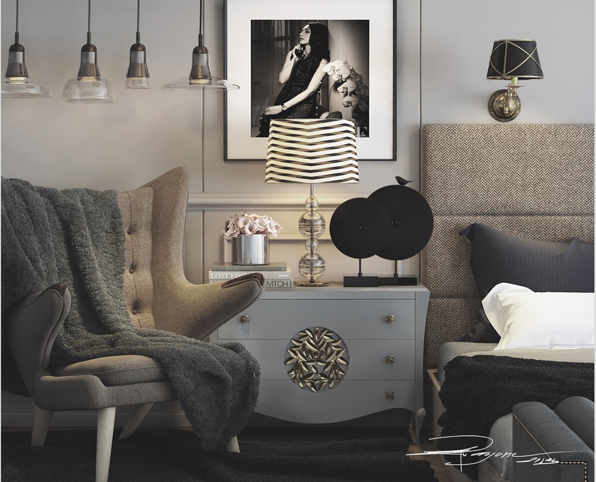
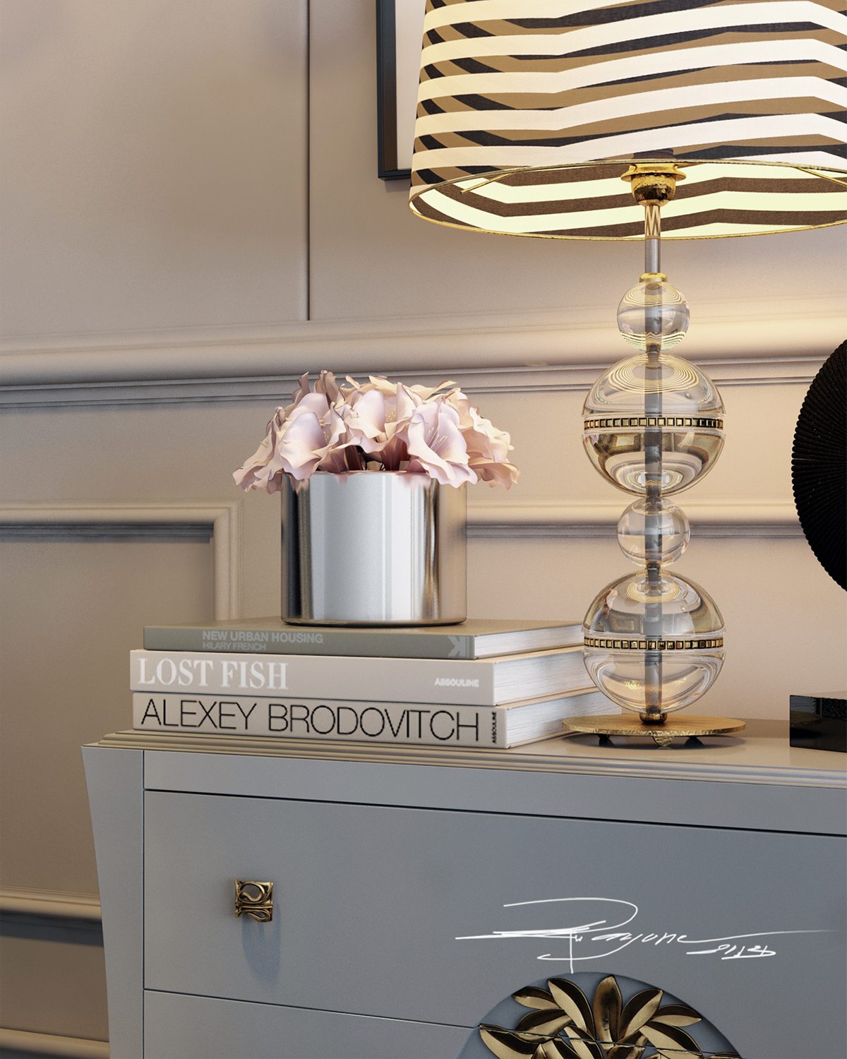
The second bedroom concept uses a lighter and more organic style, utilizing ornate classic furniture and a striped lamp that ties back into the main kitchen concept at the beginning of this post.
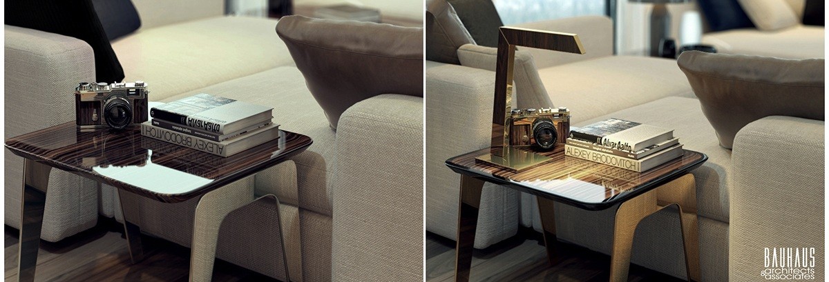
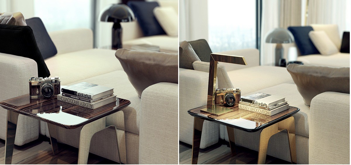
Two different takes on the same side table – in the second visualization, the lamp creates more an emphasis on the table itself whereas it serves as more of a functional accessory in the first.
