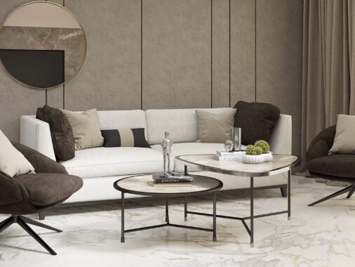
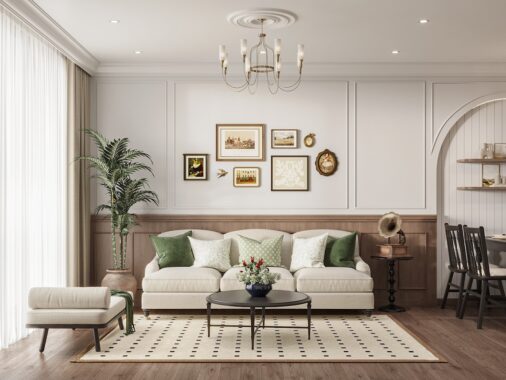
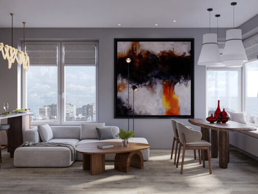
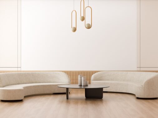
Which texture theme do you prefer: soft and cozy or sleek and glossy? It's hard to choose between two styles that work so well – and the choice becomes even more difficult once you realize just how much new finishes and patterns can change the atmosphere of a home. If you're thinking about switching up your interior decor textures, these photos demonstrate how two modern apartments with similar colors and similar architecture can look completely different from one another just by using different textures. Both spaces use a mixture of soft and sleek styles, yet the magic stems from how they use them.
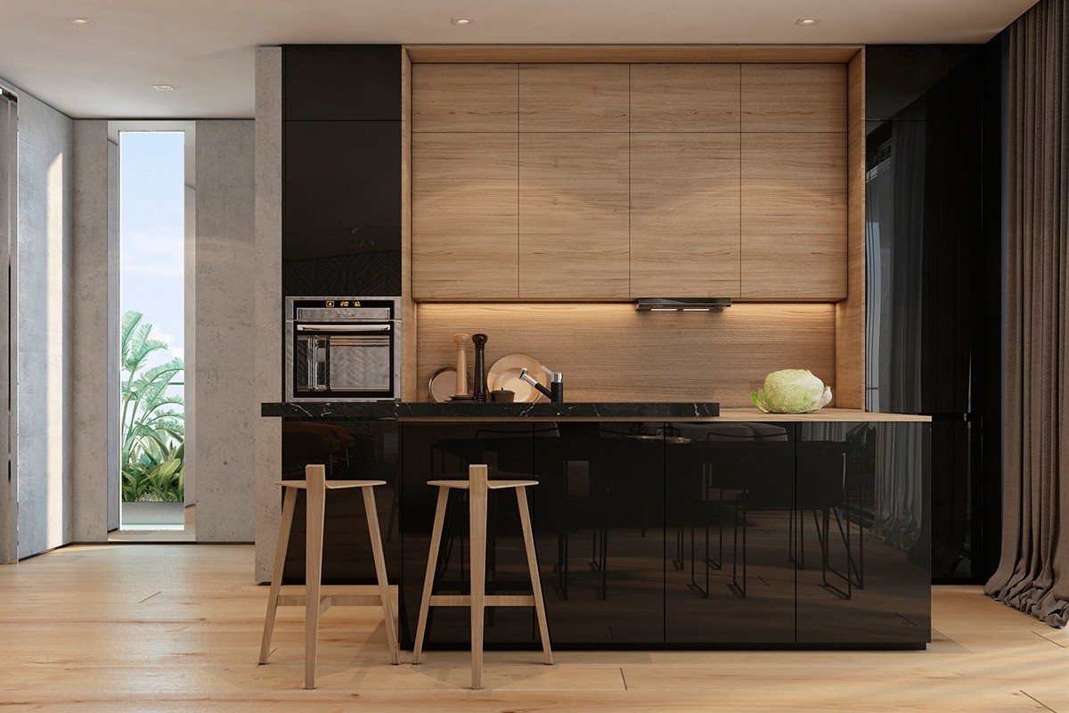
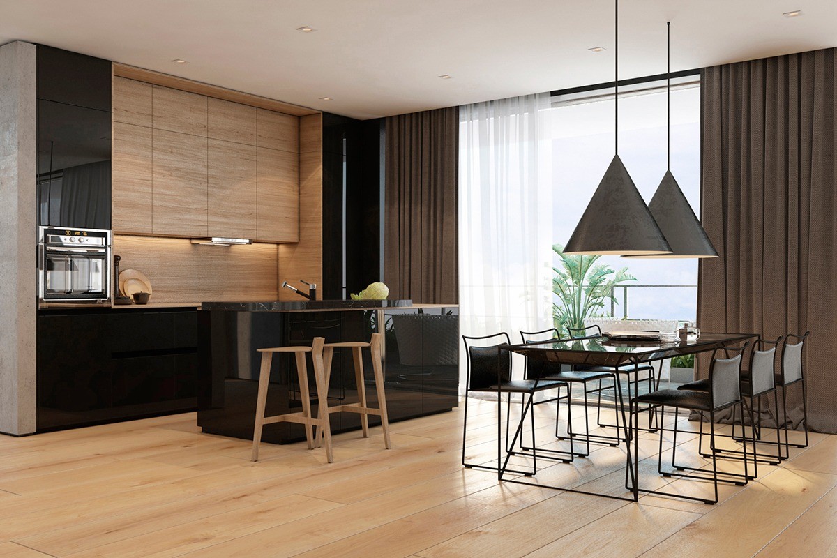
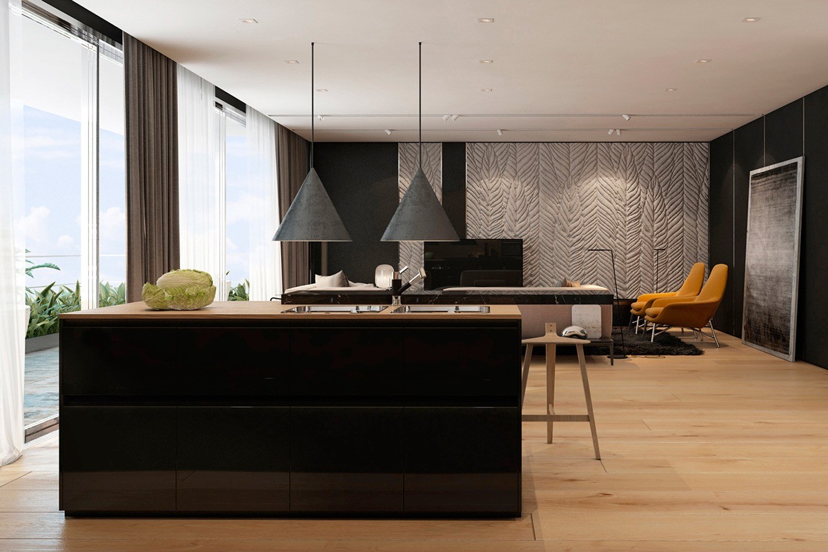
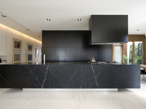
Concrete, wood grain, and heavy curtains provide a nice textural contrast to the glossy black cabinetry, completing the transition from a soft aesthetic to a sleek one. The bar stools at the kitchen island are quite unusual, featuring three legs joined together with a T shape and supported by only the faintest hint of a backrest.
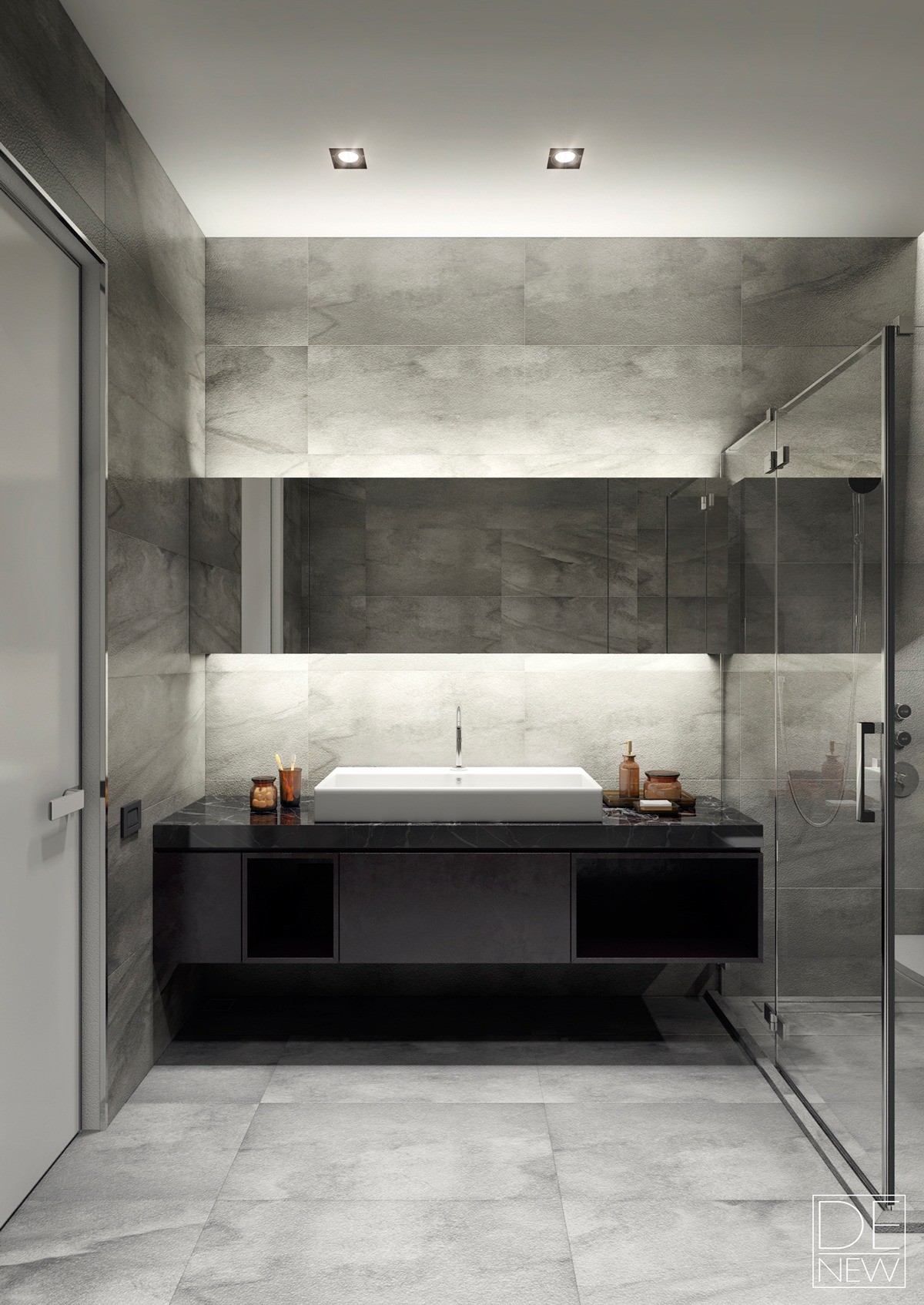
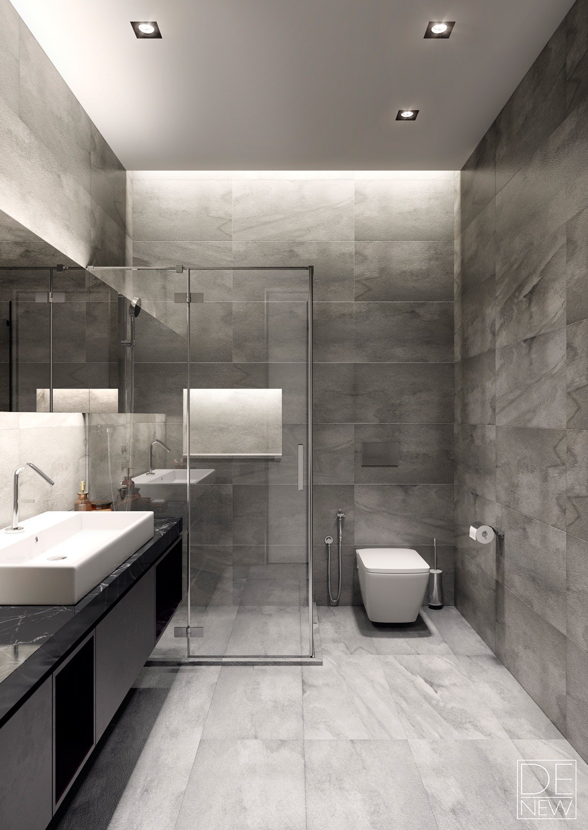
Smart indirect lighting helps the smoothly textured and monochromatic bathroom feel bright and welcoming without becoming overwhelming. It seems like a nice, relaxing place to wind down with a hot shower after a busy day.
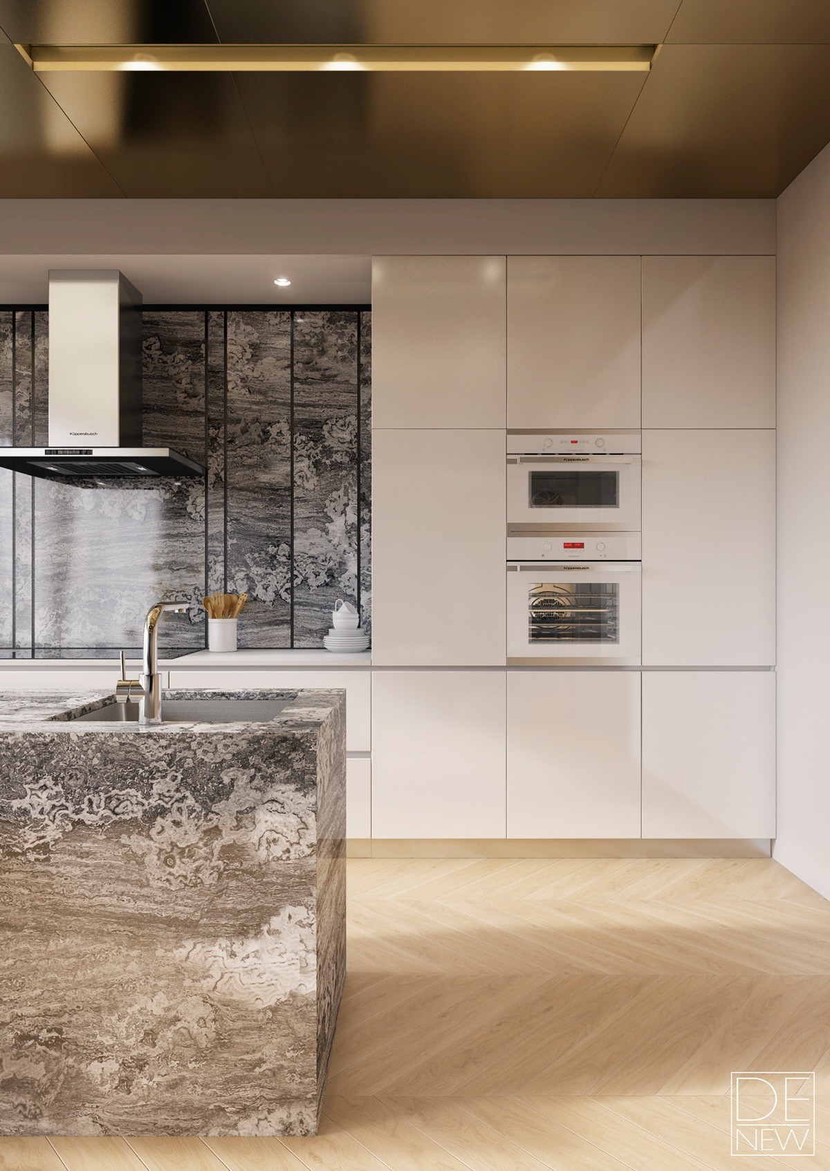
Kitchen cabinetry is either from the Maxima 2.2 collection from Cesar or the Pure collection from SieMatic – both are top of the line systems. Fixtures include a commercial quality Küppersbusch range hood and modern minimalistic faucets.
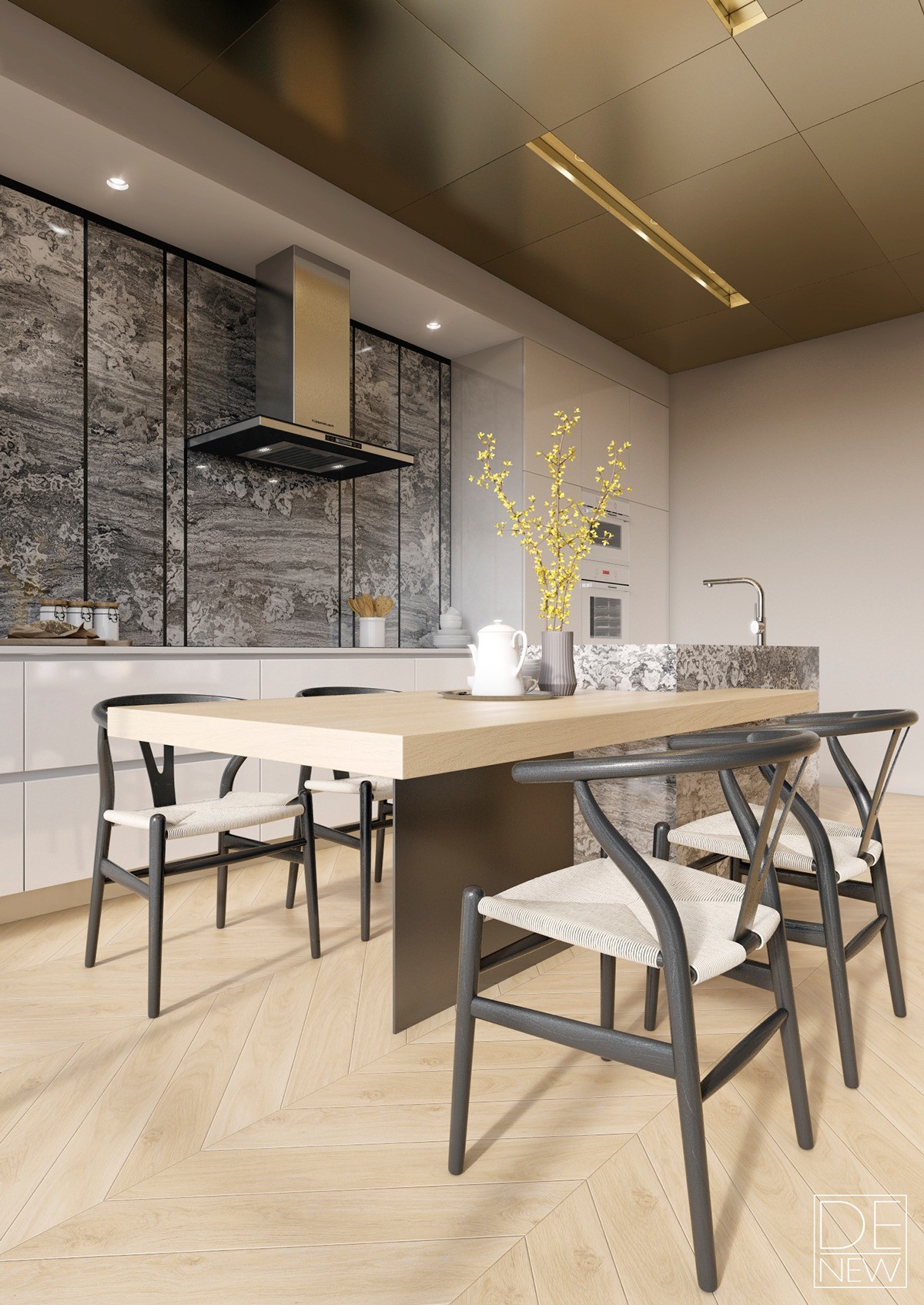
The table seems to defy gravity perched on a thin panel, but the strength comes from its cantilever attachment to the marbled kitchen island beside it. Wishbone dining chairs by Hans Wegner are a classic and nostalgic touch.
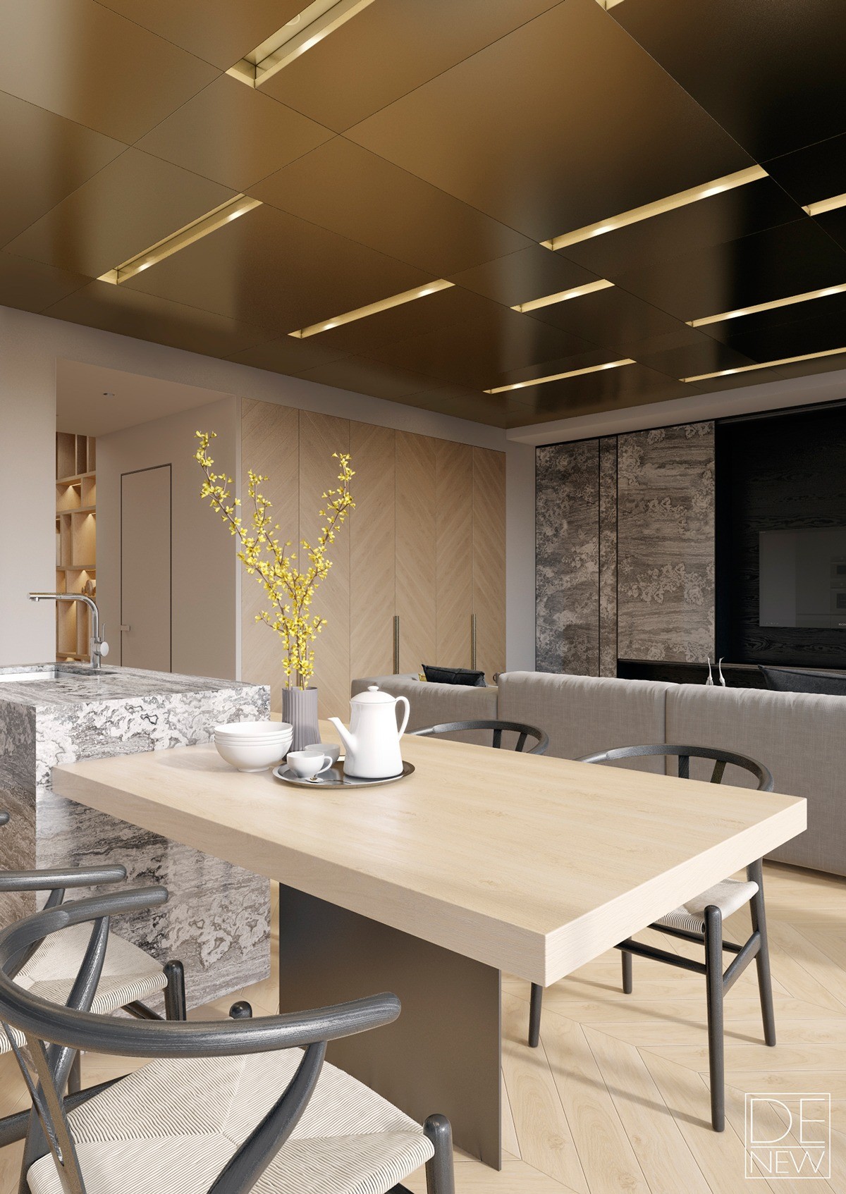
A branch of yellow flowers brightens the dining table and breakfast bar combo. This is a great angle to view how the extremely varied textures come together as one cohesive interior design.
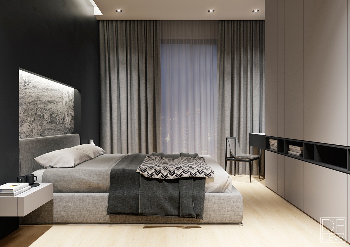
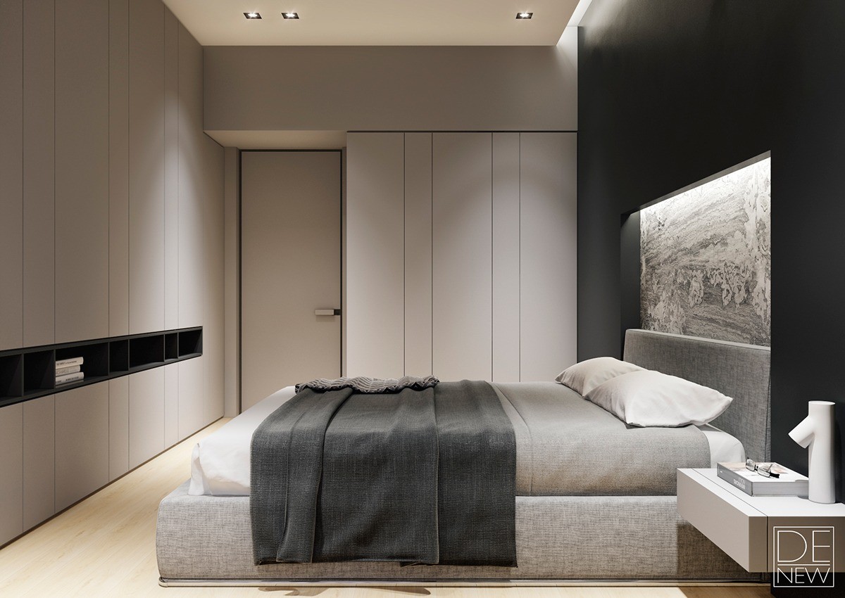
Recessed stone creates a vertical extension of the strongly woven headboard fabric. White cantilever side tables against a satin black wall serve as a sort of visual inverse to the black shelves and white cabinets on the right.
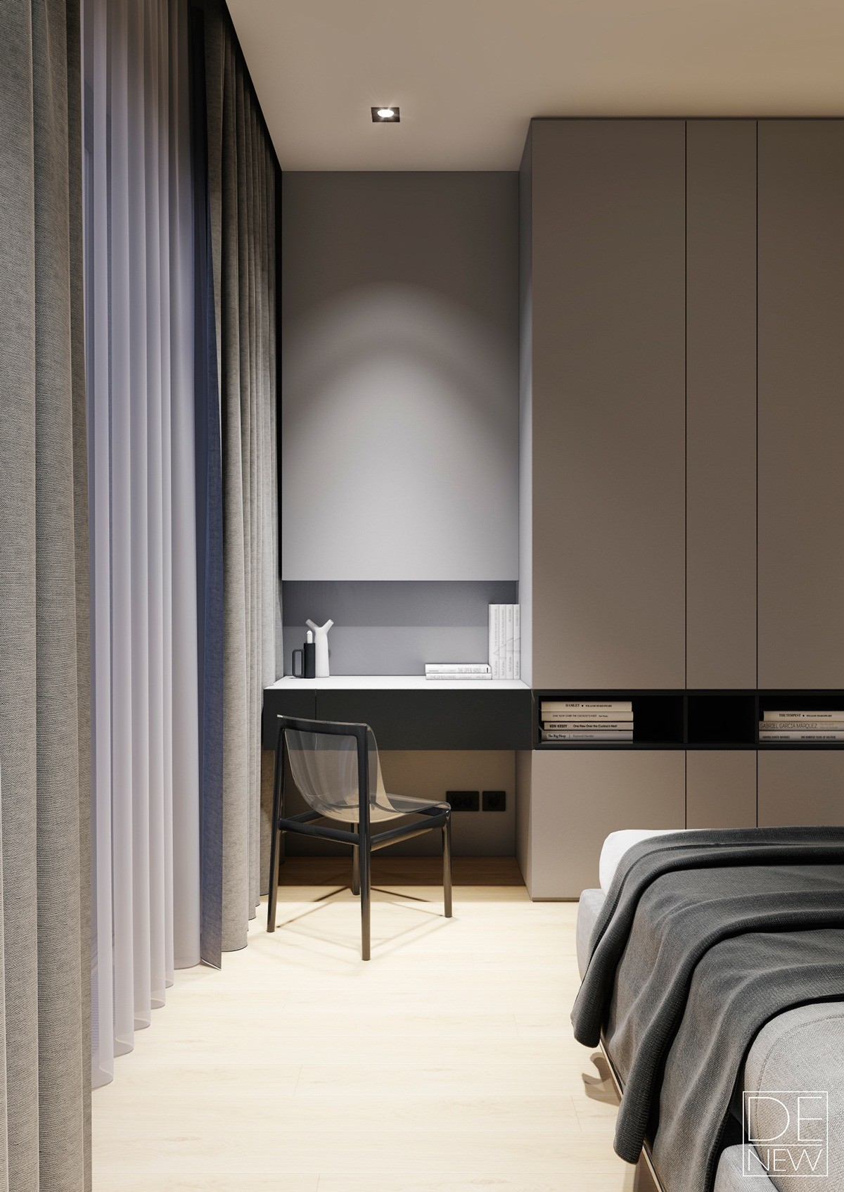
The master bedroom expresses texture in a much more subdued way. Layered curtains in weightless gossamer and strong tweedy fabrics offer a lovely contrast. The curtains continue alongside the desk niche for a neatly integrated look, the desk itself serving as a continuation of the open shelf that bisects the wall of cabinets.
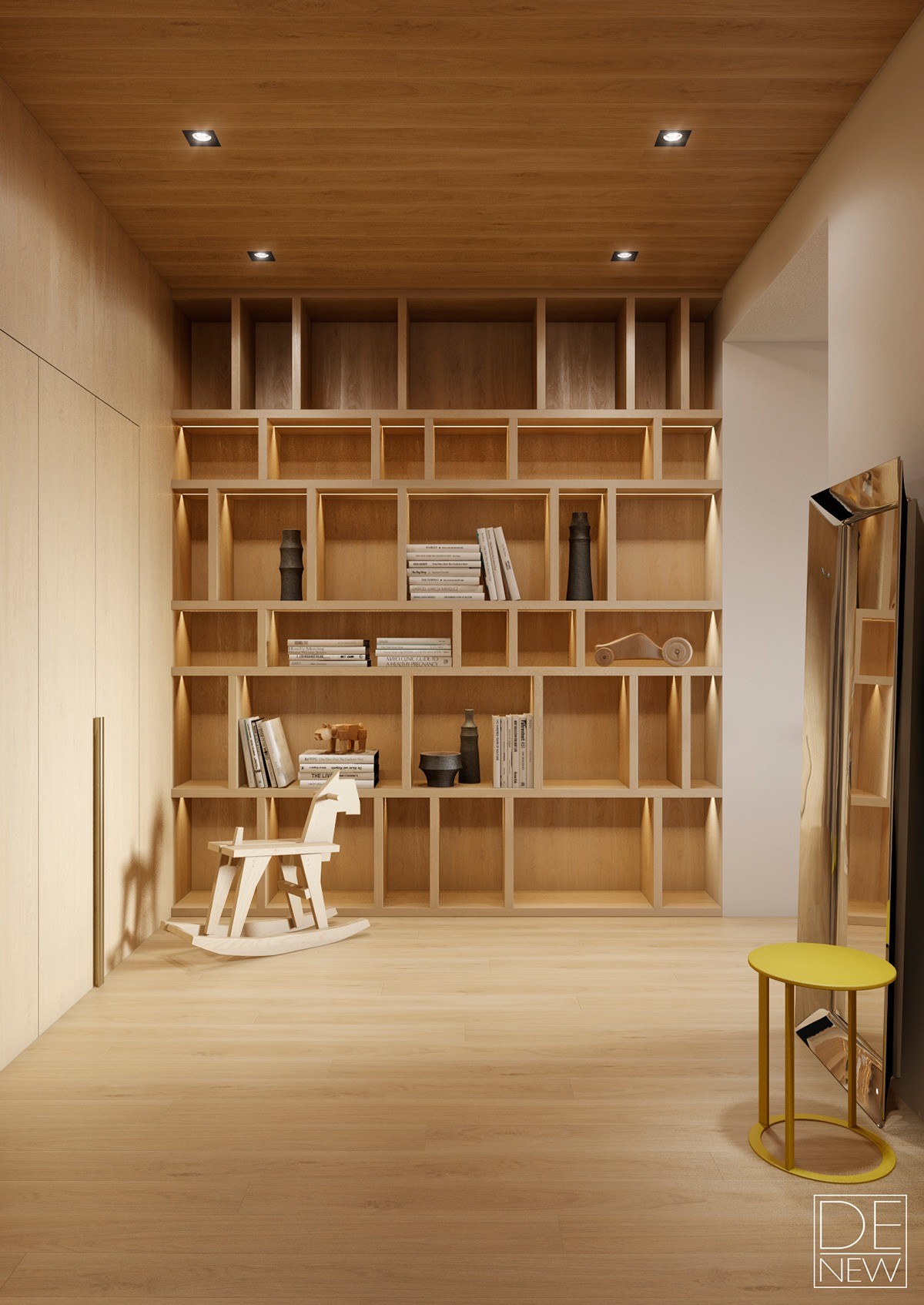
Floor-to-ceiling bookshelves fill the far wall of the library space, otherwise minimally furnished with a charming wood rocking horse by Dutch designer Bo Reudler and a yellow Elios side table by Antonio Citterio.
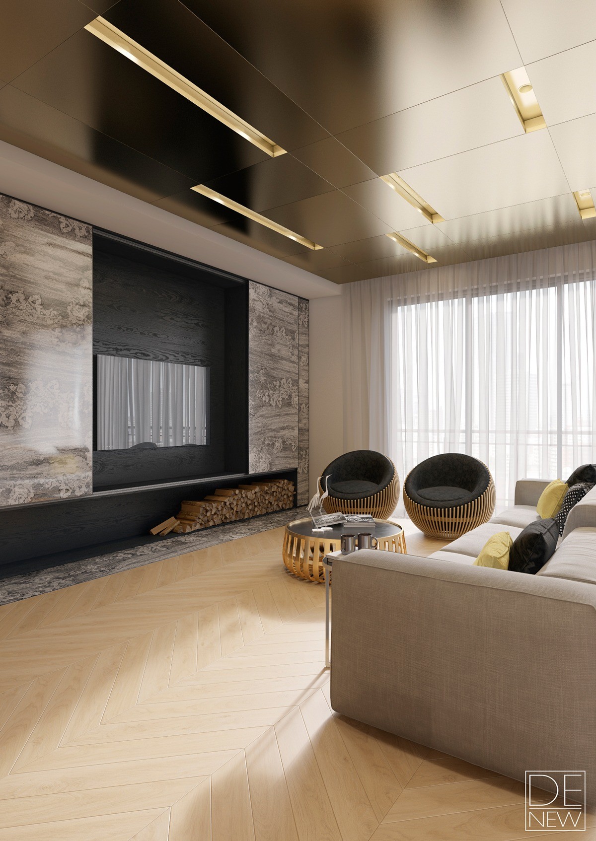
A cozy social area centers on a dramatic stone-clad entertainment center, underlined with a niche for firewood. The chairs are part of the Motley III Collection by Samuel Chan – this model is known as the Egg Chair.
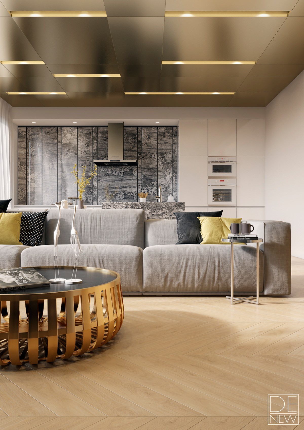
The goldish-brass table seems to take inspiration from the Panier table by Erwan and Rowan Bouroullec, although the sophisticated materials really enhance the design compared to the popular plastic version. Perched on that same table are two beautiful white crane sculptures to keep guard over the sitting area. In many cultures, cranes symbolize grace, beauty, and even eternal youth.
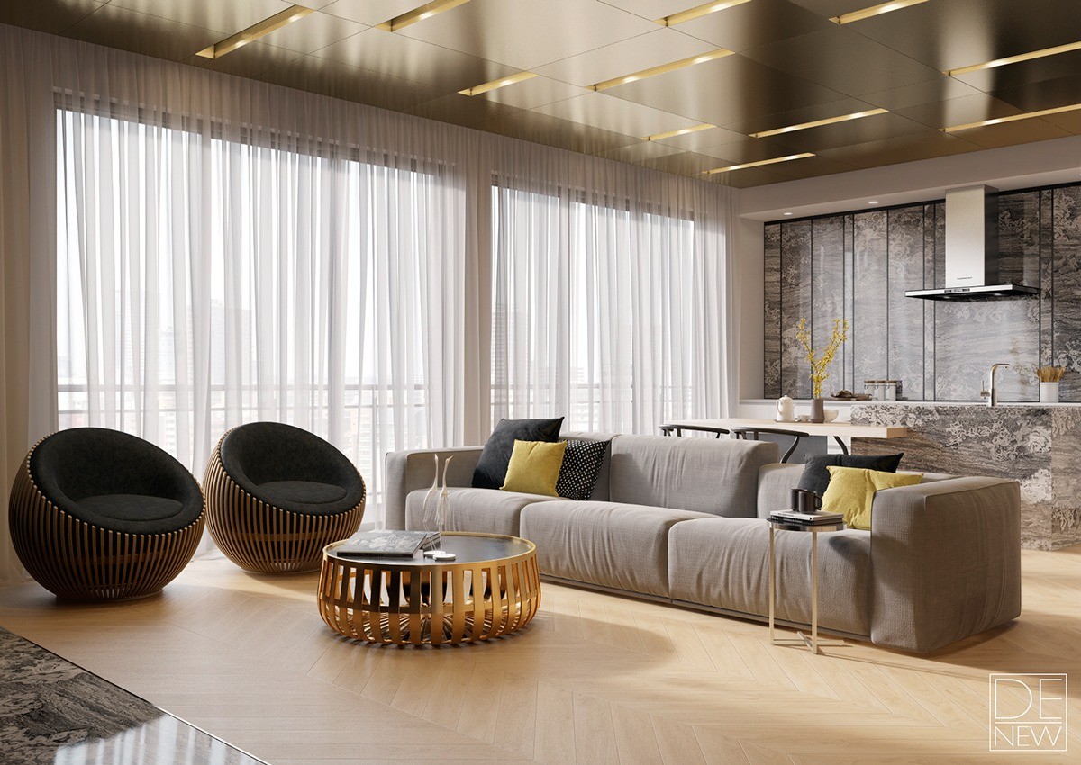
Studio DEnew emphasizes the sleek textures of polished brass and lustrous stone in this extra-luxurious Moscow apartment. Even the ceiling is richly plated with brilliant brass! It would be difficult to find an apartment with metallic texture as well integrated as this one. Of course, this opulent style would certainly prove difficult to emulate without extreme attention to detail – and this apartment is very conscious of how each part fits into the whole.
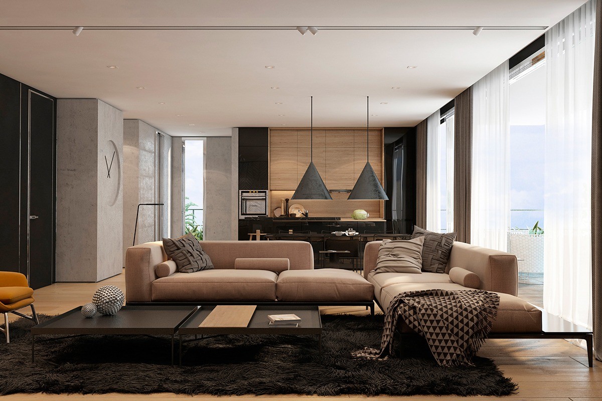
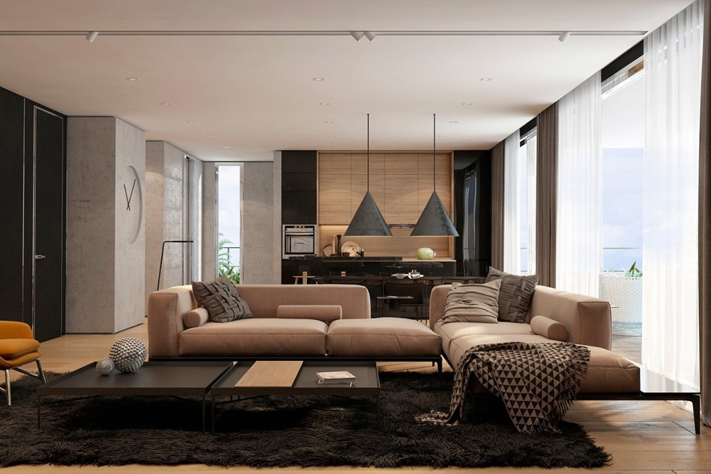
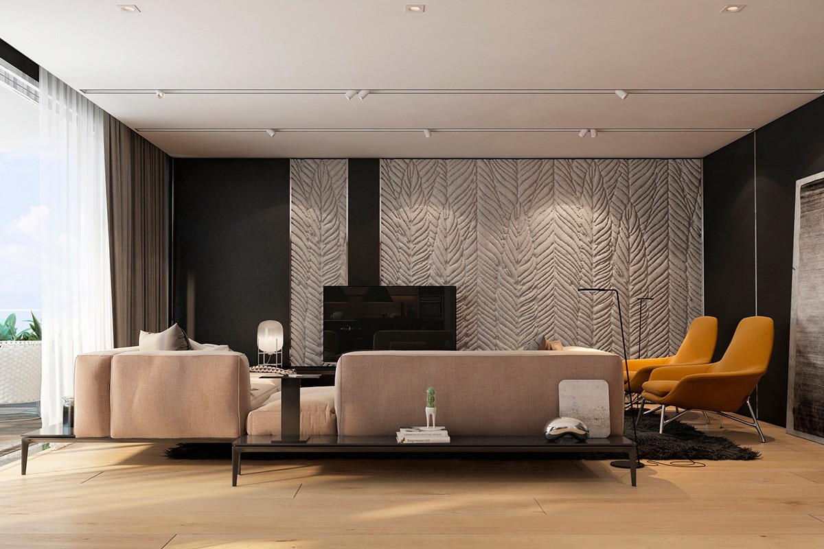
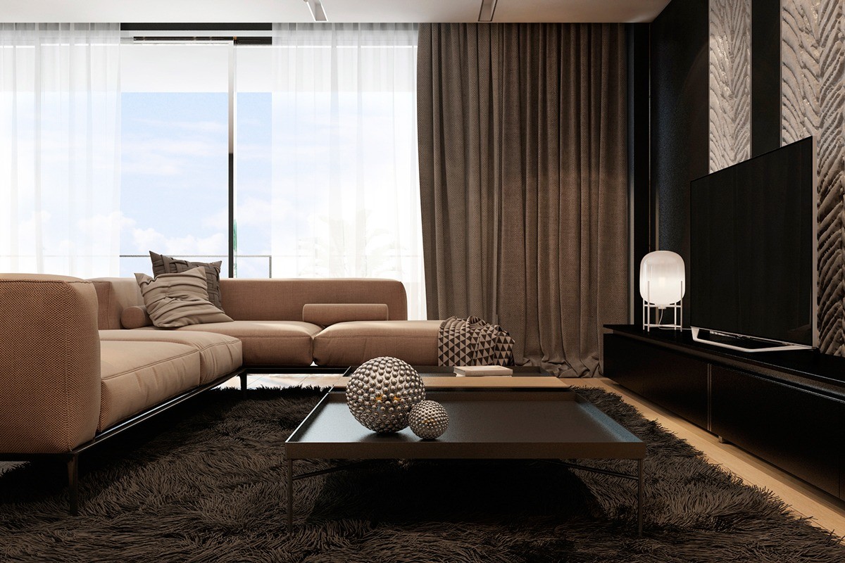
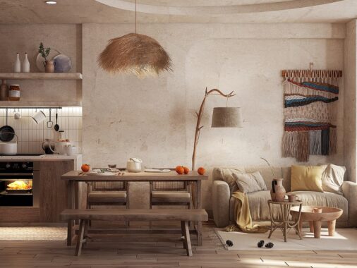
Designed by Iryna Dzhemesiuk, this Tel Aviv apartment features a warm and comfortable living room decorated with soft textures that beckon the viewer to reach out and touch them. From fuzzy wool to unfinished concrete, this space mixes and matches tactile experiences to make every square meter unique in its own right.
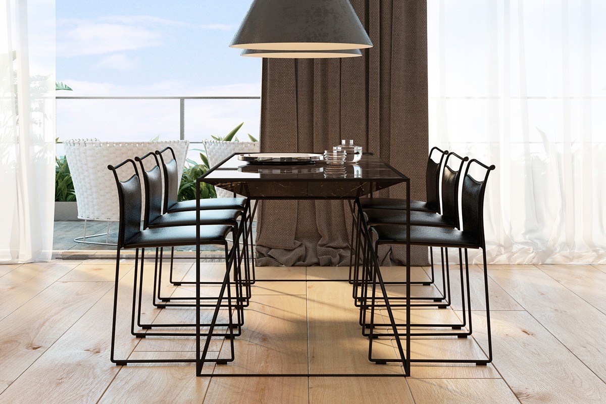
Clean lines and low-profile aesthetics preserve the gorgeous view. The shape of the conical pendant lamps reappears in inner profile of the table – a very cool effect.
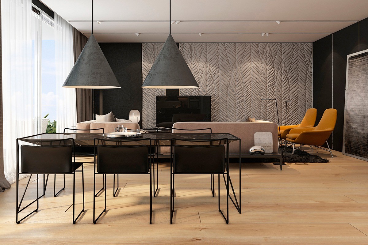
The dining room is slightly smoother, centering on a wire frame dining table with a unique trapezoid marble top. Perfectly coordinated chairs seat six. Of course, the most eye-catching part of this arrangement must be the oversized pendant lamps by Swedish architecture firm Claesson Koivisto Rune. They're relatively thin and light, but the rugged texture makes them look heavy and substantial.
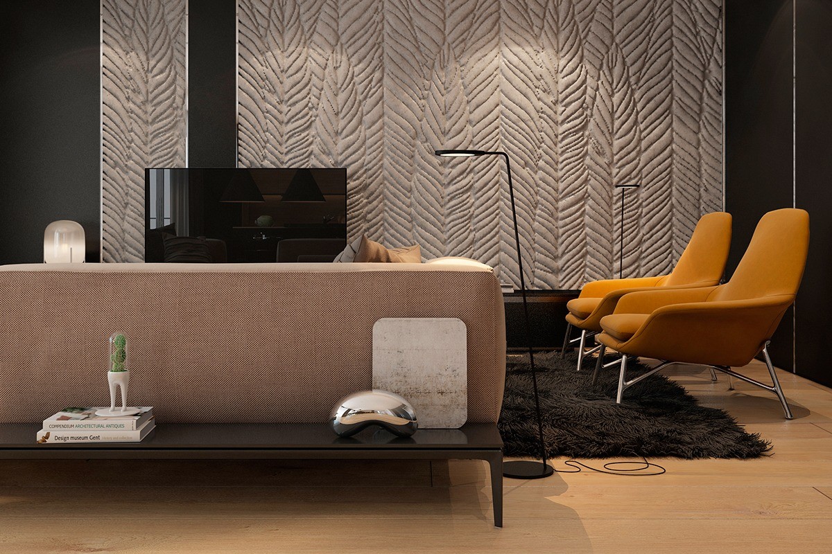
Built-in low tables make this sofa ideal for placement in the middle of a room. Here, miniature works of art brighten the apartment. One is a small-scale version of the Cloud Gate sculpture by Anish Kapoor – the full size version of which serves as an interactive exhibit in Chicago. The other piece is the Domsai planter by Matteo Cibic, inspired by the Tamagotchi trend of the 90s.
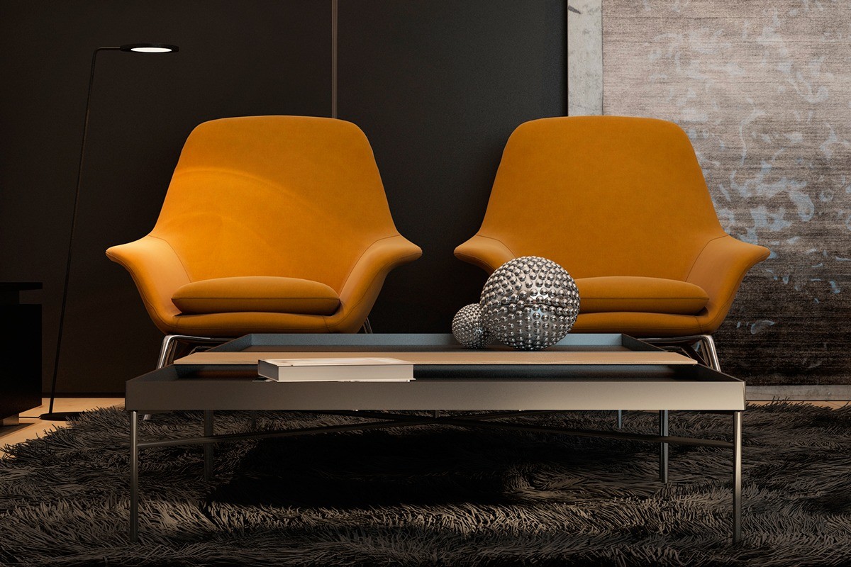
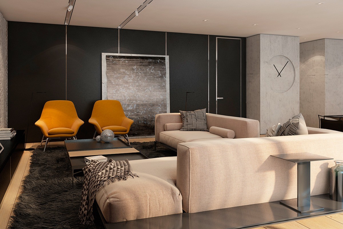
Prince armchairs by Rodolfo Dordoni offer the only true accent color in the apartment, a vibrant splash of orange.
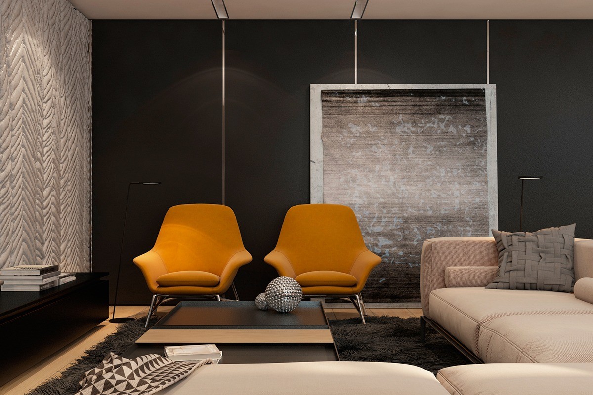
The living room uses the softest textures, expressed through patterned throws, ornate spheres, and silky finishes – all tied together with a lovely shag rug. Exposed concrete on the far wall acts as a stunning canvas for a rugged print and the accent wall to left enjoys a drama of light and shadow that plays over its deeply grooved surface.
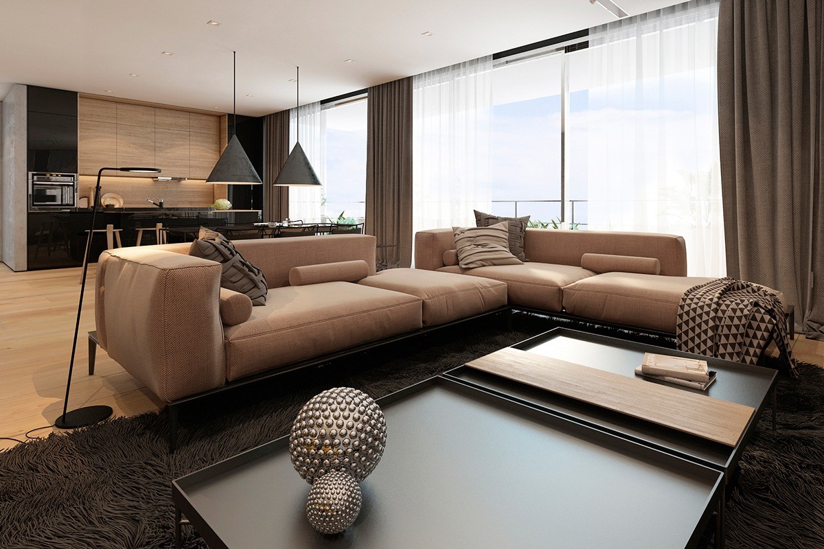
A slanted floor lamp provides just the right amount of light for casual reading on the sofa. The unique coffee table – actually two square tables pushed together – comes with a fitted tea tray to make serving guests as easy and convenient as possible.
