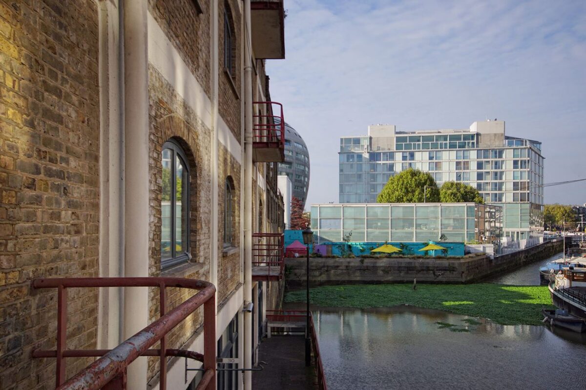
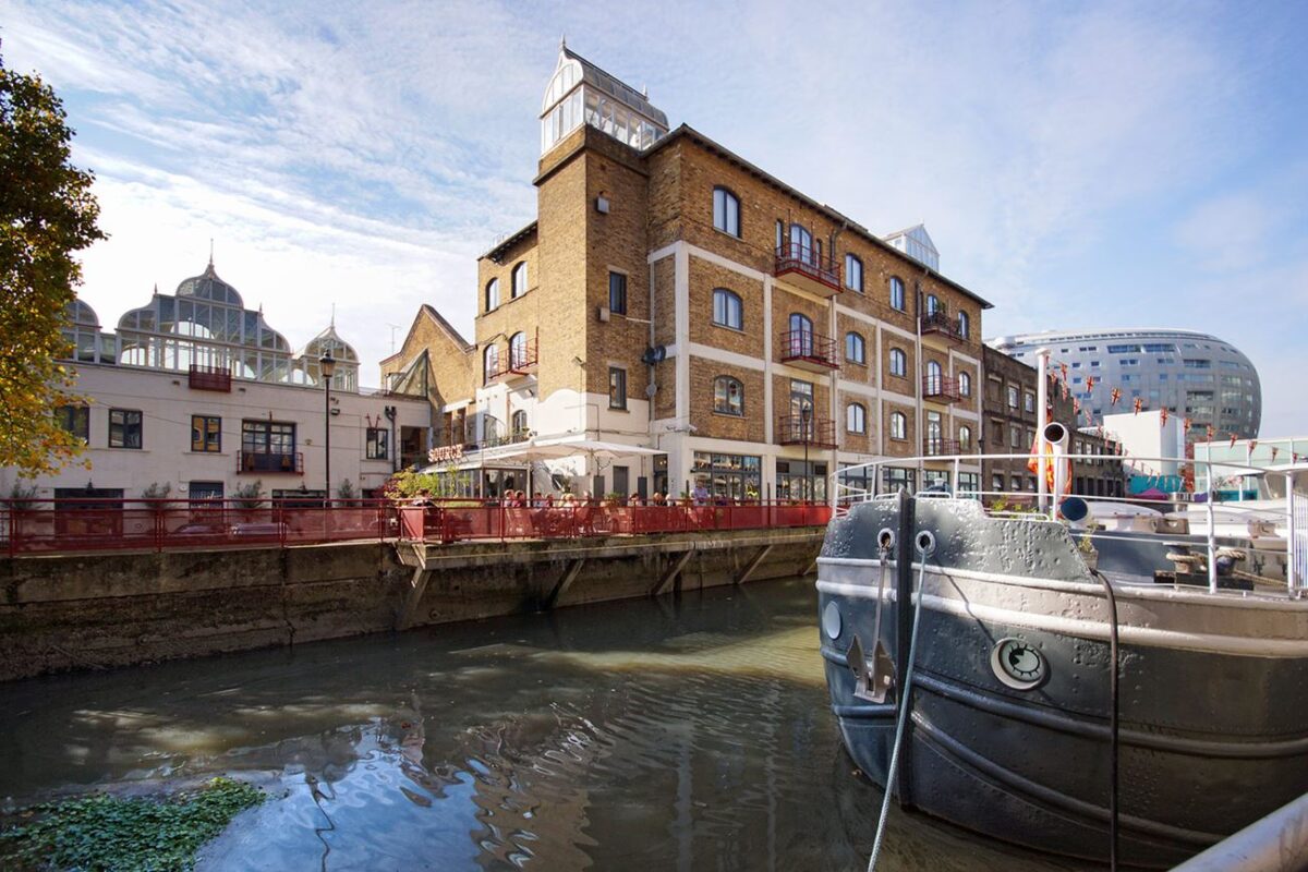
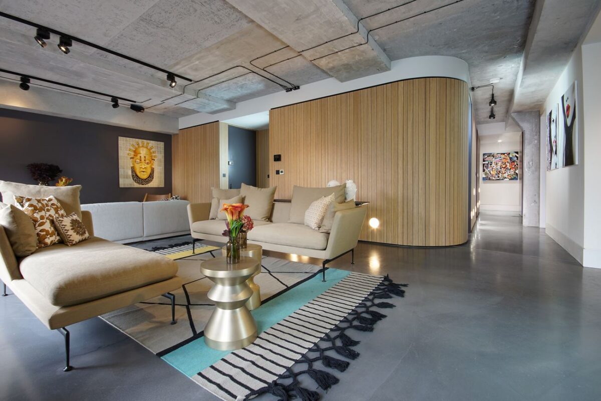
Located at Ransome's Dock in Battersea, this unique London apartment occupies the space previously occupied by Victoria Beckham's design studio. With its unique location surrounded by famous fashion houses and respected architectural practices, this warehouse renovation demanded nothing short of excellence and innovation, delivered by architect Rafael Borrego in conjunction with CLPD and Italian kitchen design company Minacciolo. It retains the aesthetic of its industrial origin with polished concrete and exposed hardware, modernized with designer furniture and creative room dividers.
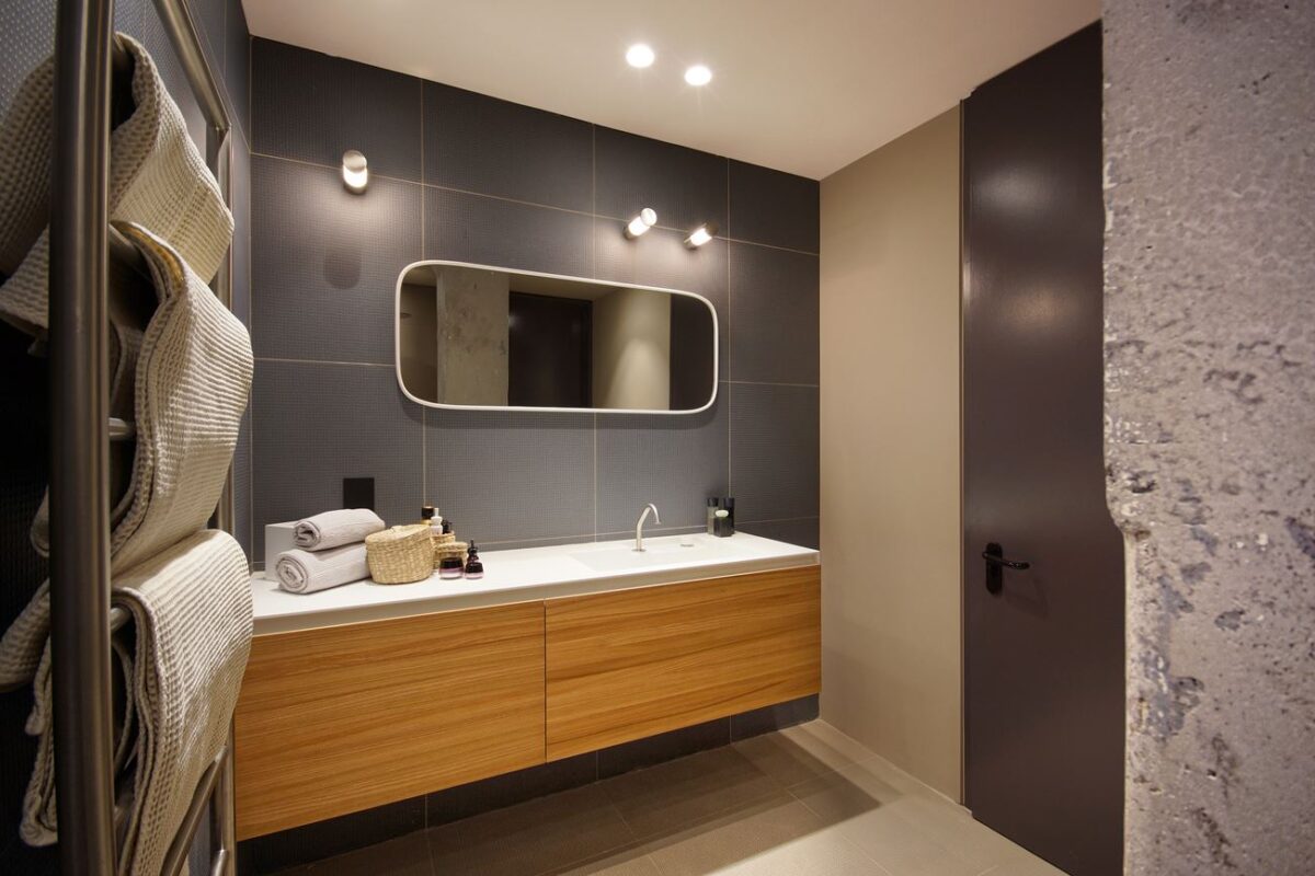
Tiles designed by Ronan & Erwan Bouroullec give the bathroom a splash of relaxing color and texture, and they're made of recycled materials for an added bonus. A rounded mirror by Monica Graffeo hangs above the gorgeous Ergo_nomic vanity from Italian bathroom design company Rexa.
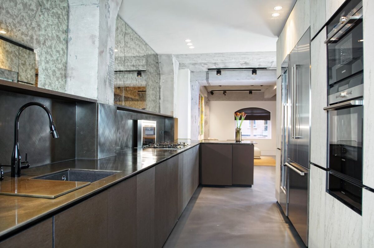
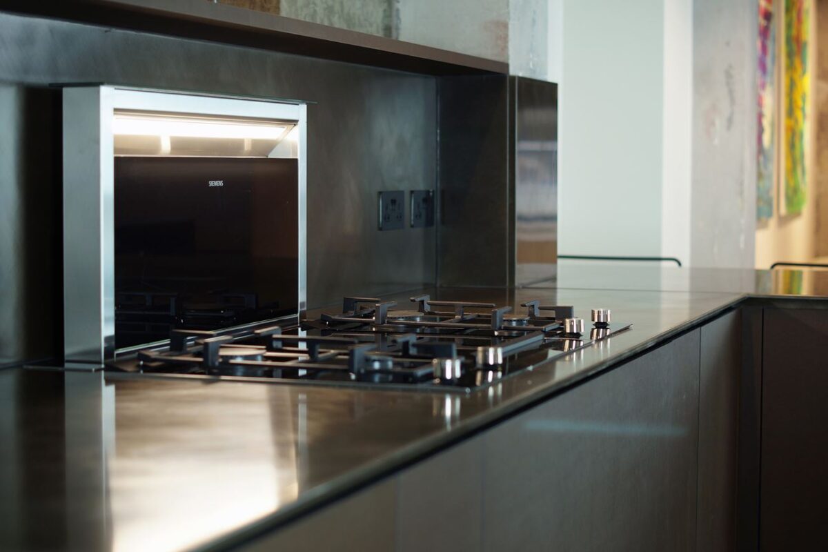
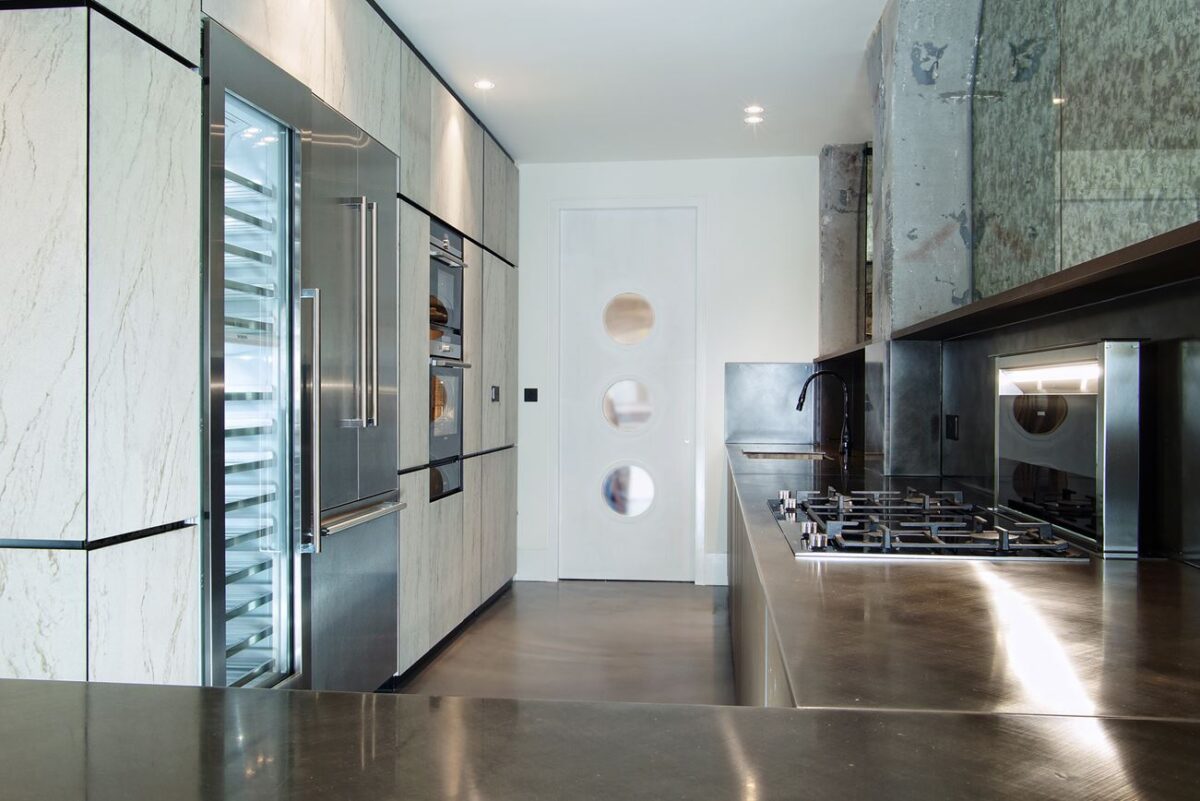
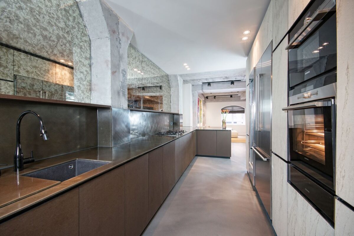
A fitted panel covers the sink when not in use, providing even more workspace in an already spacious kitchen.
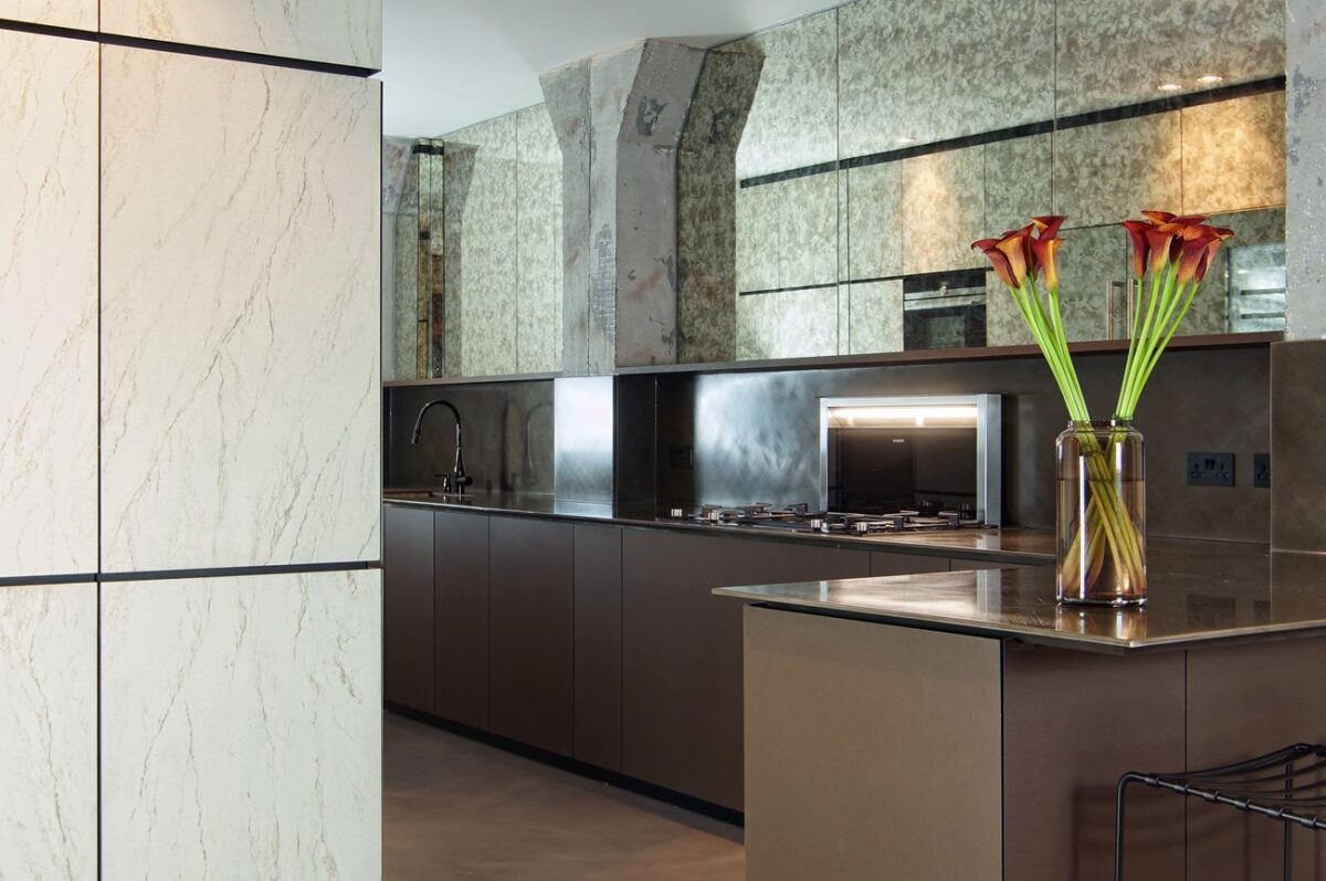
Distressed structural columns heighten the luxurious feel of the modern materials through careful contrast.
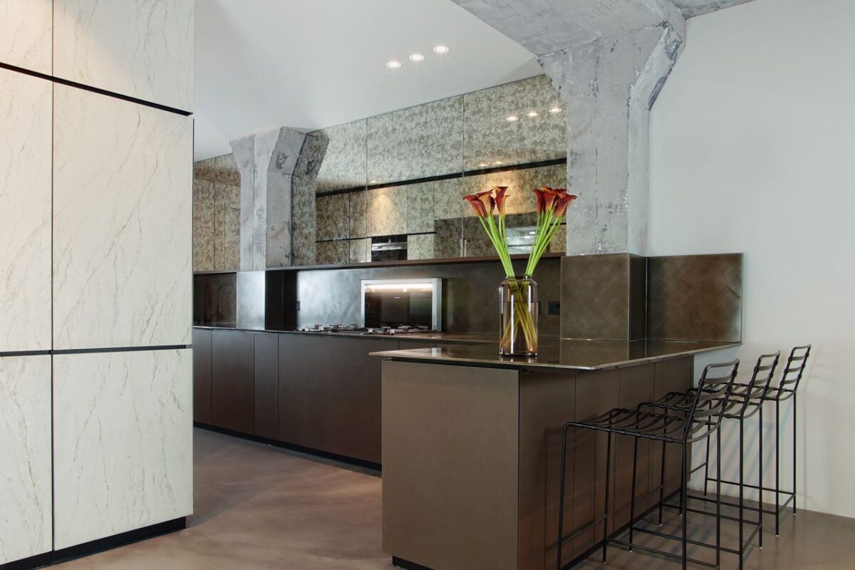
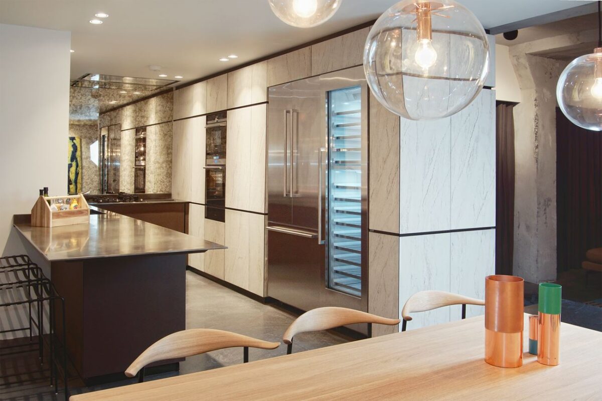
The countertop wraps around into the dining room to create a handsome little breakfast bar with an extra wide surface. PARIS counter stools (also from Minacciolo) offer a lightweight barely-there aesthetic.
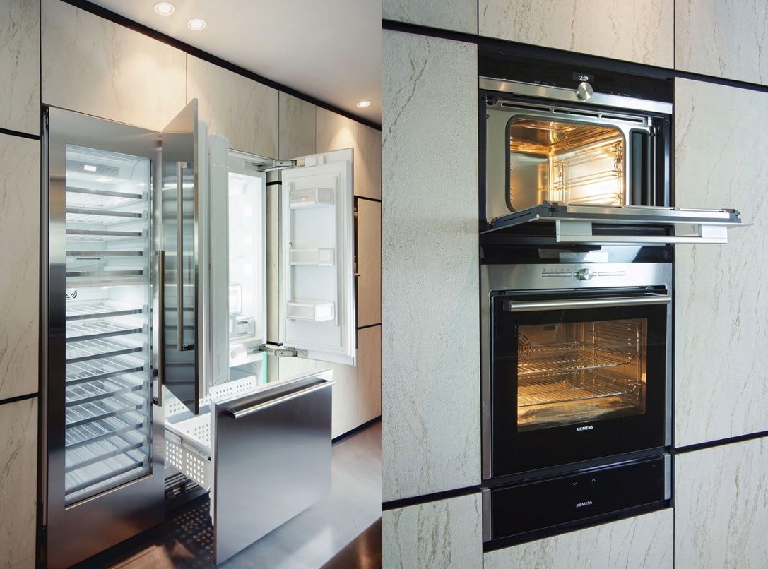
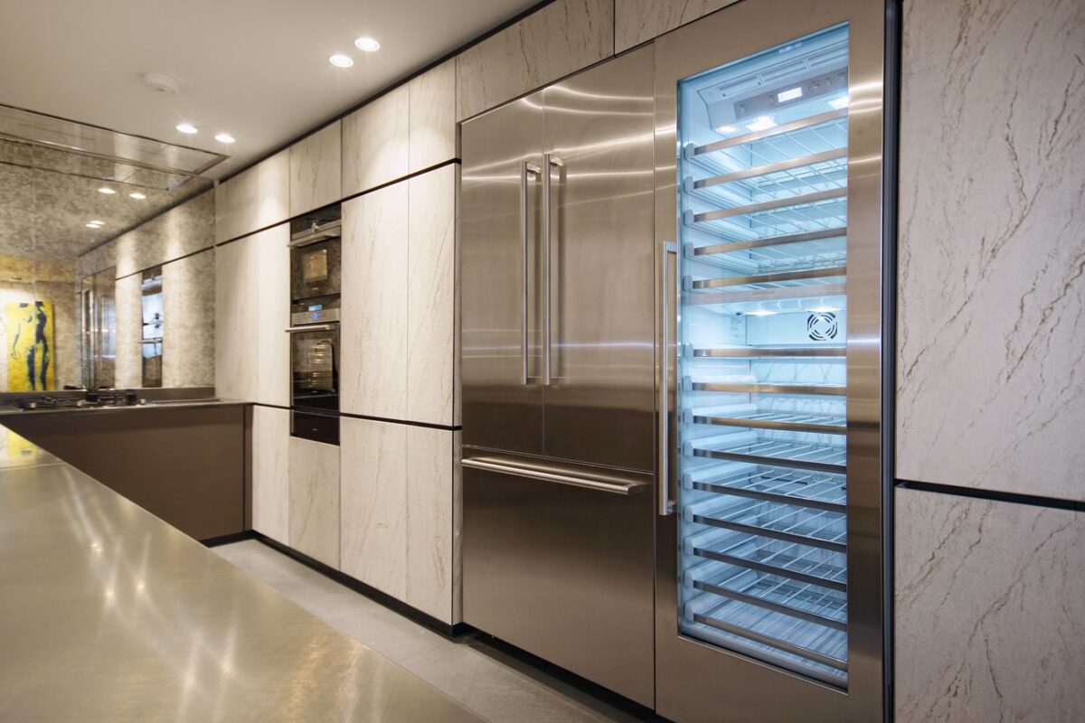
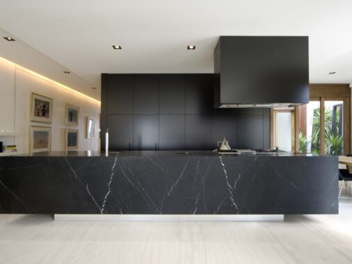
Also part of the Natural Skin collection, the modular "monolith" provides clever integration of all kitchen appliances, while providing hidden storage spaces for baskets, drawers, shelves, and everything a chef could need. Minacciolo decided to use gorgeous marble – not normally available with the Natural Skin line – and the effect is truly breathtaking.
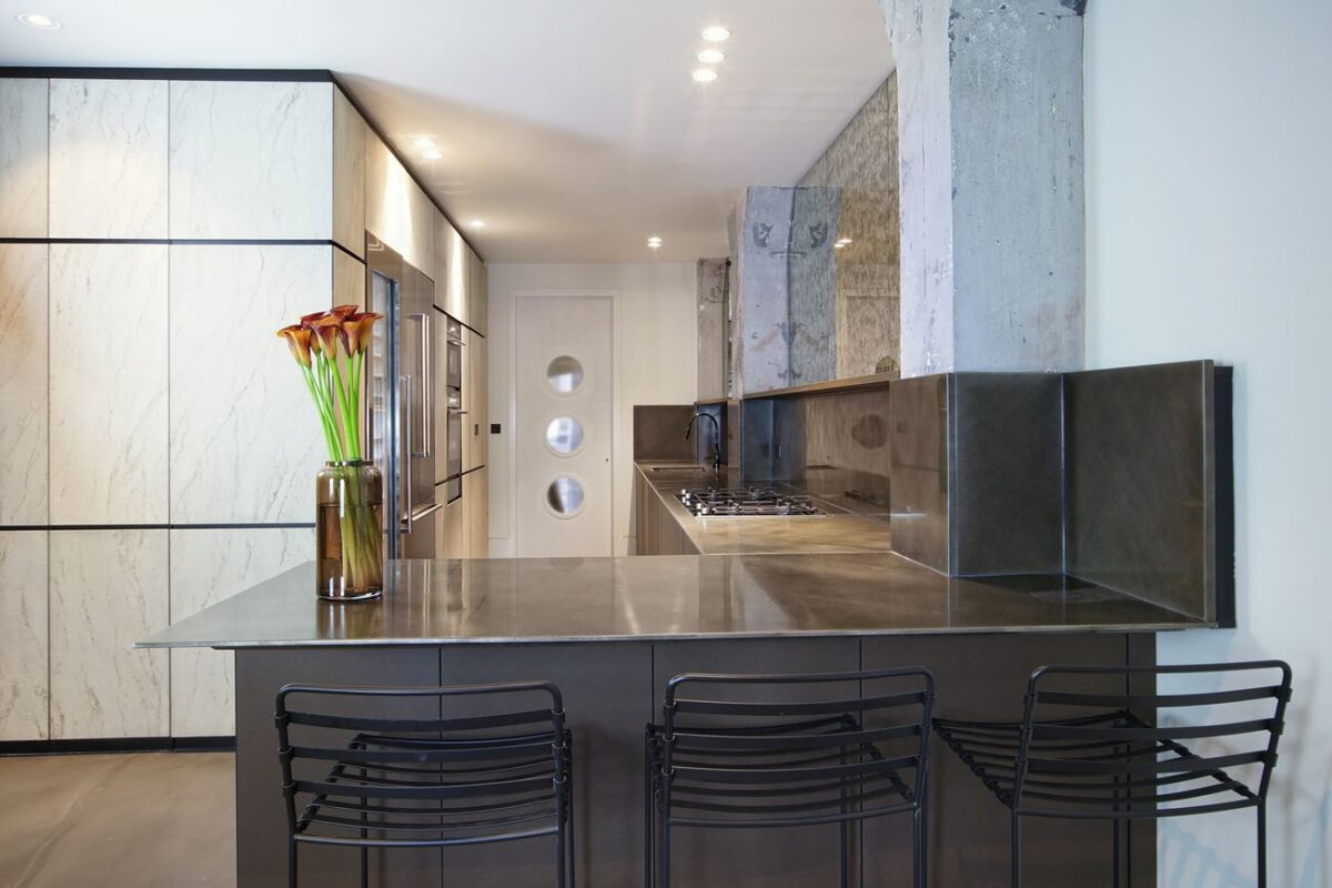
Italian kitchen manufacturer Minacciolo went above and beyond with this design using customized elements from their popular Natural Skin collection. Metal worktops provide a professional-grade working surface, and eco-friendly sandstone paper gives the cabinetry a subtle but highly luxurious finish.
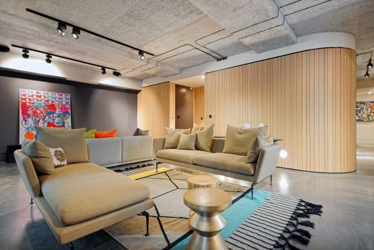
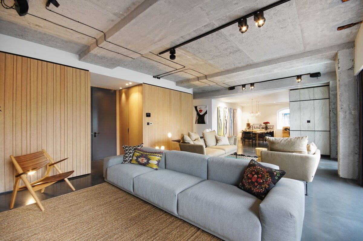
The previous open floor plan allowed abundant flexibility for creative structural expression, like the use of bespoke dividers to create new spaces within the home – each interior wall hides a wealth of discrete storage space.
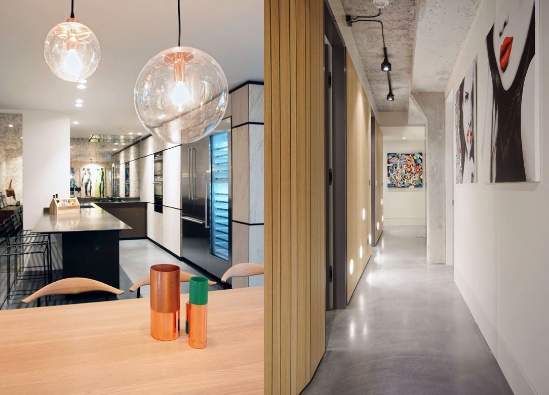
Copper vases from Habitat add yet another precious material into the mix – and a little pop of color as well. On the breakfast bar, a little wooden toolbox makes the perfect no-nonsense condiment holder, easy to hide away between uses.
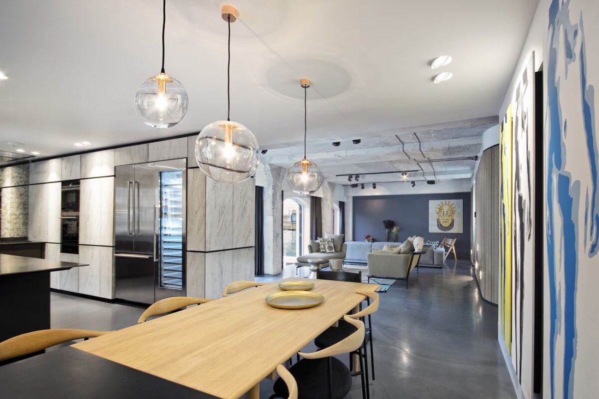
In the foreground, you can see the excellent detail of the blown glass Selene pendant lamps designed by Sandra Lindner. In the background, a marble-clad modular kitchen unit from Minacciolo extends the wall to divide between the living room and kitchen.
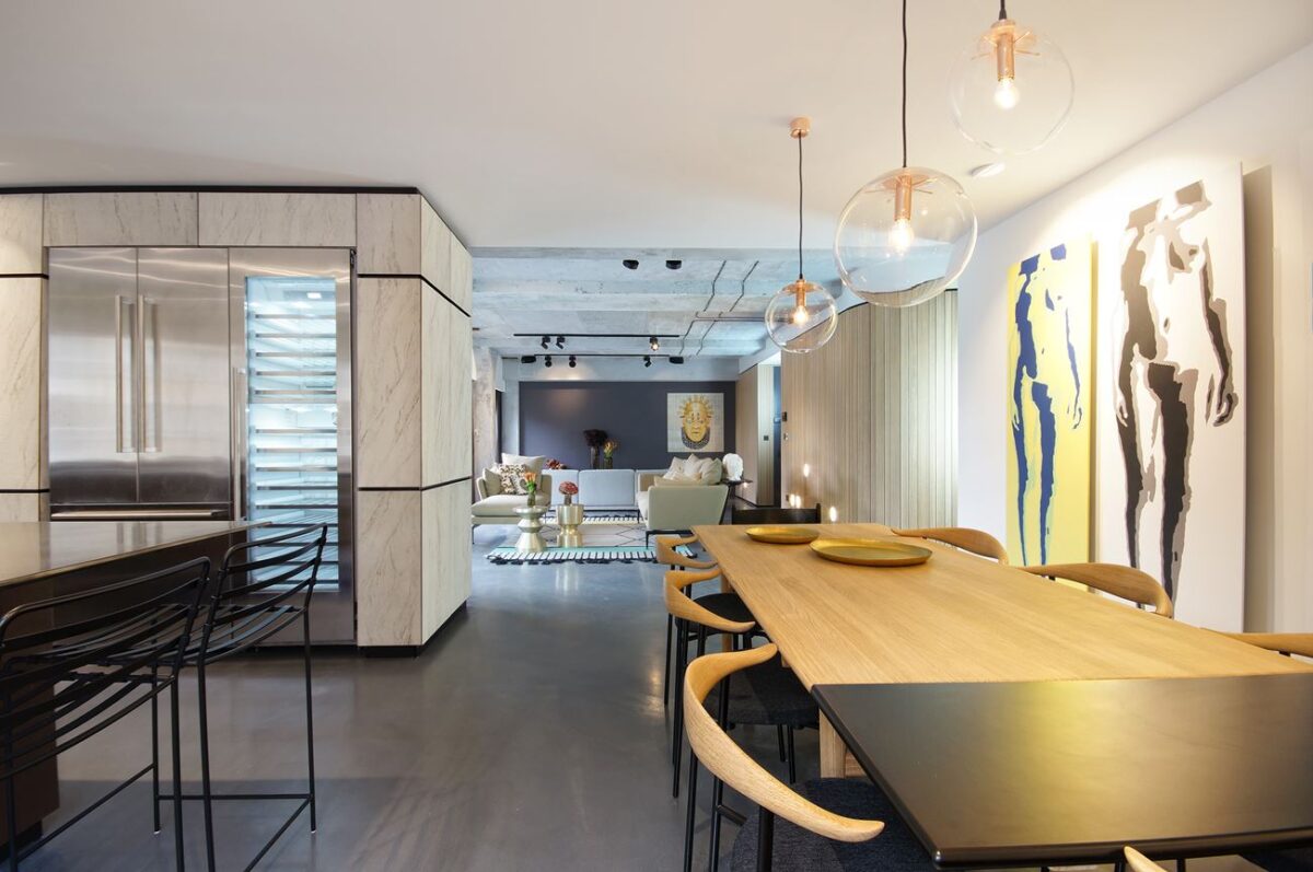
Designed in 1955, the sleek dining chairs in this photo only existed as a prototype until 2014, when Carl Hansen & Son put them into production to honor the 100th anniversary of Hans J. Wegner's birth – a very special chair for a very impressive home. The paintings are the work of Jason Pengelly.
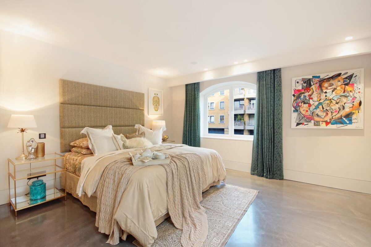
A brilliant mixture of fabrics and textures help this light bedroom feel extra warm and substantial, its personality brought to life with playful cerulean accents. Next to the bed sits a delicate gilded table holding fabulous decorative rarities, and a bright canvas by Spanish painter Daniel Dalopo ties the room together.
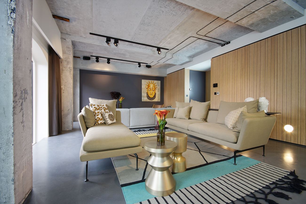
The midcentury-inspired sofa and chaise are from the Suita collection by industrial designer Antonio Citterio.
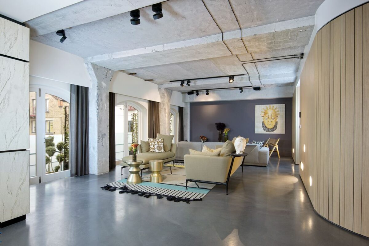
This time, the artwork is a mixed media piece called Litany for Those At Sea by Joyce Treasure. The image pays homage to the famous Benin Pendant Mask – an image of Queen Idia, a powerful African monarch of the 16th century.
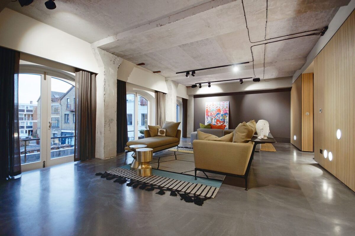
Most of the paintings and prints come from a partnership between CLPD and London artist collective Chrom-art. The artwork featured on the far gallery wall is the work of Ireneo Frizzarin, titled The Right Thing.

