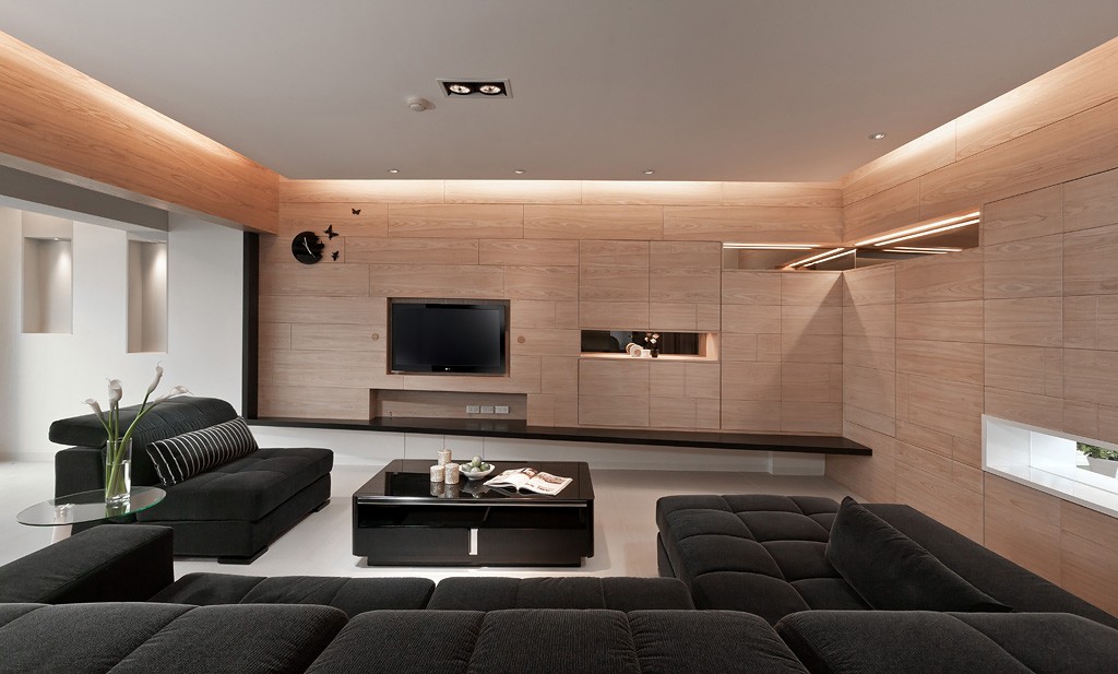
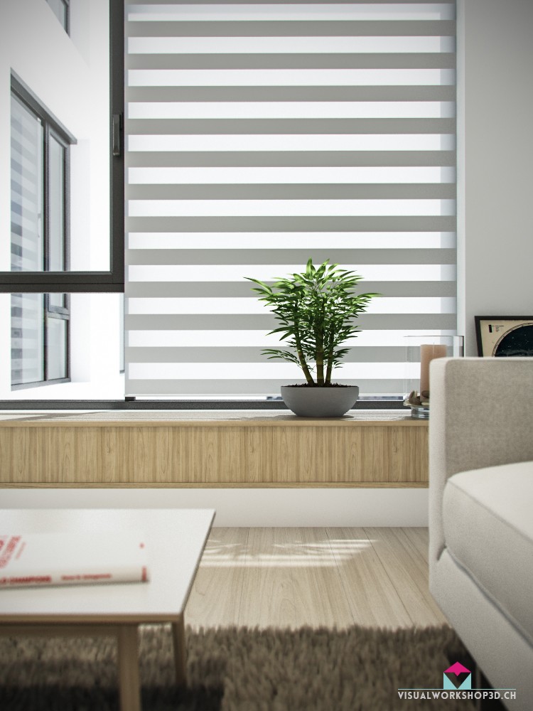
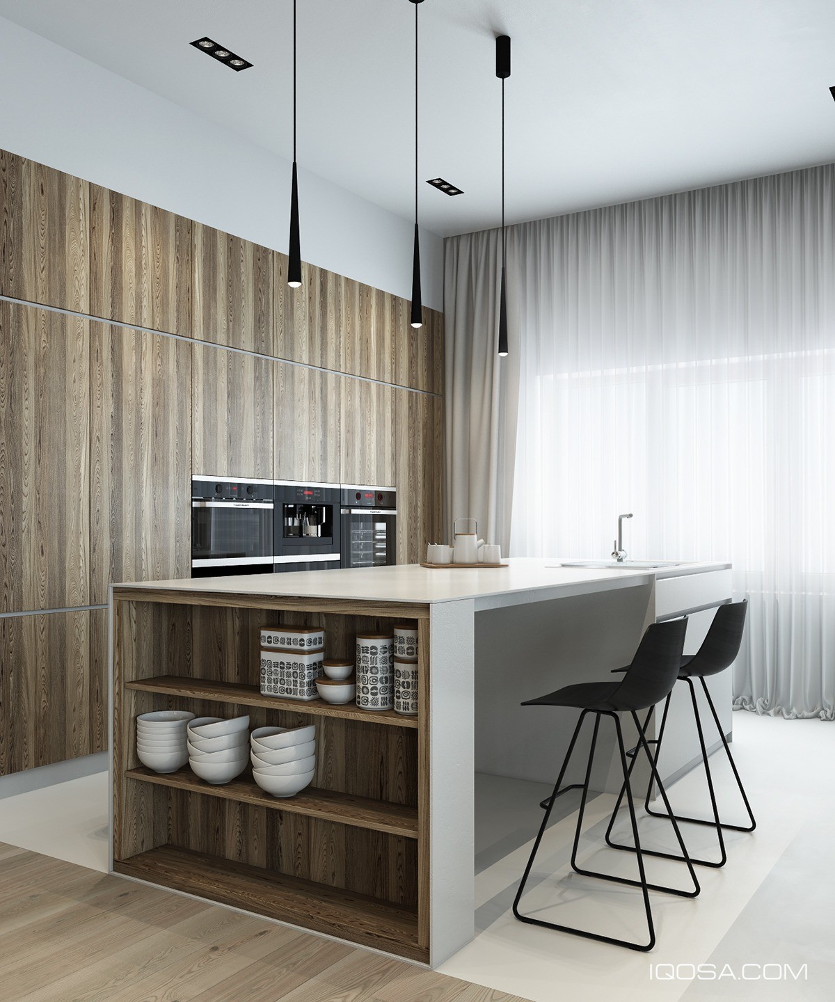
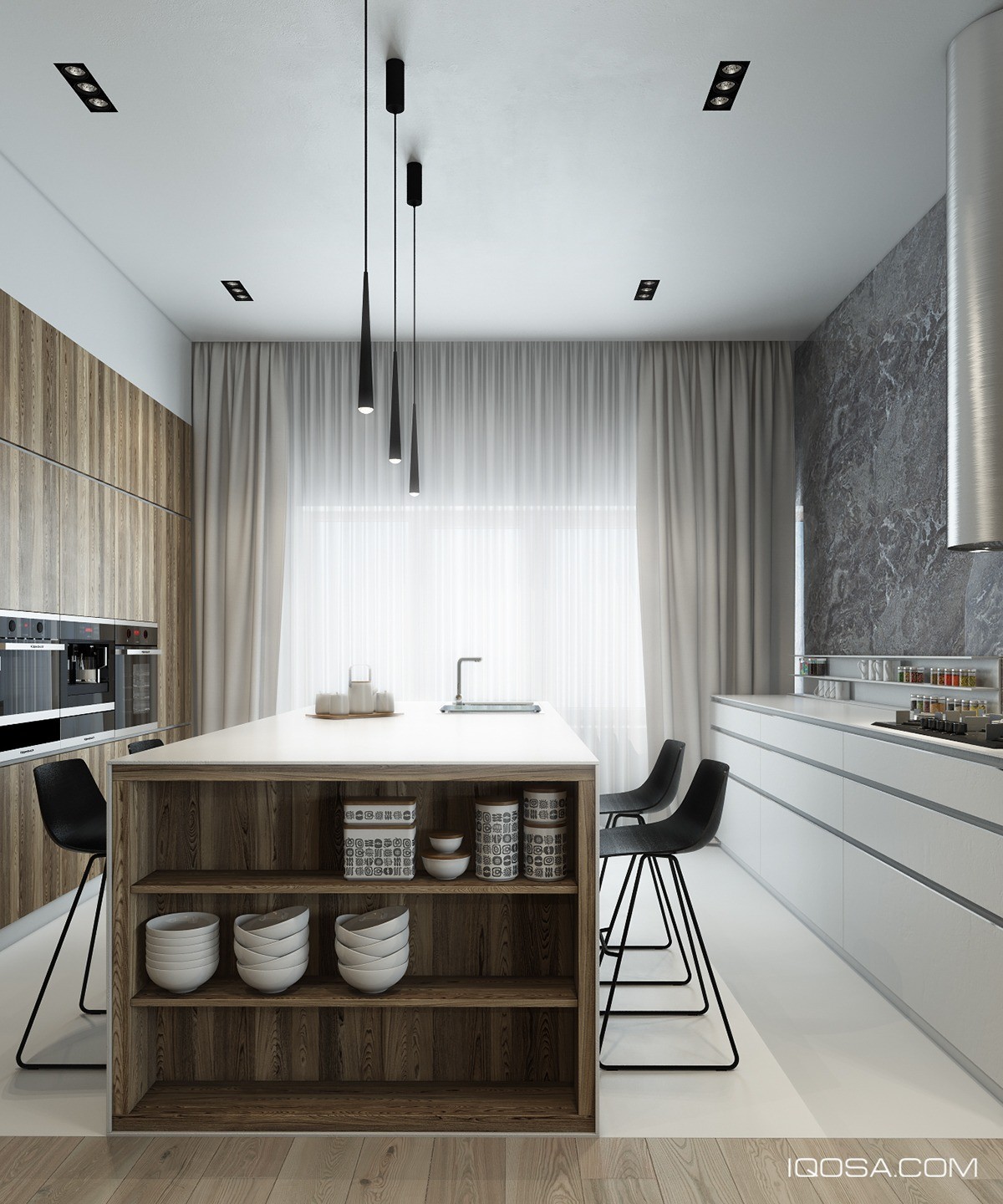
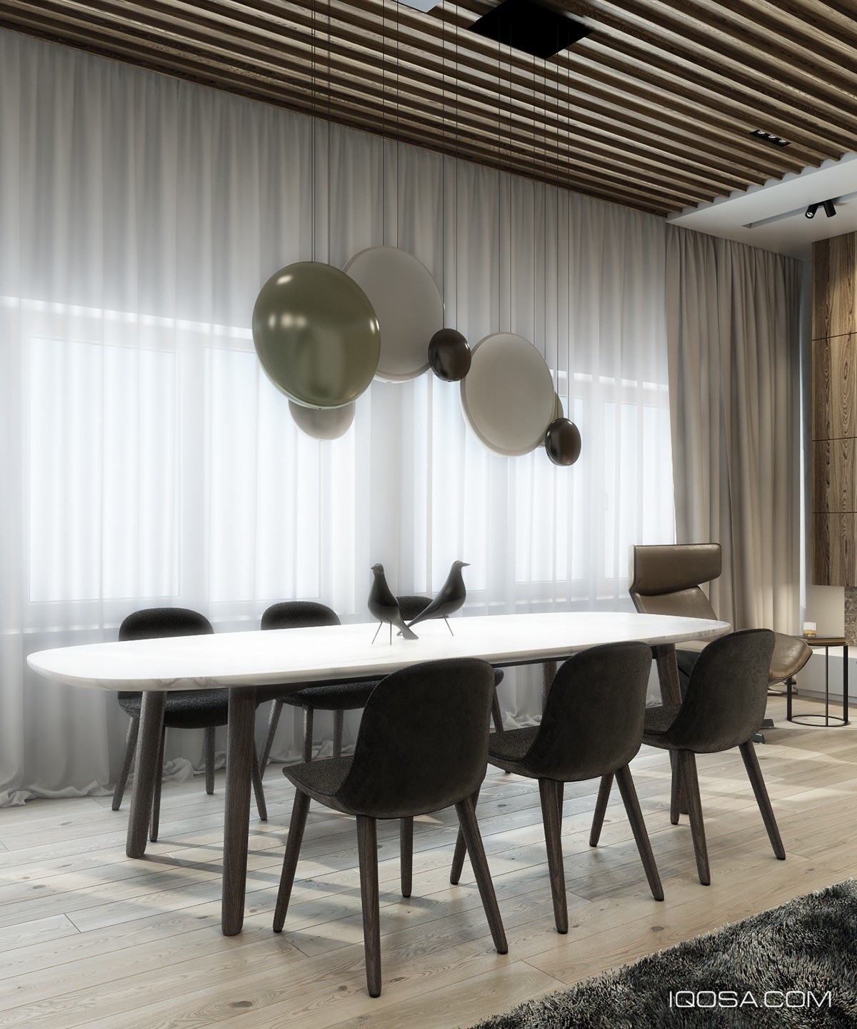
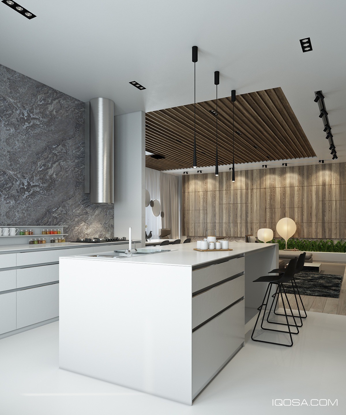
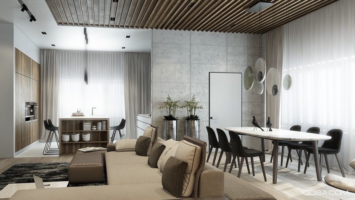
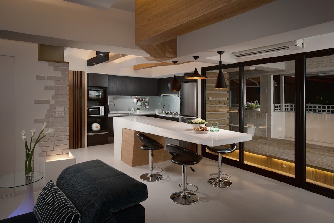
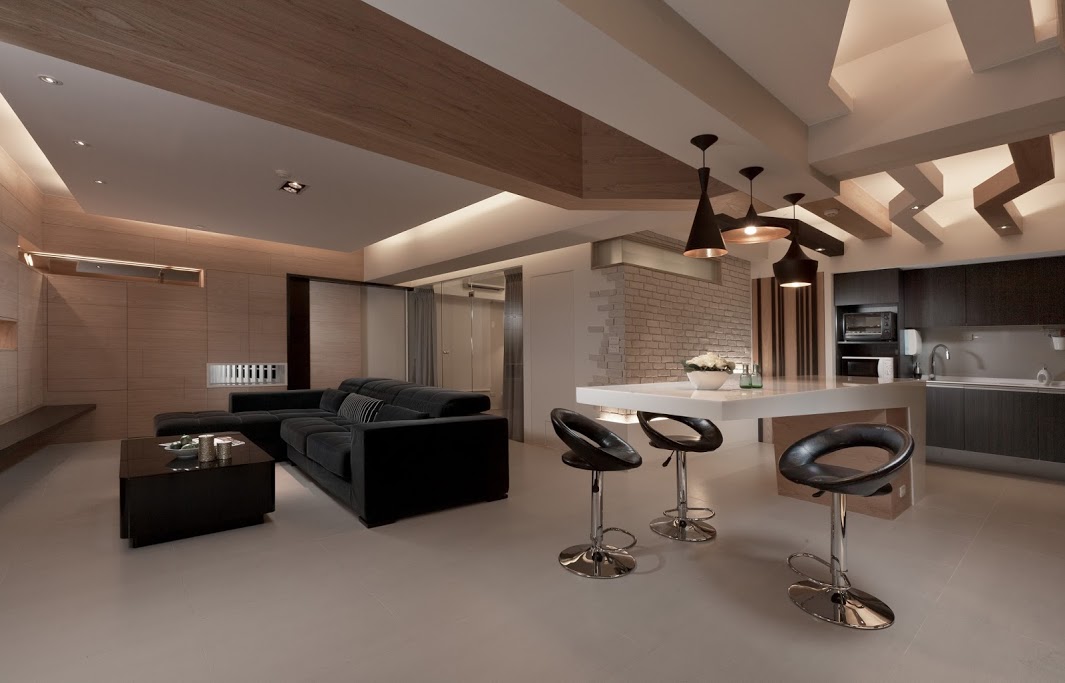
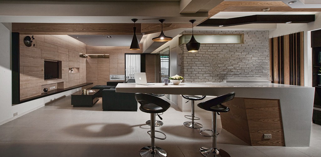
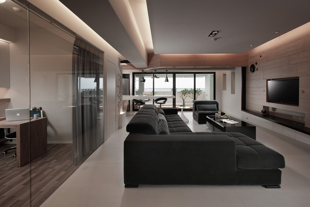
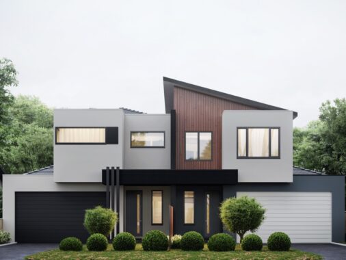
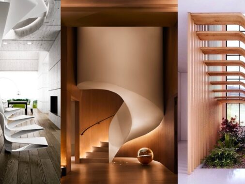
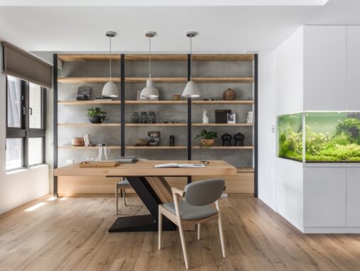
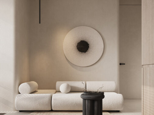
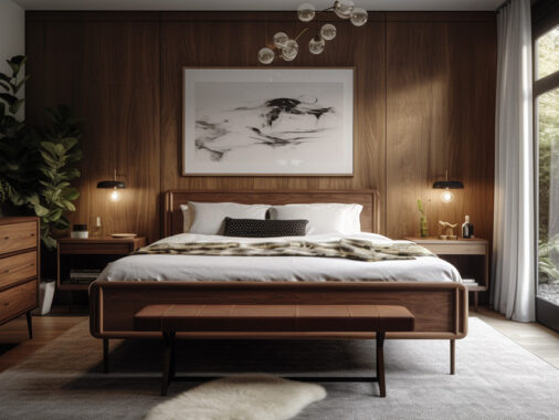
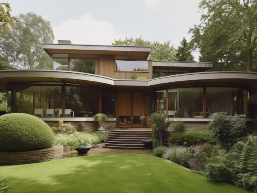
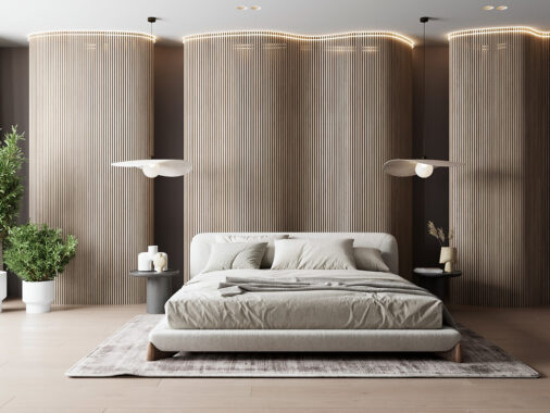
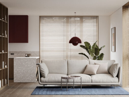
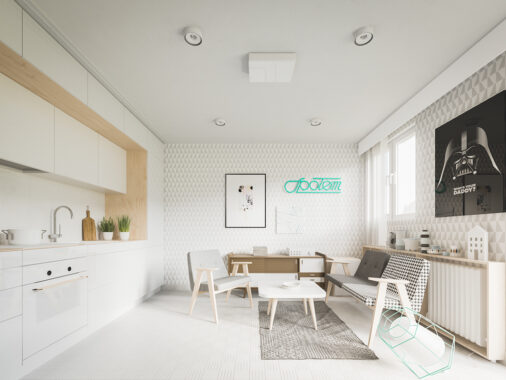
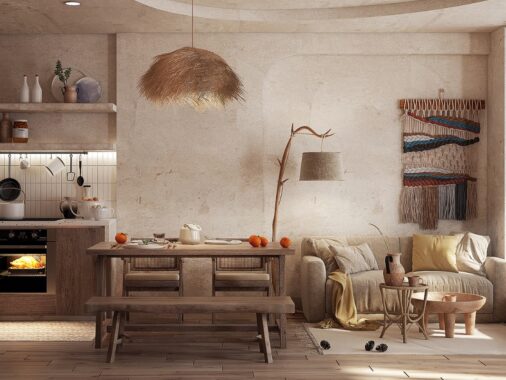
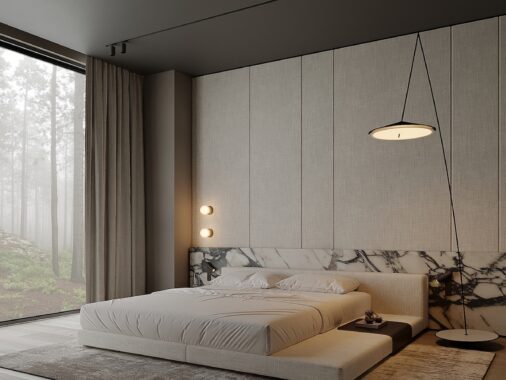
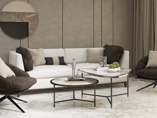
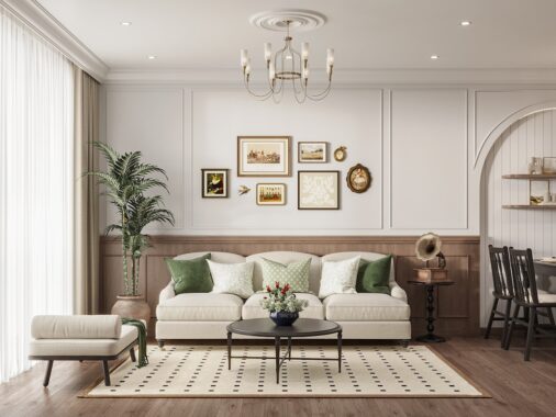
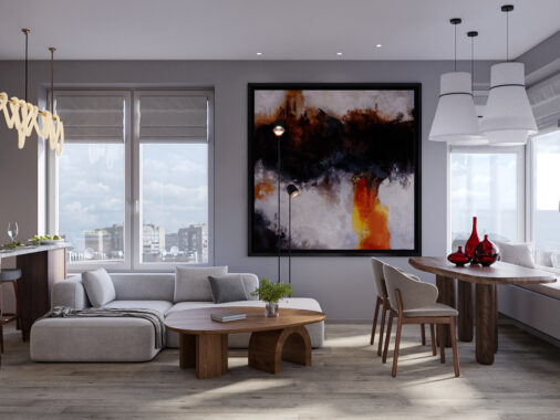
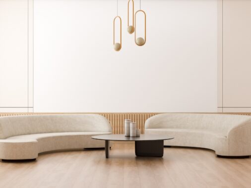
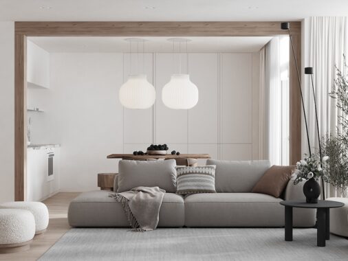
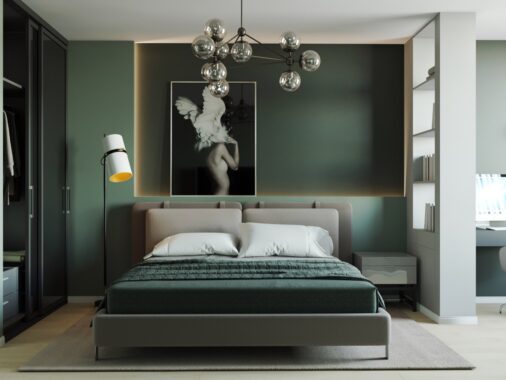
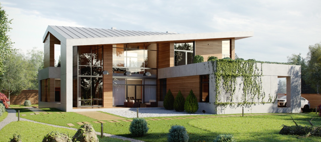
These four interiors rely on bold wood details to breathe life into otherwise minimalistic spaces – and the effect is tremendous! Here, wood isn't just another building material. Each space cuts down on unnecessary details, using simple decor and subdued color palettes to give the bold wood elements a chance to shine. The results are vibrant, warm, and full of life. Will such extensive use of wood interior decor ever go out of style? It's unlikely to happen as long as designers continue to find innovative ways to highlight its beauty as these designers have done.
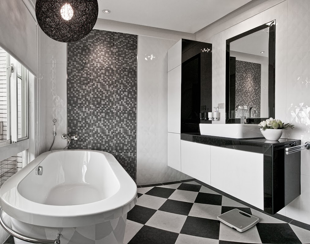
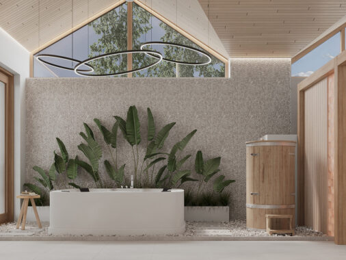
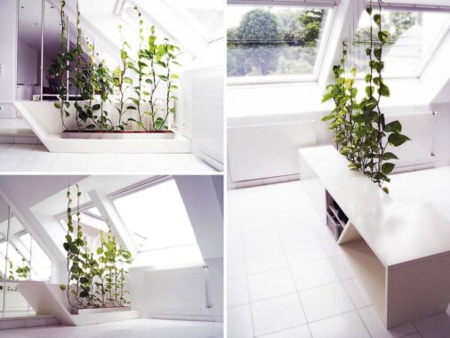
No wood here! The bathroom is purely monochromatic and offers a clean break from the rest of the home. There's nothing wrong with going for a completely different palette in a room as secluded as the bathroom, and in fact, such a bold change can help reset and reframe the mind – and that's what a nice long bath is all about, right?
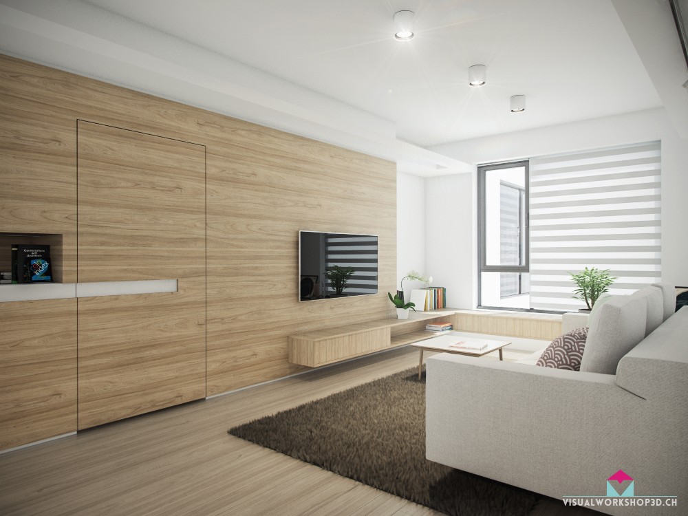
Each feature integrates into the next. A stripe of white continues from under the cubby and across the front of the door. Then, a long and low wall-mounted sideboard wraps around the corner and becomes a windowsill. At the far wall, the sideboard no longer floats as it does along the entertainment console. Here, it sits flush with the structure beneath, perhaps providing the support necessary to serve as secondary seating with a great view.
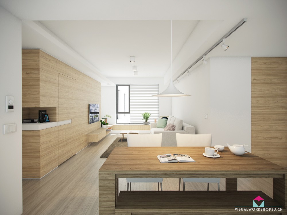
Super simple forms and a bright white palette give this interior a sleek and minimalistic appeal, but the generously applied wood paneling makes it look warm and natural enough to feel like home. Continuous horizontal woodgrain leads the eye around each room until it rests on a neat focal point, like the striped solar shade in the living room.
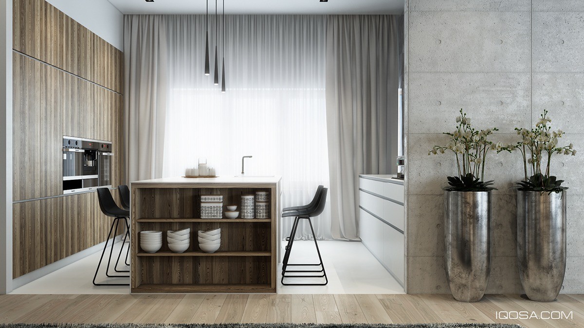
Built-in shelves add extra storage space at the end of the kitchen island. It would make a great place to store cookbooks, but the dish display definitely looks more stylish and inviting. Even ordinary dishes can look fabulous when with such a thoughtful and precise arrangement.
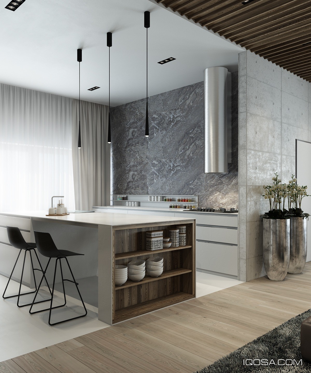
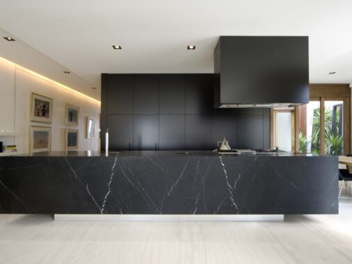
Sharp contrast defines the kitchen. Color, form, and materials change abruptly for an incredibly striking effect. Wood transitions to glossy white, concrete turns to marble, all wrapped up in a clean modernist package.
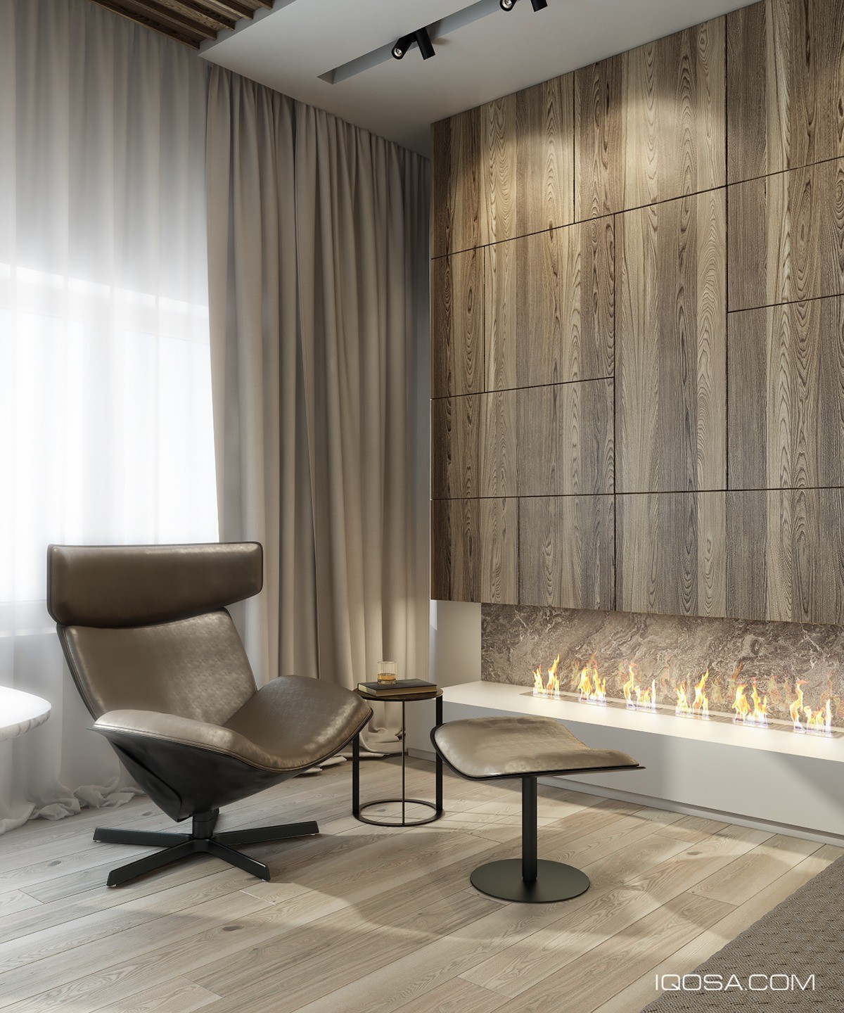
Behind the sofa and located just to the right of the dining table, a luxurious wingback chair takes advantage of a subtle fireplace – historically, the wings were intended to shield the face from the heat of the fireplace or to trap it in place for all-encompassing warmth.
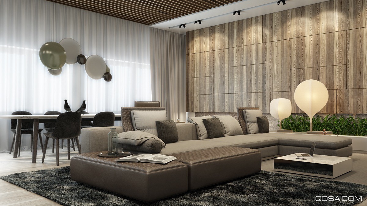
Stylish interlocking wood panels echo the arrangement of the sofa. Subtle details like these are one of the most enjoyable things about this design. And the black birds on the dining table? Totally loveable, and a great centerpiece to balance out all the purely geometric forms used throughout the space.
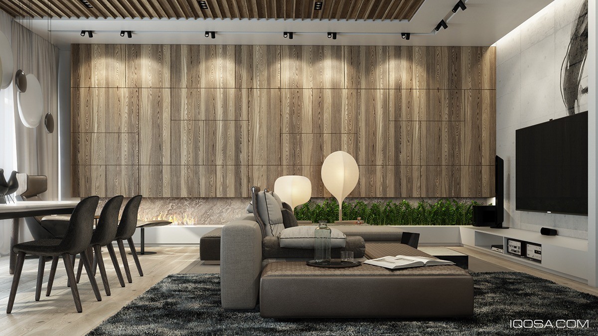
A slatted wood ceiling panel unifies the dining and living areas. In this visualization, it's easier to see that the floor, ceiling, and cabinetry all feature different styles of wood - and how well they all work together even in a small and open space.
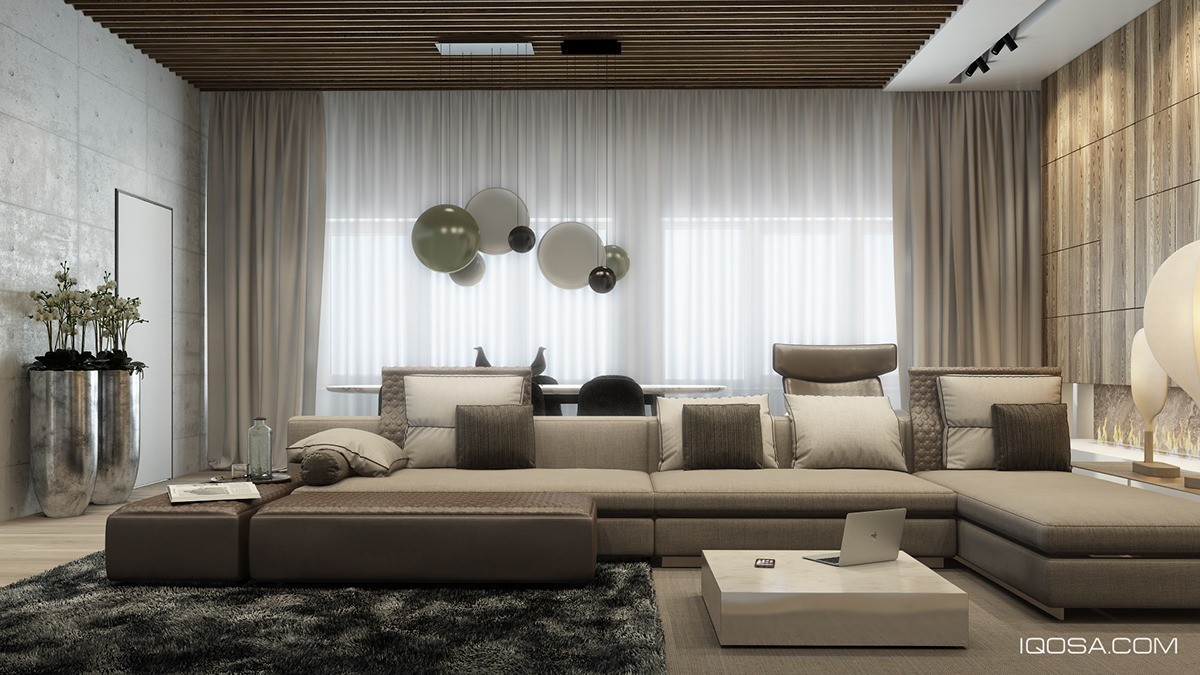
Curves and sharp corners are distributed thoughtfully to create an impressively cohesive look overall. Rich exotic woods heighten the sense of luxury.
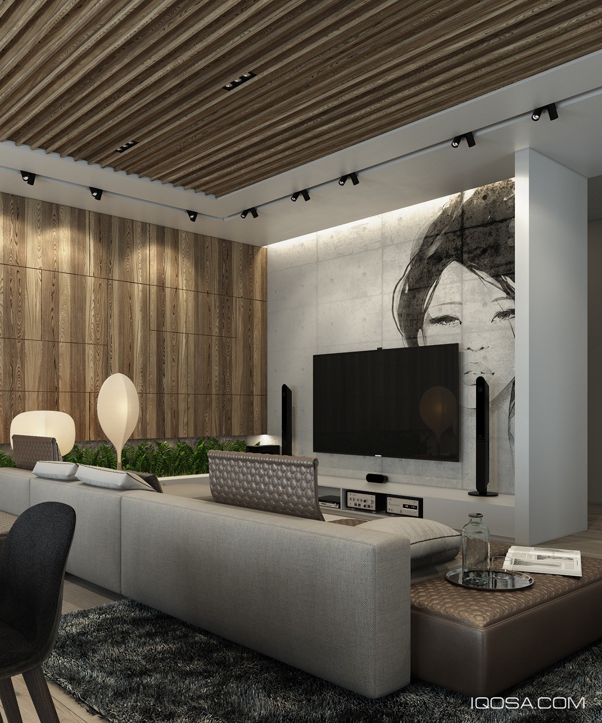
A striking portrait grabs the eye for an energizing first impression. Designed by IQOSA, based in Ukraine, this home reveals its soothing nature as the eye starts to soak up all those gorgeous muted neutrals and warm mocha tones.
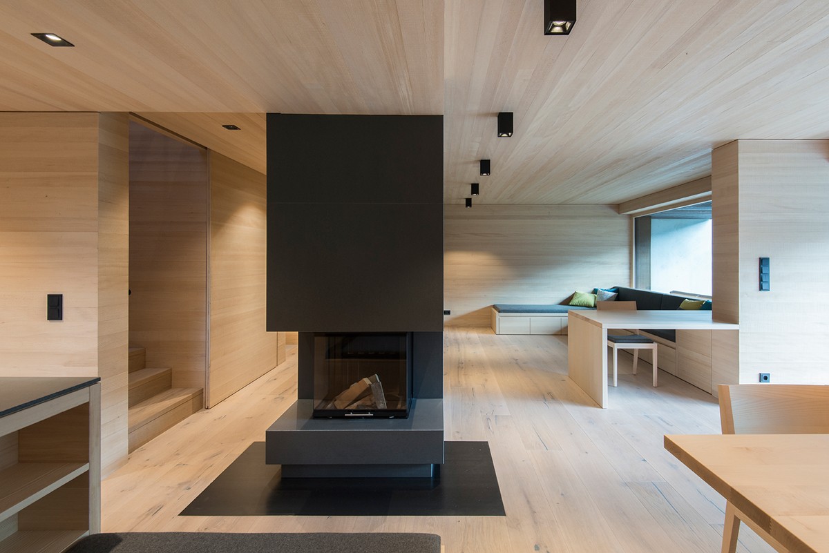
Designed by LP Architektur, this single-family house makes good use of subtle wood paneling on the walls and ceilings – the wood floor blends into the design very smoothly, only slightly differentiated with characteristic knots and lines.
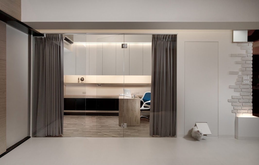
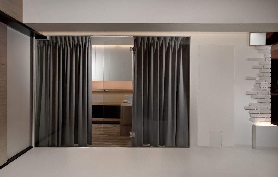
The cat door is seriously adorable, a great choice for such a minimalistic door. To the right, scattered brick cladding is quite different from the rest of the home – a surprising and effective contrast to the woodwork and glossy white treatments.
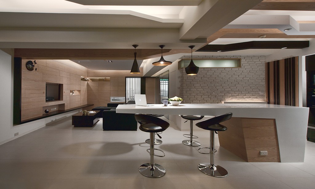
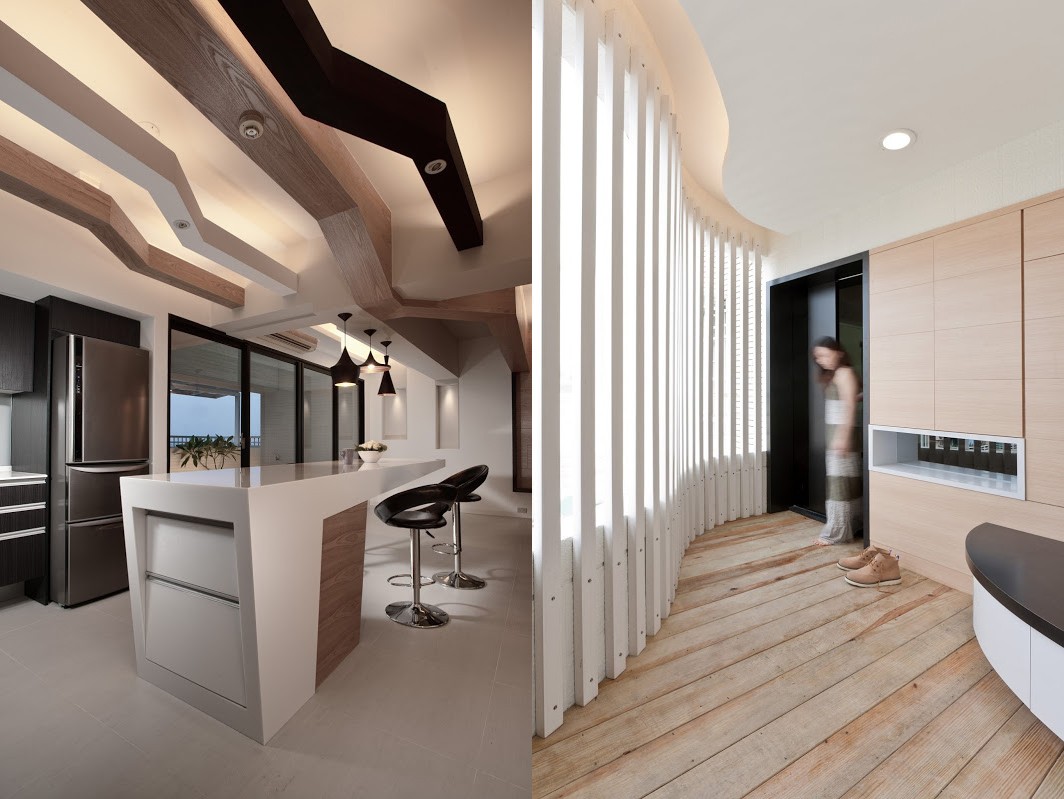
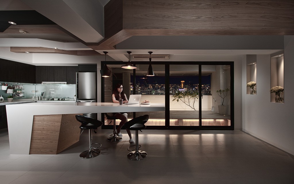
The dining room looks fabulous with wood accents in all the right places. And check out that amazing ceiling! Taken together, the design is futuristic, fun, and undeniably artistic. The iconic pendant lamps from Tom Dixon were the perfect choice for such a distinctive and geometric motif, their shapely profiles underscored by the choice of swivel bar stools.
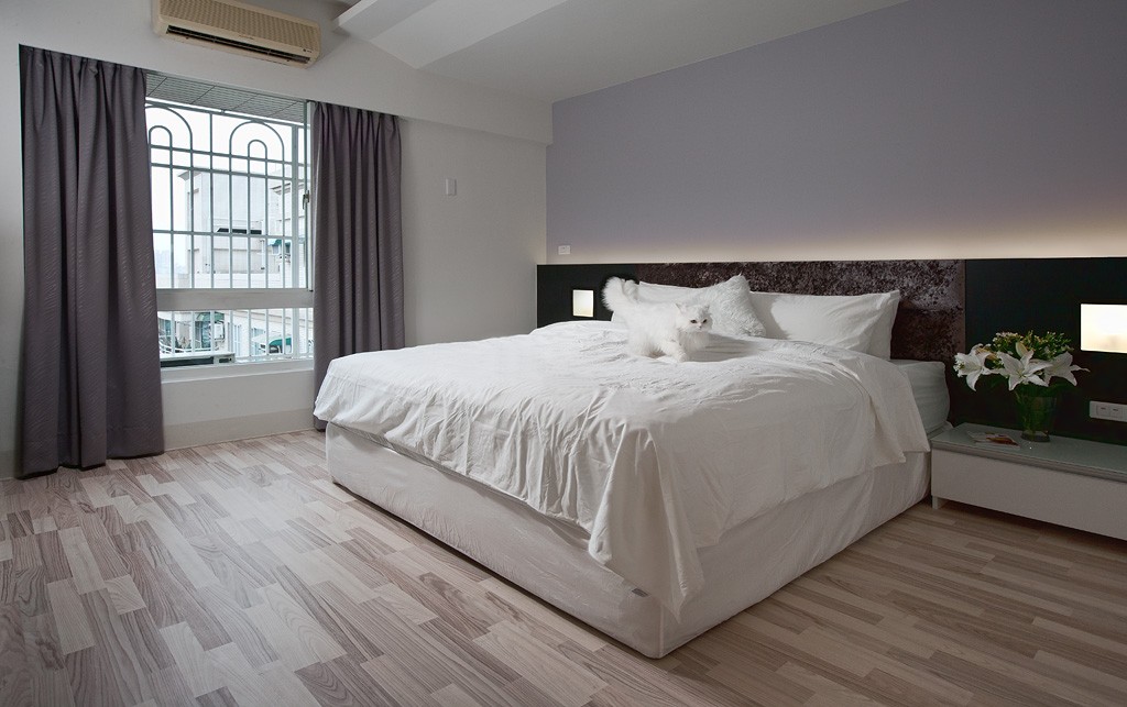
A soft touch of lavender makes the bedroom look soft and inviting. The elongated headboard – complete with soothing cove lights – ties back into the overall home design.
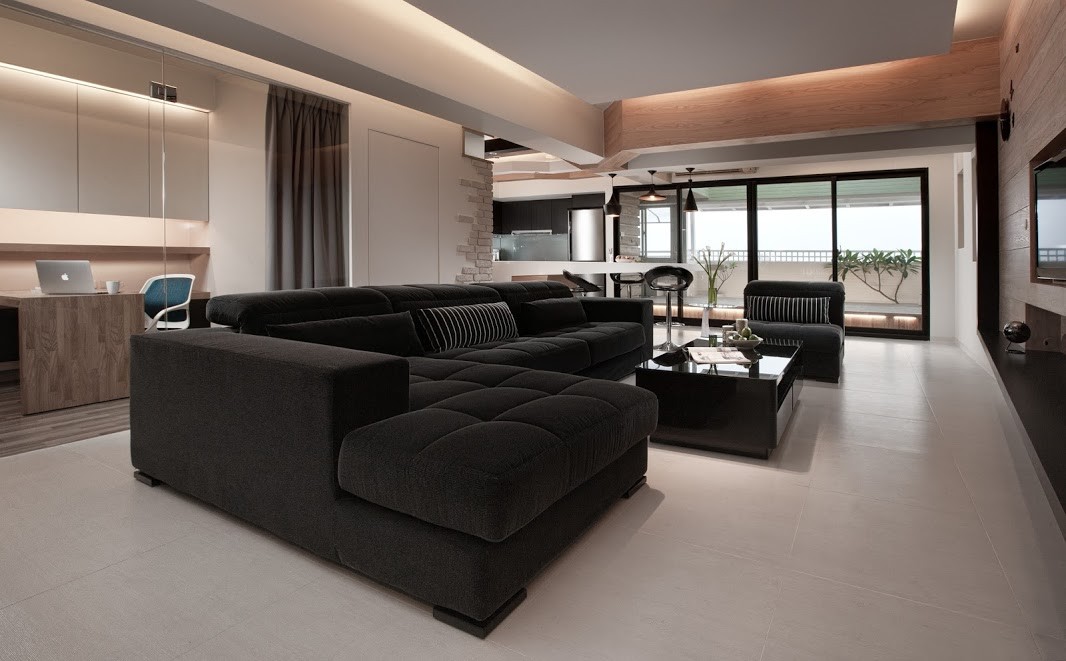
Behind the living room, a little glass-walled office allows a working parent to watch the children (or even the television) – they can simply close the curtain when it's time to buckle down and focus.

The more you explore this home, the more detail it reveals. It starts out with a relatively simple living room brimming with warmth. Horizontal wood panels feature a mix of shorter and longer segments, making it easier for any integrated storage spaces to blend seamlessly and disappear within the woodwork.
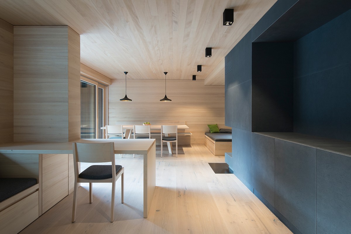
Dual purpose: the fireplace continues along the length of the room to serve as a divider for the hallway and an entertainment console for the living area. While many designers would have chosen a glossy finish for the sake of modernism, the matte treatment seems to establish a softer touch more appropriate for the organic wood theme.
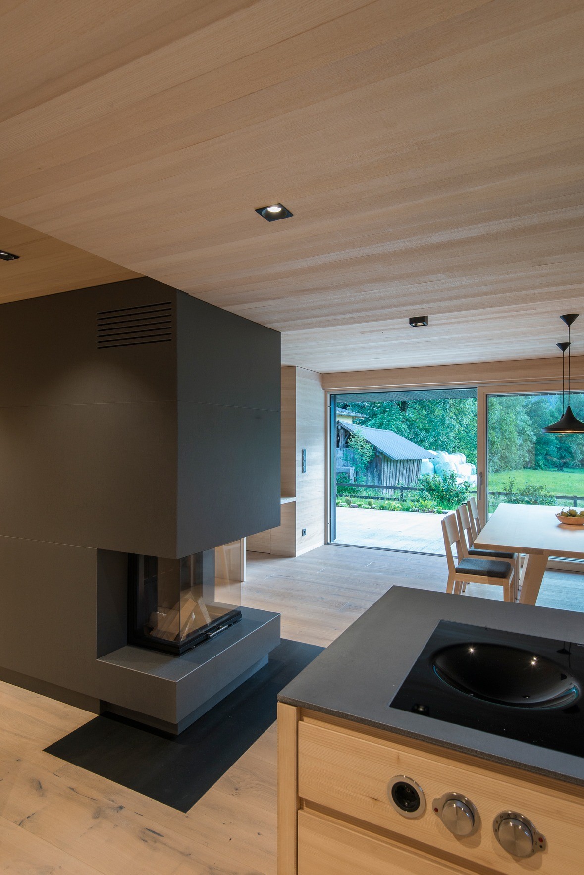
The charcoal-colored modern fireplace and countertops are made of a modern composite material called fibreC anthracite, developed by the Austrian concrete company Rieder Group. It's a blend of glass fiber and concrete – its strength supports a great number of creative applications, and many of the elaborate exterior facades found in contemporary architecture are made of a similar material.
