These homes make the most of their compact layouts – each one is smaller than 50 square meters in size, yet packs an abundance of unique personality. Whether you're dreaming of a small home to call your own, or just want to make the most of what you already have, these spaces demonstrate how creative constraints can lead to inspiring breakthroughs. In fact, many adventurous souls who could otherwise afford spacious abodes are opting for a more streamlined lifestyle by choosing cozy apartments like these. It goes beyond practicality – the tiny home movement is part minimalism, part environmentalism, and part genuine curiosity. Use these ideas next time you need to spruce up a small space.
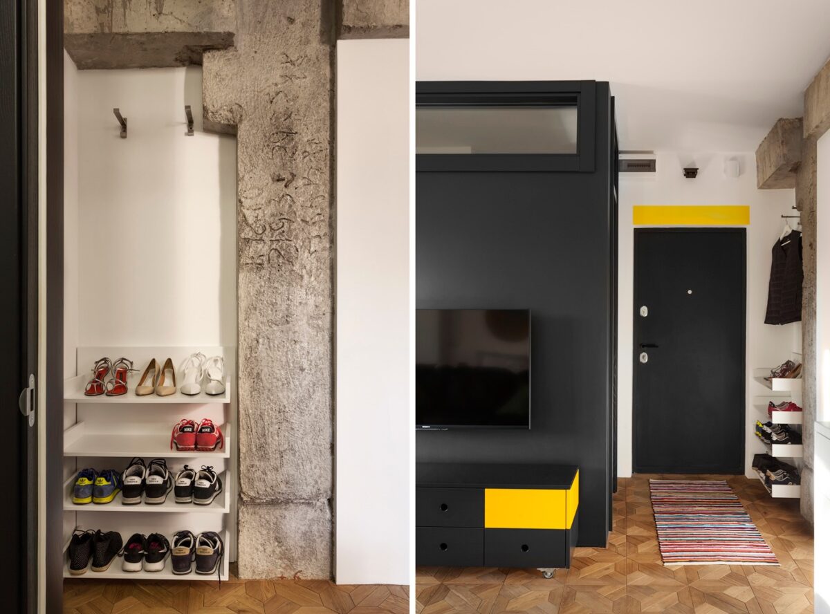
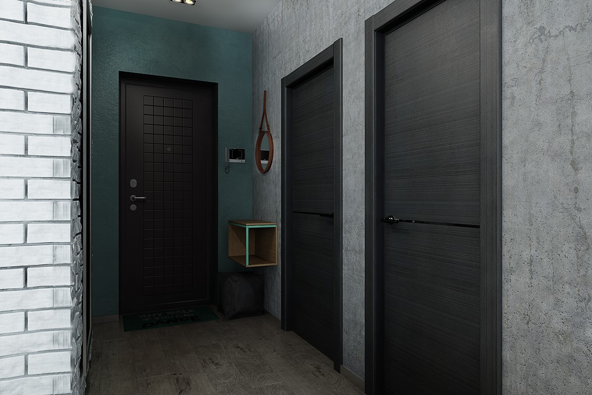
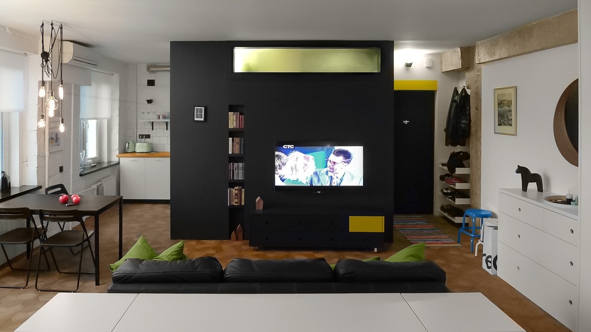
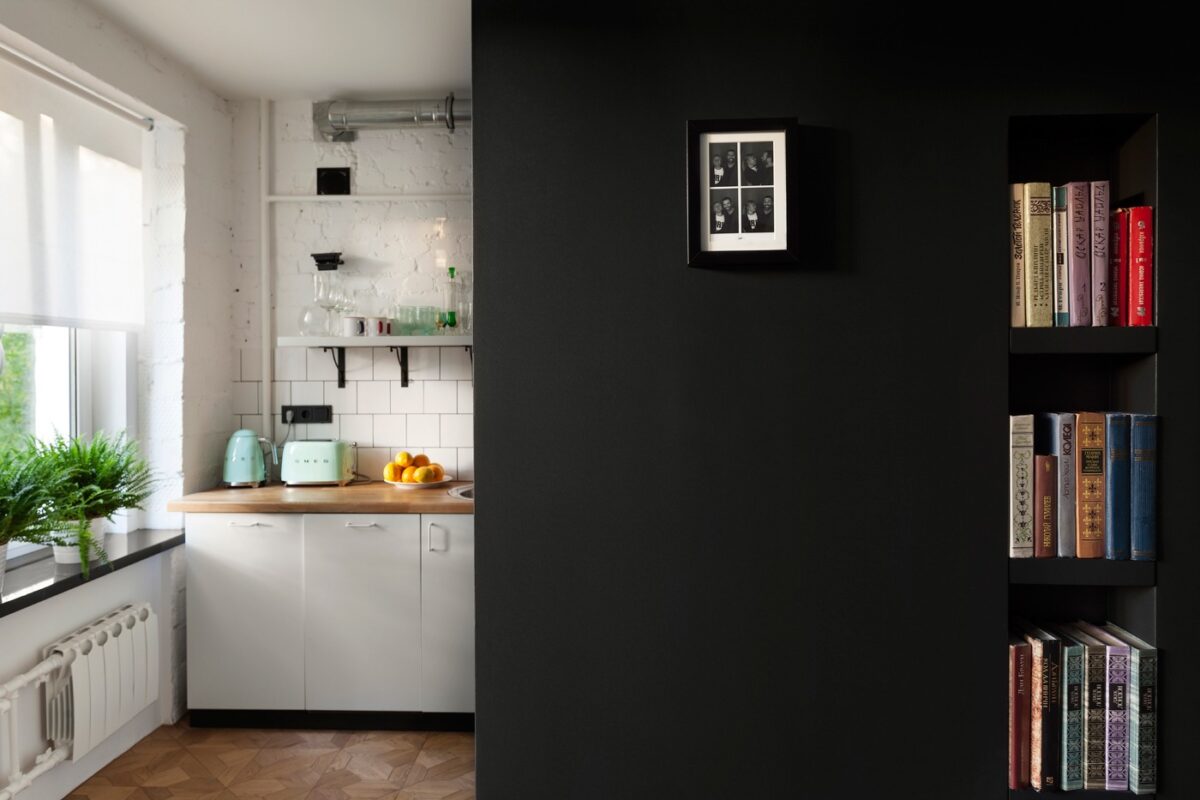
Designed by Ukrainian architect Nastya Antonyuk, this bold apartment makes a big impression in just 43 square meters. It centers around a matte black structure that houses the entertainment system on the outside, and cleverly hides a bathroom on the inside – a window at the top ensures that natural light can penetrate even into the private heart of the home.
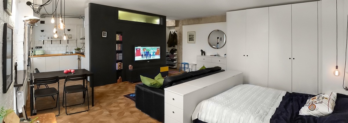
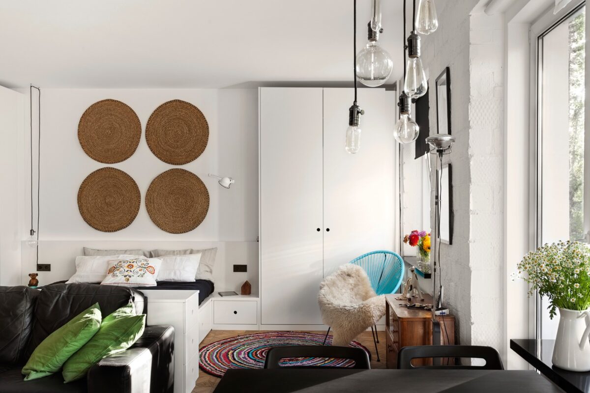
Eclectic decor reflects the personality of the client. Antique furniture, diverse textiles, and industrial lighting come together for a fascinating and fun aesthetic. It's hard to go wrong with a nice mid-century modern focal point to center the space, like the classic Acapulco chair in striking cyan blue.
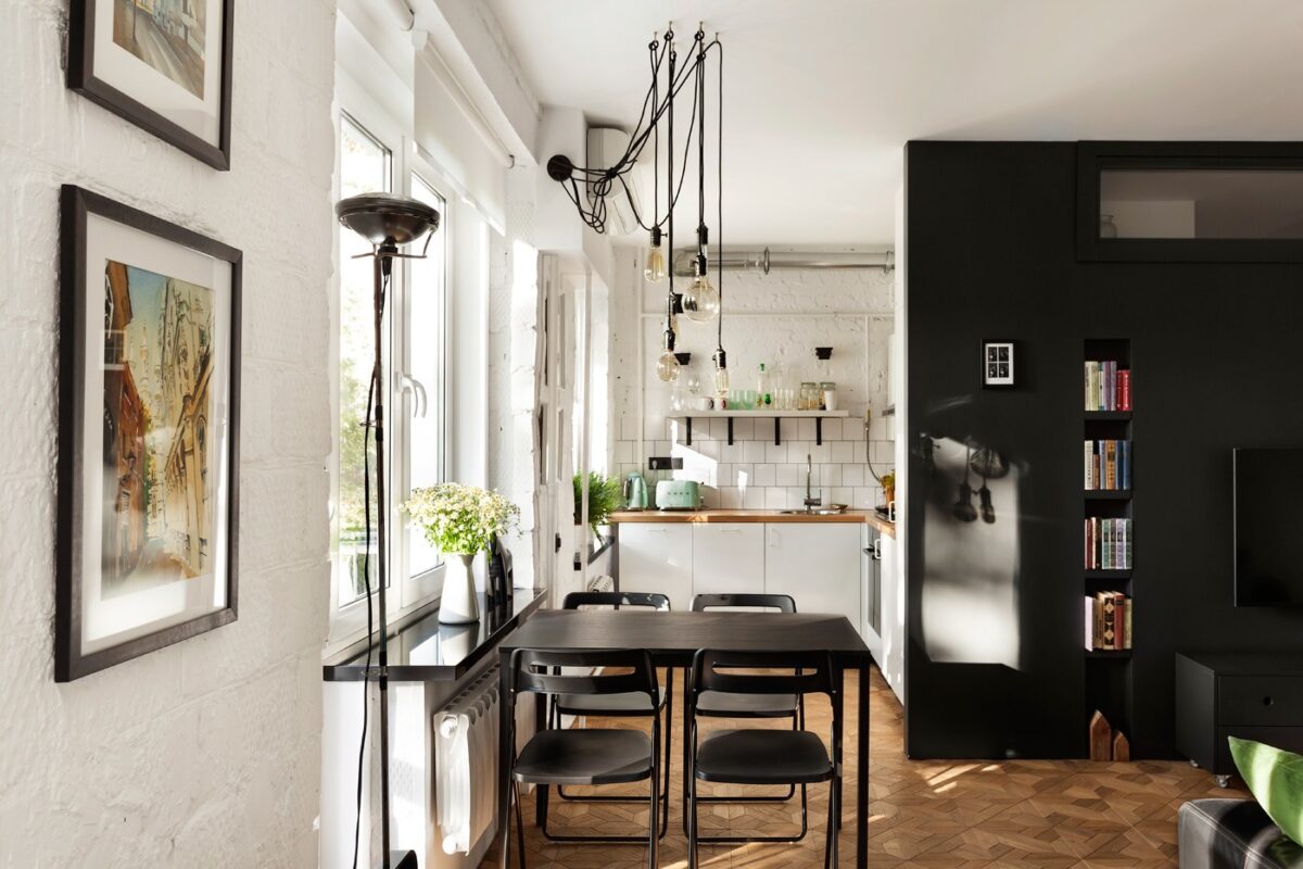
A quick peek at the kitchen reveals gorgeous vintage-inspired appliances from Smeg. The industrial lighting also enjoys an antique revival - highly visible cords draw immediate attention, while the Edison bulbs provide a soft glow that won't overwhelm the senses.
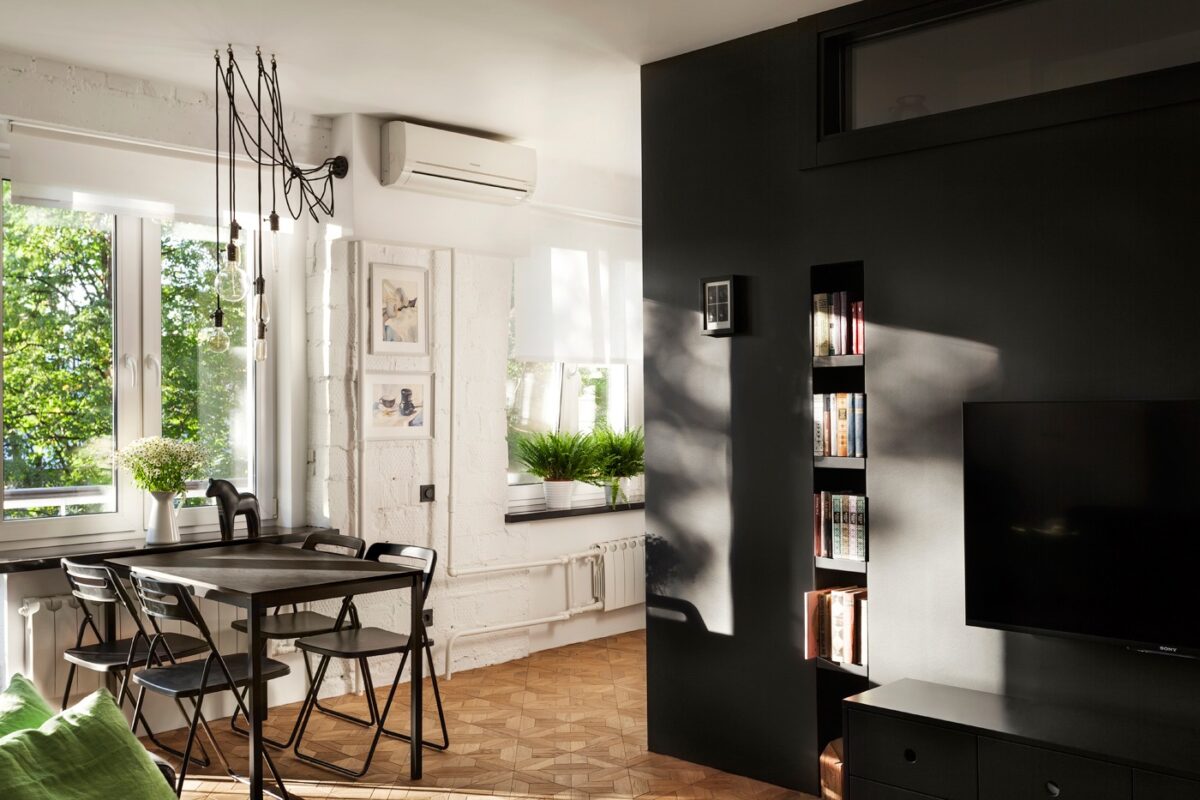
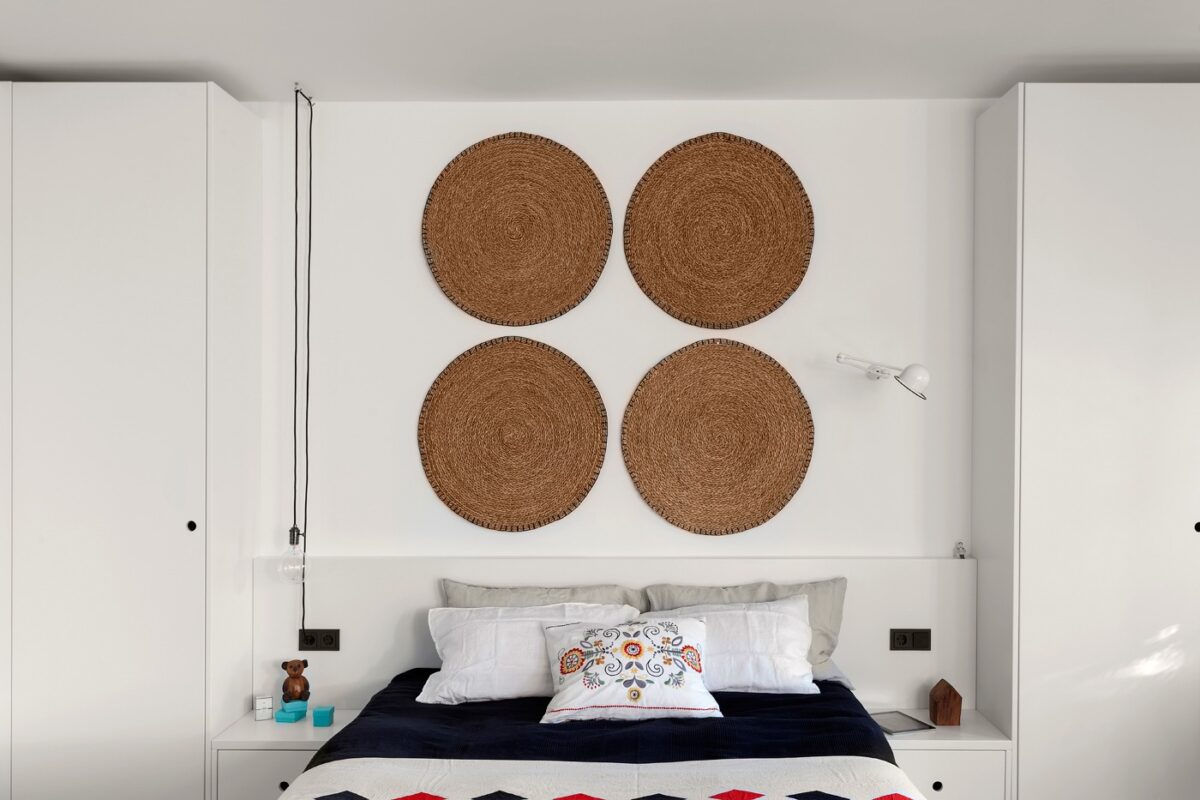
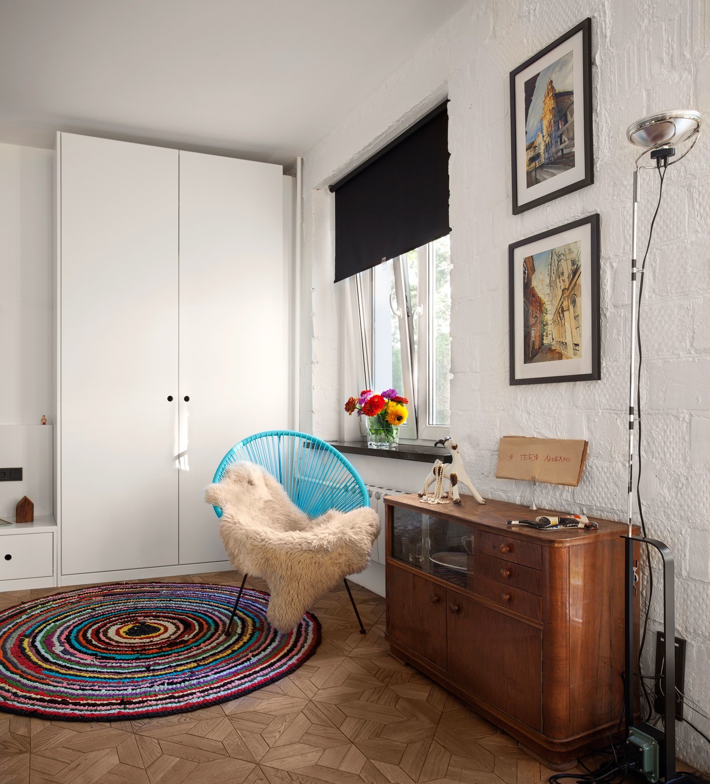
Lovingly curated details make this small Moscow apartment feel like home.
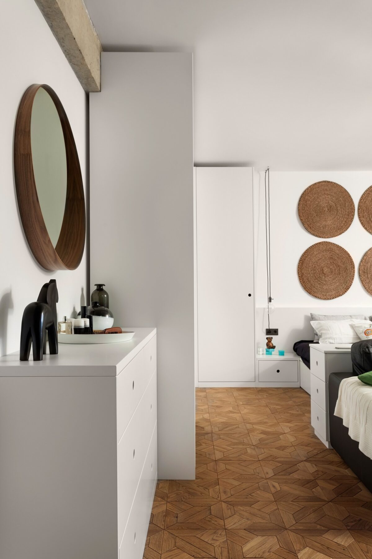
Most of the necessary storage space is housed in minimalistic white drawers treated with a silky white finish - it looks clean and sharp, and most importantly, doesn't take any emphasis away from the more important decorative details throughout the apartment. Using round decor provides an interesting contrast to the cubic forms of the furniture.
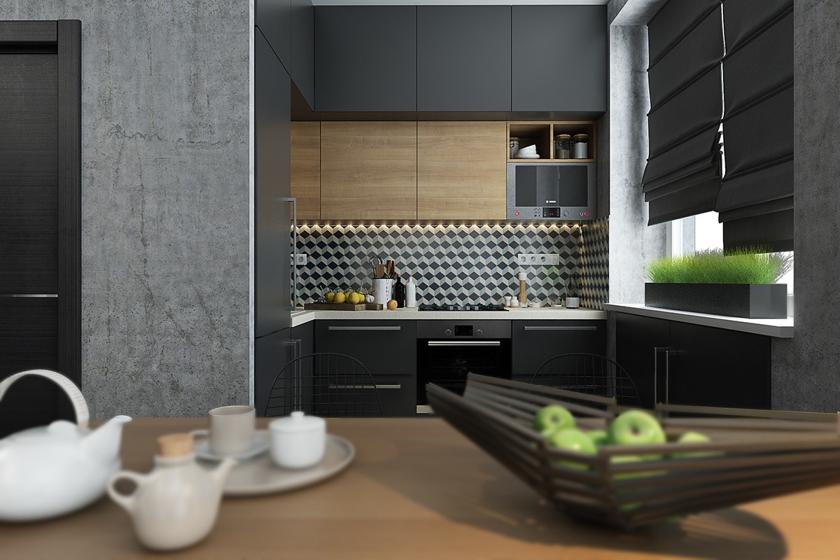
Where the living and sleeping areas feature brighter colors, the dining and kitchen take on a darker palette. Wood cabinets complement the natural furniture materials used throughout the home.
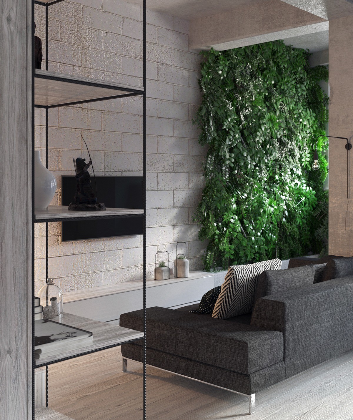
Working within a small footprint of just 43 square meters, designer Michael Temnikov took a minimalistic approach by embracing simple geometric forms and rich textures. Concrete, wire, and wood – the designer did a fantastic job applying these inexpensive materials in a way that looks fresh and sophisticated.
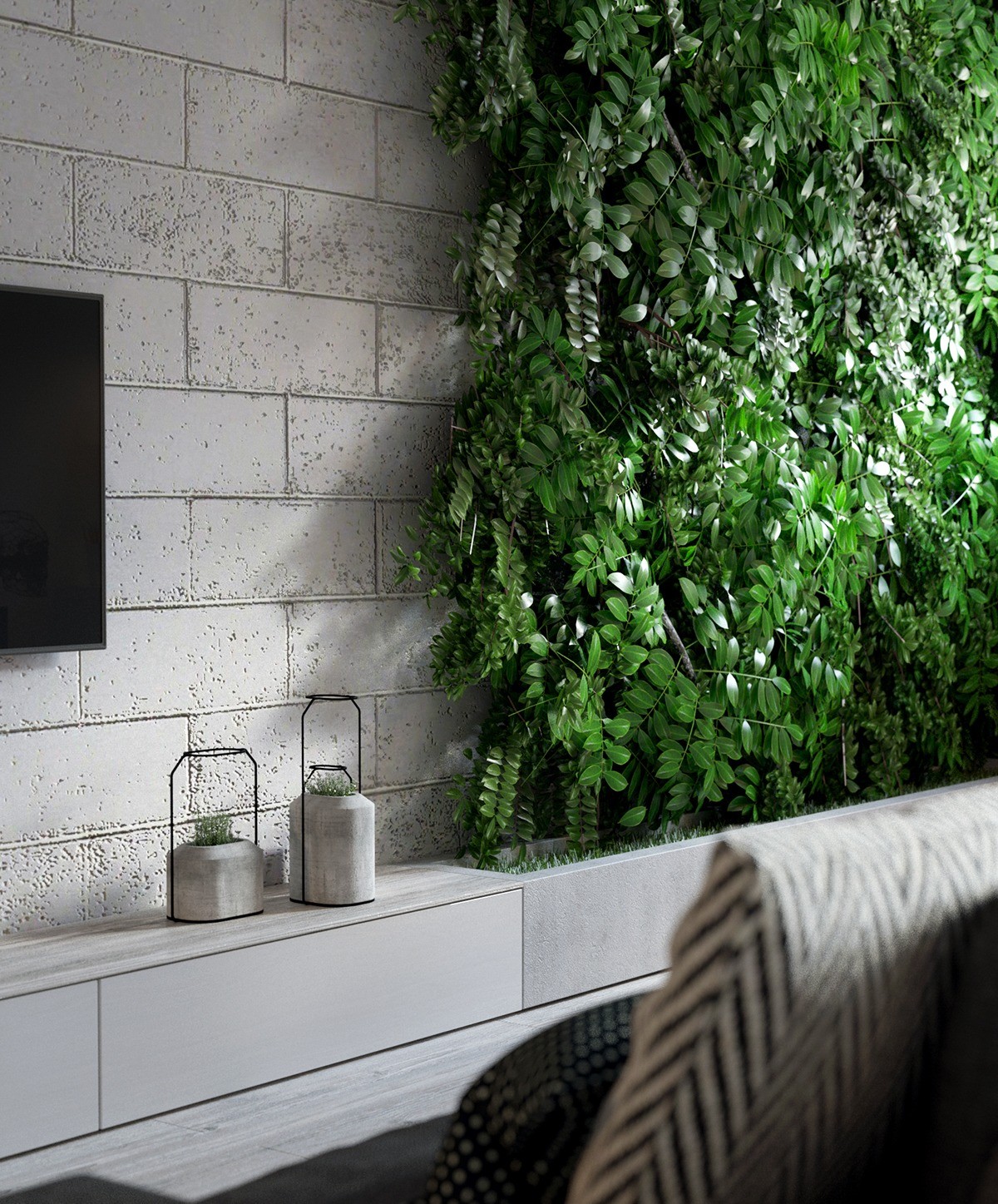
Luscious vines serve as a living accent wall. This lively display helps balance the emphasis on industrial materials – you can never have too much greenery in a refined or minimalistic space.
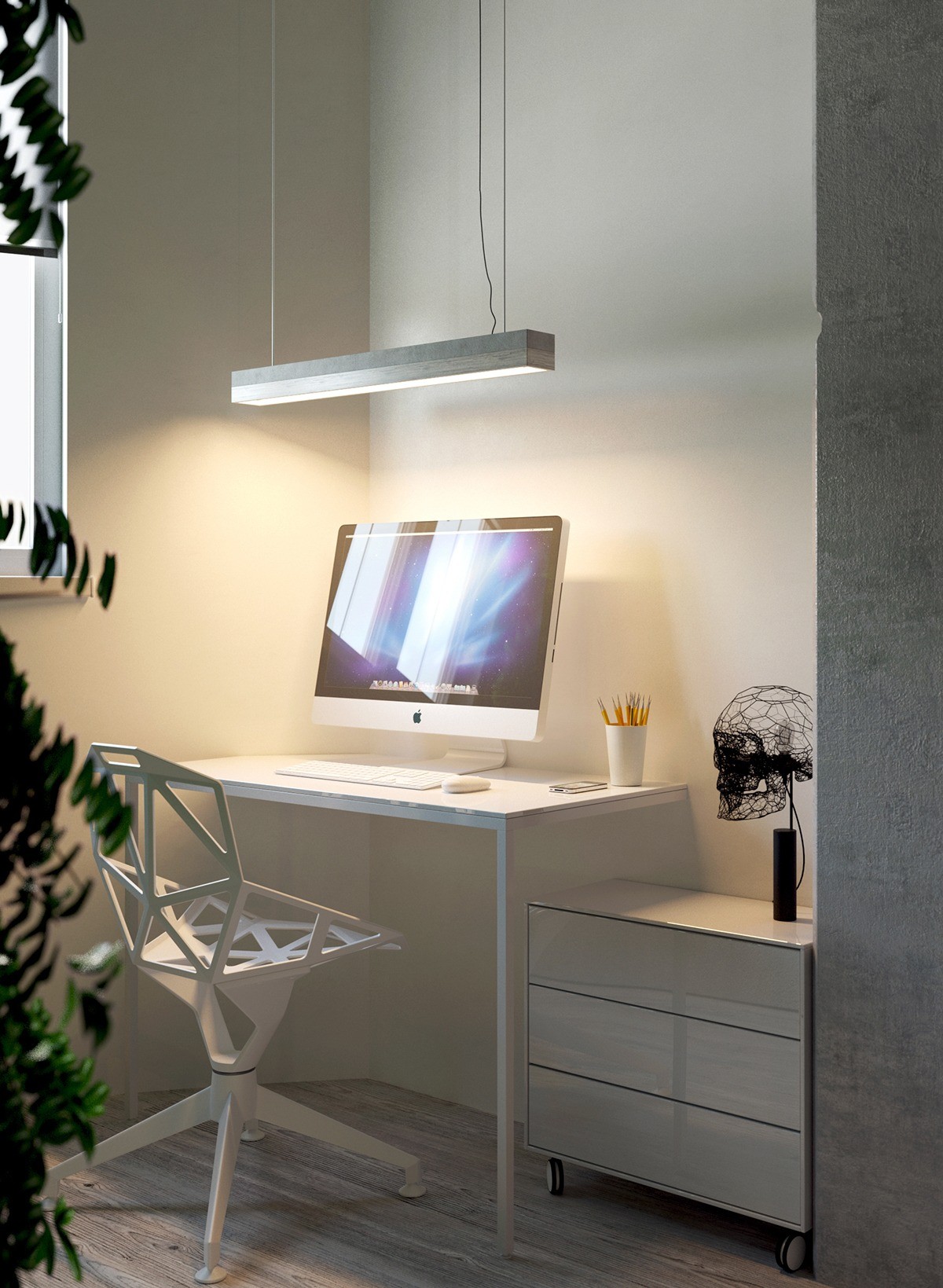
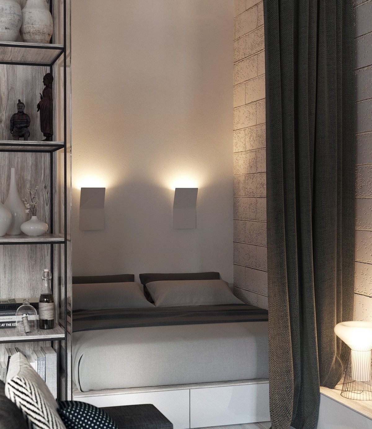
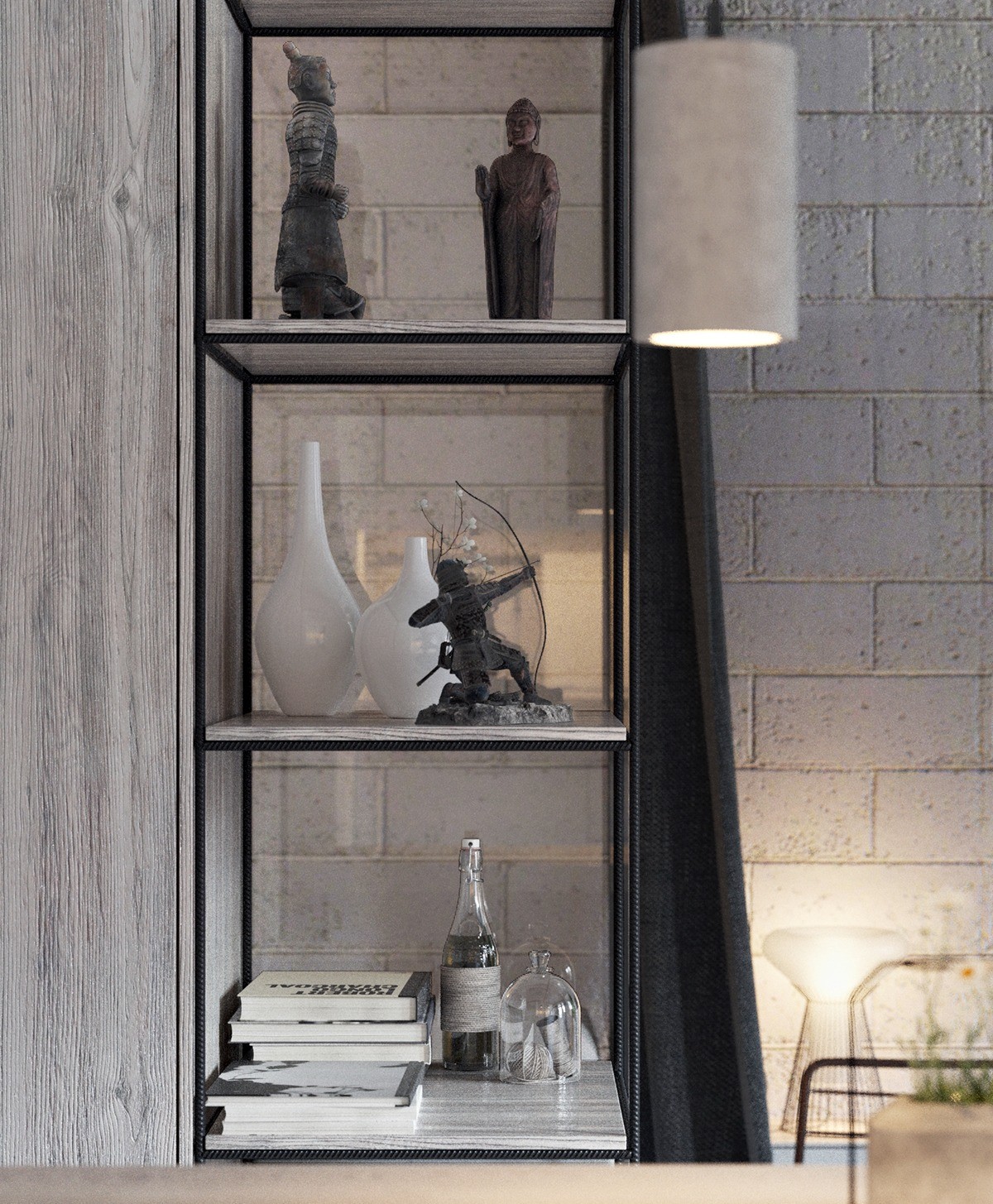
Negative space plays an important role throughout. Much of the furniture feels weightless as can be, whereas opaque or heavy furnishings would have blocked too much light and might have made the monochromatic theme feel imposing. Whitewashed woodwork certainly helps to amplify and preserve the sunlight.
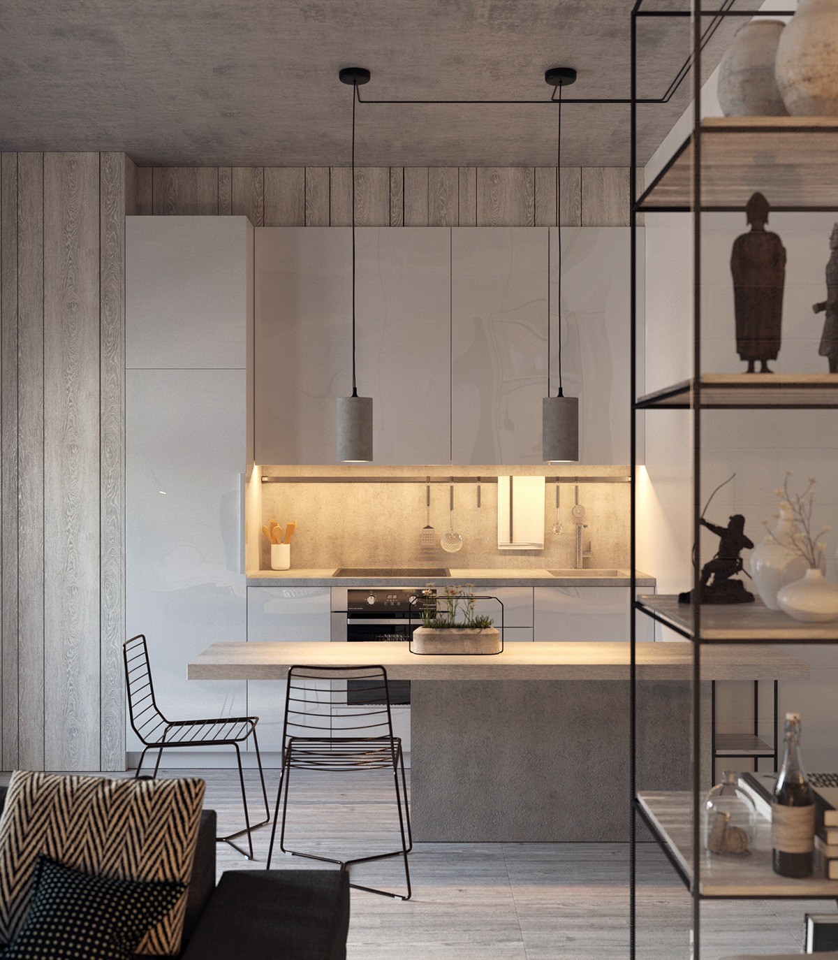
Concrete treatments appear in the most surprising places, like the hanging lights and even the planters. And aren't those planters just fabulous? They're the work of Decha Archjananun – and they serve a crucial role in uniting the greenery, wire accents, and concrete themes throughout the home.
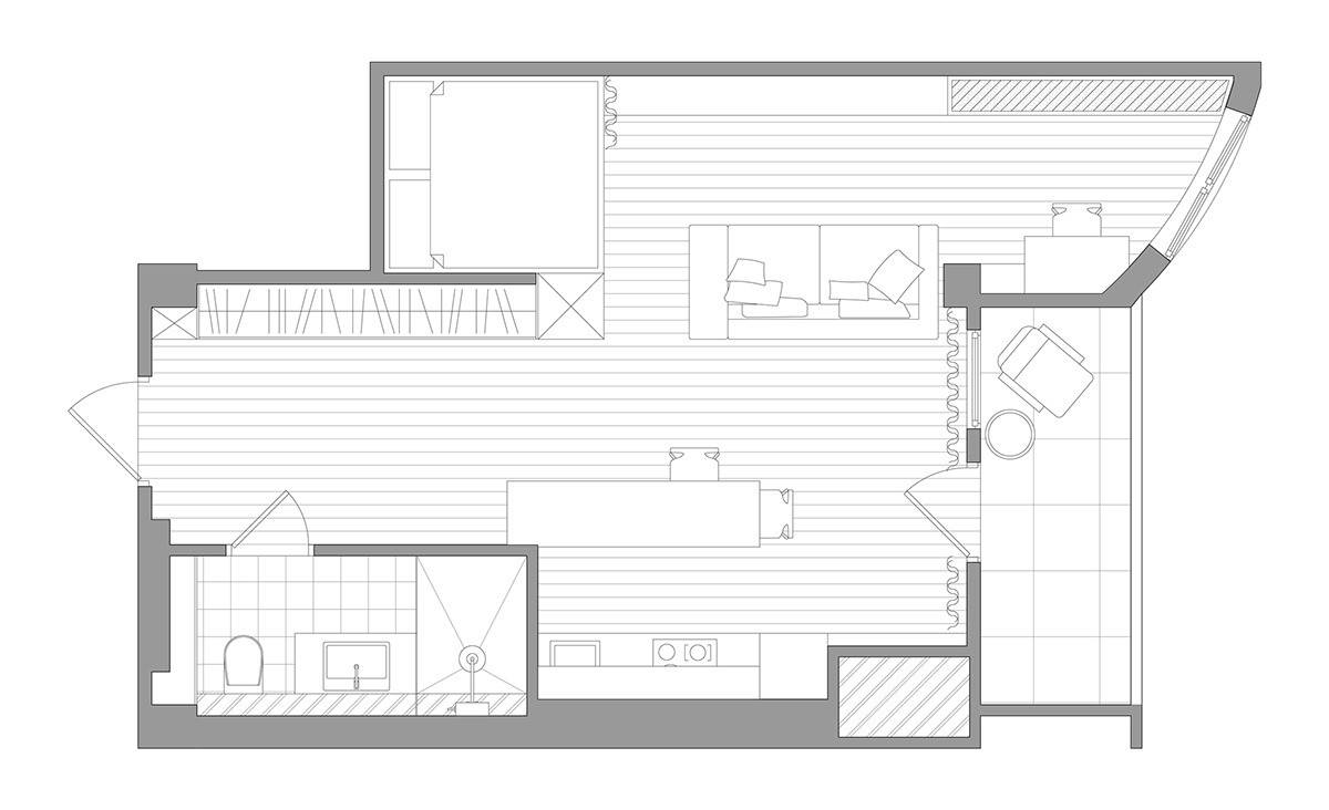
Solo Design Studio completed this sophisticated studio apartment for a young couple who wanted clearly defined zones within the interior. Each space is distinct in terms of aesthetics and function, interspersed with smartly coordinated characteristics to unify the space overall. It has all the practicality of a studio without necessarily looking like one.

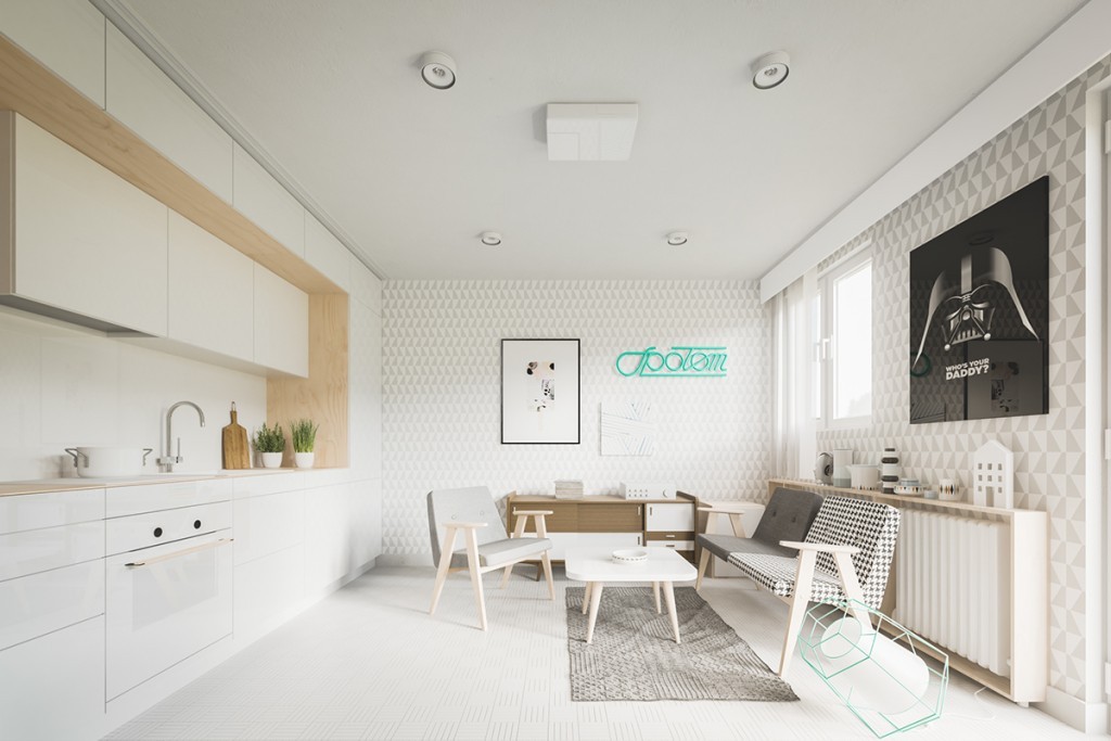
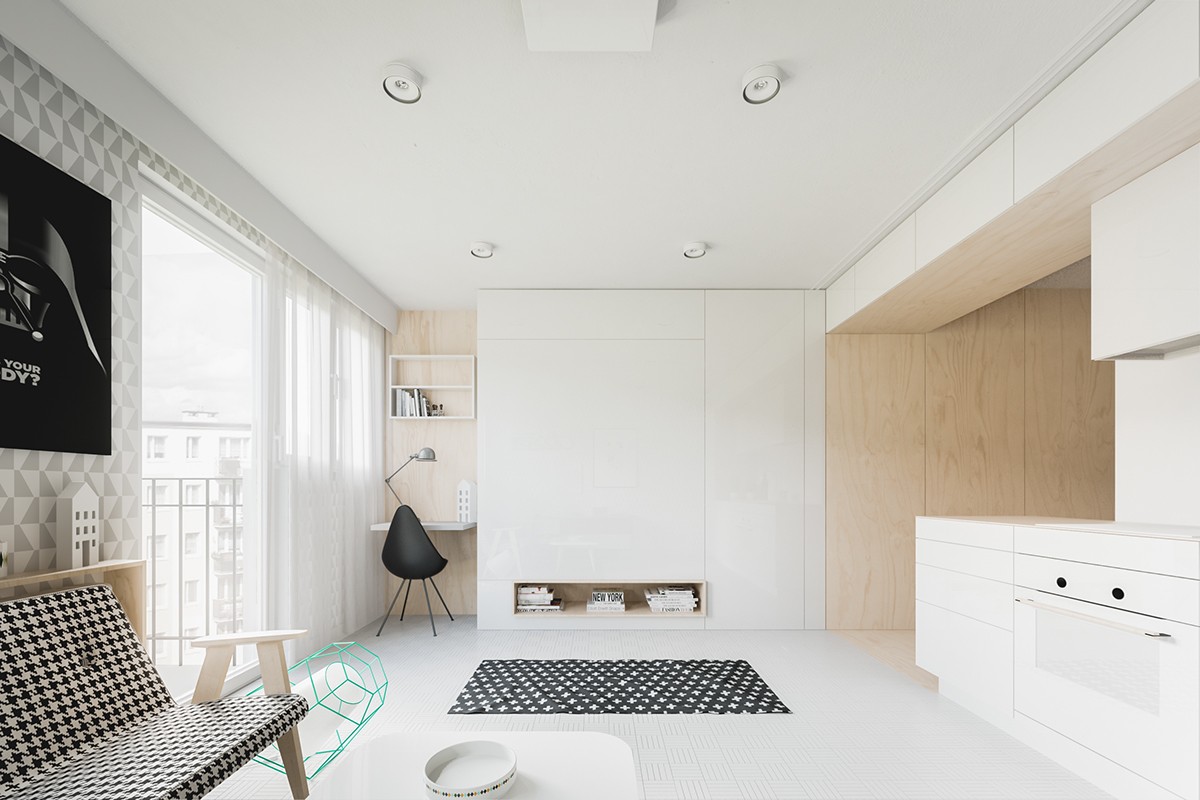
Light colors and simple lines always make a room look a bit larger than it really is. The designers used scaled-down patterns in monochromatic colors to weave a playful character without creating any unnecessary visual clutter.
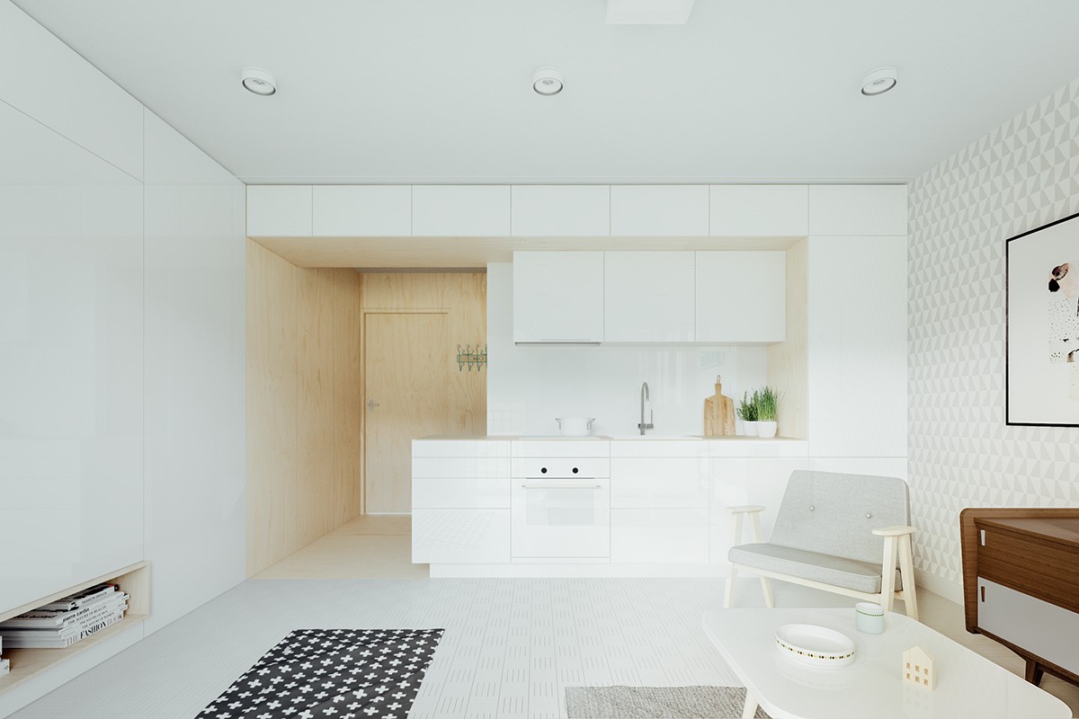
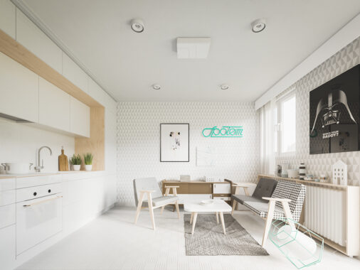
One side of the room pops with cool graphic-printed wallpaper, and the other shines brightly with glossy white paneling. An abundance of integrated storage is a must-have for a space as tiny as this one.
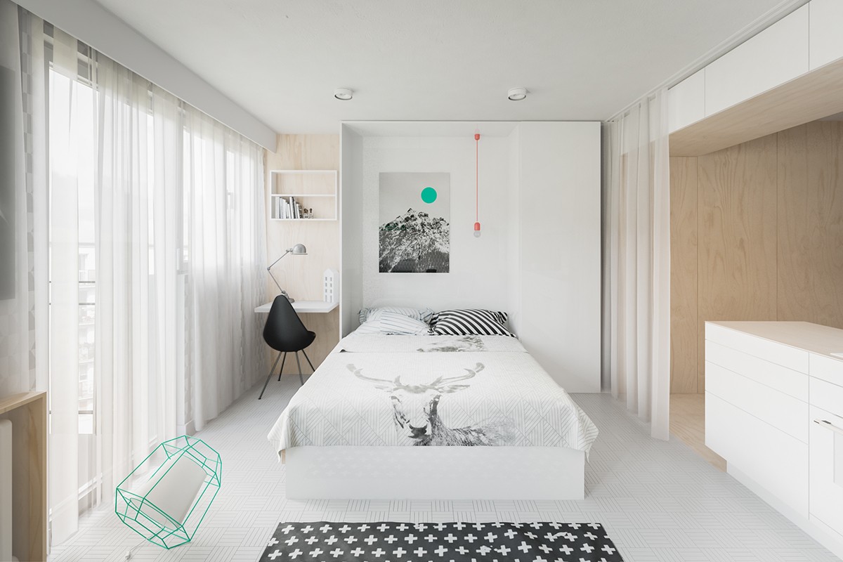
Very clever take on the classic pull down bed – the hidden pendant light is a fun touch that offers a striking contrast to the teal accents found throughout the room.
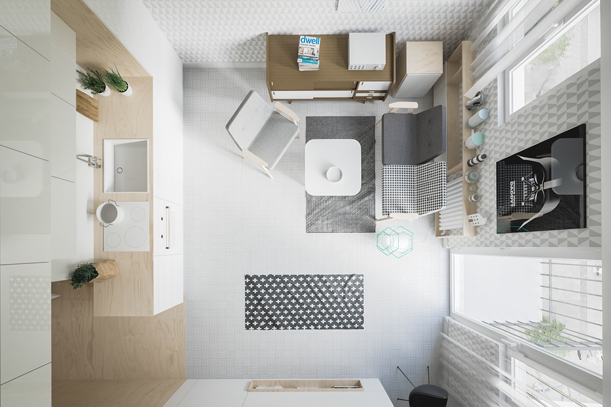
The stylish chair is a refurbished Chierowski design that originally belonged to the client's grandmother - an important piece of nostalgia, and perhaps one of the few features left over from the renovation. Grandmother must have had fantastic taste in furniture. The matching sofa is a contemporary interpretation of the iconic 366 design.
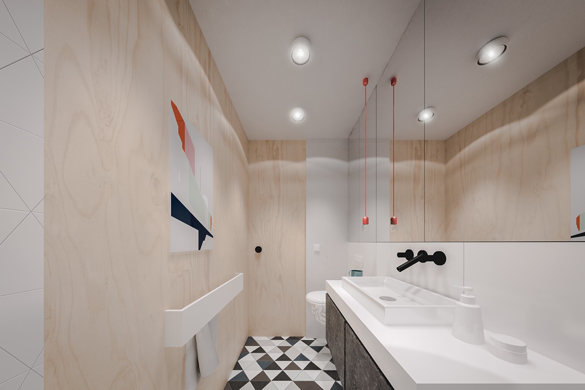
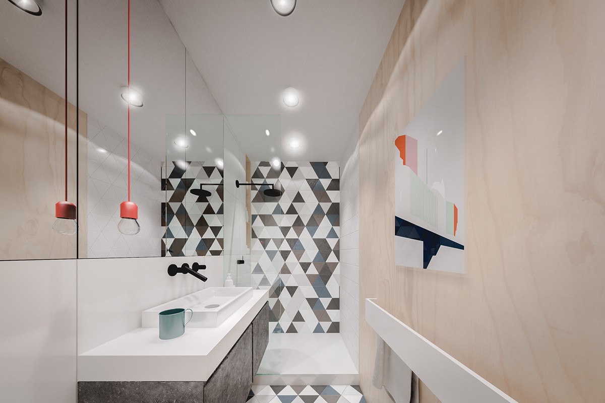
The bathroom takes a completely different approach from the rest of the apartment. It can be risky to use such large patterns in a space this small, but the effect here is absolutely gorgeous. Cohesive colors and clear lines make a statement without crowding out the senses.

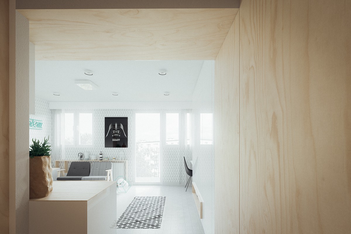
Talented designers Piotr Matuszek and Gosia Czarny gave this small-scale apartment a bright and spacious makeover. The clients were a young couple who inherited the property from their grandmother – and at only 20 sq. meters, it required a near-total structural transformation to make the space feel large enough for two.
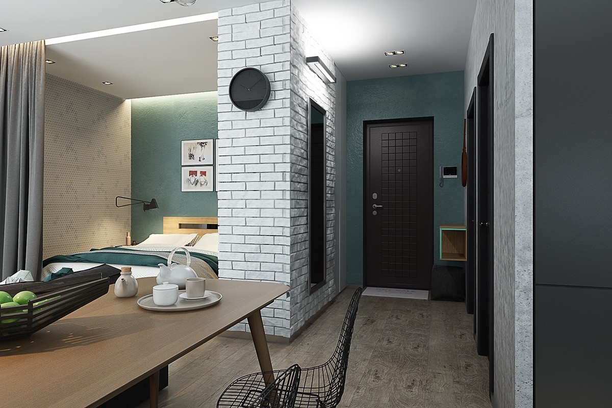
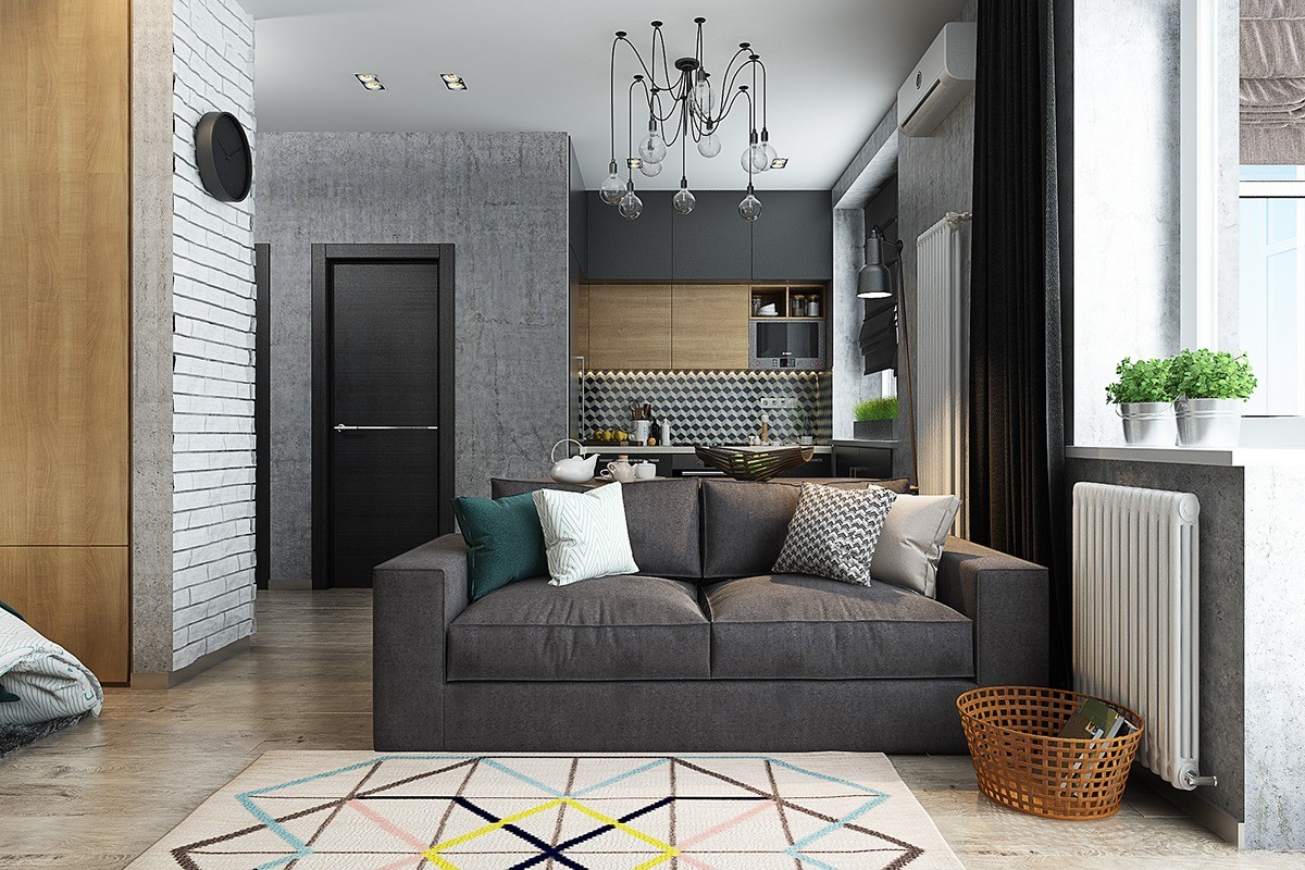
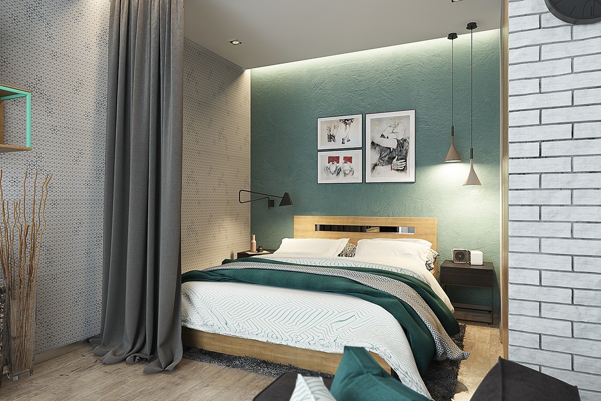
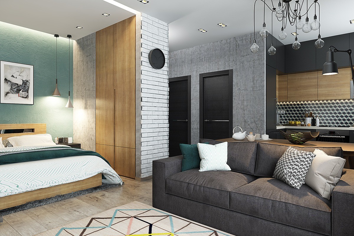
This sleeping area is the perfect "room within a room". Curtains hang from a recessed cove that also provides a bit of soft indirect lighting – ideal for relaxing in the evening, when the pendant lamps might be too bright.
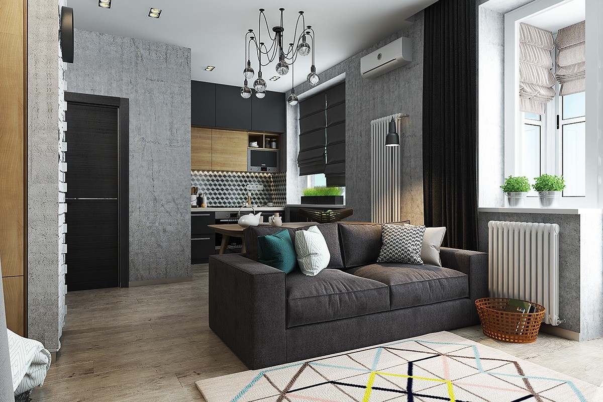
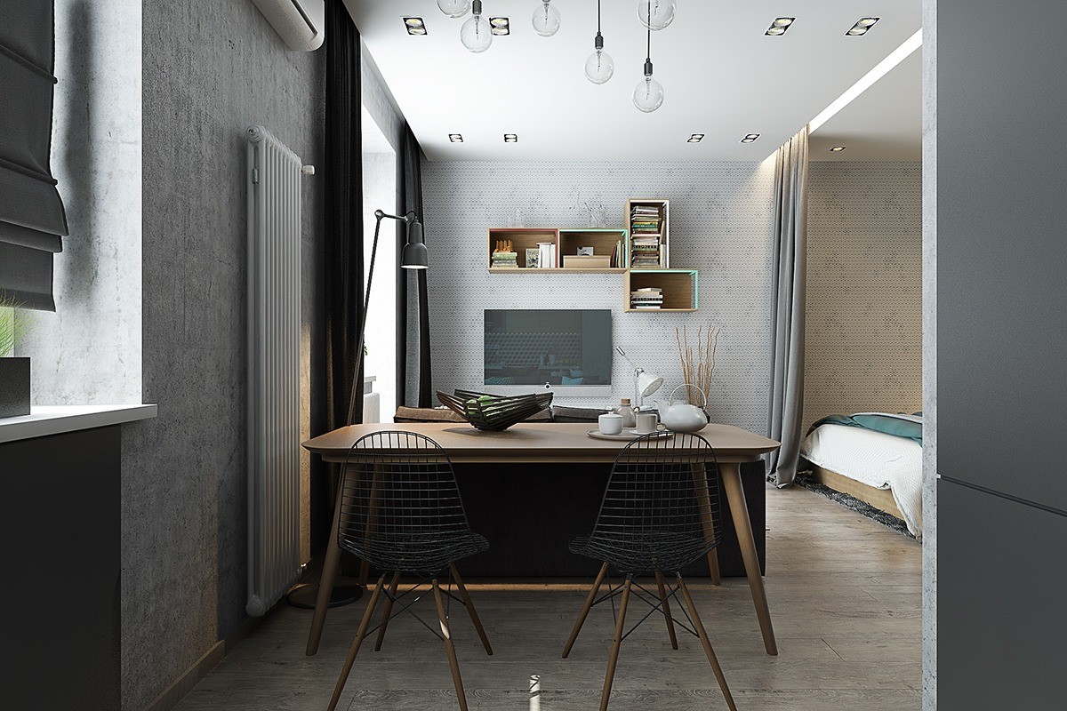
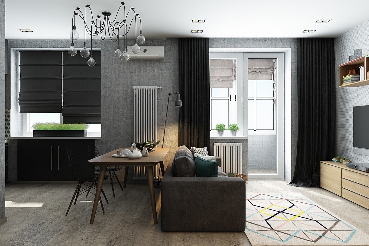
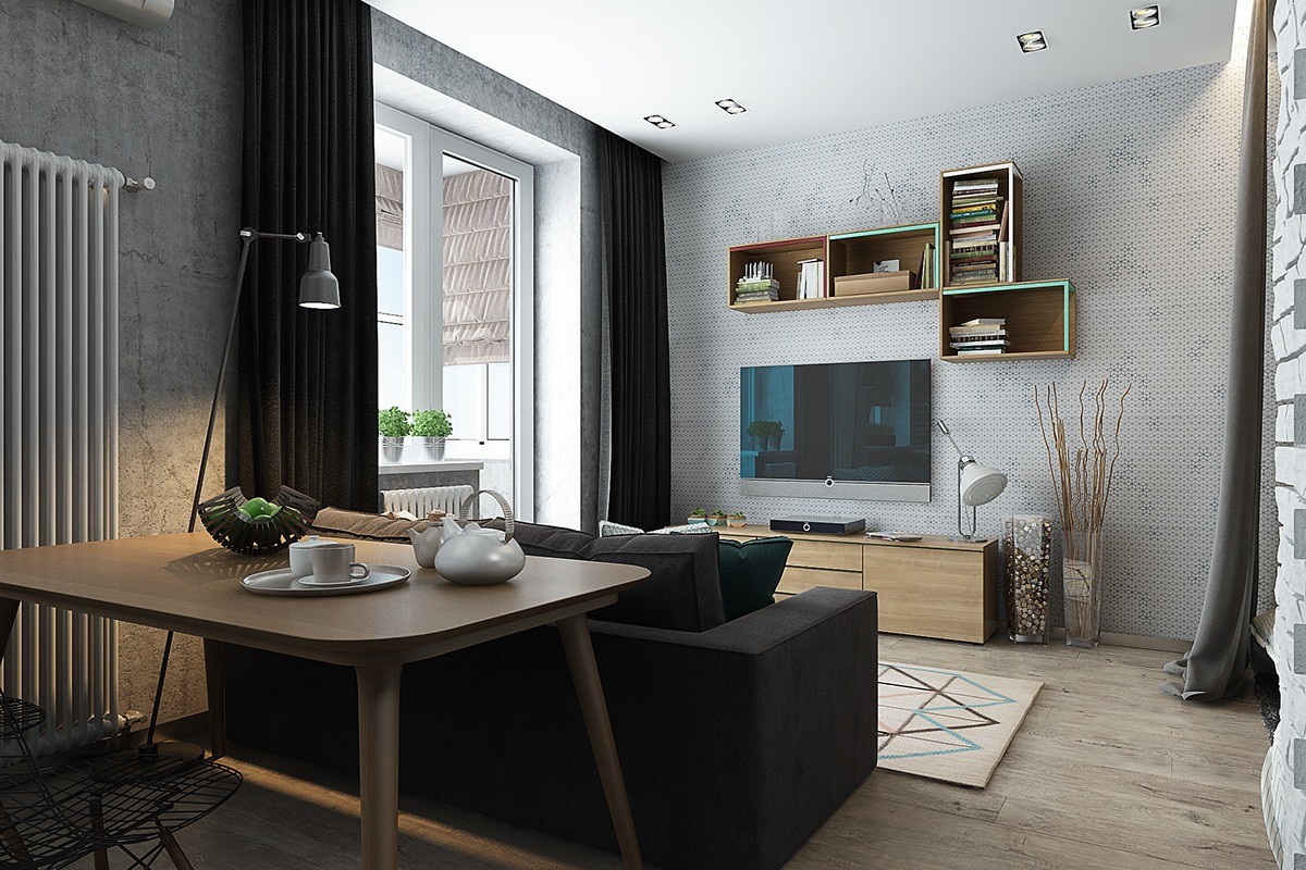
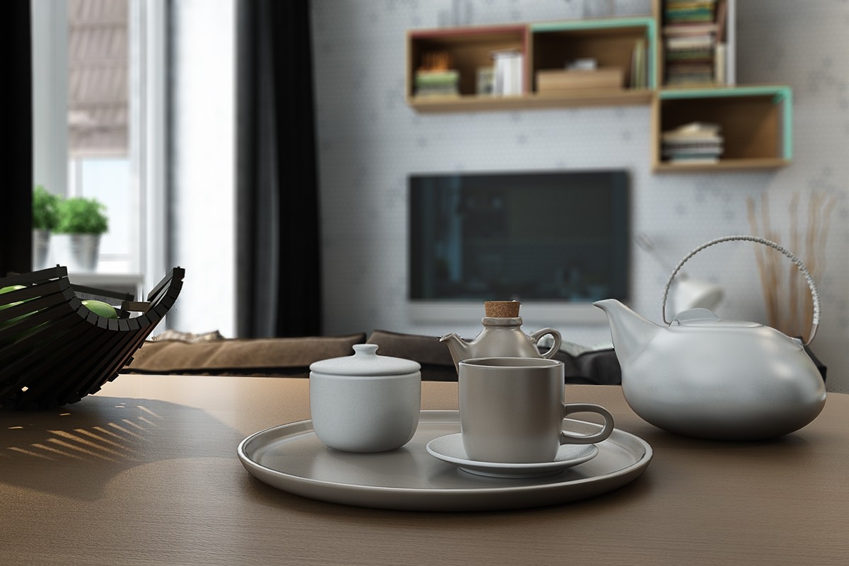
Lively colors help set the living room apart. The modular shelving above the television hints at teal and white, while the geometric pattern rug ties the space together. The apartment only has 40 square meters of floor space, so these little pops of color really make a big difference.
