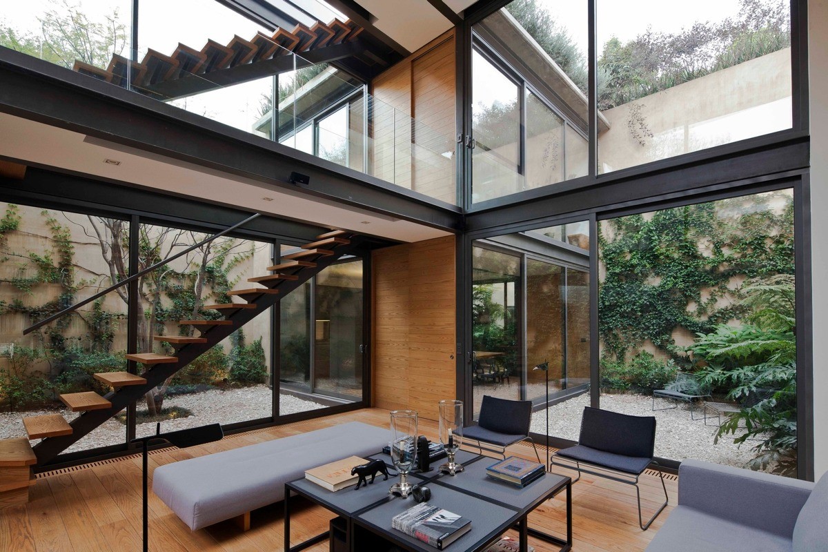
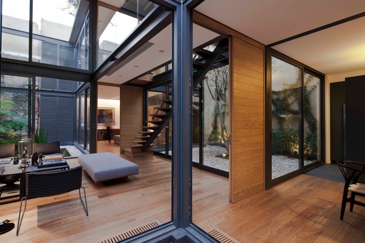
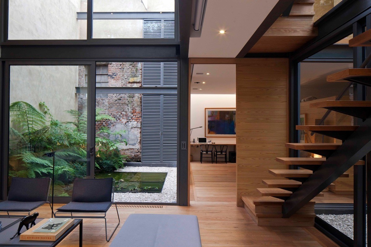
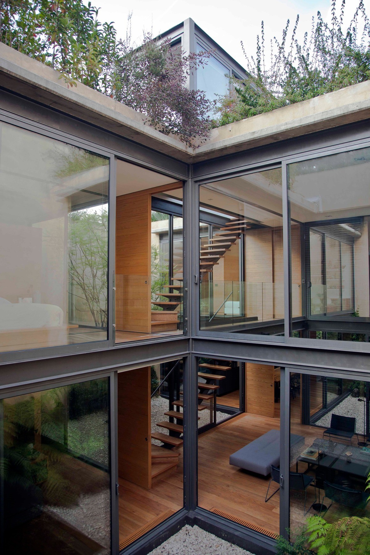
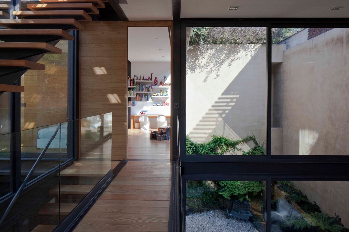
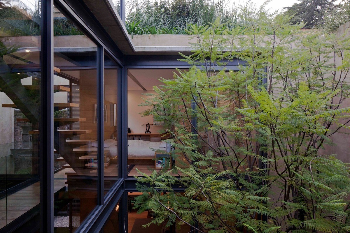
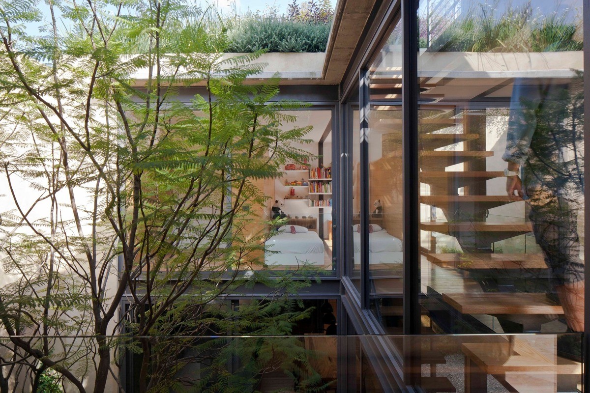
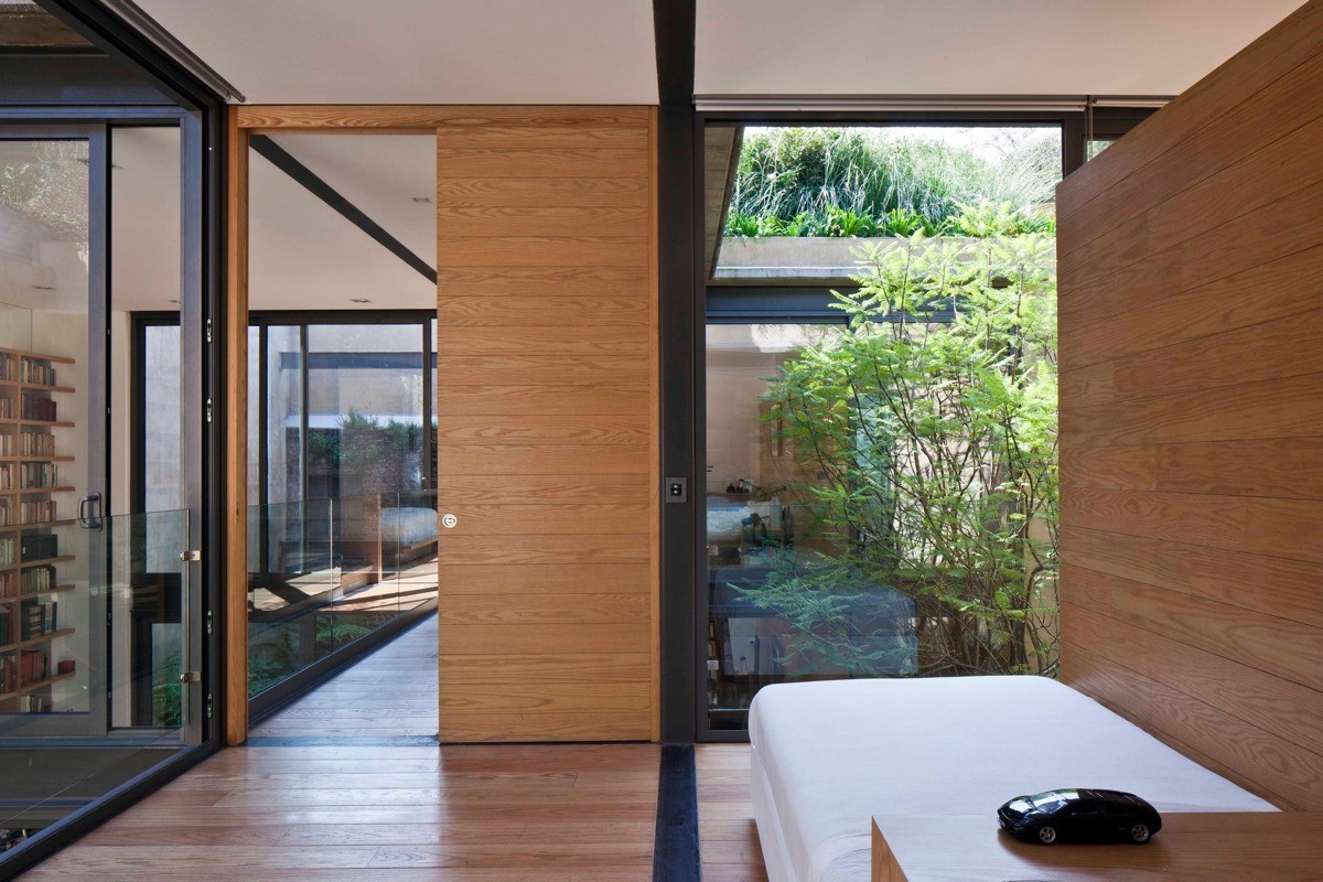
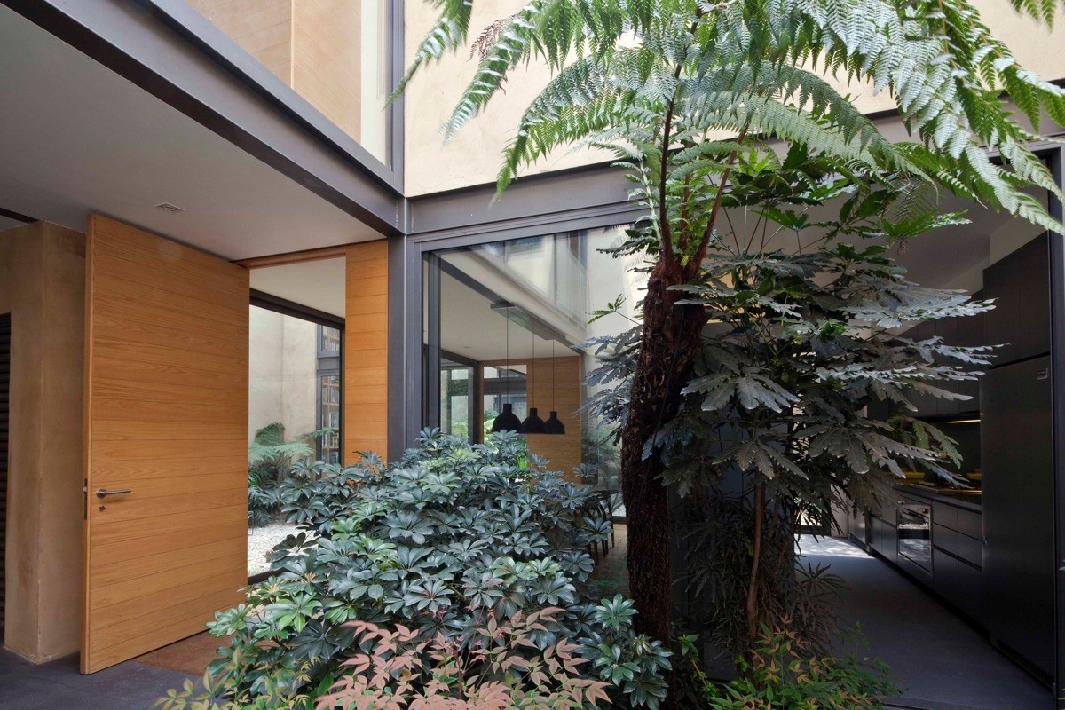
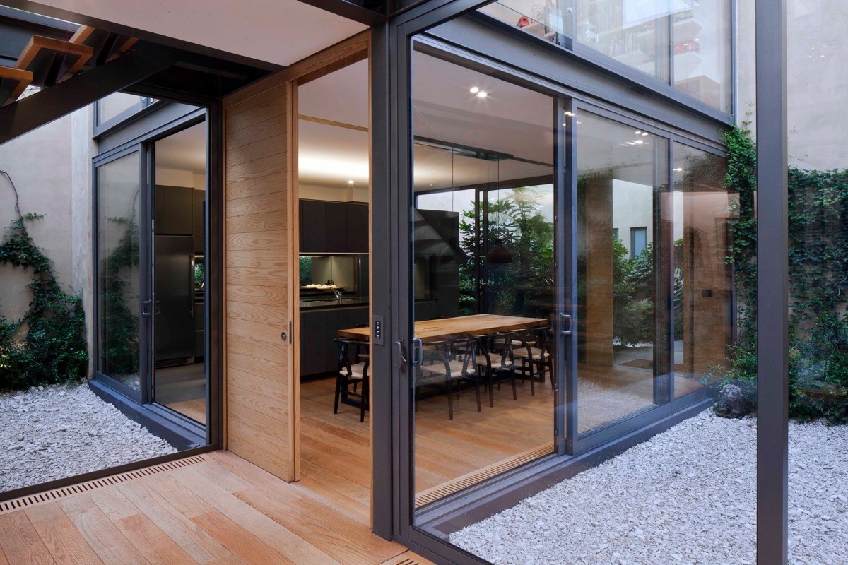
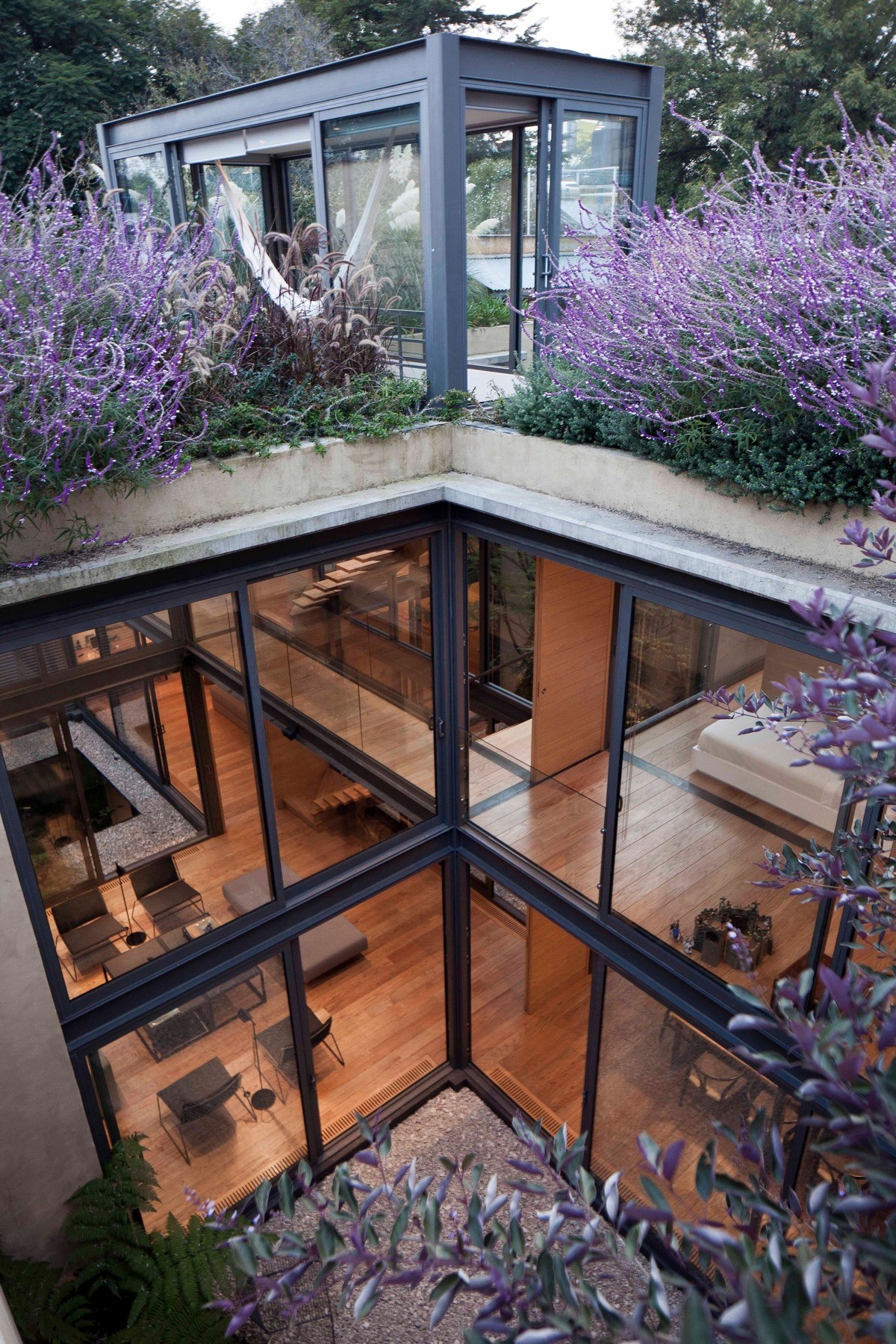
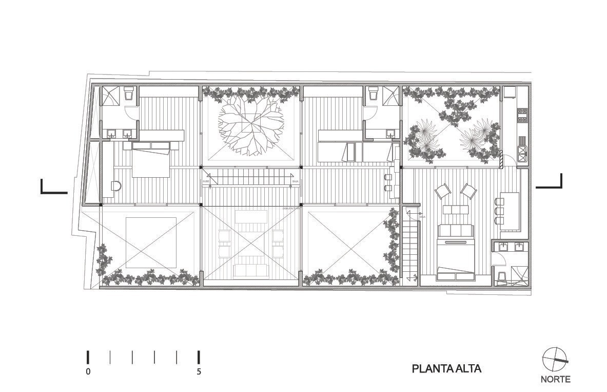
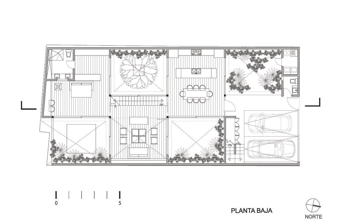
Designed by architect Andrés Stebelski, this innovative home features a tessellated layout alternating between modern courtyards and cubic structural segments. The black metal frame maintains a thin profile to allow an unobstructed view over the gardens and into the neighboring rooms. Located just west of Mexico City the site posed several important constraints: such a free and open design would not have been practical without the addition of a tall perimeter wall to protect the privacy of the occupants. And without the courtyards, the perimeter wall would have made the home feel claustrophobic. What a beautiful solution!
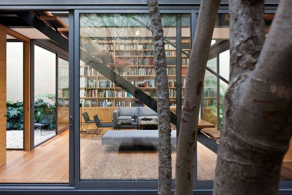
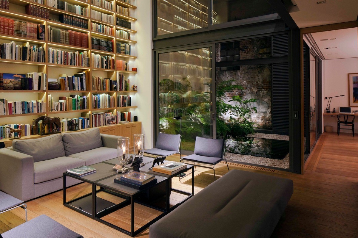
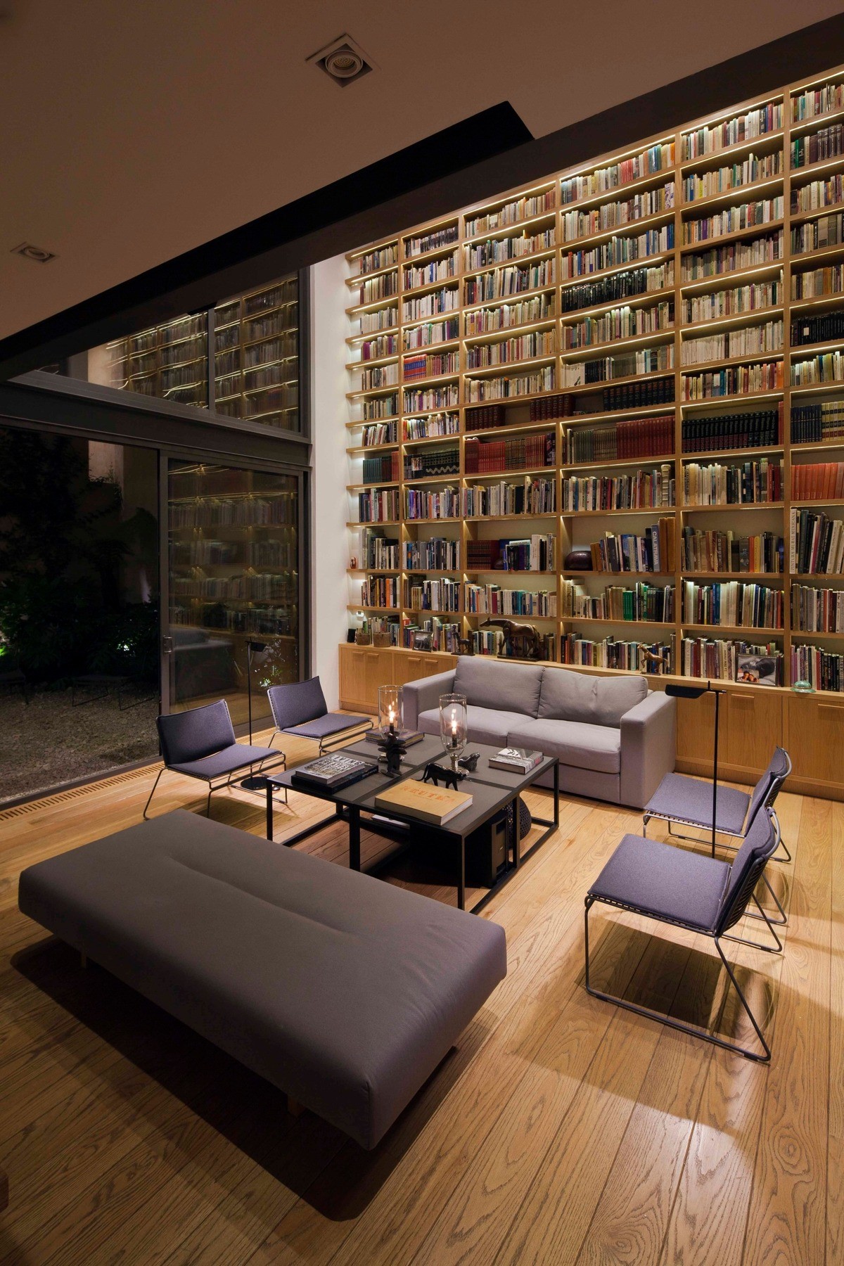
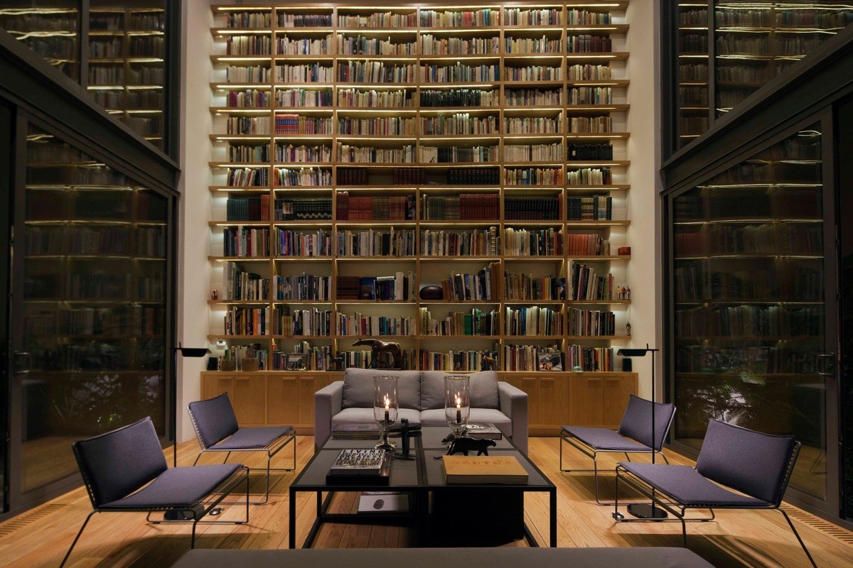
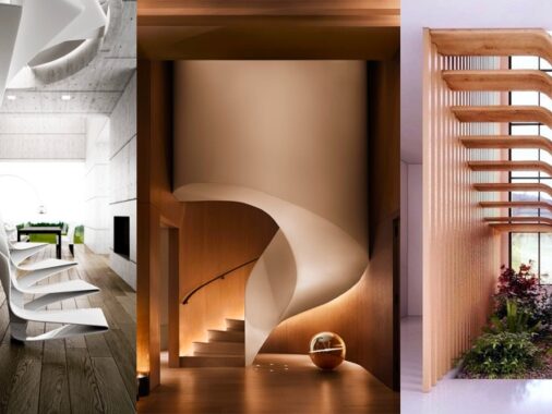
A bright central atrium contains the main living room, flanked by a spectacular two-story library on one side and a light and airy staircase on the other. This hub connects the ground floor living spaces - kitchen, dining, and entertainment room - with the private living areas on the next floor. The stair treads balance on a thin spine, a perfect complement to the dark steel frame of the home.
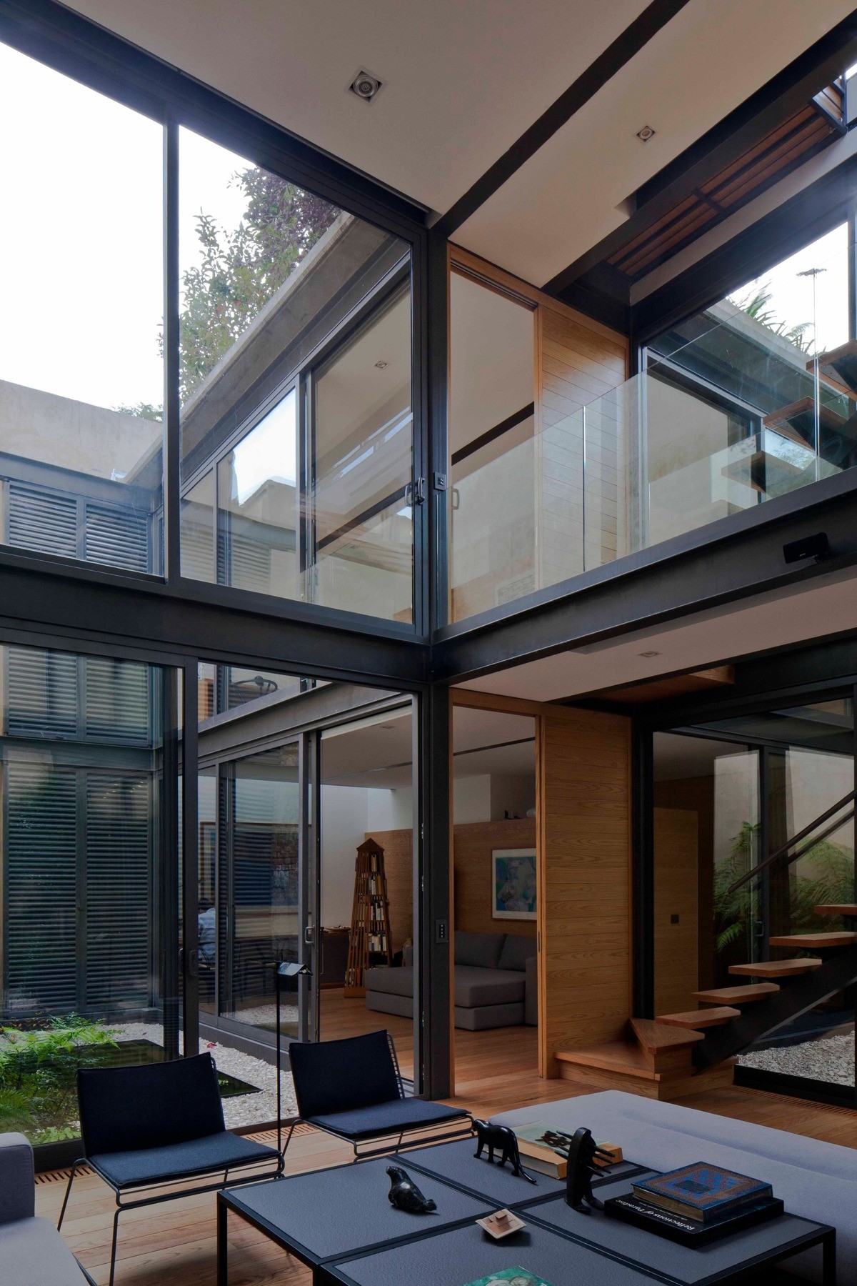
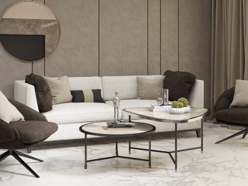
Natural materials and dark accents foster a surprisingly intimate atmosphere that emphasizes the verdant focal points interspersed throughout. The contemporary furniture is practical and inspiring - for example, by combining four side tables to create one large coffee table as shown above, residents can easily free up more floorspace when entertaining.
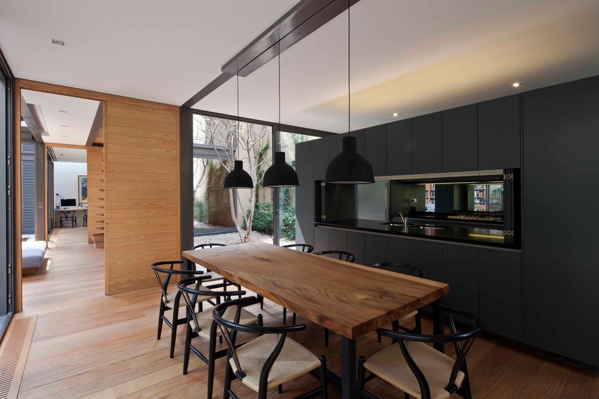
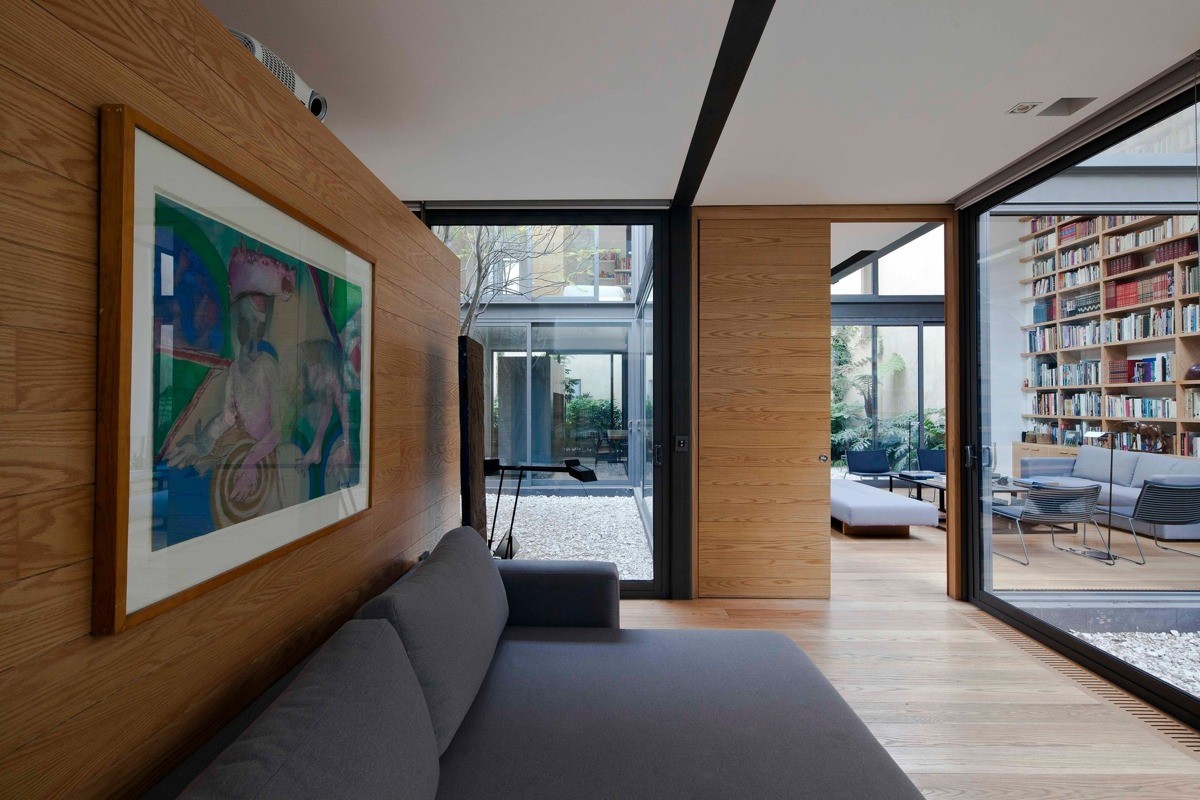
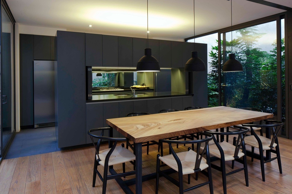
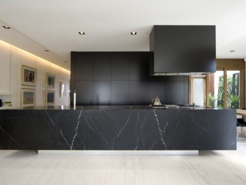
Segmented yet unified, cascading glass walls provide a continuous view punctuated only by the stylish landscaping between. A streamlined enfilade layout preserves the functional circulation between each area, making the property easy to navigate despite its unique shape. This photo shows the minimalistic kitchen layout and offers a peek through the living room toward the ground floor study.
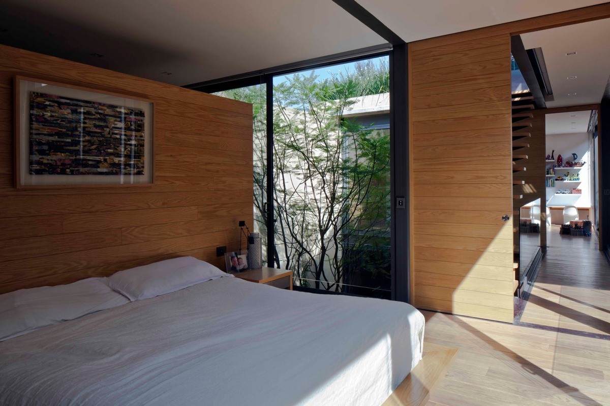
Even the upstairs bedrooms aren't excluded from the lovely courtyard greenery – gorgeous trees planted in central locations offer a splash of color to enjoy from almost any room in the house. Although the foliage helps shield the view from one bedroom into the next, the occupants can pull down the super-low-profile shades for a more reliable barrier.
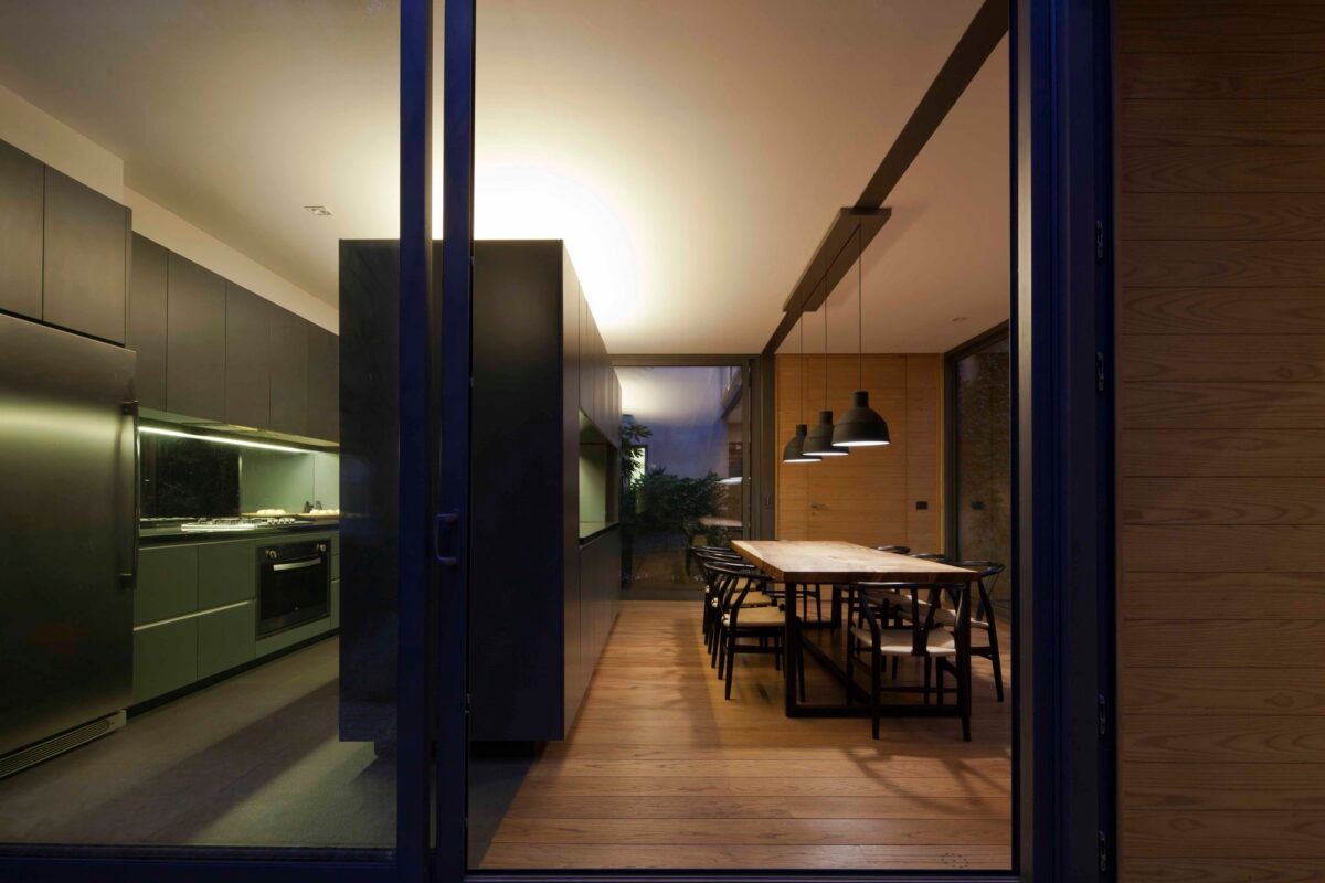
Unique cabinetry serves up plenty of integrated storage while acting as a well-defined yet visibly connected boundary between the kitchen and dining room. A mirrored backsplash behind the stove makes good use of the soft lighting and, as demonstrated in a few of the previous photos, extends the view of the courtyards.
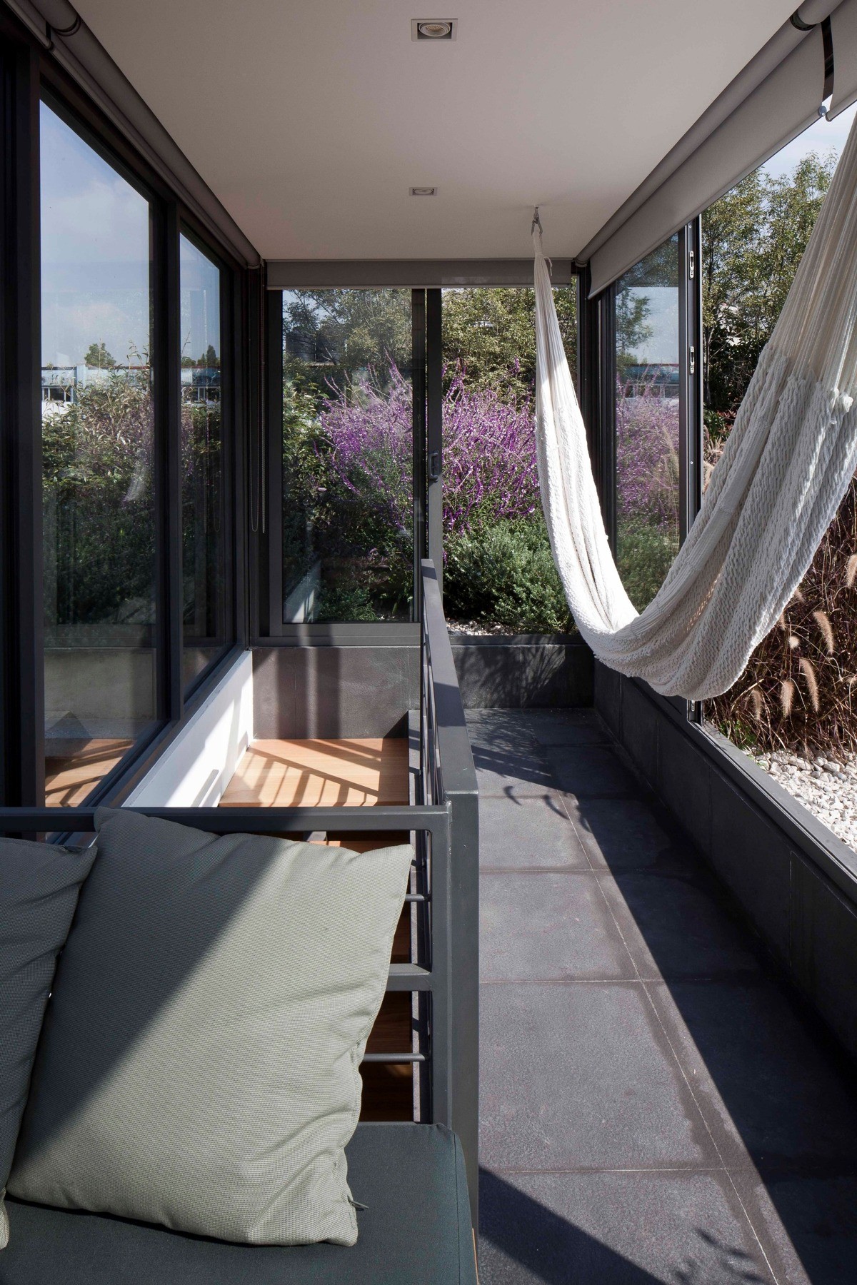
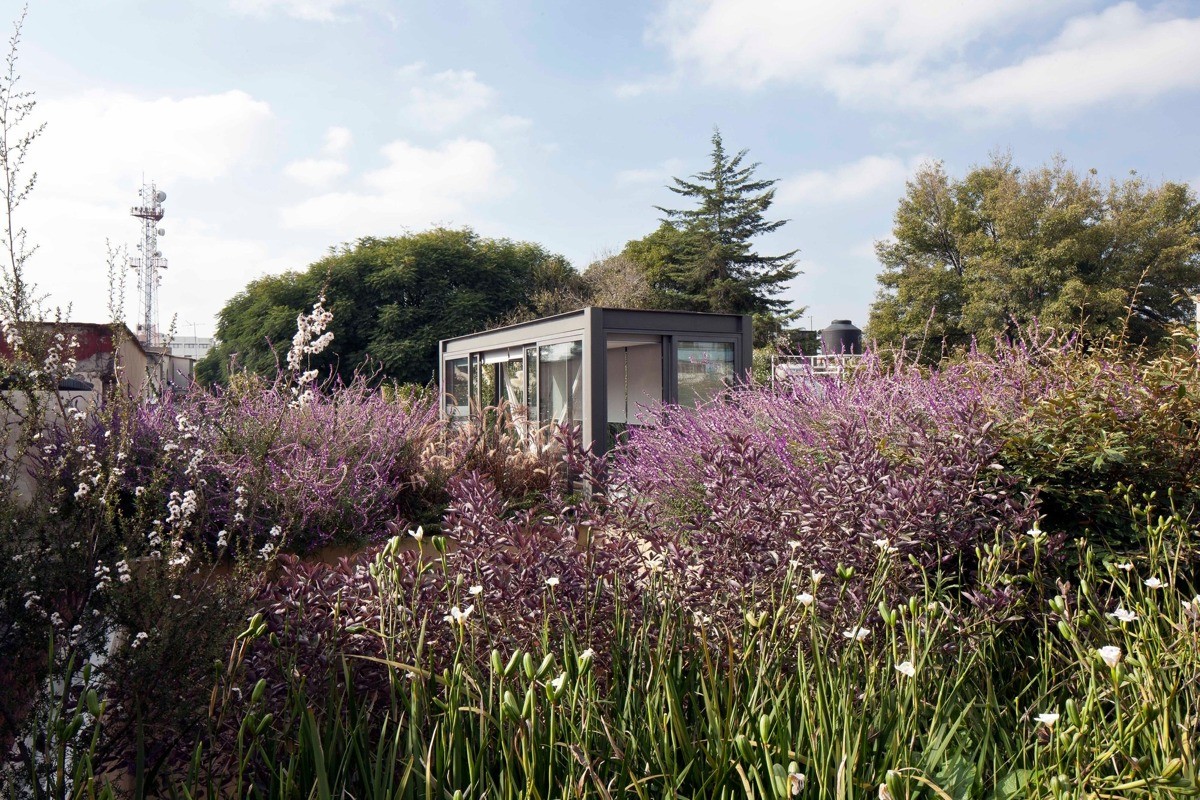
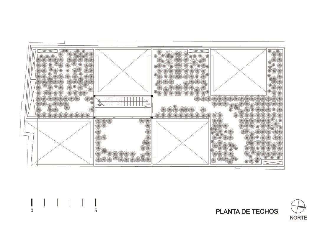
The staircase leads up to a glass-encased cube that opens to a diverse rooftop garden. The garden helps cool the home, while its circular walking path provides an excellent 360-degree view of the surrounding neighborhood. That fun hammock looks like an irresistible place to nap, read, or daydream.
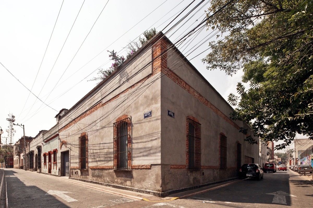
Would you have guessed that this unassuming facade hides such a sleek and modern home? The perimeter wall respects the original architectural style of the neighborhood down to the finest detail, even going so far as to reflect the age of the surrounding buildings. Crossing the threshold into the inner courtyards would surely leave first-time visitors entirely speechless. To passersby, the only hint of what lies within is the spray of lavender peeking out from the rooftop garden above.

