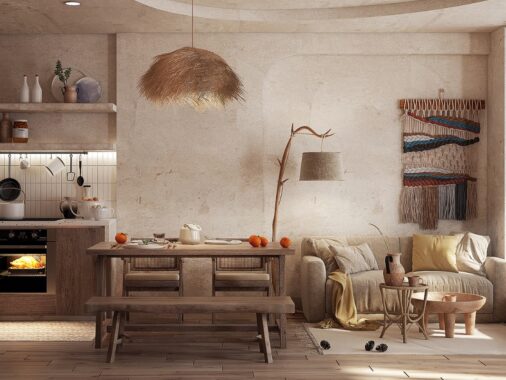
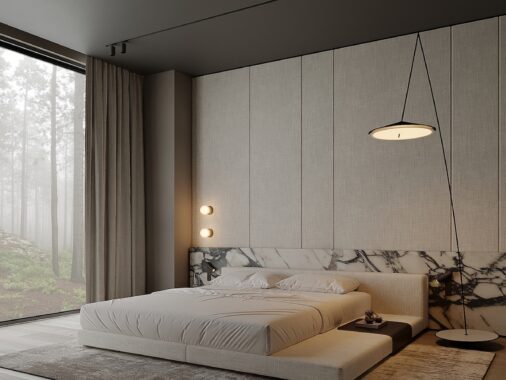
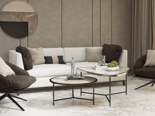
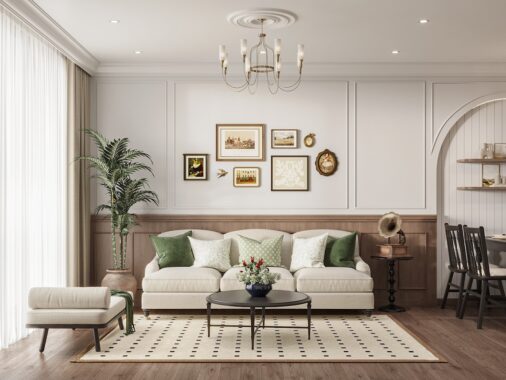
Modern minimalism is sometimes perceived as cold, serious, or sparse. These beautifully designed spaces by Fertility Design show just the opposite, combining together unique design approaches with plenty of texture, smart storage solutions, and pops of color.
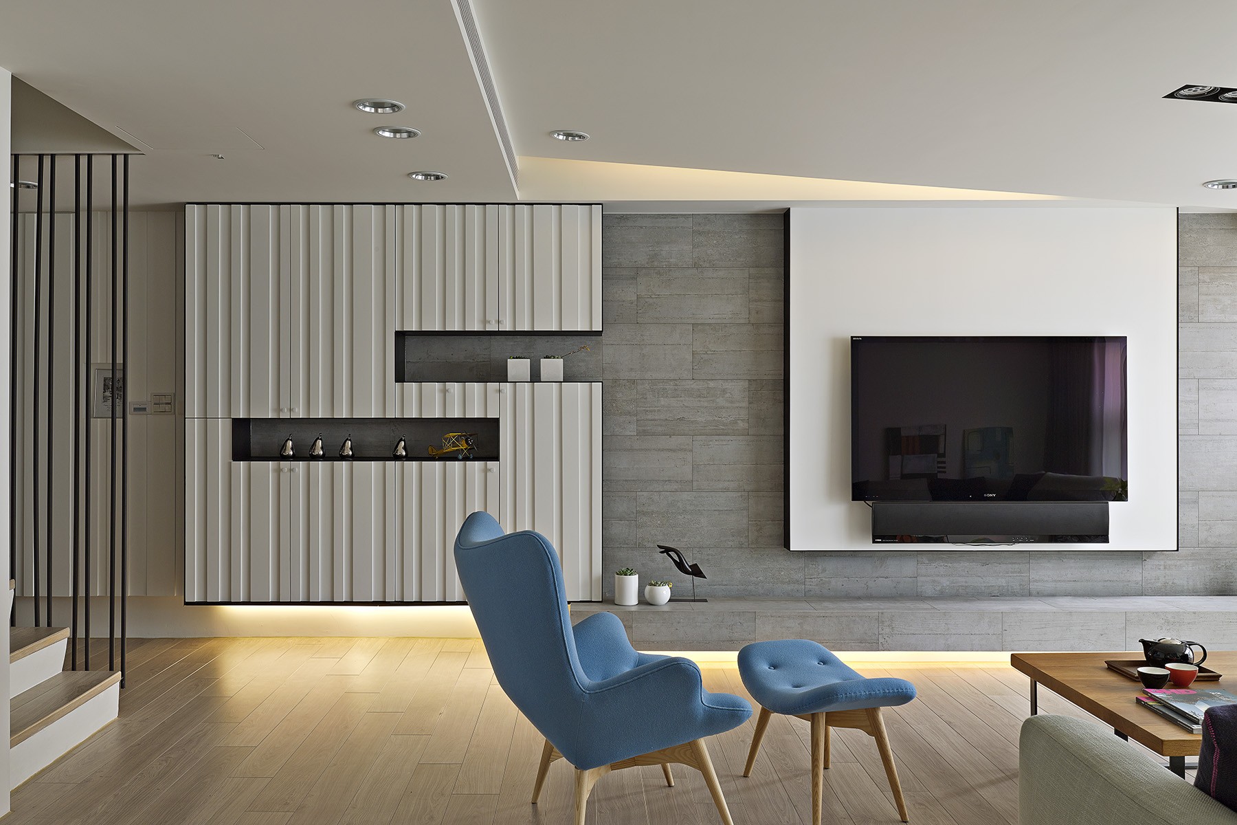
At 1424 square feet (132 square meters), this apartment presents a unique solution to a ceiling problem, in which there was a height difference that threw off the interior's aesthetics. To correct, the ceiling in the living area as given a beveled design, in addition to a sloping ceiling shape. This created a space that looked - and felt - longer and wider. Designed by Huang Yi Feng and Li Yuzhi, this apartment is located in the Taichung area of Taiwan and features a modern design, including a living room, dining room, kitchen, guest suite with bathroom, study, and master bedroom with bathroom.
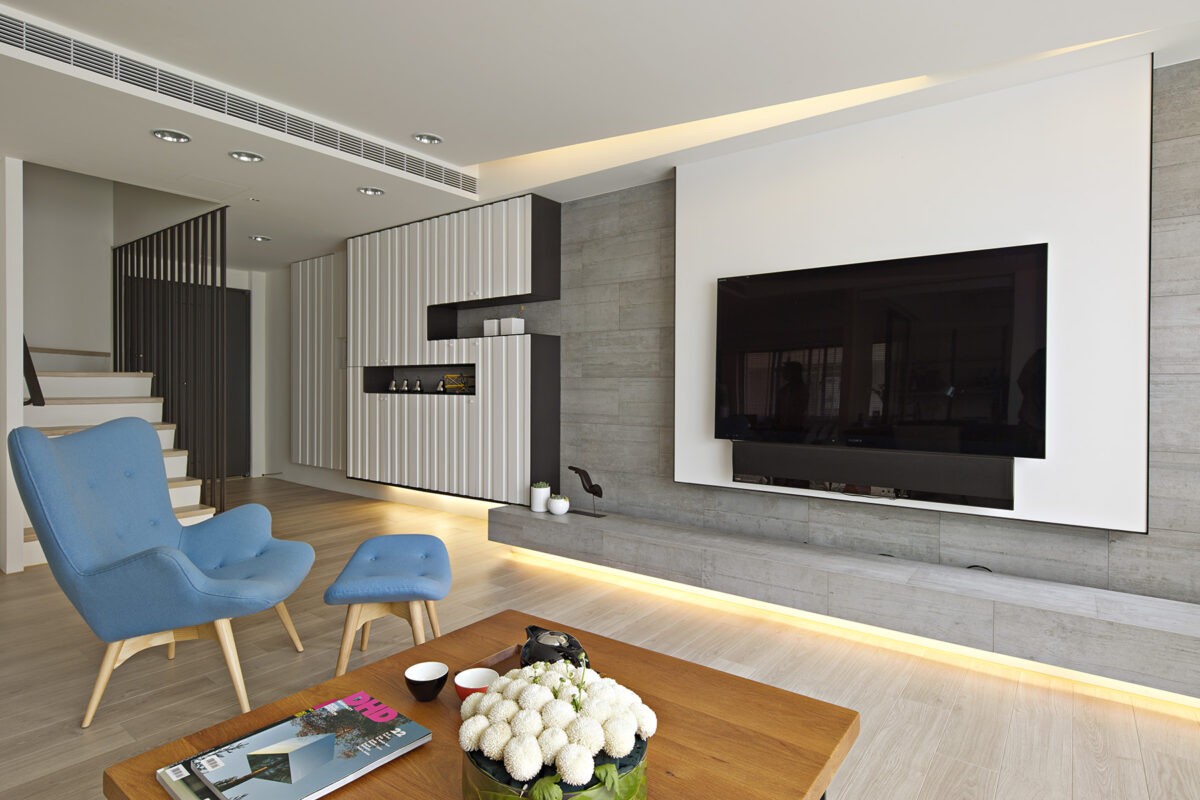
Using a very open design, each space is designed to flow seamlessly into the other, with plenty of clean lines softened by organic materials, like the luxe textiles used in the furniture upholstery and window treatments. Overall, a sense of smoothness radiates throughout the space with neutral woods, imported tiles and stone.
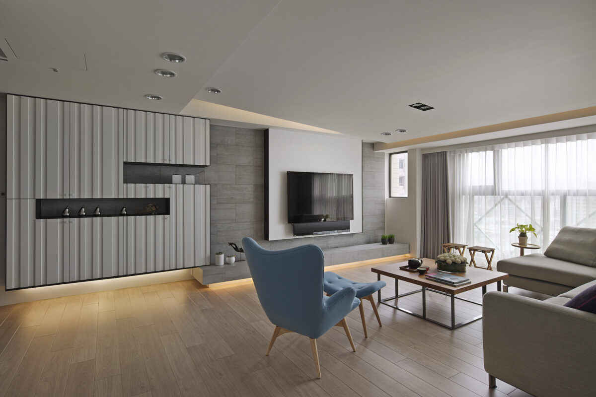
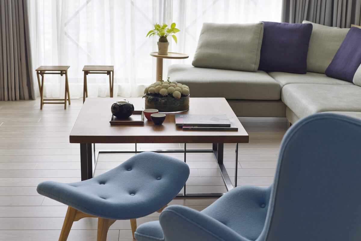
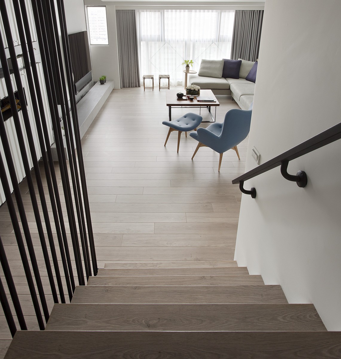
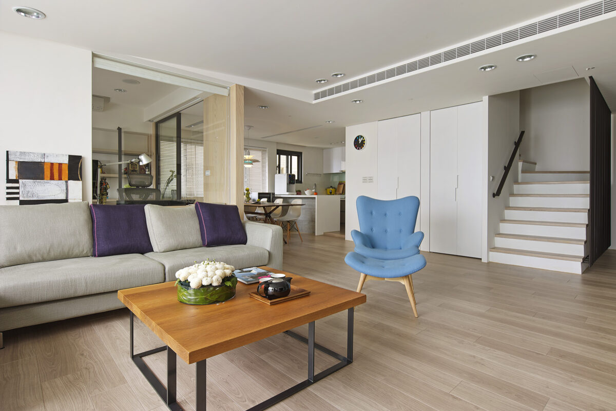
The living area asserts its charm with smart but sculptural storage along the main wall, adjacent to the media center. Plenty of light pours in from the floor to ceiling windows along the balcony. The look is very crisp and modern overall, but it's the charming blue chair that really makes the space feel lively.
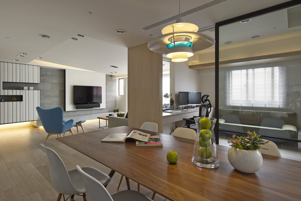
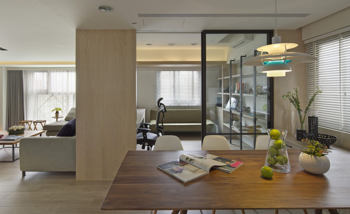
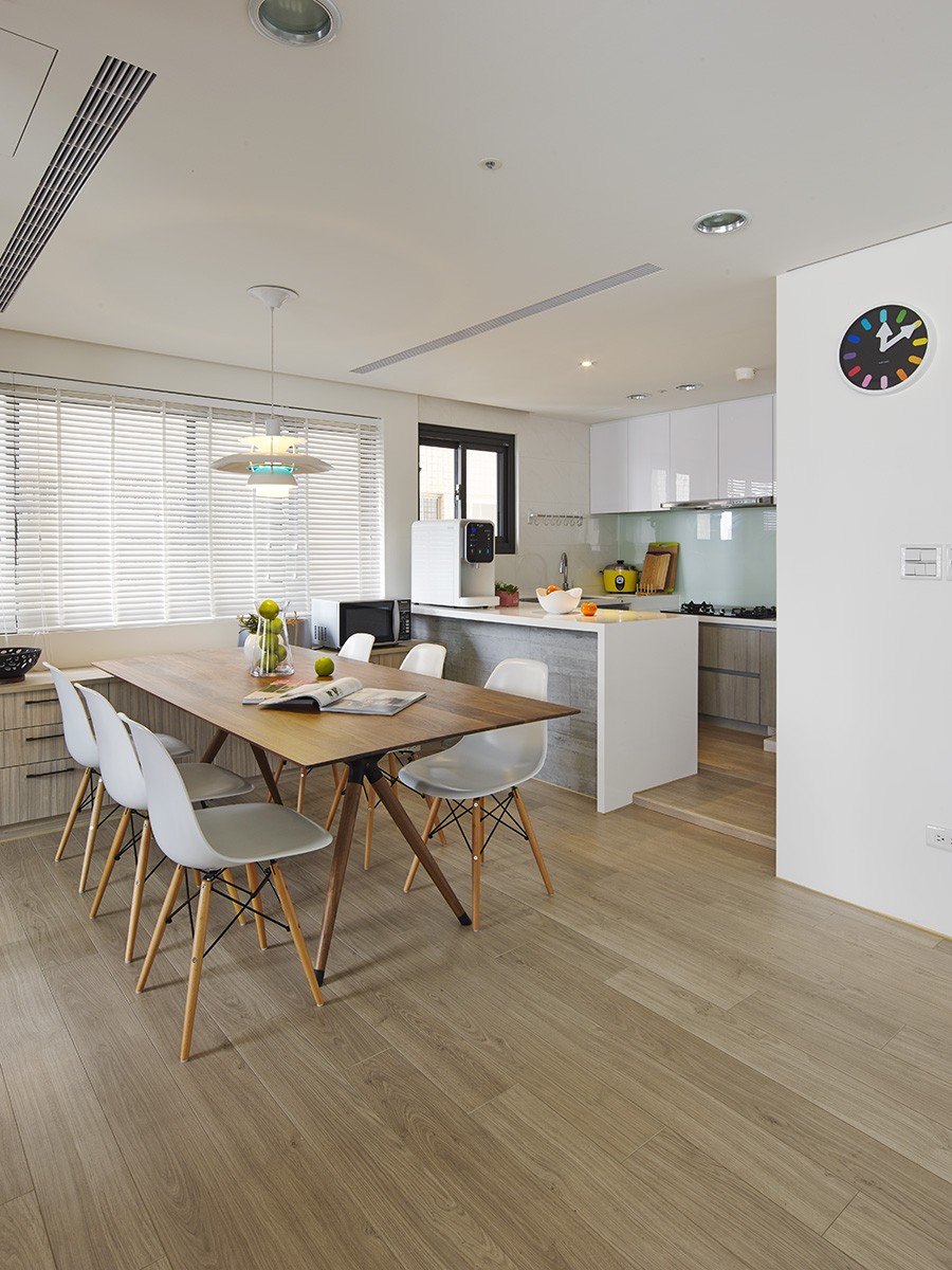
The dining area, just a few steps away, features a transparent sliding door into the study, Scandinavian wooden dining chairs, retro styled chandeliers, and window blinds. It is airy and bring. The study itself also has an open design looking out into the living room, lending to the overall flow of the space.
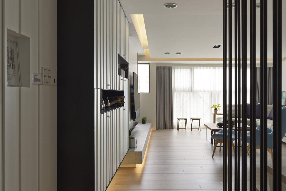
At the apartments entrance, iron railing from floor to ceiling create a distinct look that's echoed in the storage along the opposite wall. Coats, shoes, books, media, or other essentials can be safely stored there, eliminating clutter, which keeps the space feeling large and open.
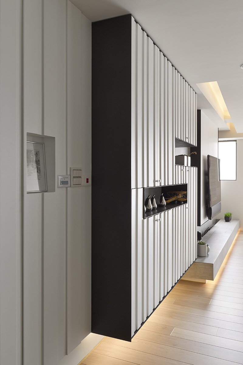
Recessed areas for carefully curated decor or treasures give the apartment a very personalized touch without making any addition feel frivolous. We especially love the play with textures and colors in the living area, which features lots of cool toned neutrals with pops of purple, sky blue, and green. It never feels harsh or sharp.
The kitchen, bright and airy like the rest of the dining and living areas, features modern appliances, lots of natural light, wood accents, and ample kitchen storage. Smooth tile and glass accents make it feel even more modern without becoming sterile.
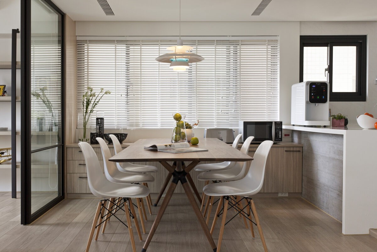
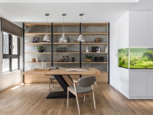
Along the dining area wall, built in storage for dining room accouterments solves any worry over space for entertaining essentials. One could easily use this as a buffet when serving at dinner parties.
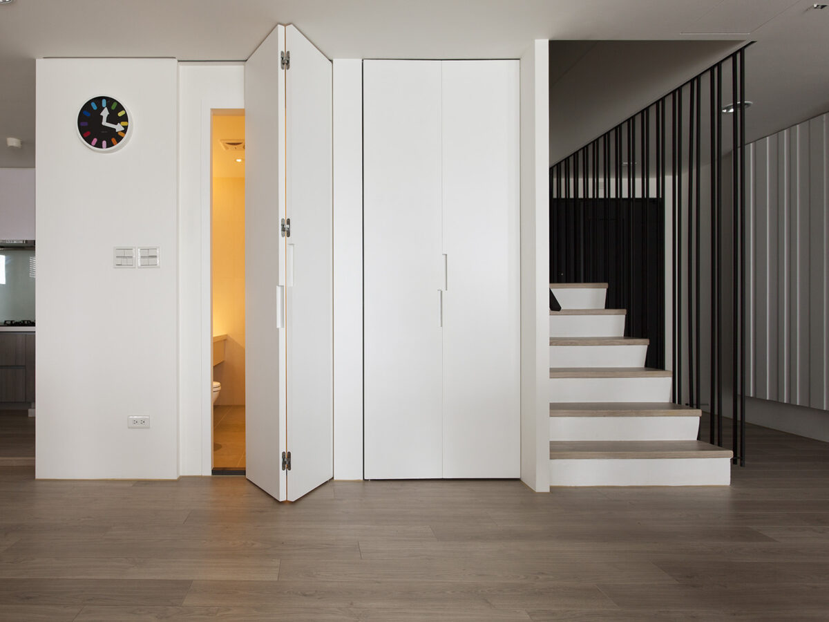
Along the wall next to the staircase, you'll find folding doors to disguise both a guest bathroom and storage space. This hidden approach to two key spaces keeps with the flow of the apartment.
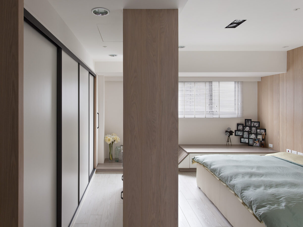
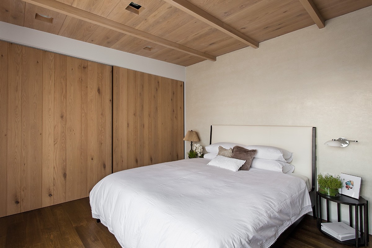
The master bedroom is separated by a large wardrobe, which doesn't make the space feel smaller. Instead it's a smart use of space to add ample storage without taking away from the openness of the rest of the apartment.
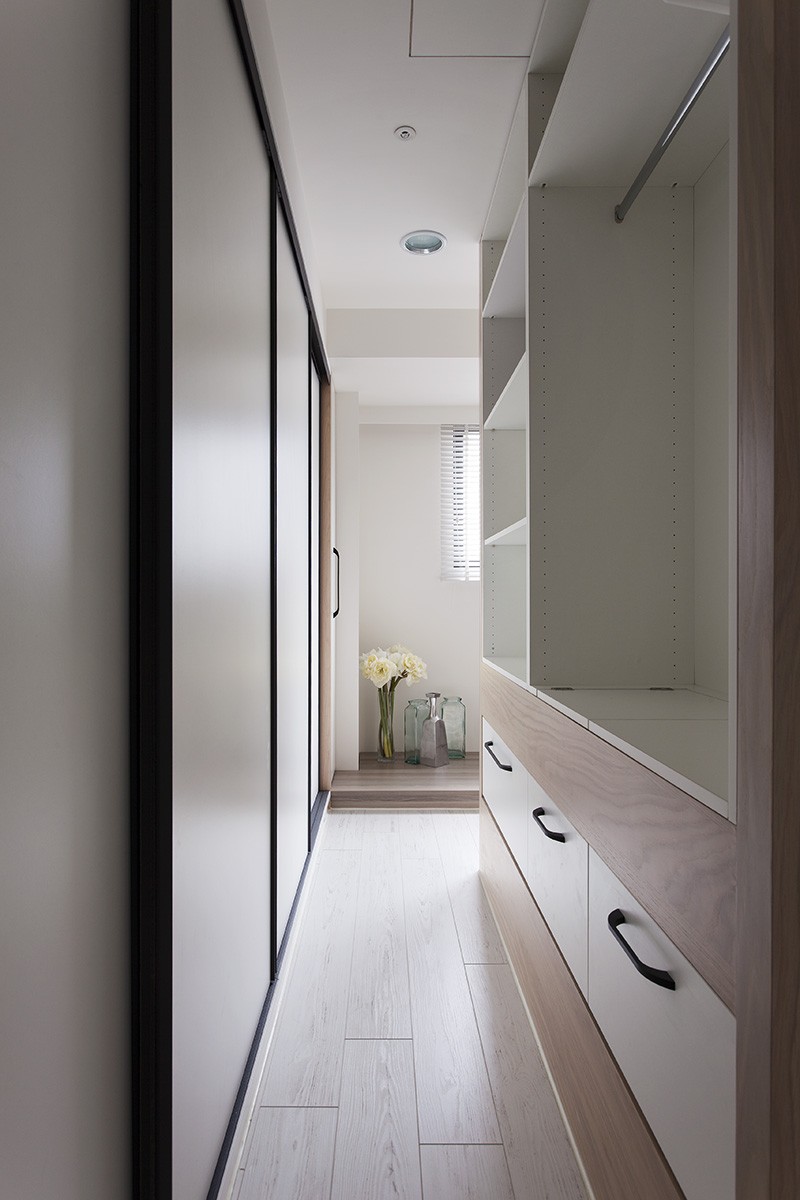
The wardrobe offers sliding closet doors coupled with drawers, open shelving, and a convenient walk through design.
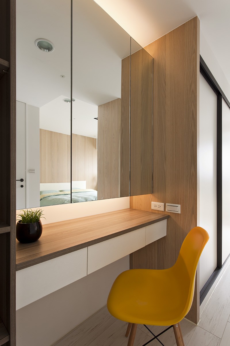
A pop of color in the bright yellow chair at the built-in vanity adjacent to the wardrobe makes the bedroom feel even cheerier.
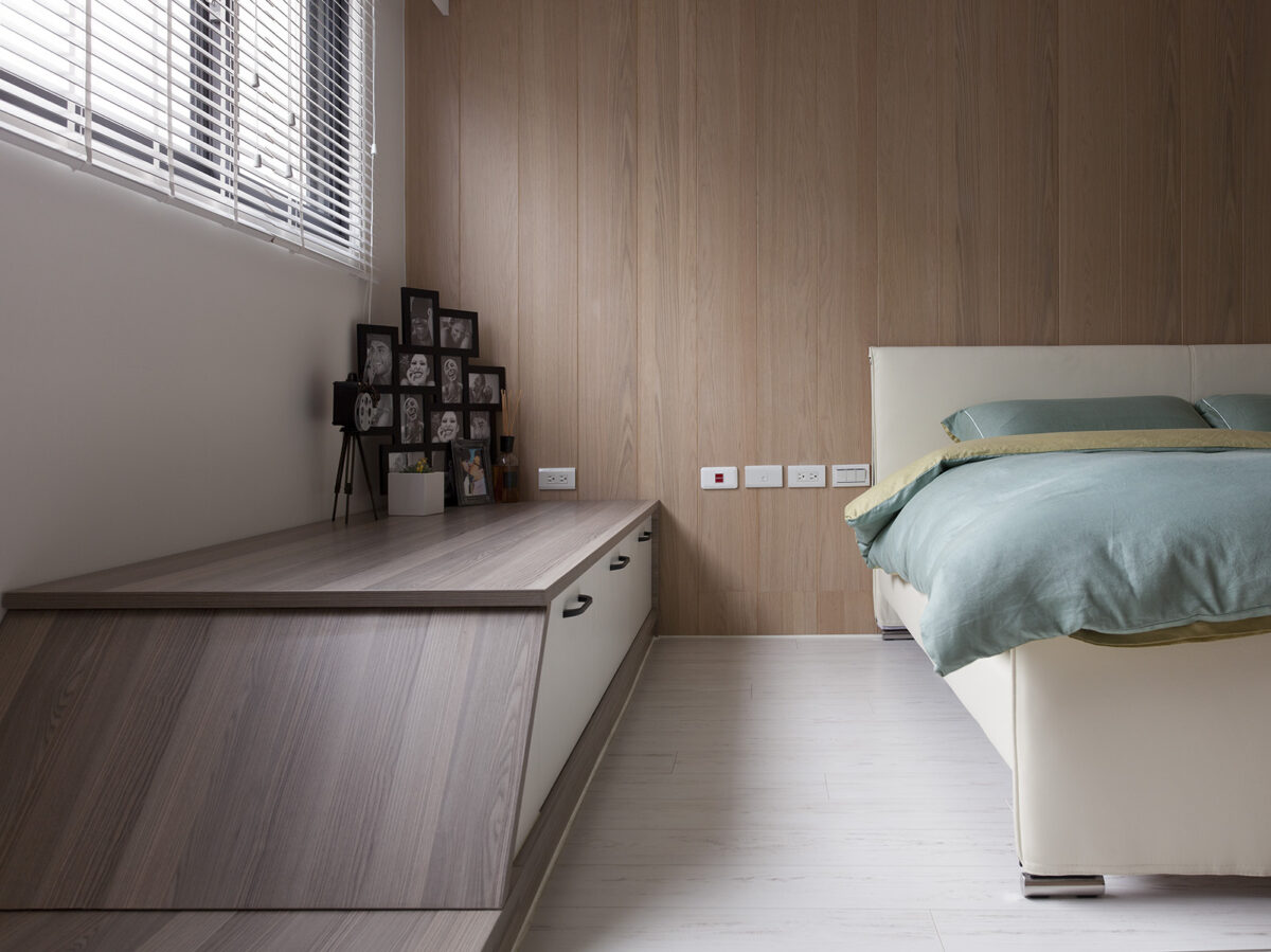
Alongside the bed, a unique slanted storage unit provides additional tabletop space for mementos while minimizing areas for gathering clutter.
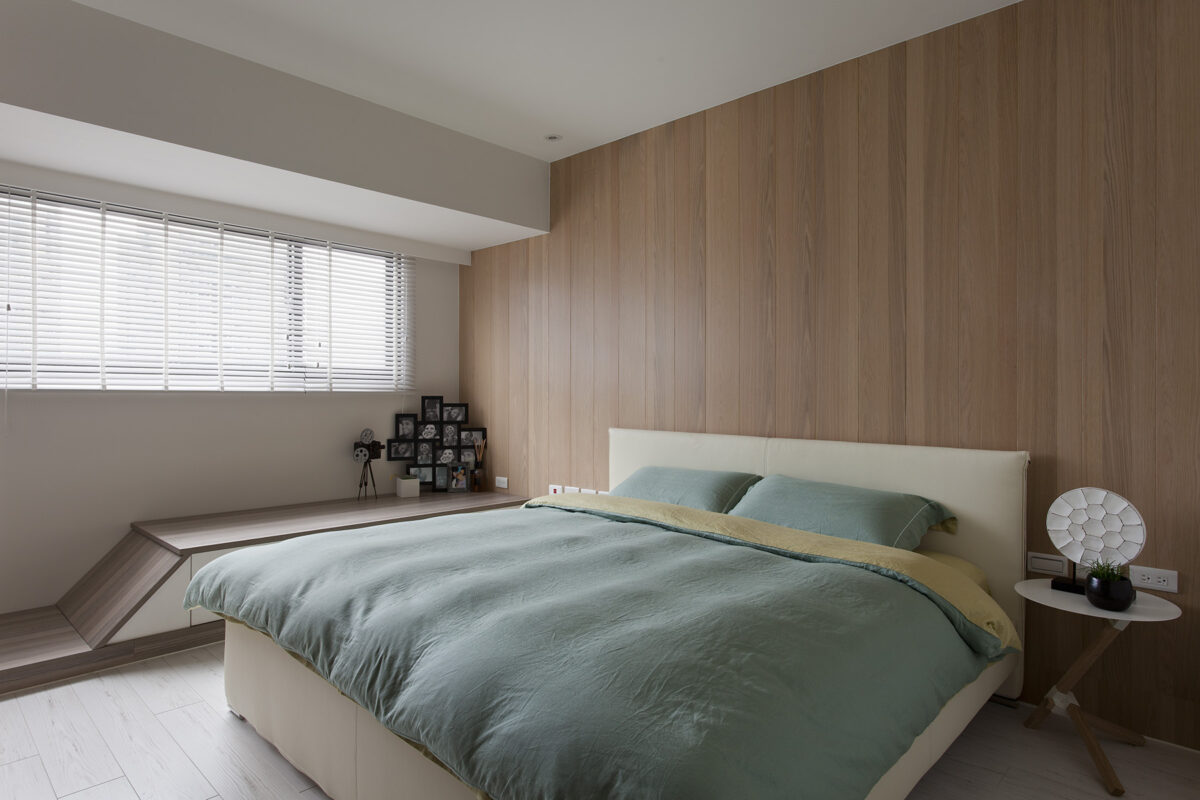
Overall, this apartment is a perfect example of taking an existing space and adapting it to the current occupants' needs for space, storage, form, and function.
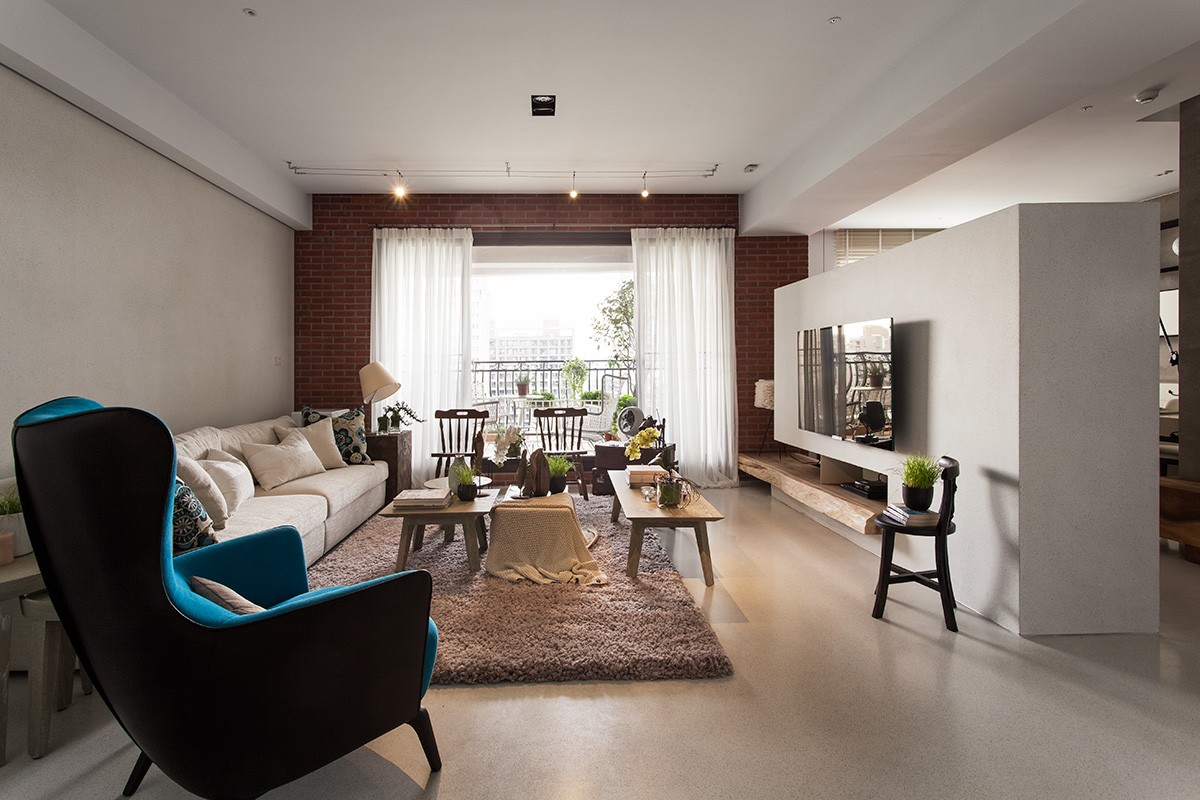
At 1779 square feet (165 square meters), this second house blends together the best of old and new. Located in the Taichung Nam Theun area of Taiwan, it's a new home that has a very whimsical look and feel, ideal for a family or one who appreciates the beauty of contemporary mixed with classic. The details throughout this three bedroom home give it a one of a kind charm that's easy to appreciate. Upon entering, you're greeted by a bright blue wall that sets the tone for the rest of the home.
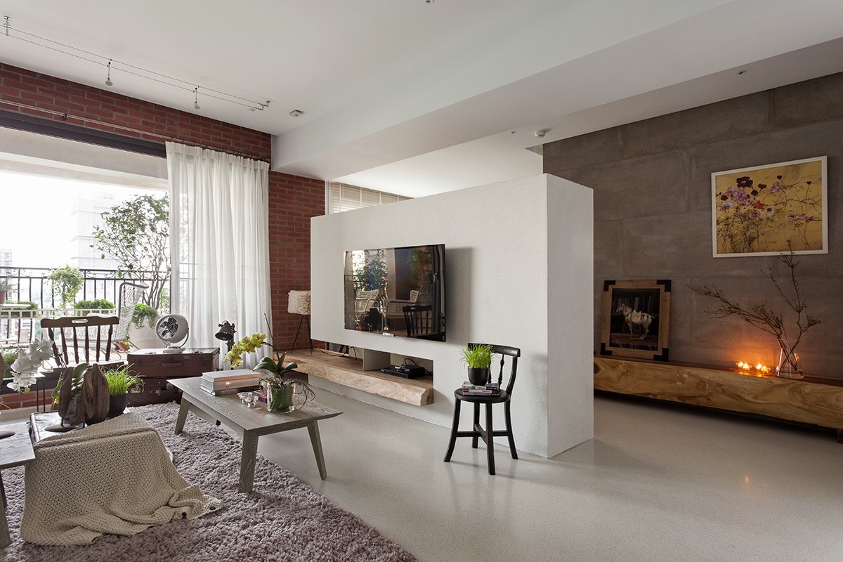
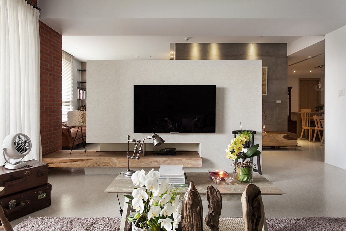
The living area showcases a red brick wall that gives some texture to the space. A built-in TV/media center acts as a room divider while keeping an open floor plan feel. The bright pop of blue from the chair echoes the blue in the entranceway, plays with the red of the brick, and gives a liveliness to the otherwise mostly white room. The plush rug, classic wood chairs, and smooth natural woods used as shelving lends softness to the clean, modern lines used throughout the rest of the design.
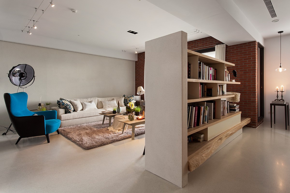
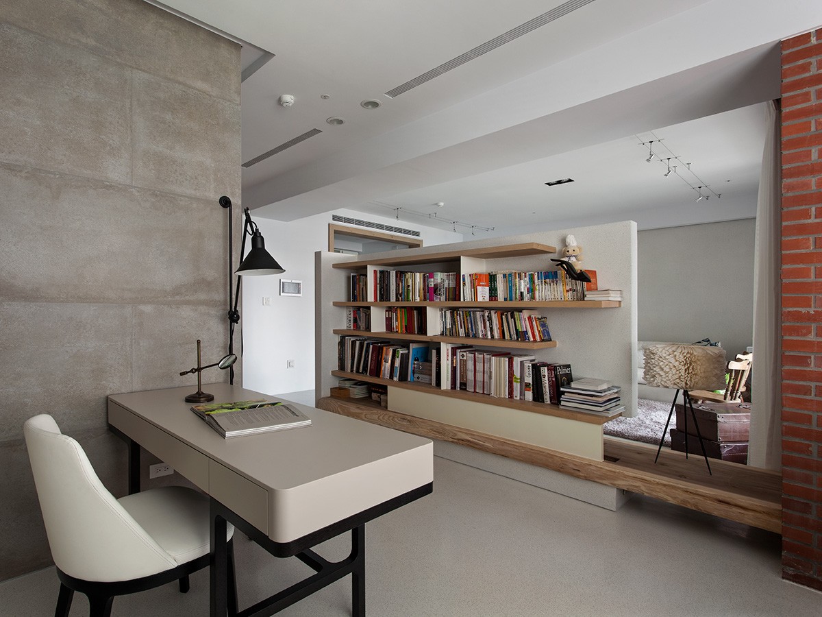
Behind the media center, clever book shelving - including a natural wood ledge - gives extra storage space to the main living area. We especially love the touches of an antique-inspired desk lamp on the coffee table, vintage suitcases as a unique end table, and a modern floor lamp next to the cozy-looking couch.
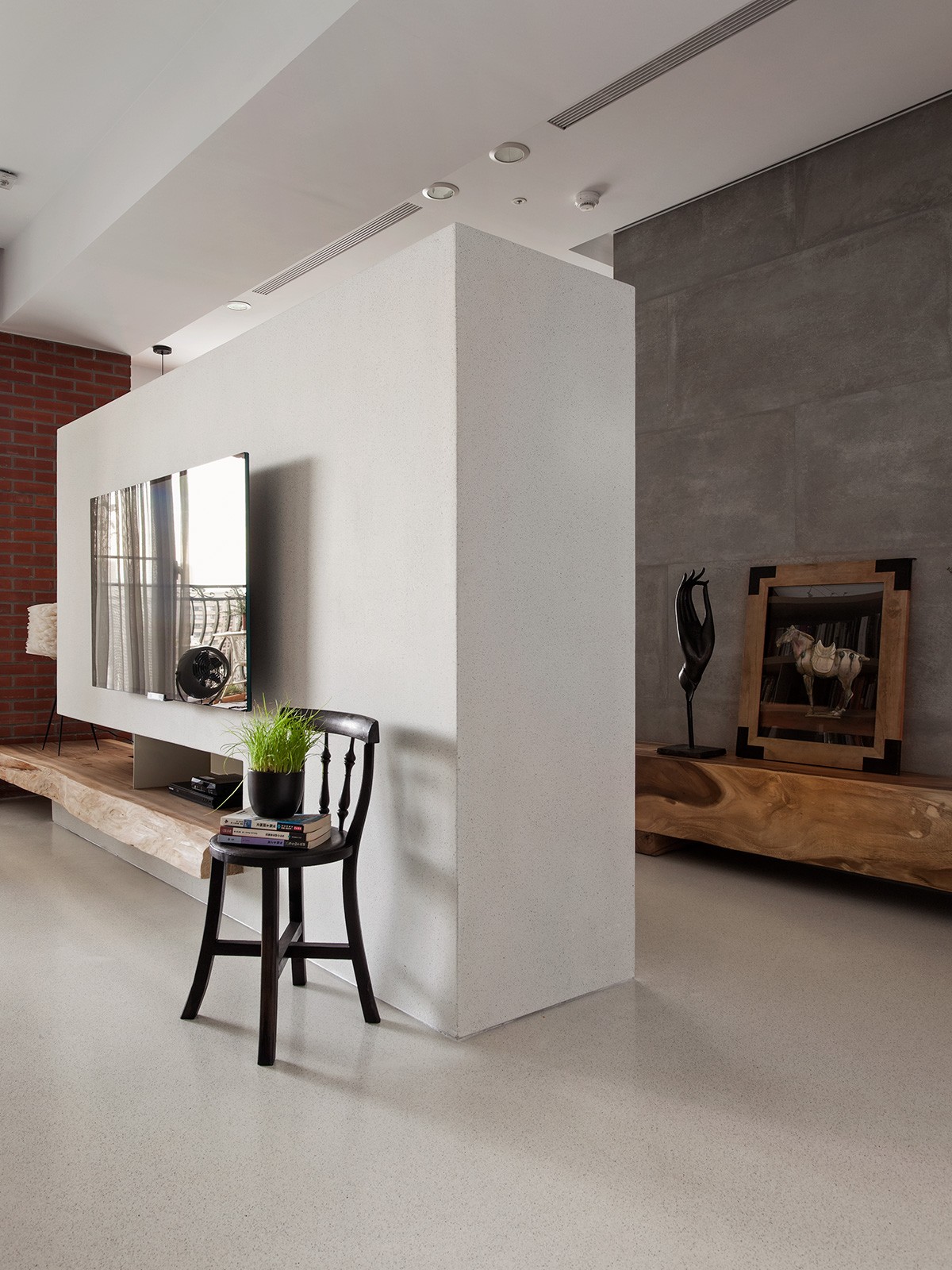
Each decorative item and piece of furniture is carefully considered and placed, making the space feel organized without being cold. Everywhere you turn, there's a sense of welcoming.
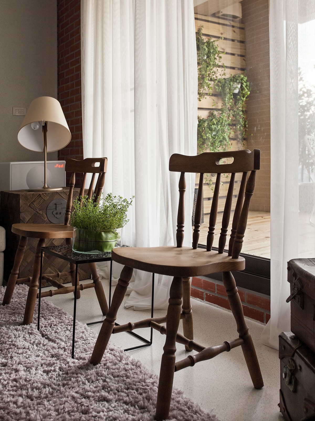
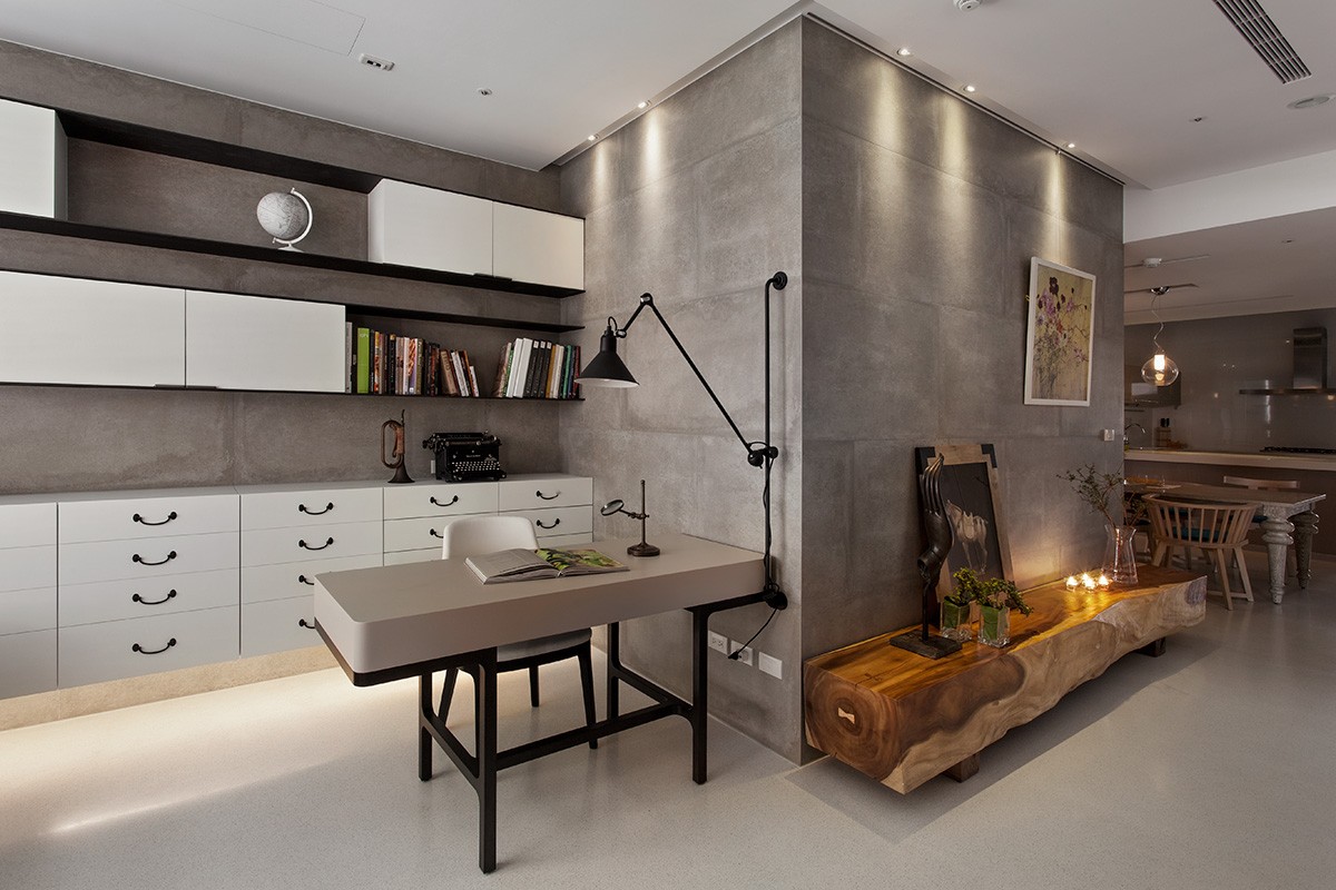
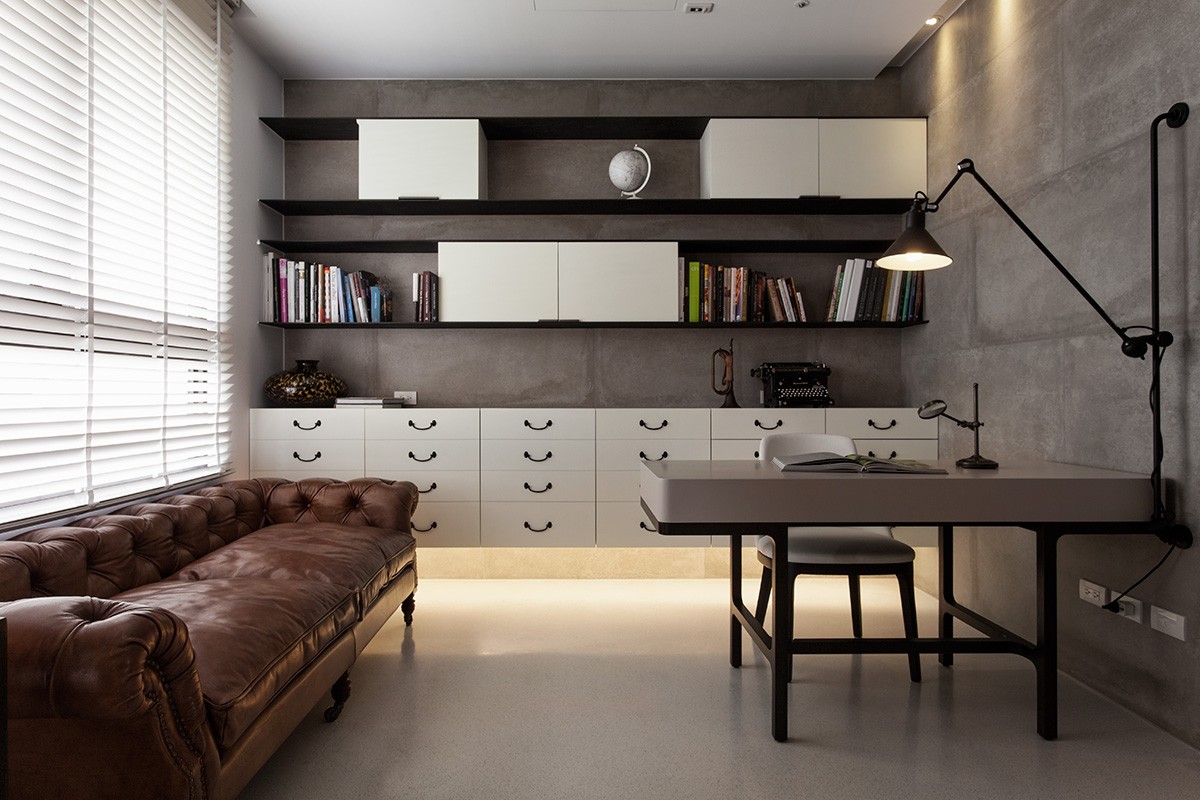
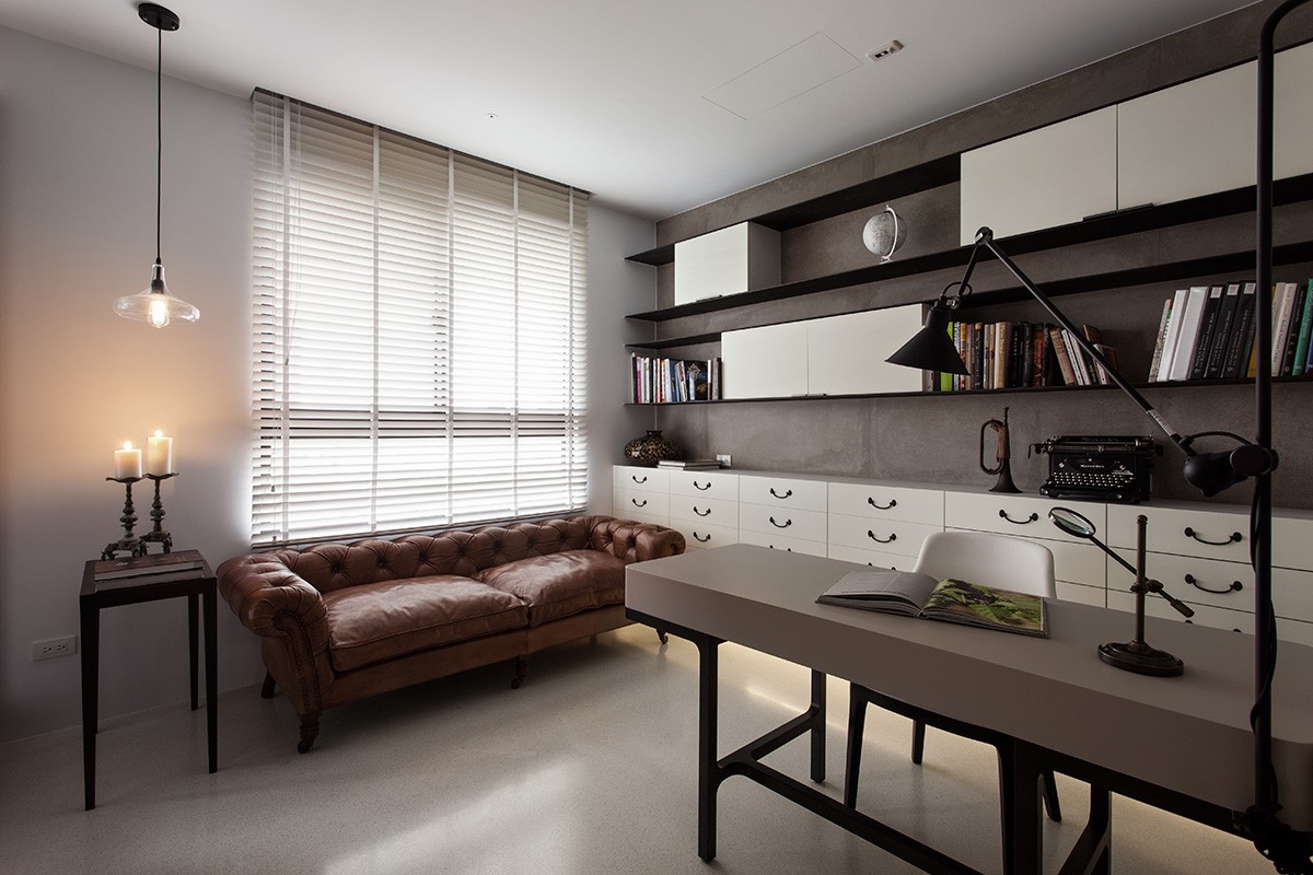
In the study, an old fashioned typewriter, tufted leather couch, and tons of storage make for a workable space that could be perfect for writing, drafting, crafting, or any other activity. It's easily accessible off of the main living area, making it a convenient workspace.
Easy access to the shelving behind the media center is a smart use of space without disturbing the open feel and flow. The connected desk lamp adds a slightly industrial touch.
One of the more unique features of this house is the smoothness on the walls and floors. Like a concrete, it has a matte finish that's both attractive and practical.
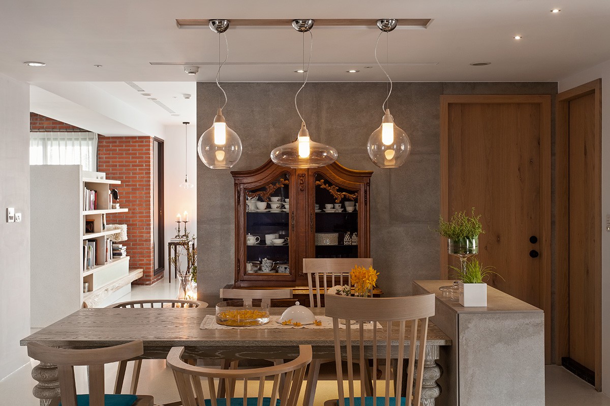
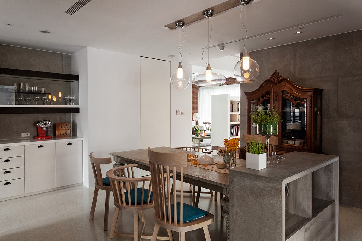
There's a slight rustic feel to the space with a farmhouse-inspired table, mismatched seating, and warm wood accents.
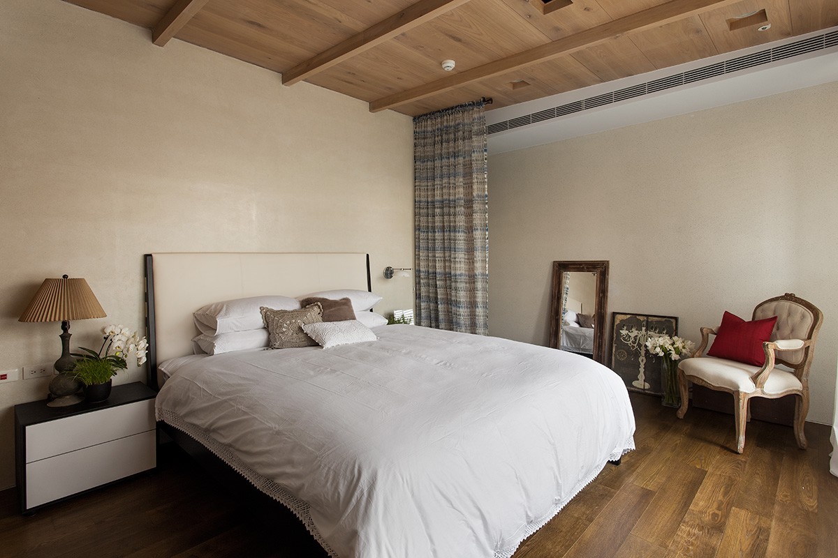
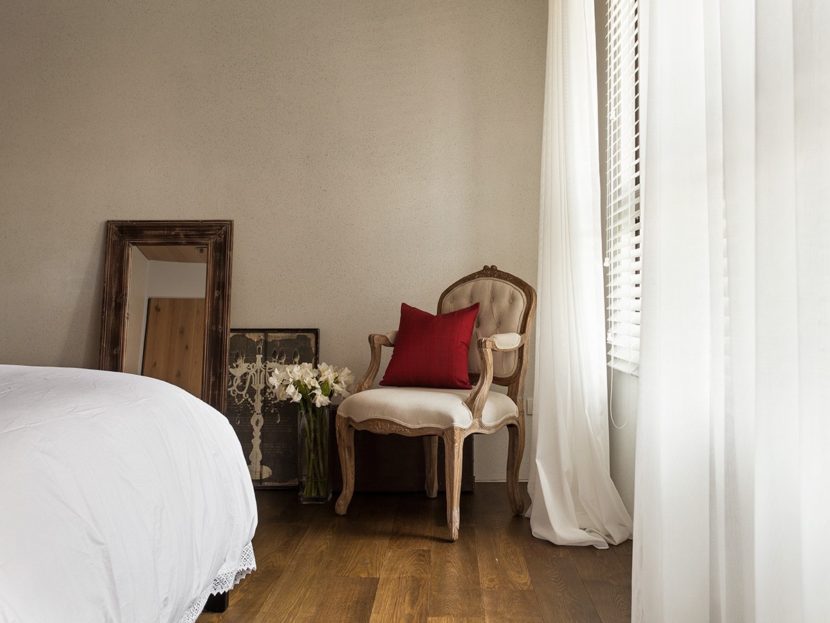
The master bedroom has a cottage feel with striking wood floors and wood beams along the ceiling. Romantic touches like a feminine chair in an antique style, fresh flowers, and soft textiles make this space feel warm and inviting. It is cozy and modern without being shabby chic.

