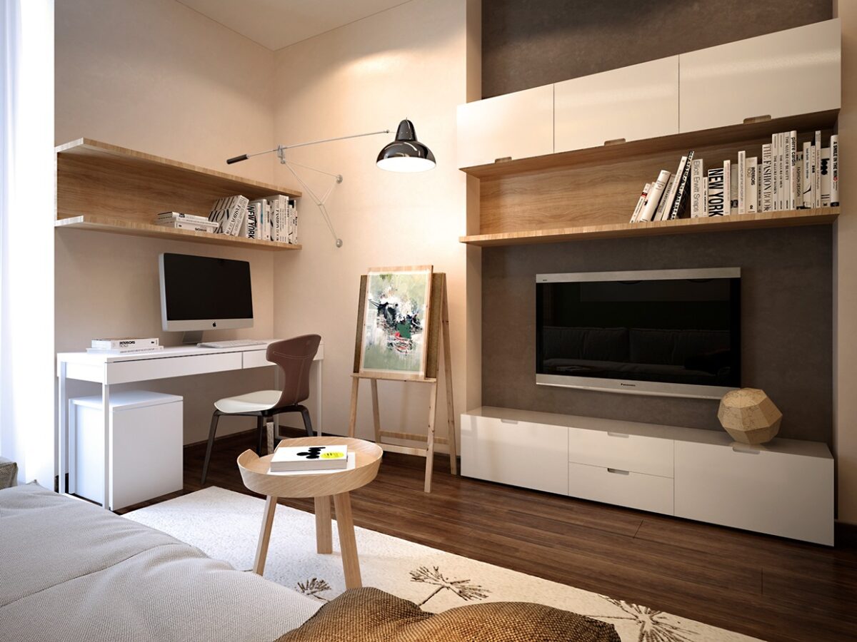
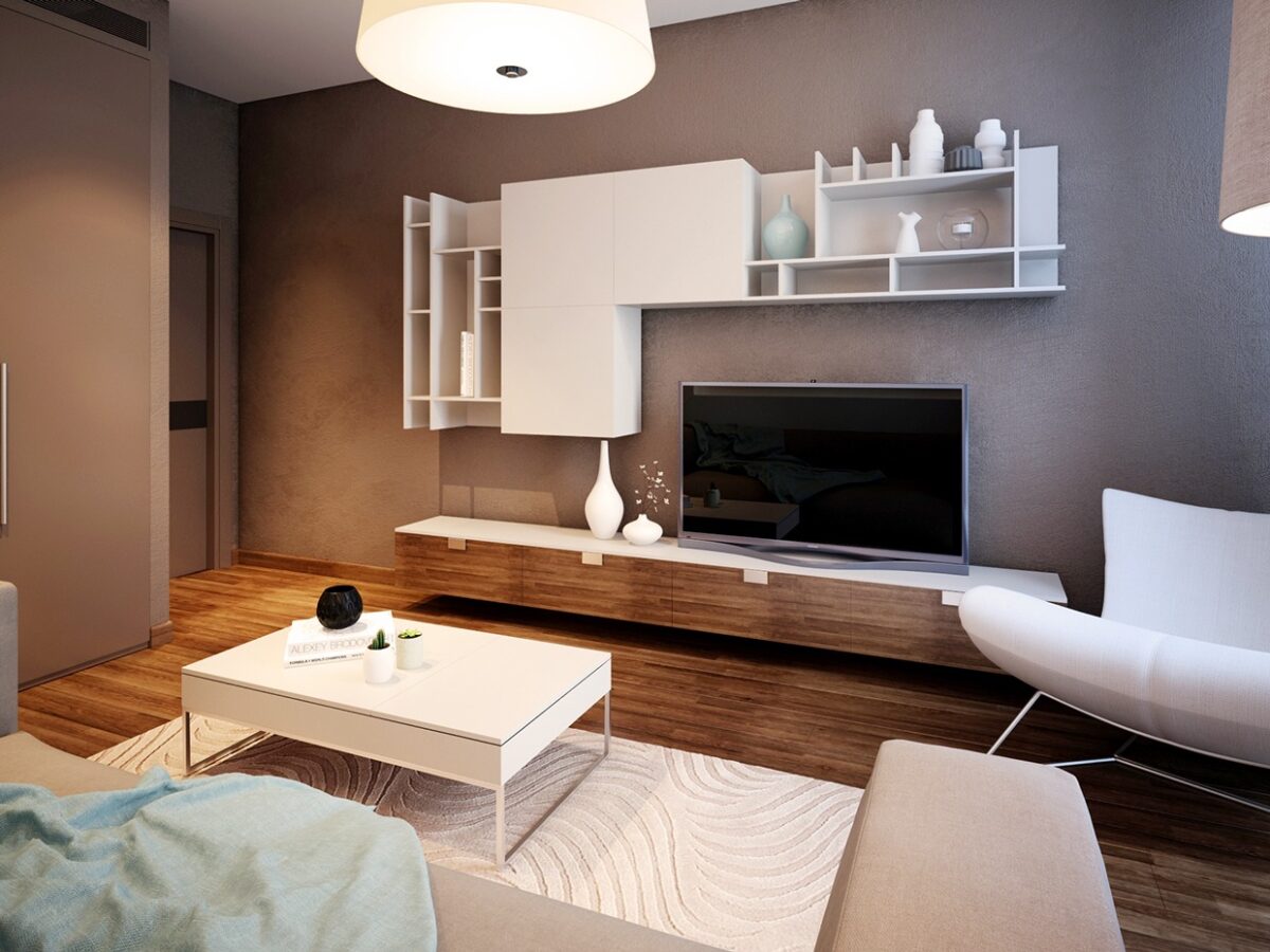
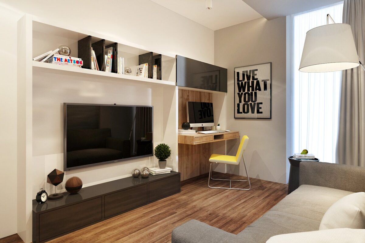
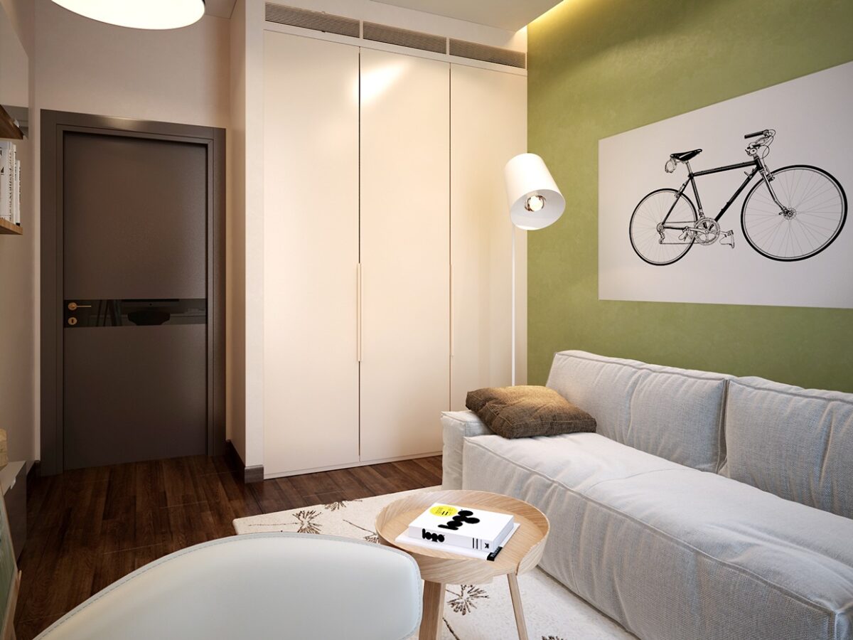
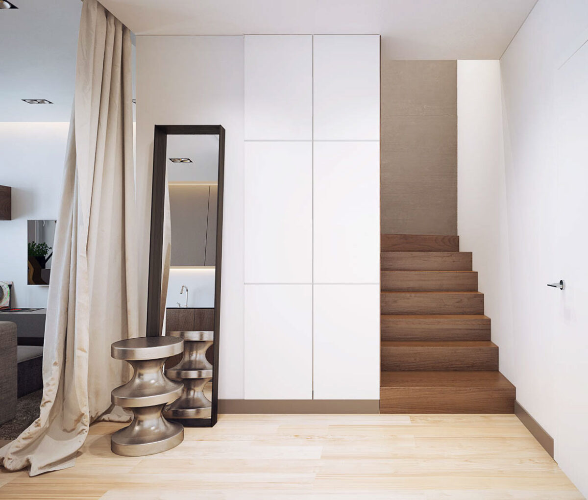
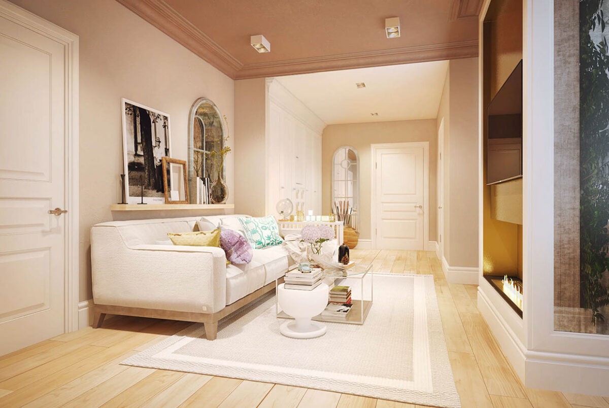
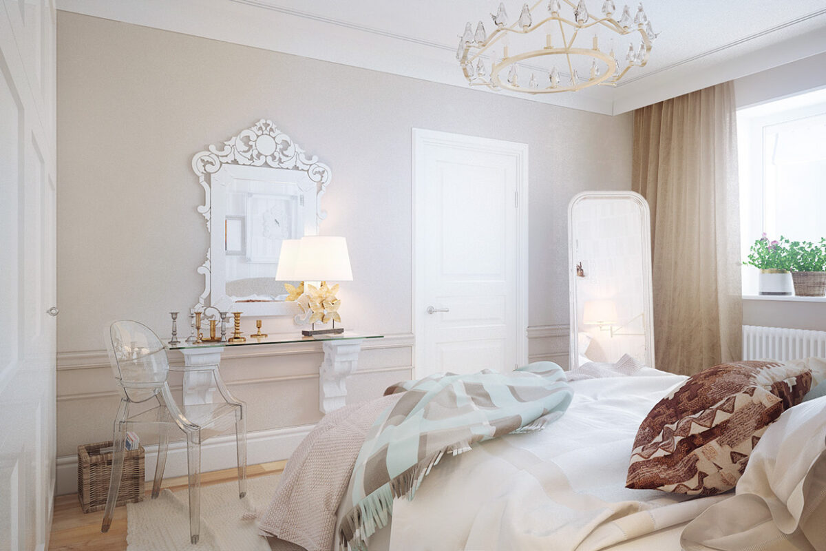
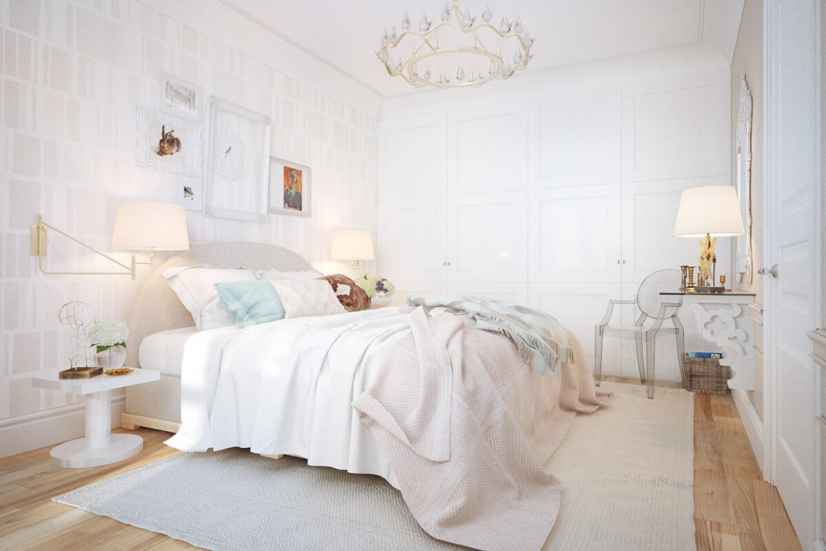
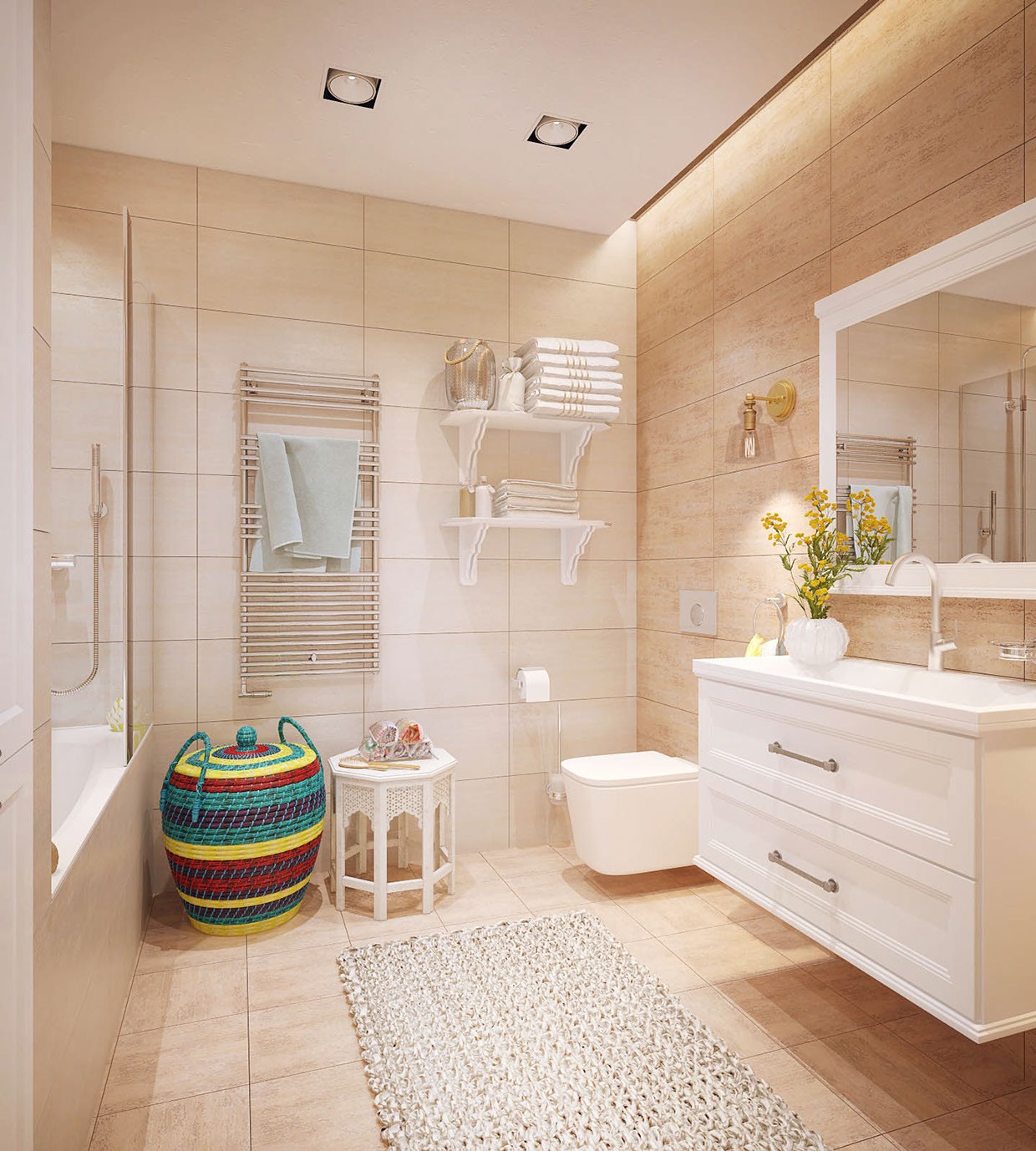
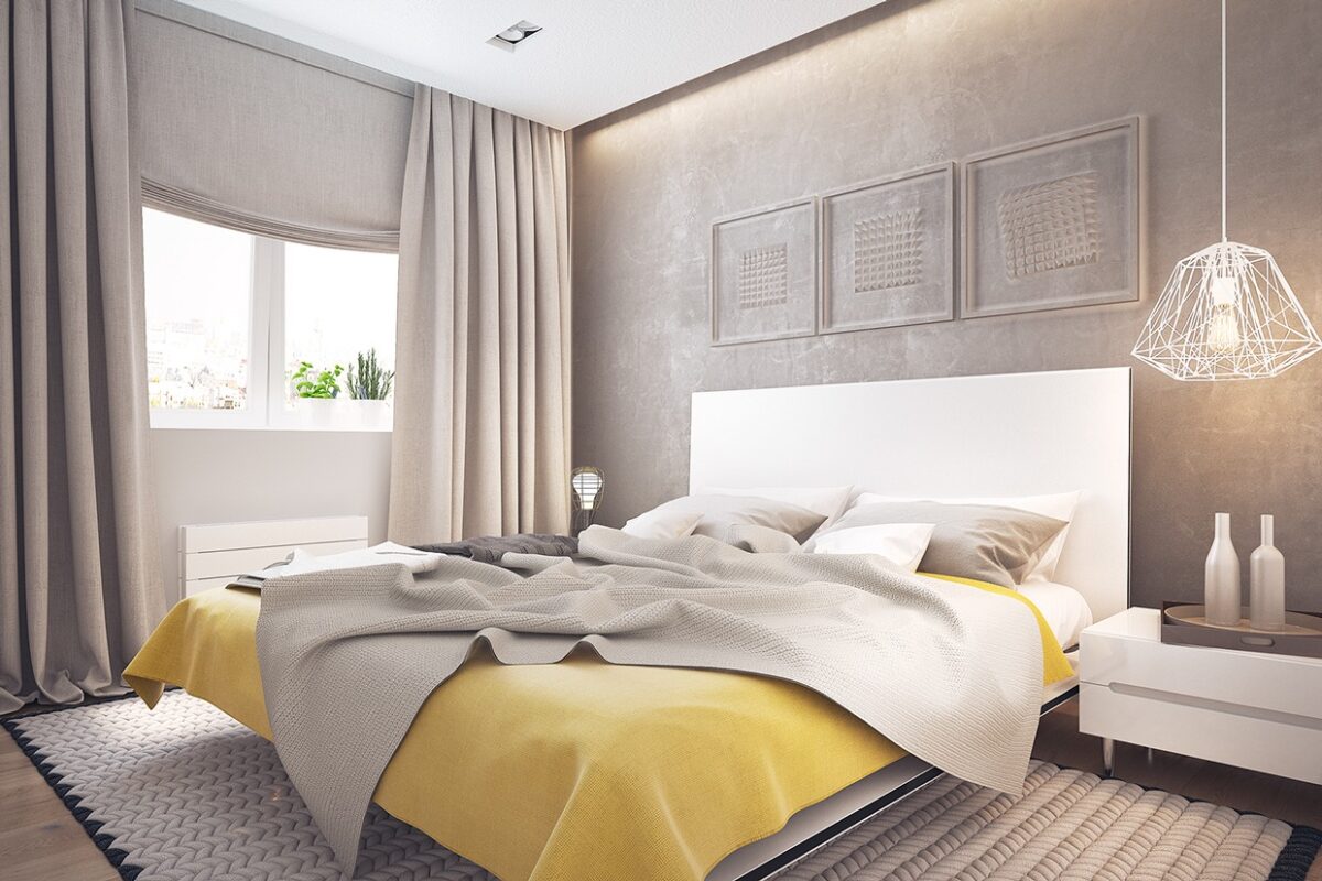
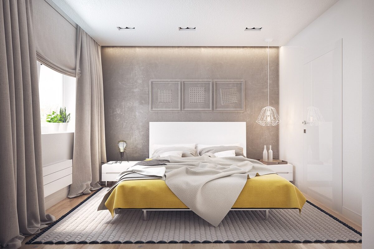
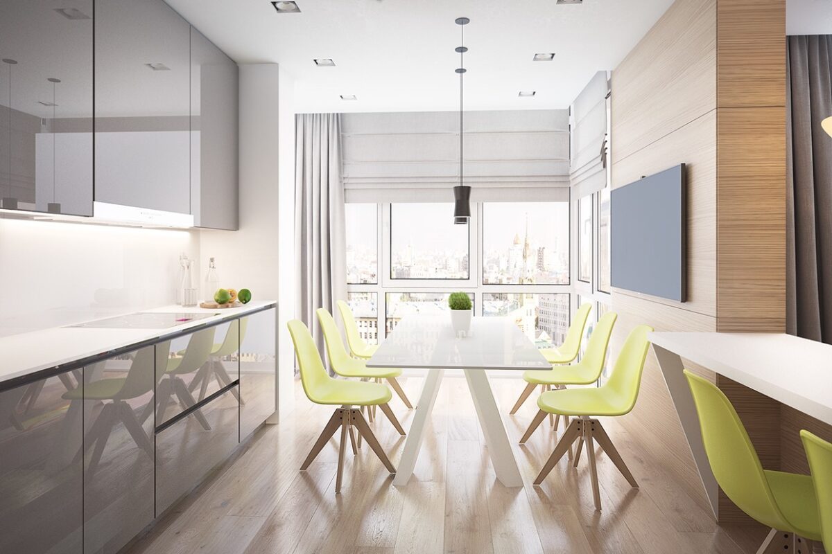
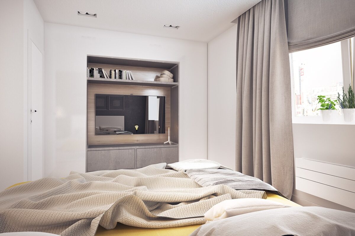
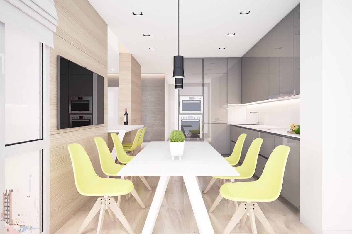
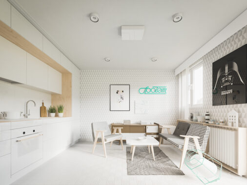
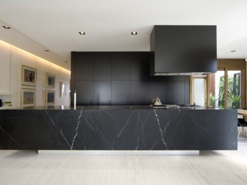
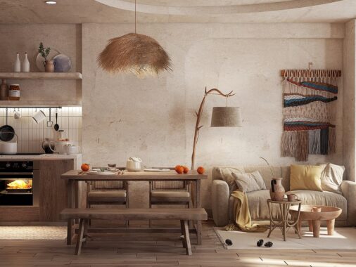
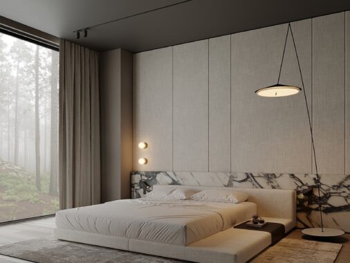
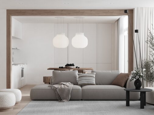
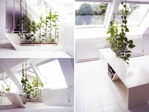
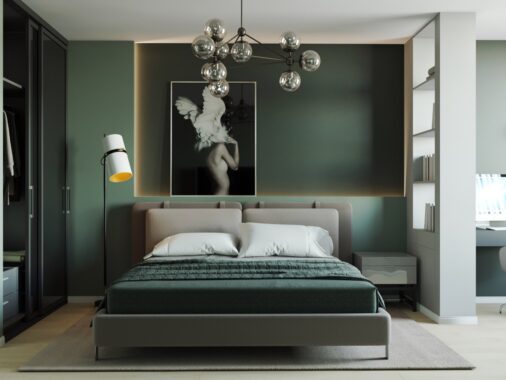
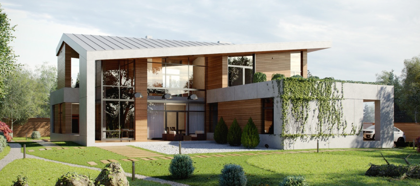
All interior designers want to create a space in which the furnishings, floorings, colors, and light exist in harmony. In the cold and sometimes dismal climates of Russia and Ukraine, the use of natural sunlight is that much more important. But interior designer Pavel Voytov manages to create spaces that feel as bright, sunny, and welcoming as any warm summer day. The designer uses many elements of modern design, including clean simple lines and limited color palettes, to create beautiful homes that are beautiful, modern, and also livable. In this post we will take a look inside eight of his designs for a big picture overview of his style and technique.
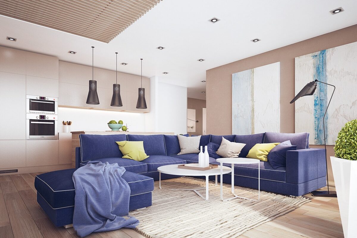
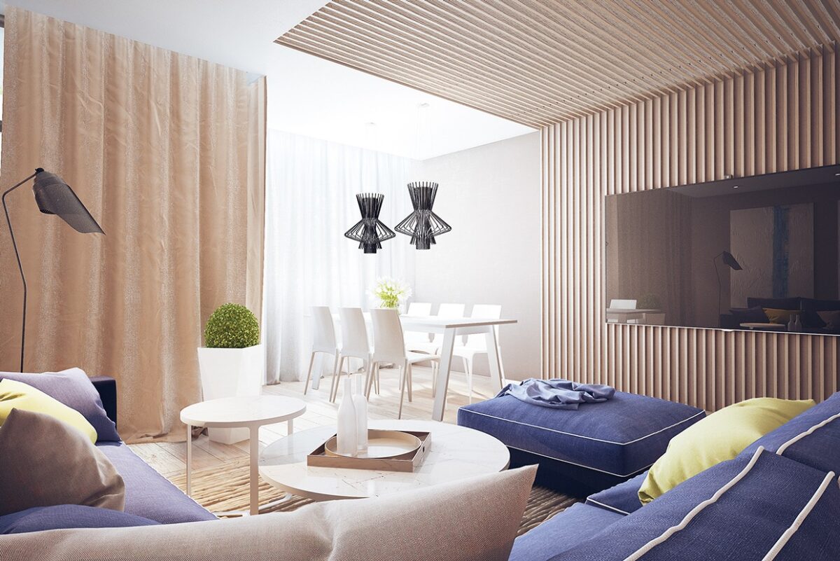
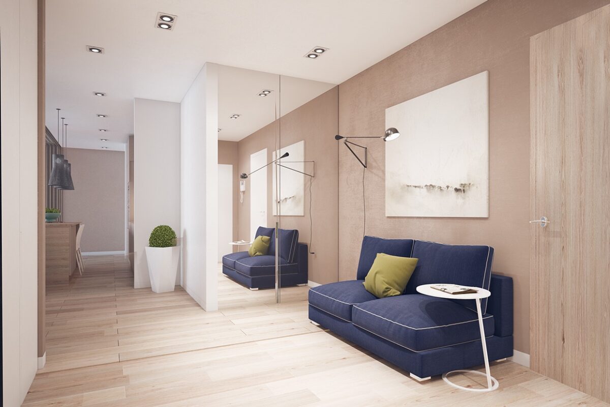
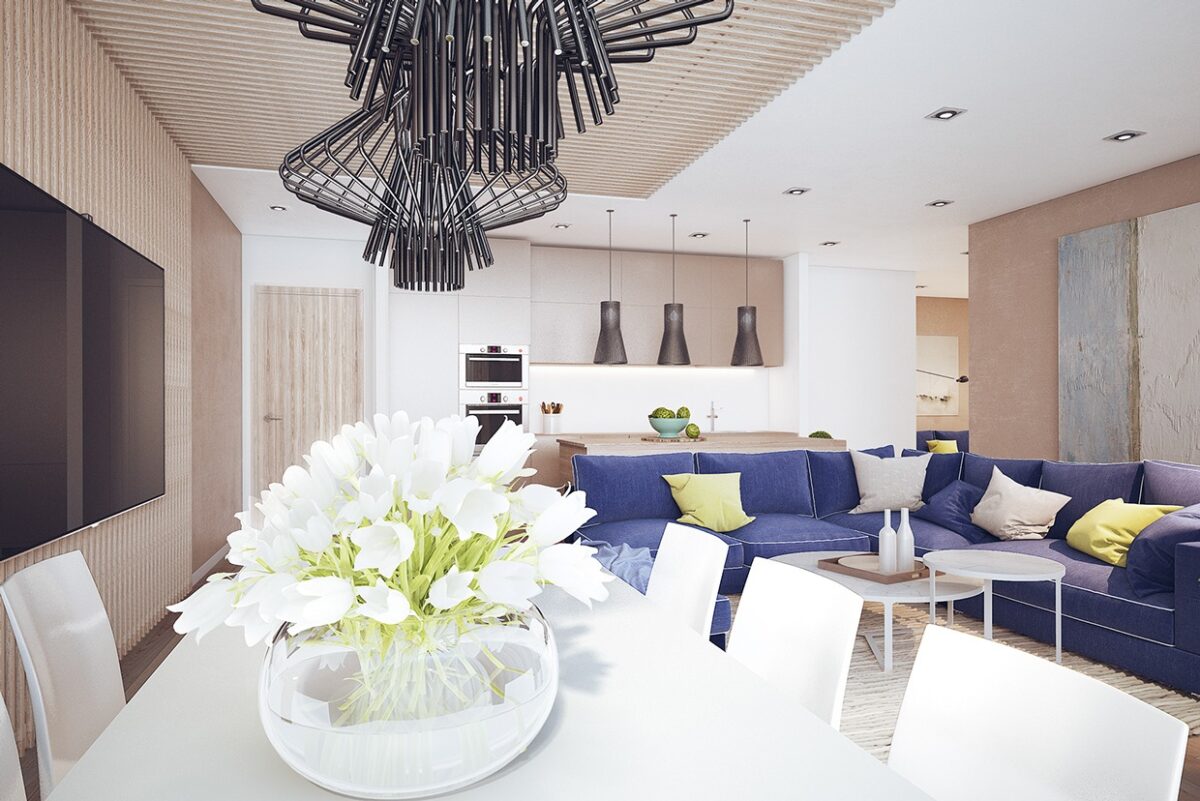
The first home makes creative use of vibrant colors, beginning with a luscious royal blue sofa in an otherwise calming, neutral living room. The blue couch living room also uses the interesting textures of wood paneling with the accent wall where the television is displayed.
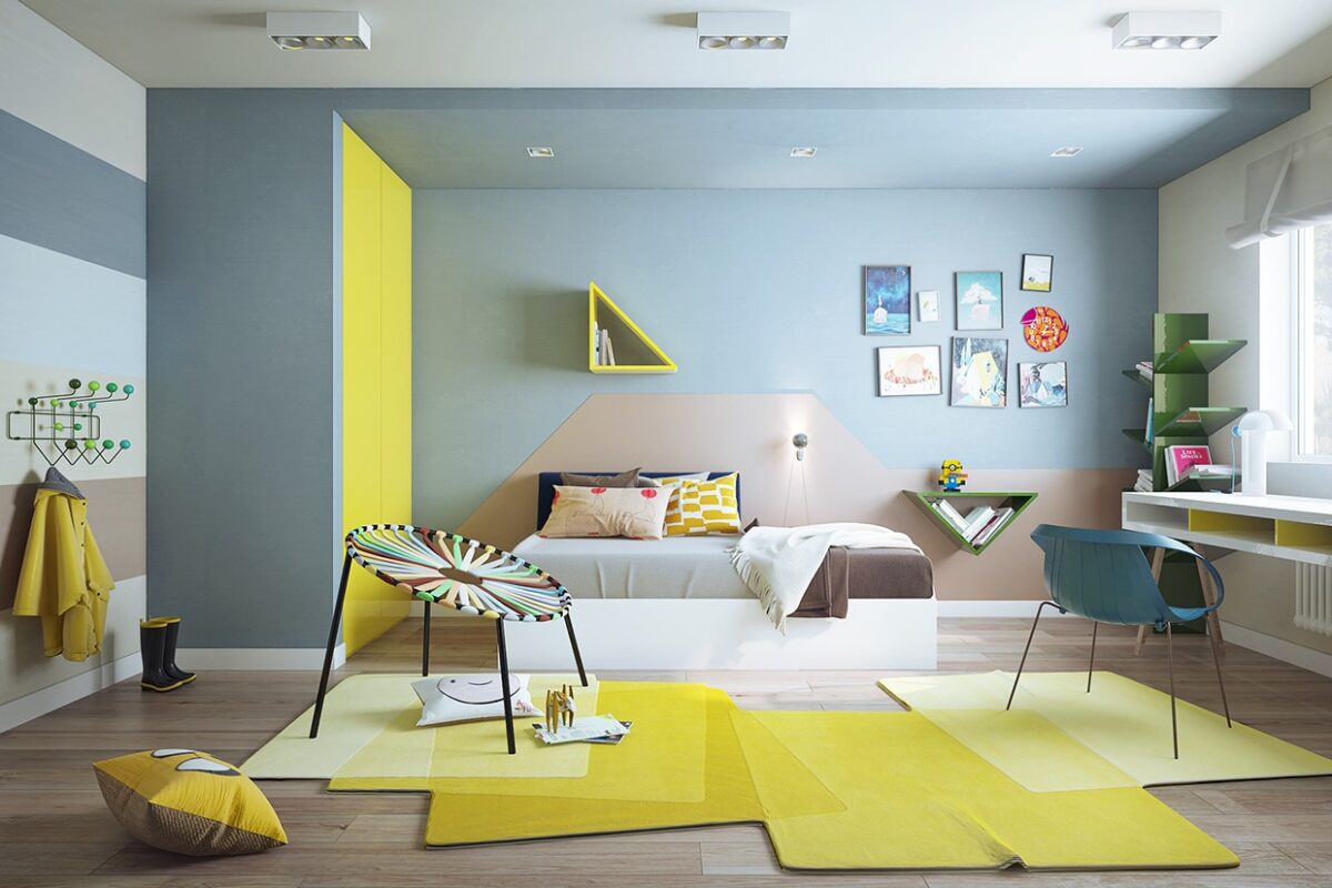
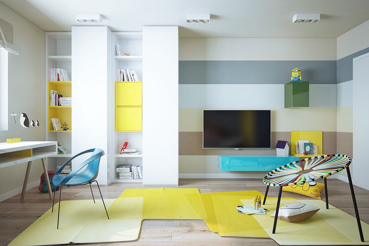
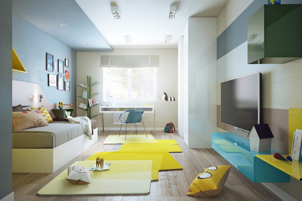
In the kid's room, the shocks of color don't stop with bright splashes of yellow and teal, inspired by Cartoon Network favorite Adventure Time. The room also includes a requisite workspace for homework.
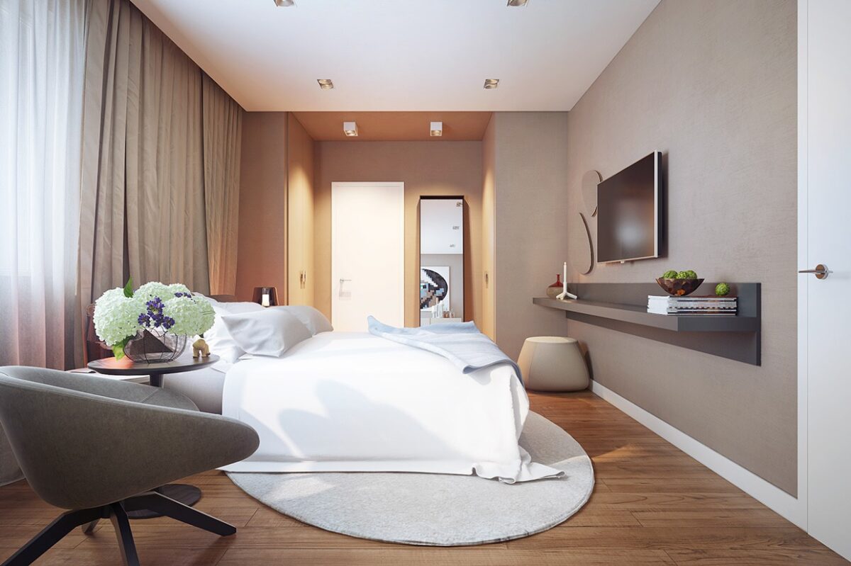
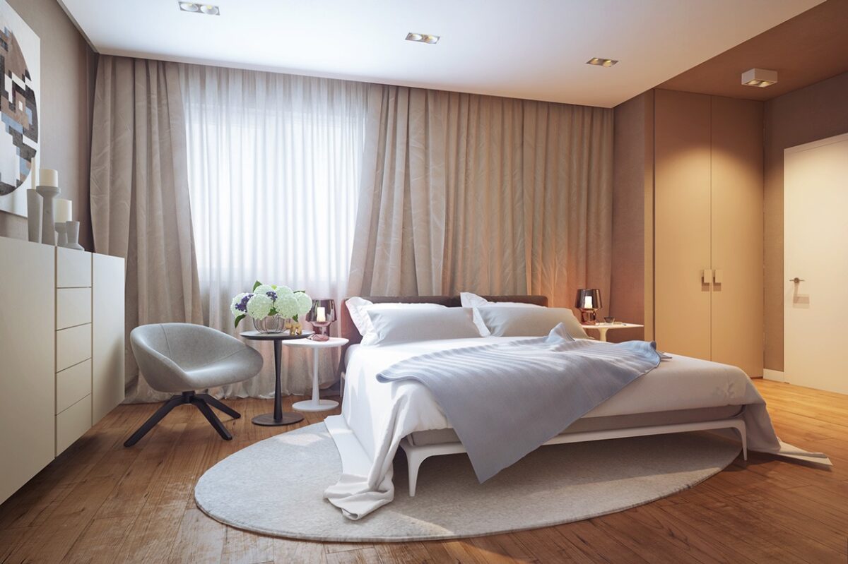
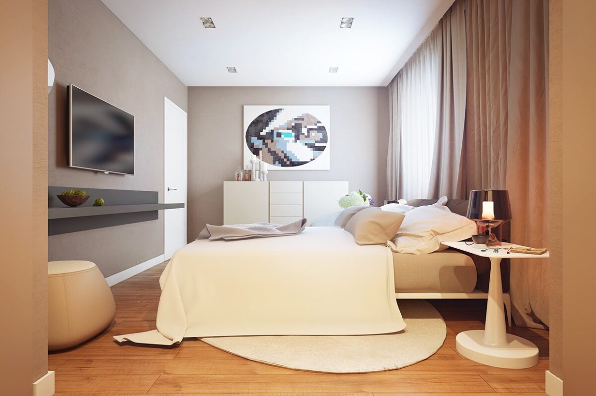
In the parent's bedroom, color are much more subdued with whites and beiges falling from the soft heavy curtains and ending in the pristine hardwood floors. Though the design of this home is certainly modern, it never feels uncomfortable or cold.
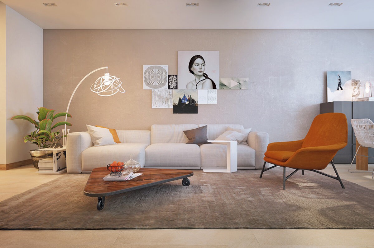
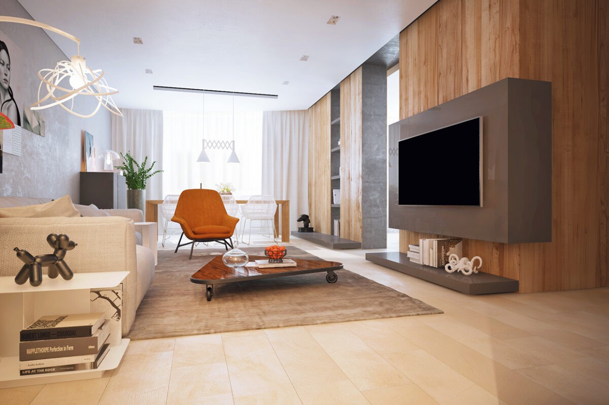
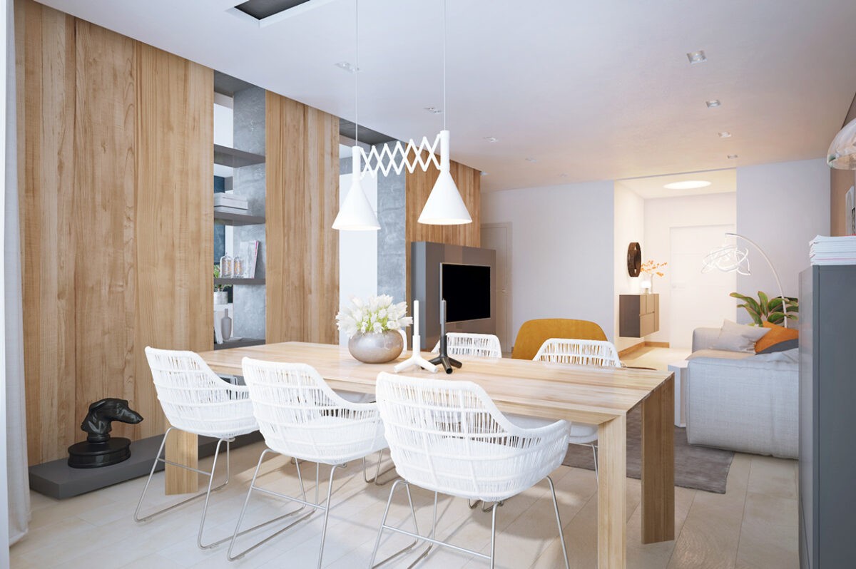
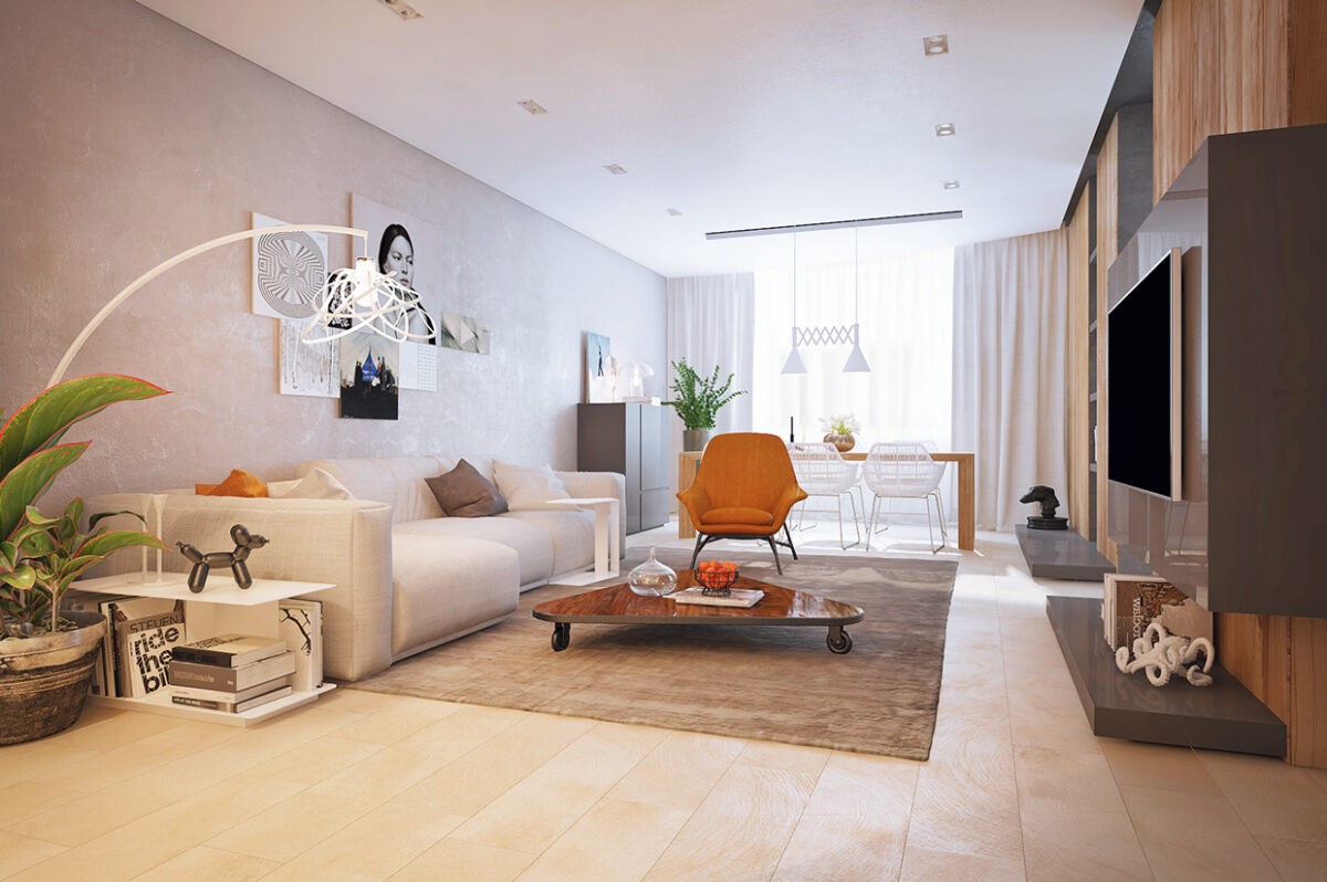
The second home uses many of the same elements of simplicity, but takes a more subtle approach towards color. The living room in this open floor plan design is largely neutral, with just a bit of a nod to brightness with its rust colored armchair. It's the perfect allusion to the fabulous interiors of the 1970's without going so far as to feel antique or overdone.
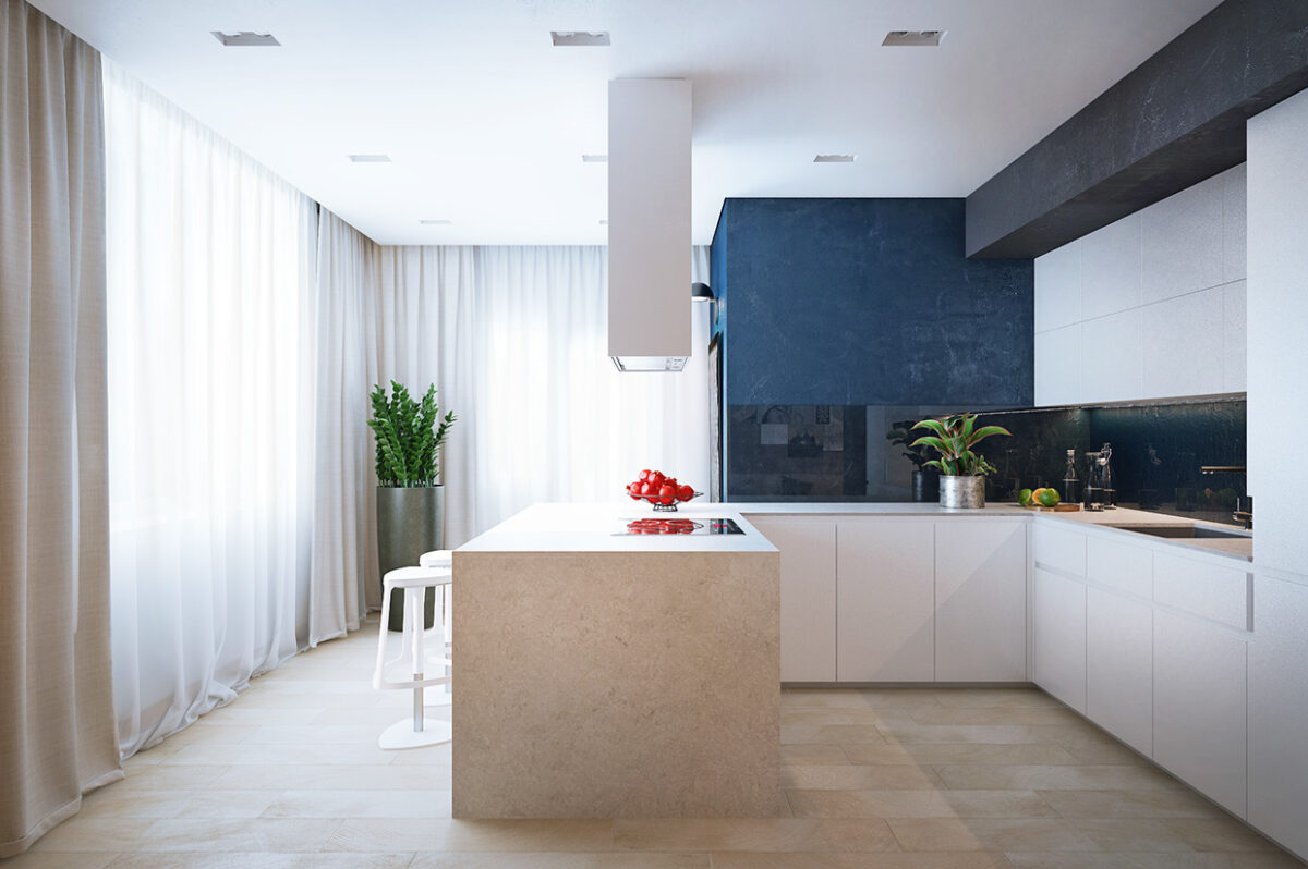
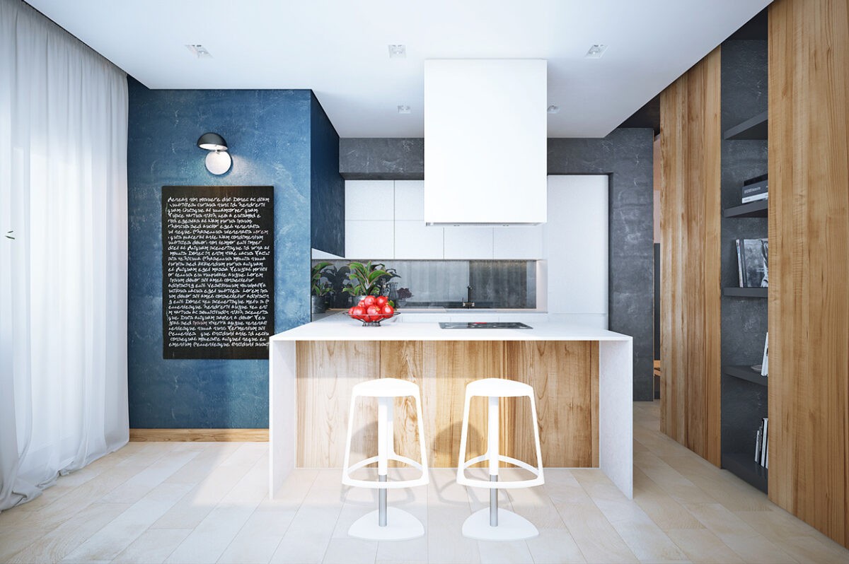
This kitchen uses white and light wood, along with pretty, gauzy curtains to give the homeowner a beautiful spot to start the day. The breakfast bar is just as much as kitchen island, making it an easy place to pause for a drink or gab with the chef from the comfort of modern swivel bar stools.
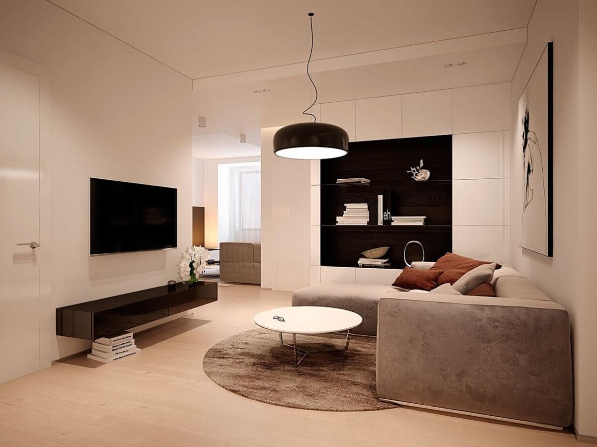
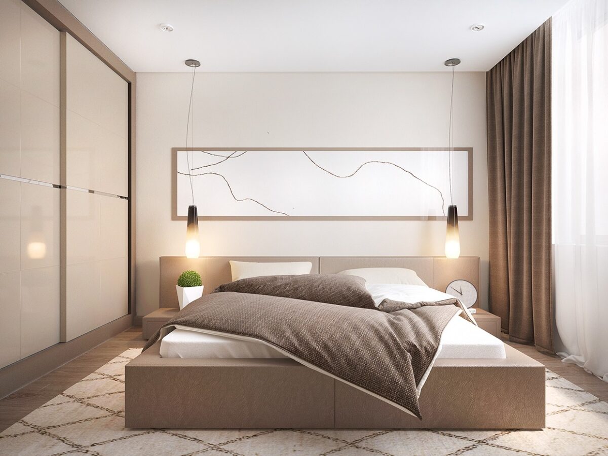
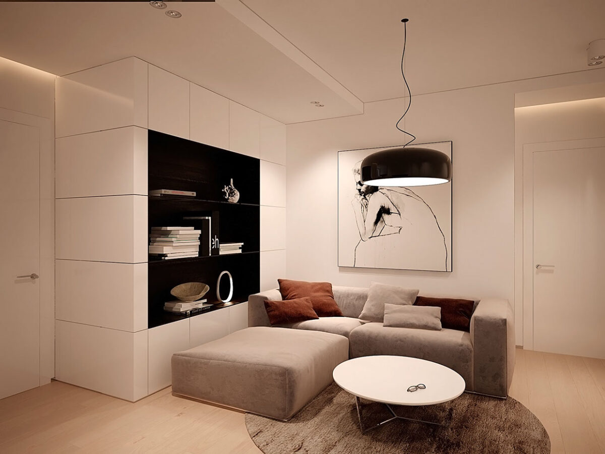
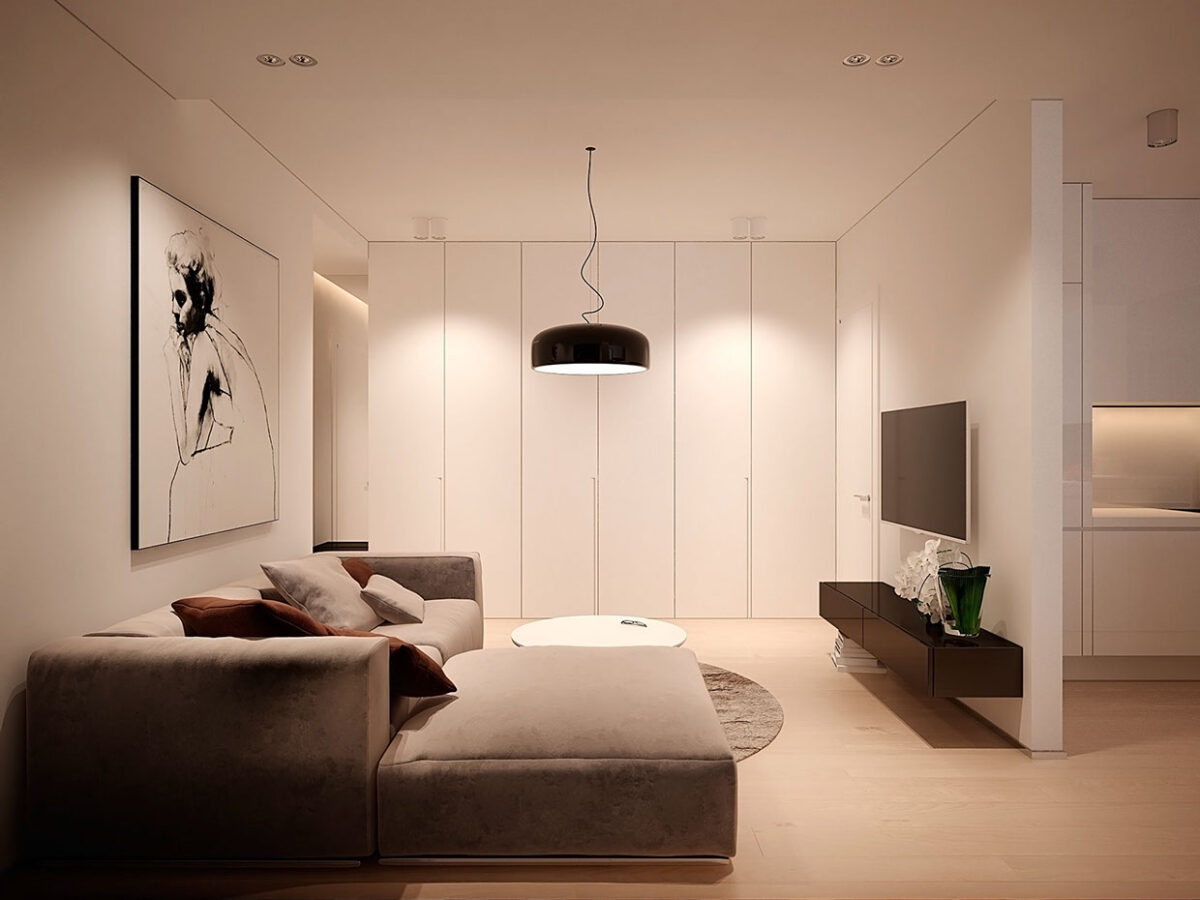
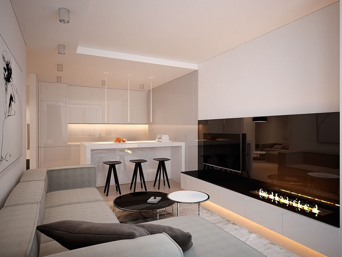
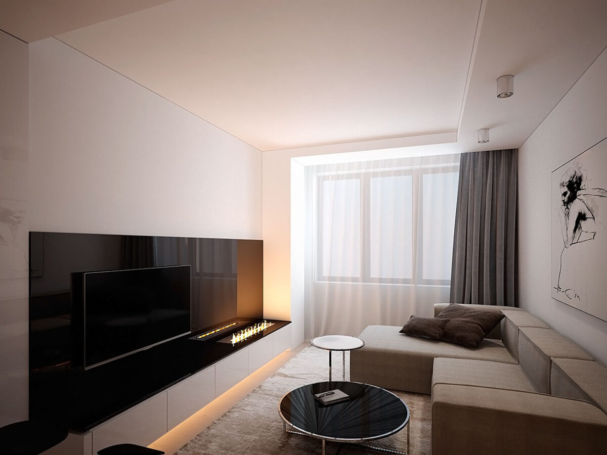
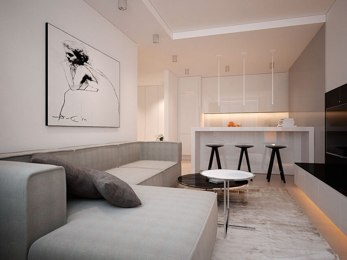
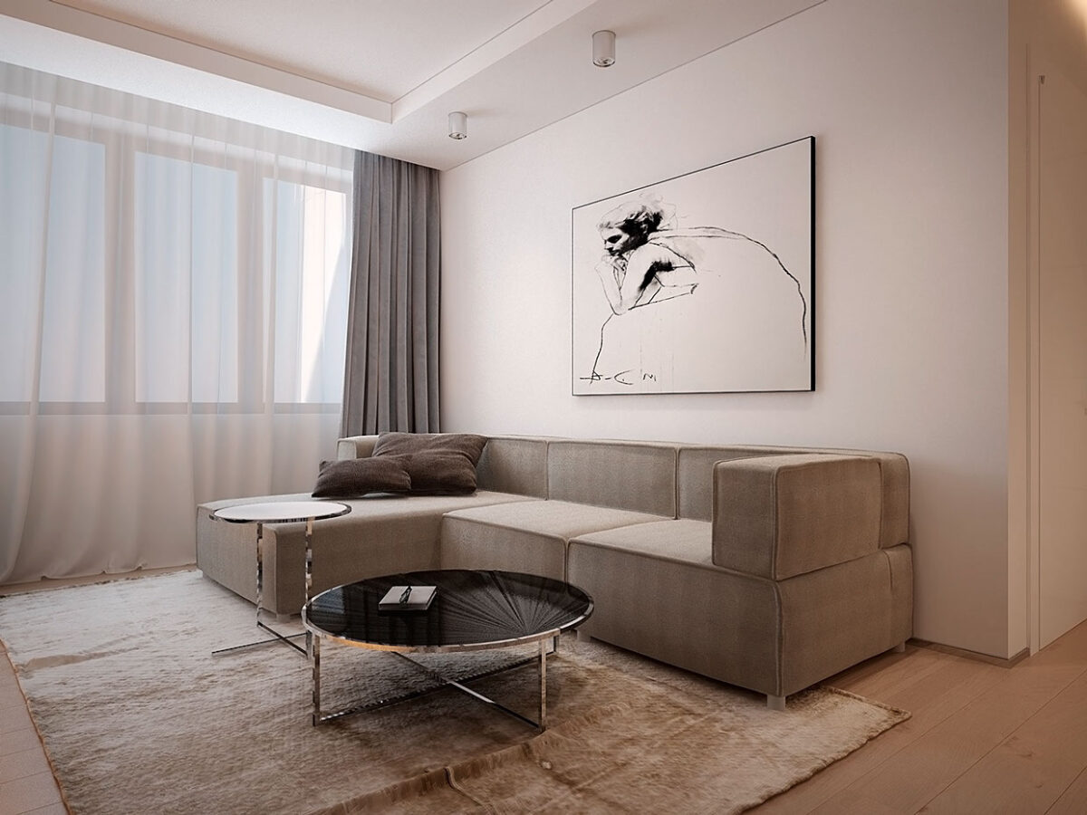
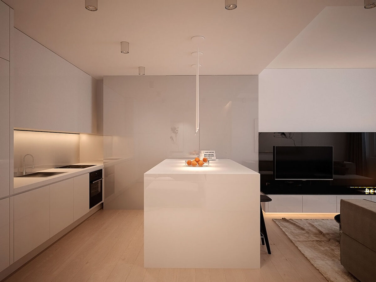
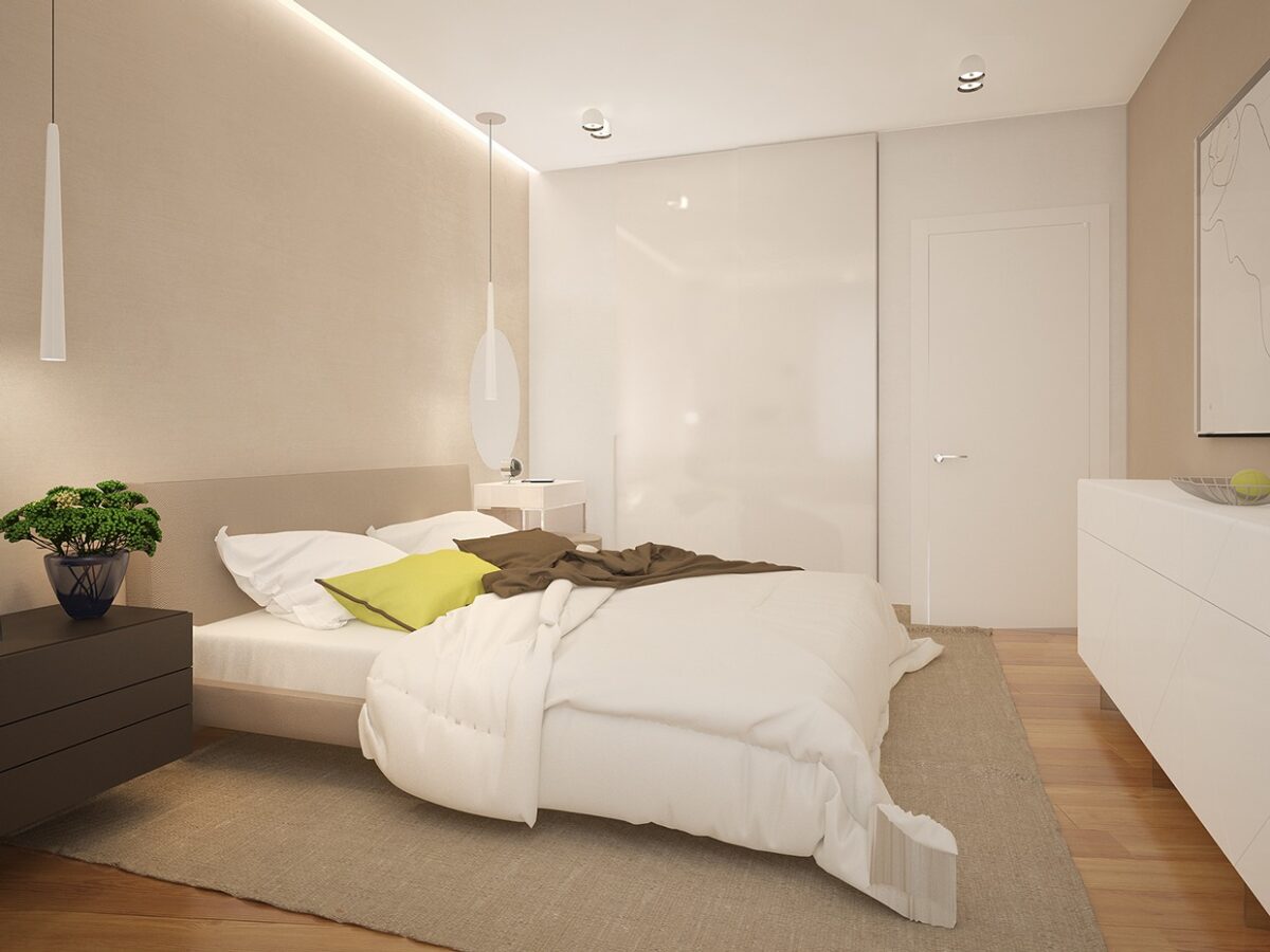
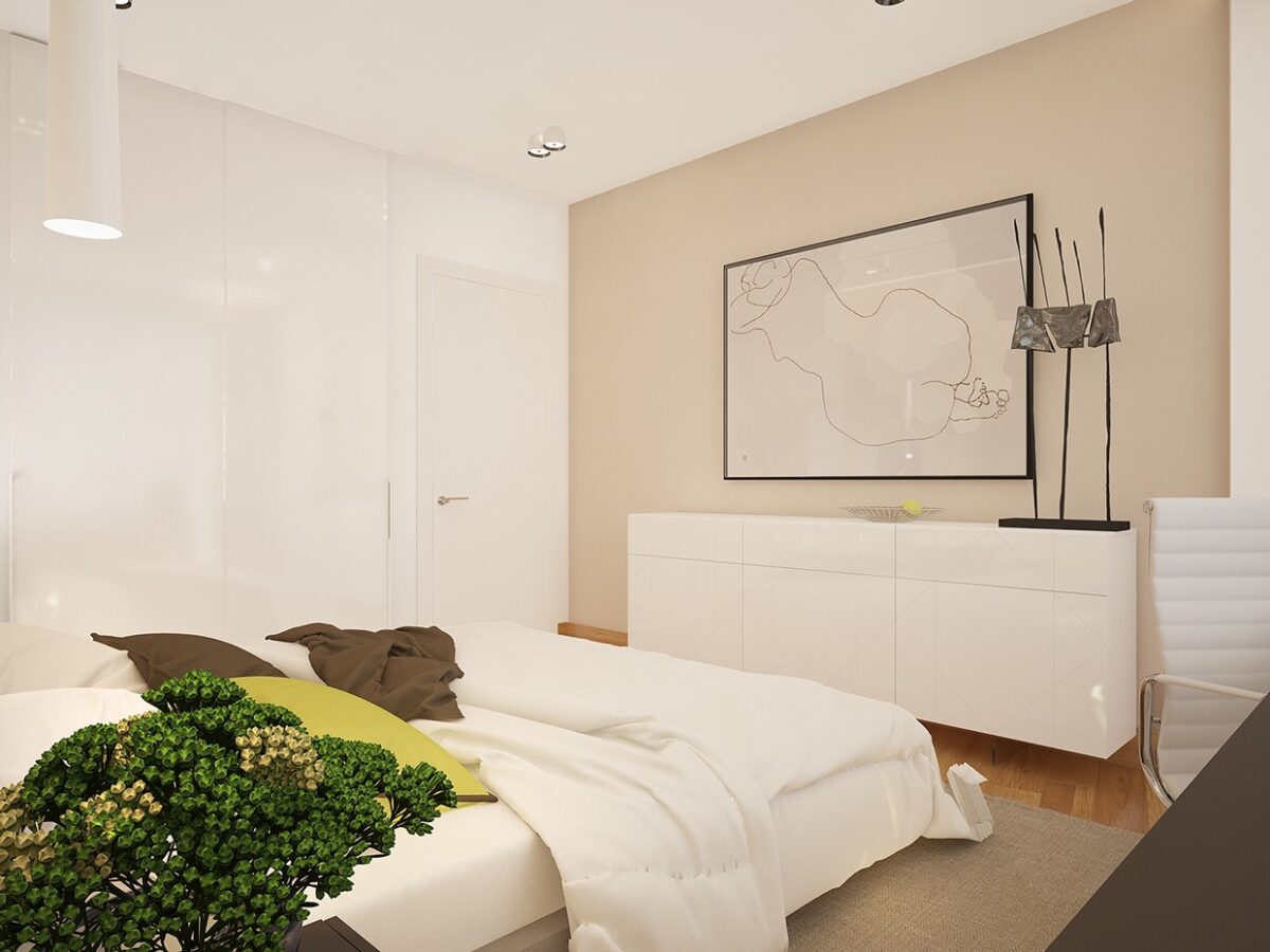
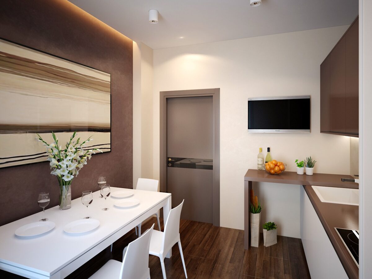
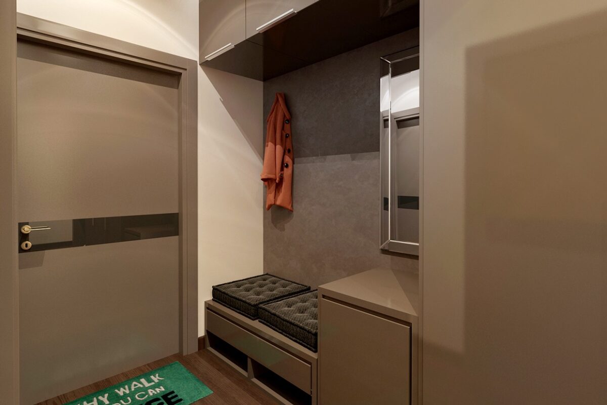
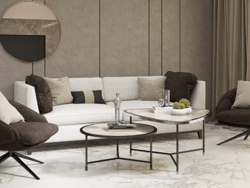
Black and white design can look very modern, but runs to risk of kitschy, calling to mind a 1950's diner. Instead of going full monochrome, Voytov uses black and white along with earthy tones of gray, beige, and brown which manage to envelop anyone who enters while staying sleek.
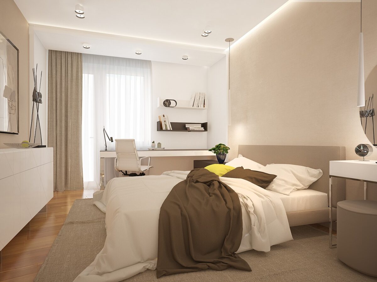
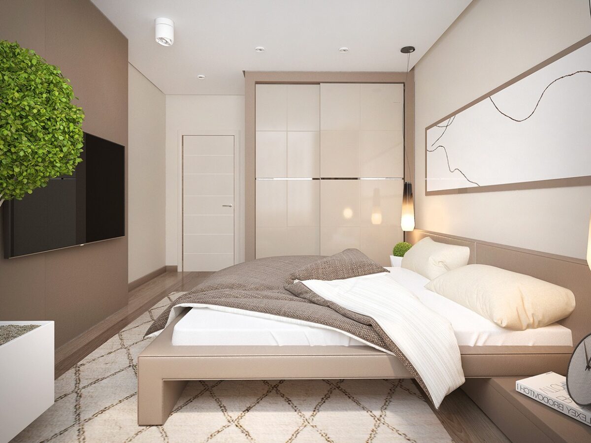
The bedroom stays with the same palette, bringing in a bit more white, which makes it a clean and lovely place to retreat at the end of the day.
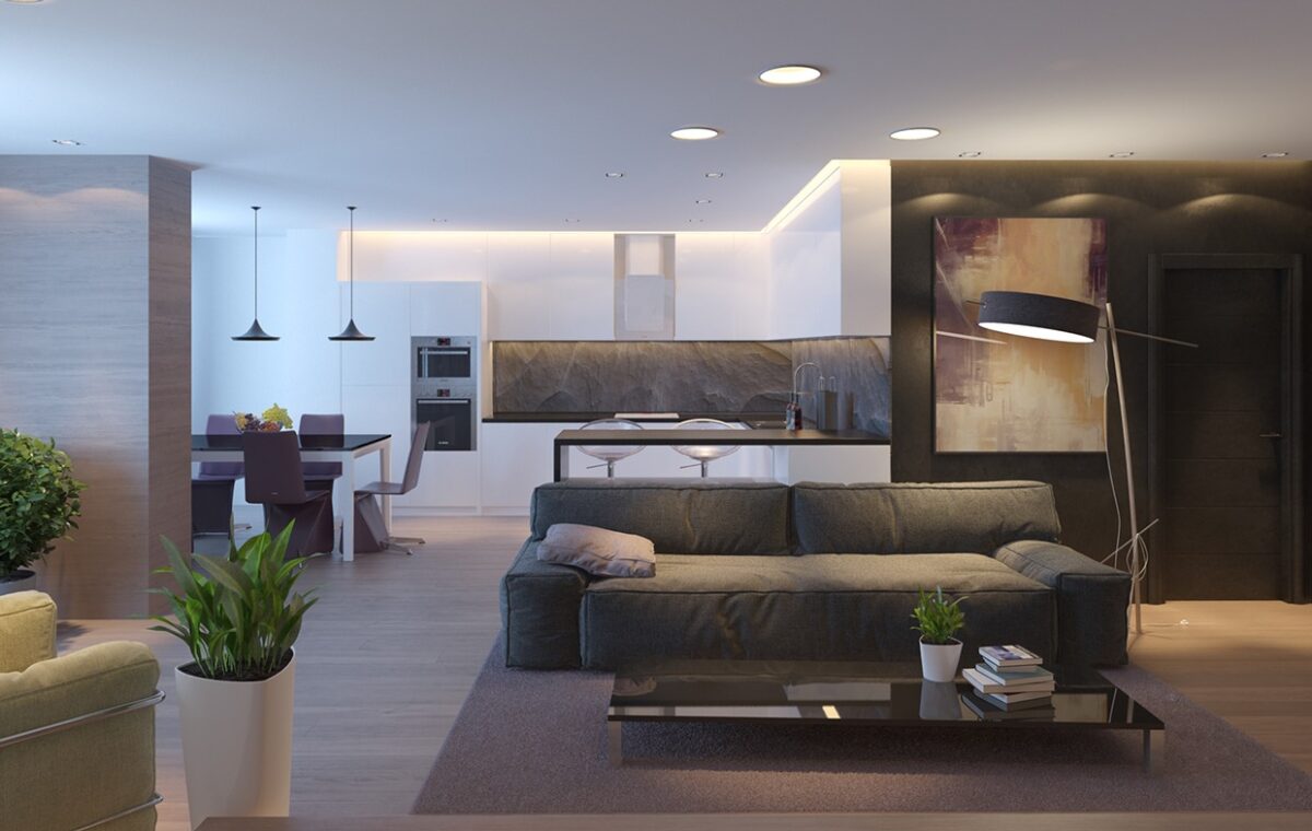
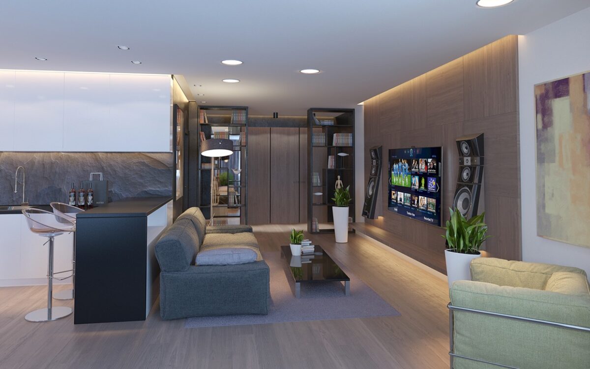
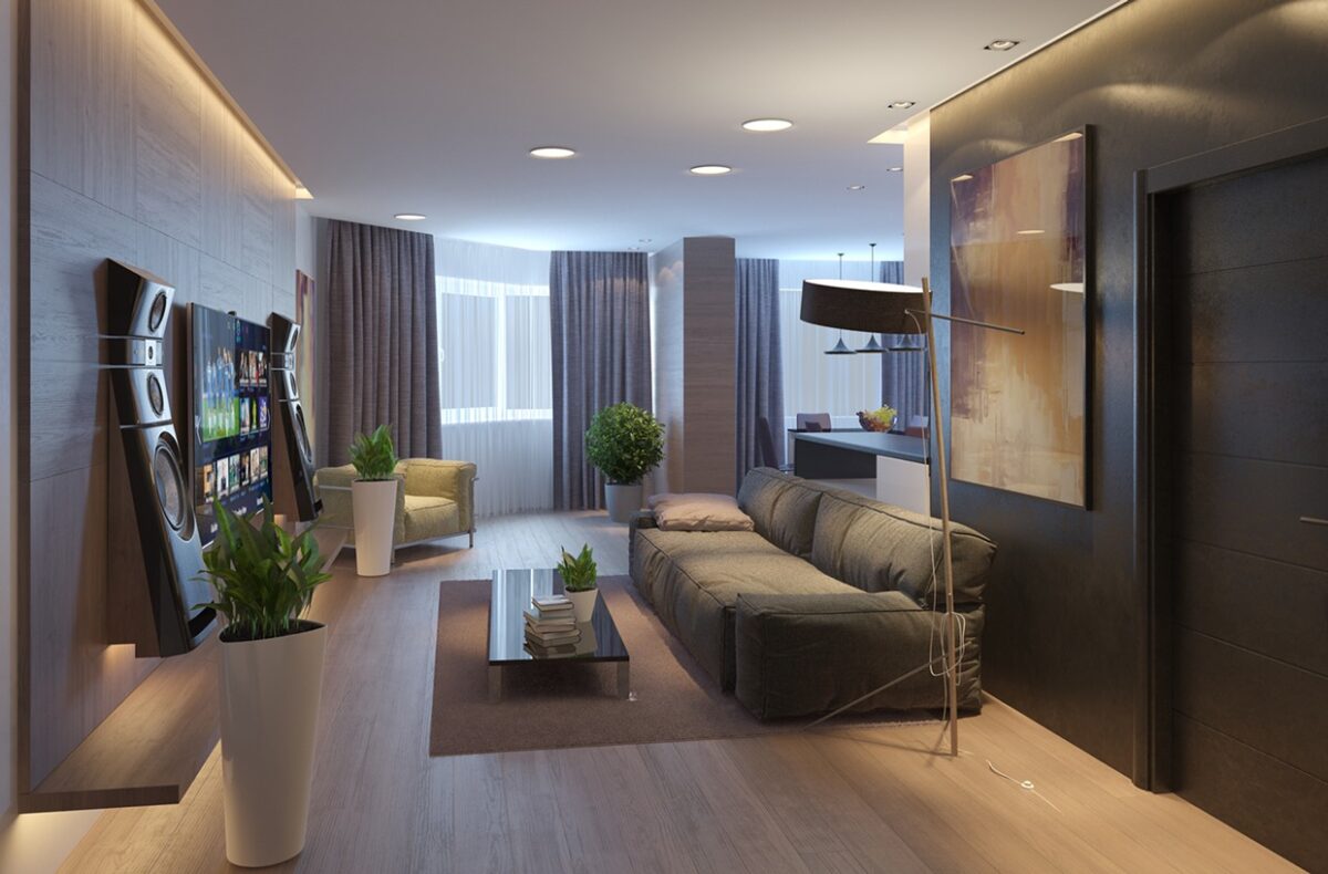
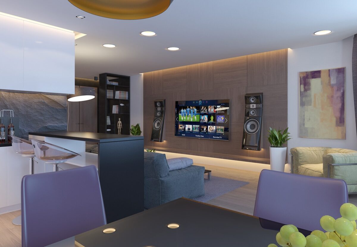
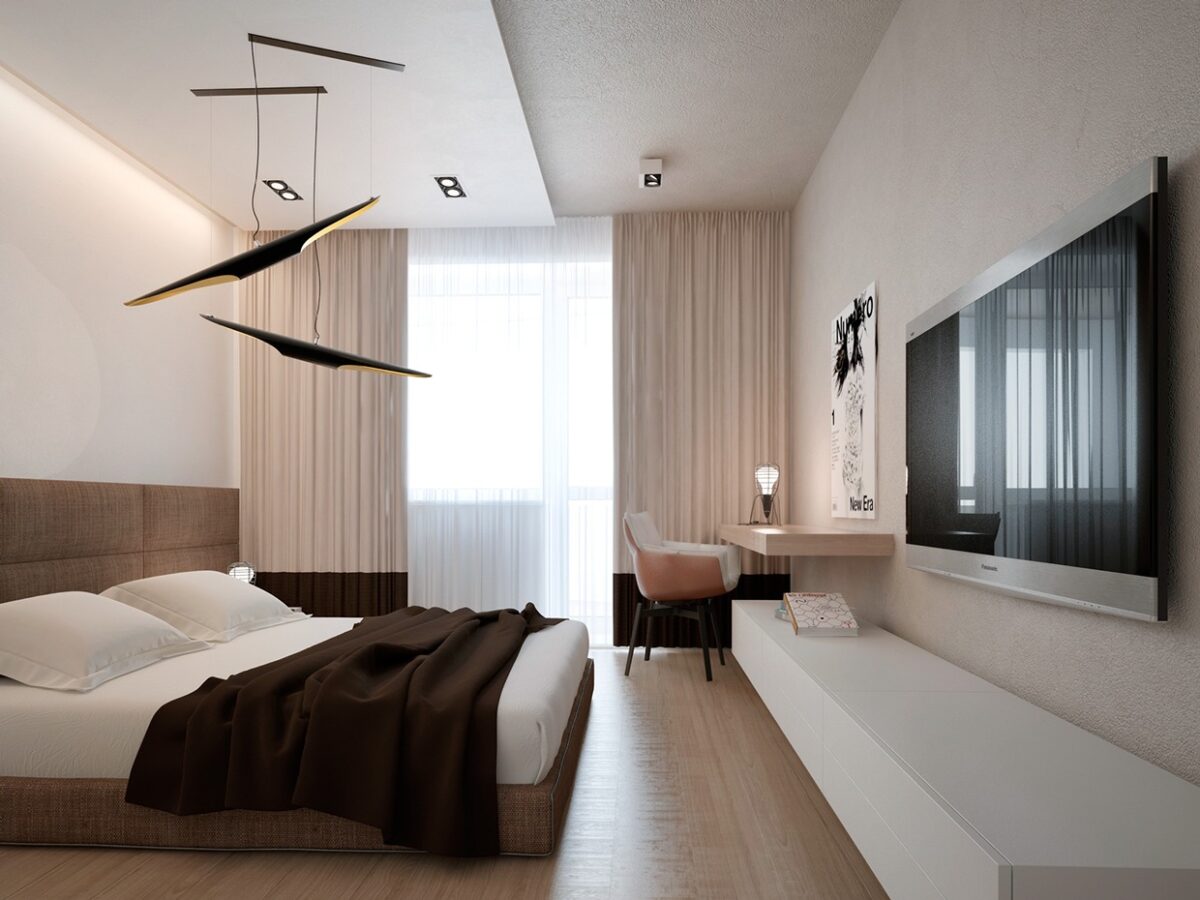
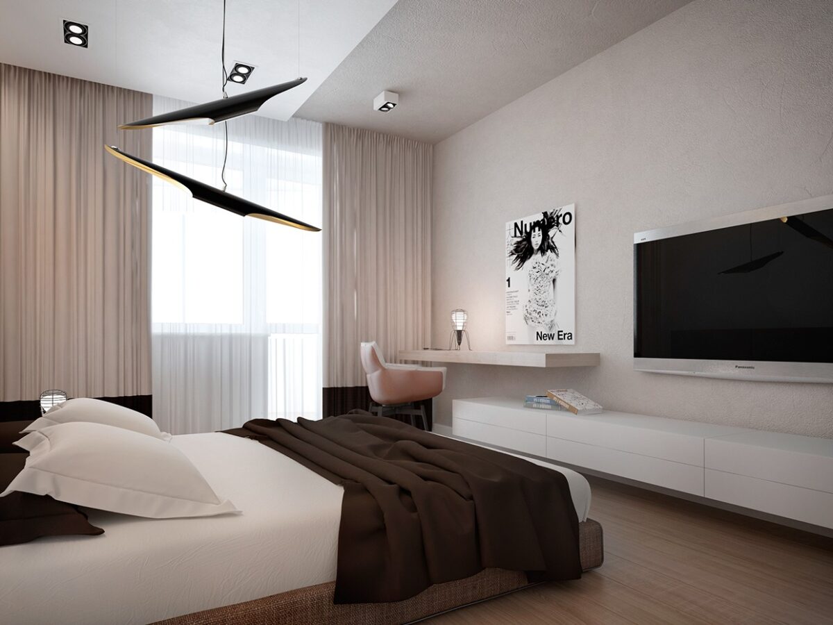
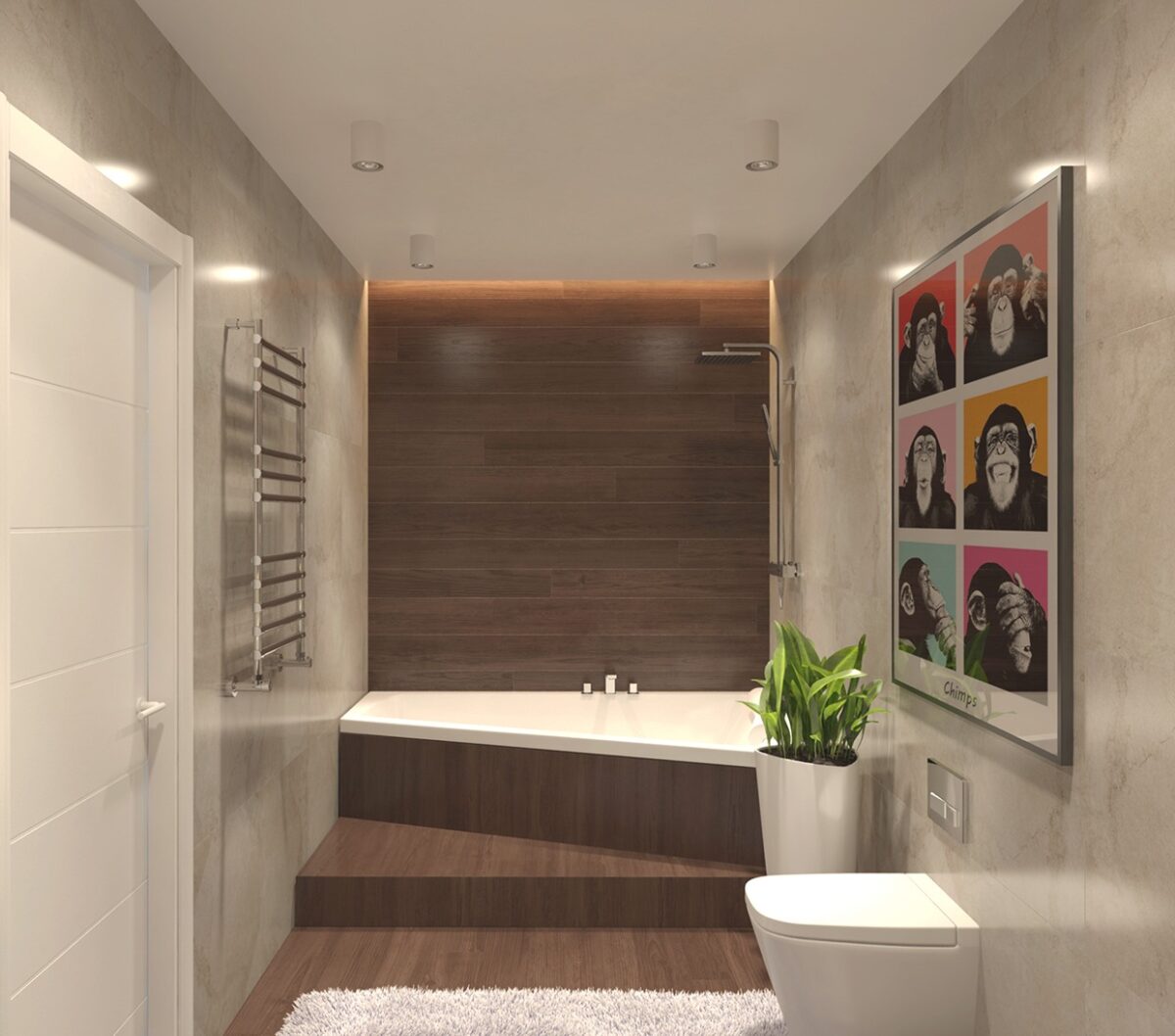
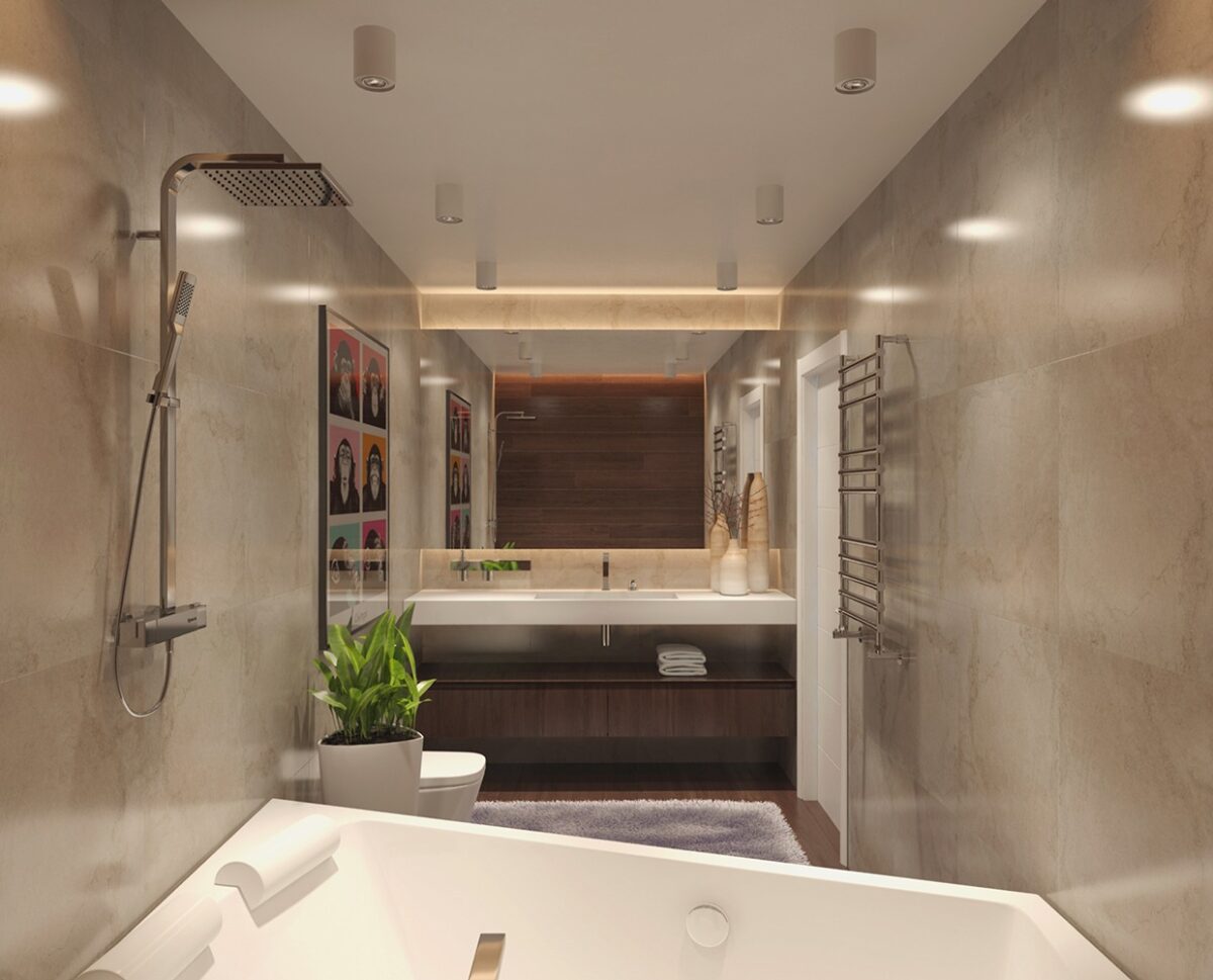
The earth tones in the previous designs have tended more towards warm browns and beiges, but in this fourth home Voytov moves into the cooler dark gray tones with slate, concrete, and gunmetal. The aesthetics are modern but perhaps a bit more masculine and calming in their design.
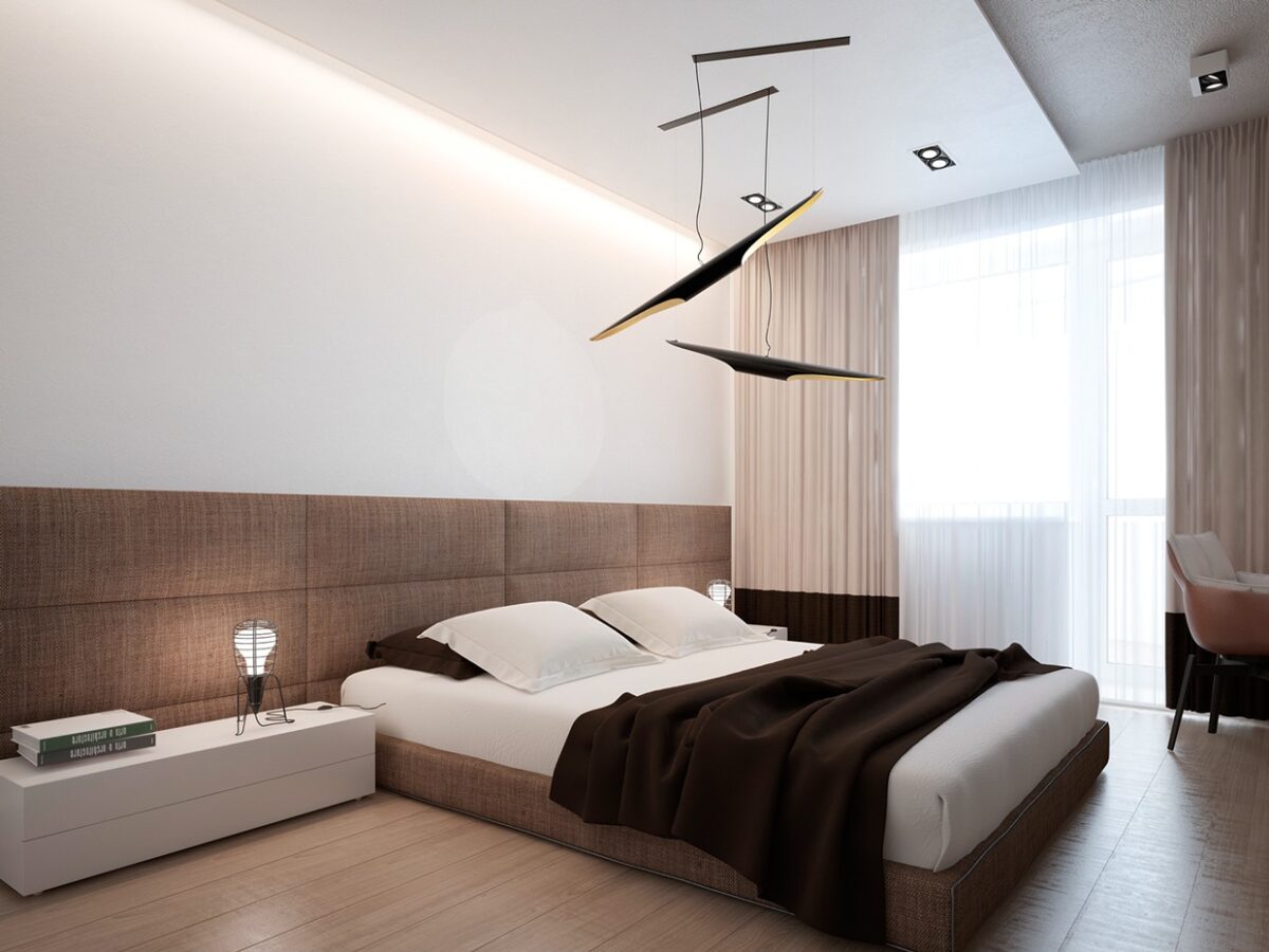
The bedroom includes a chocolate brown duvet and creative ceiling-mounted mobile, giving a nod to Voytov's artistic pursuit of sculpture. In the mast bath, an angular tub, elevated from the rest of the room is a bit of simple, modern luxury.
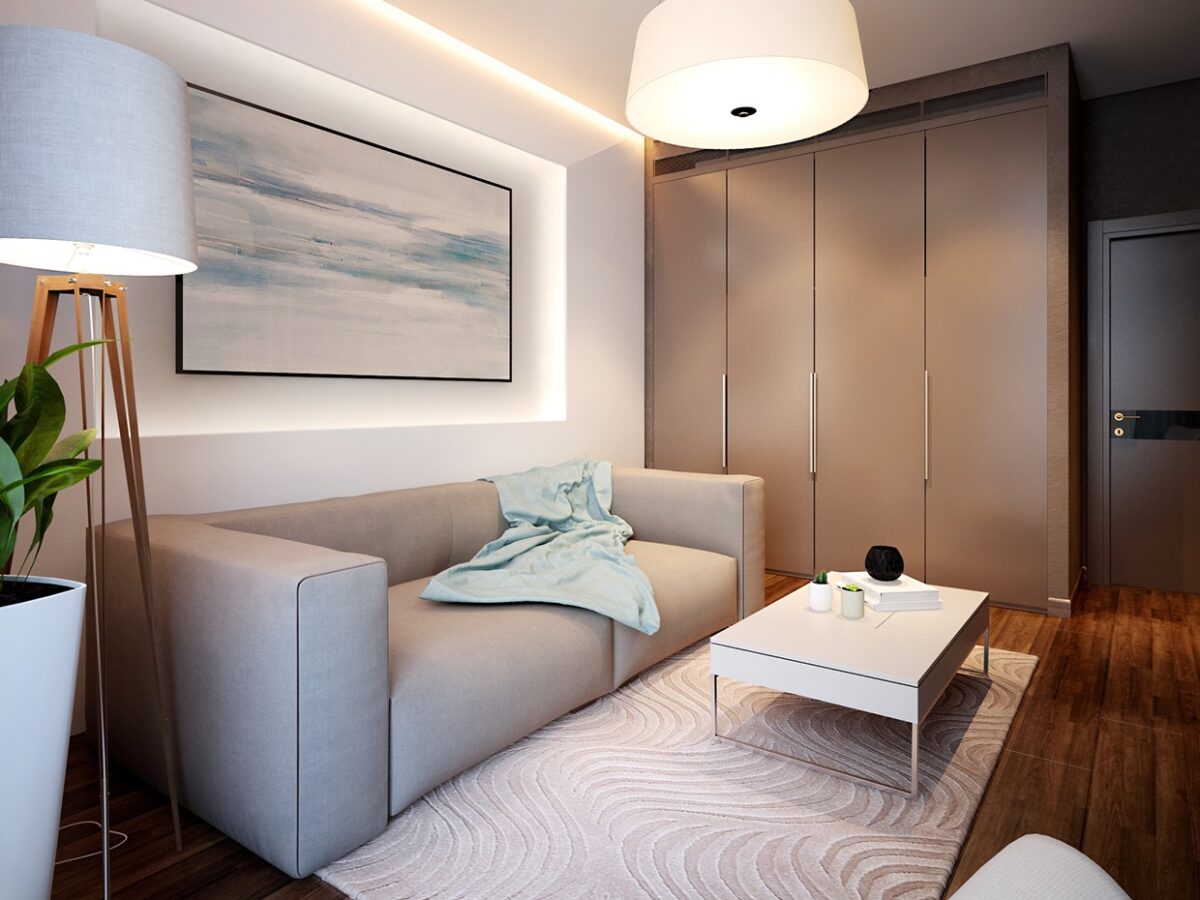
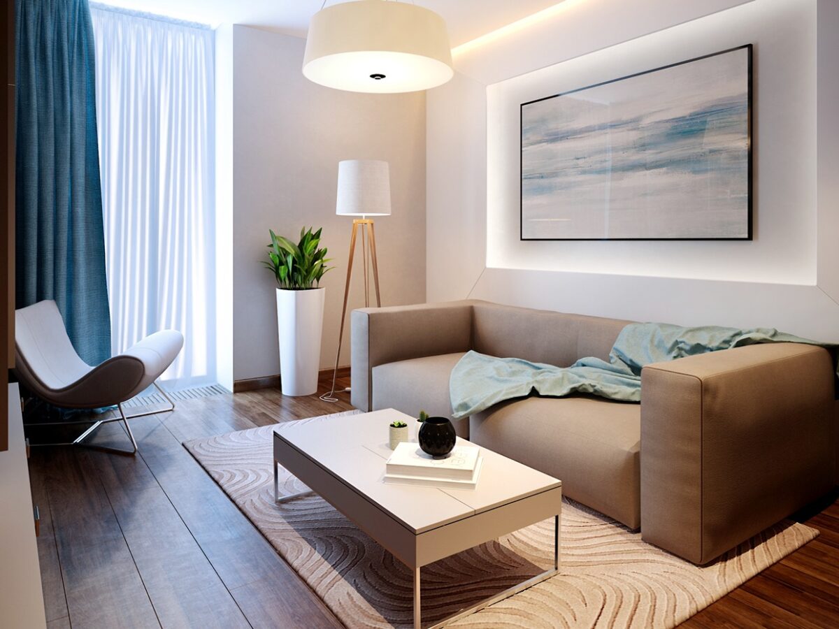
The next home is a bright and beachy, from the sand colored area rug (complete with zen-inspired textures) to the pretty ocean blue thrown on the simple sofa. Even the curtains seem inspired by the water with their heavy, blue texture that seems to cascade like a waterfall over the window.
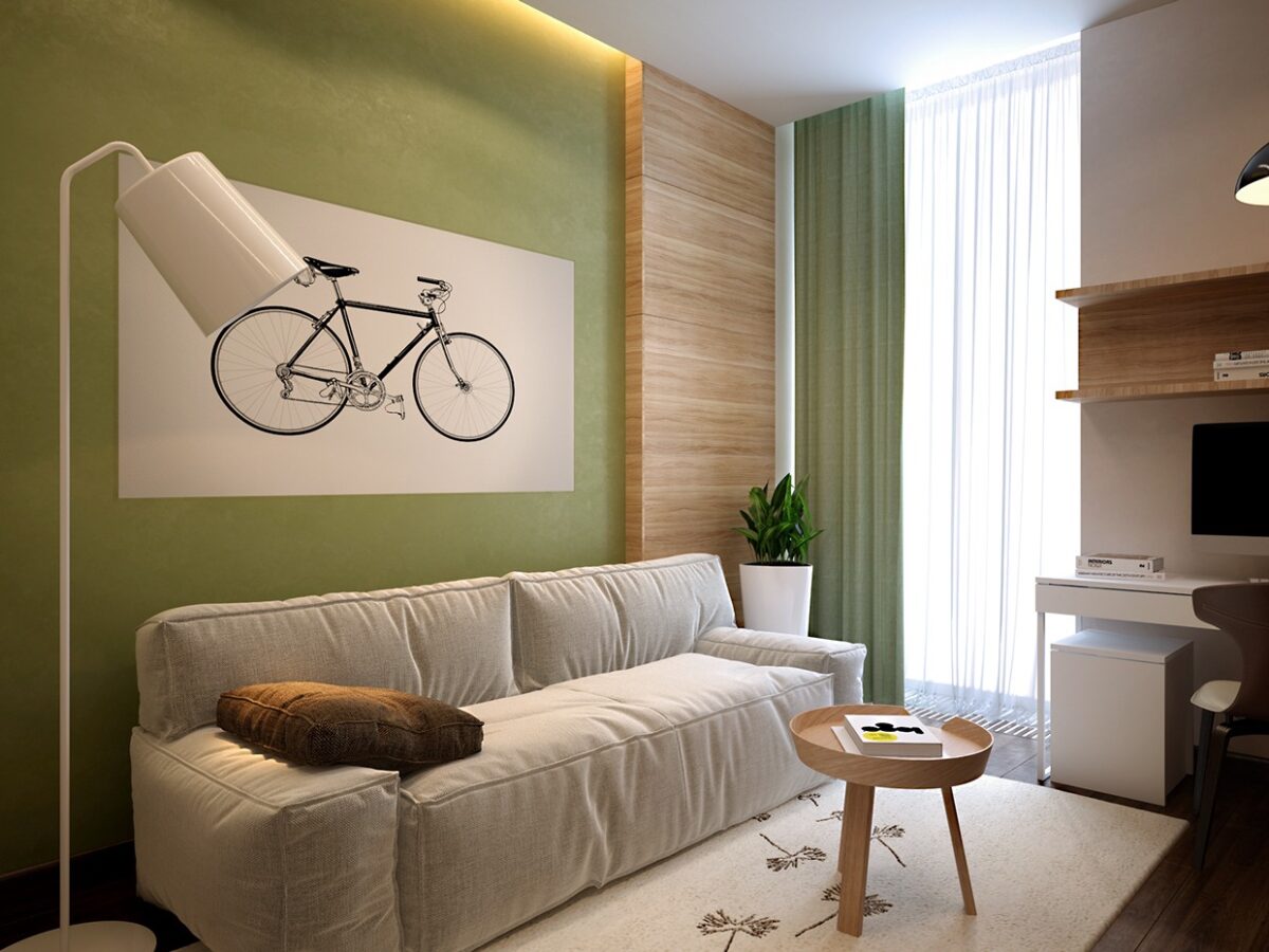
In the home's front room we have a fresh color scheme that uses a mossy green, which still manages to bring the calming beauty of nature indoors.
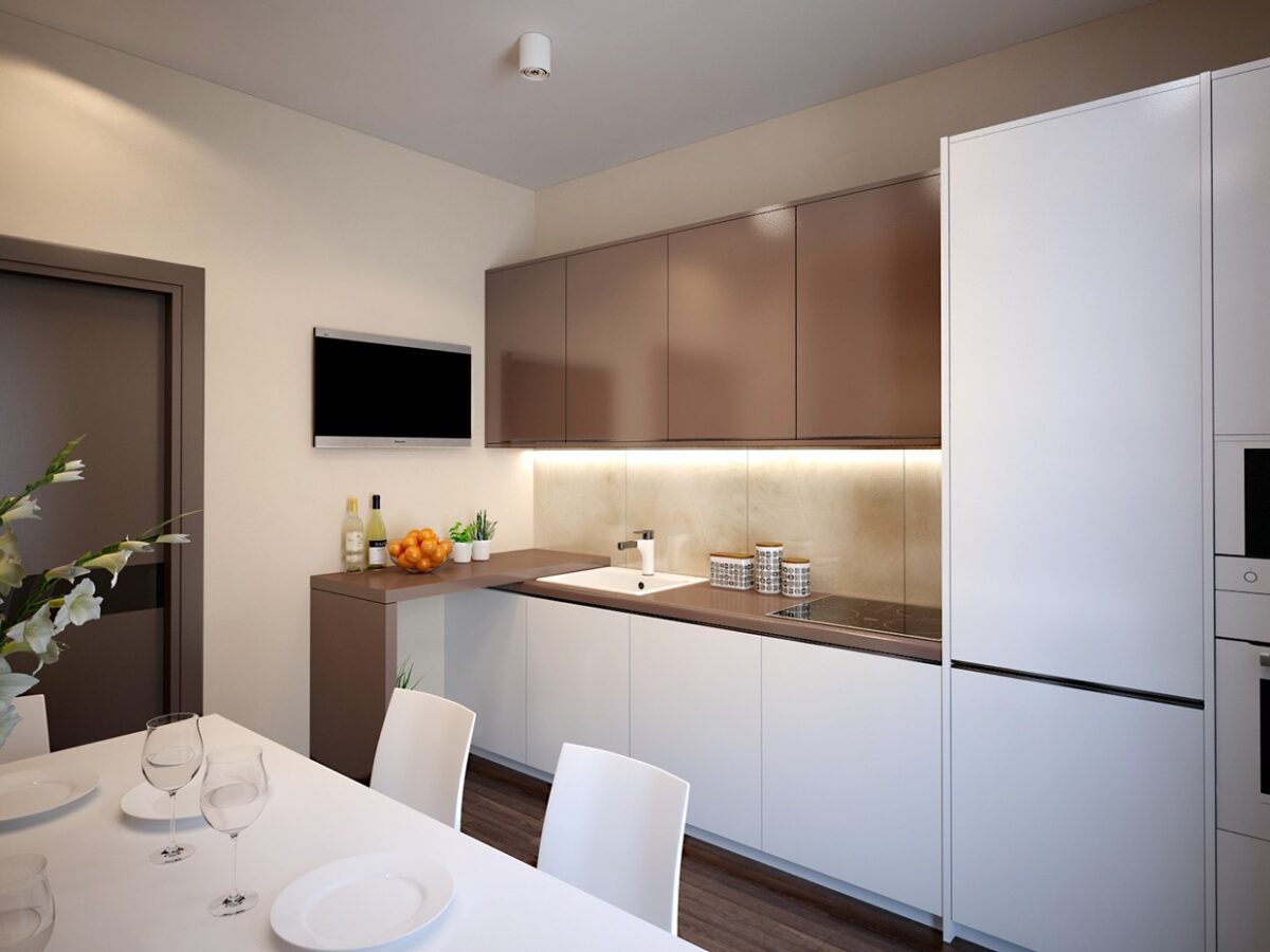
The kitchen and dining area are small but feel bigger than they are with use of a lot of white as well as diffused lighting that comes from overhead for a soft look throughout.
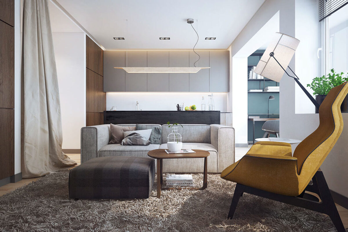
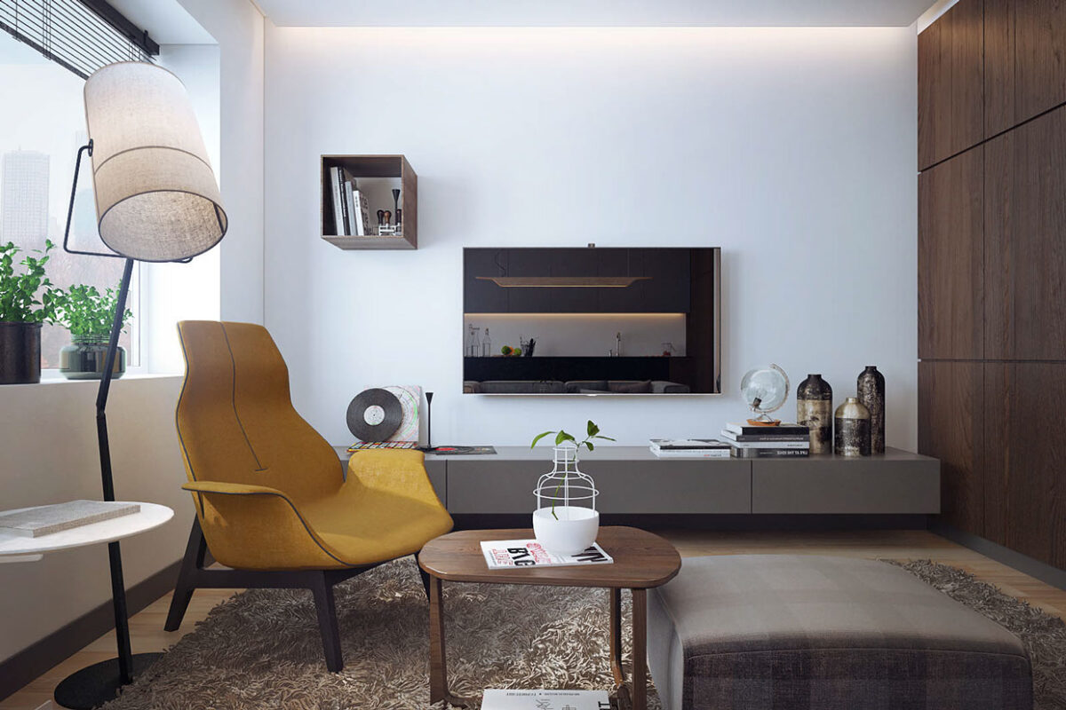
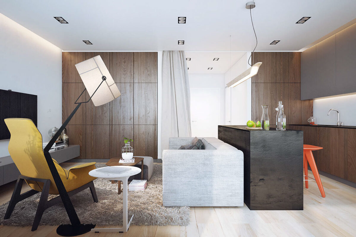
This next space again uses a structured armchair in the living room to break up the neutral color patterns. This time, the chair is a rich and delicious mustard color and has uniquely molded arms. Against the sandy shag carpet, this smooth chair acts as a stylistic focal point.
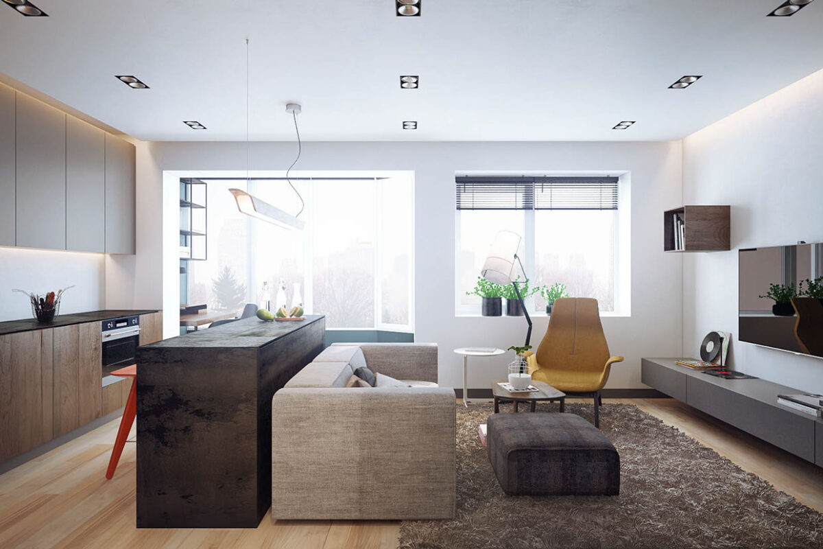
The setup of this apartment aims for contrast, putting the sofa and kitchen island directly opposed to one another, separating the relaxing living space from the sharp and smooth surfaces of the kitchen.
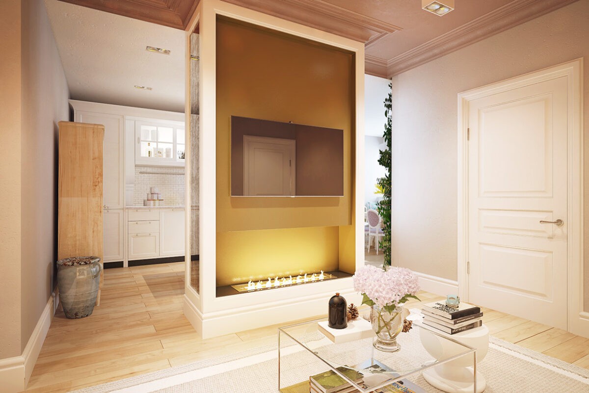
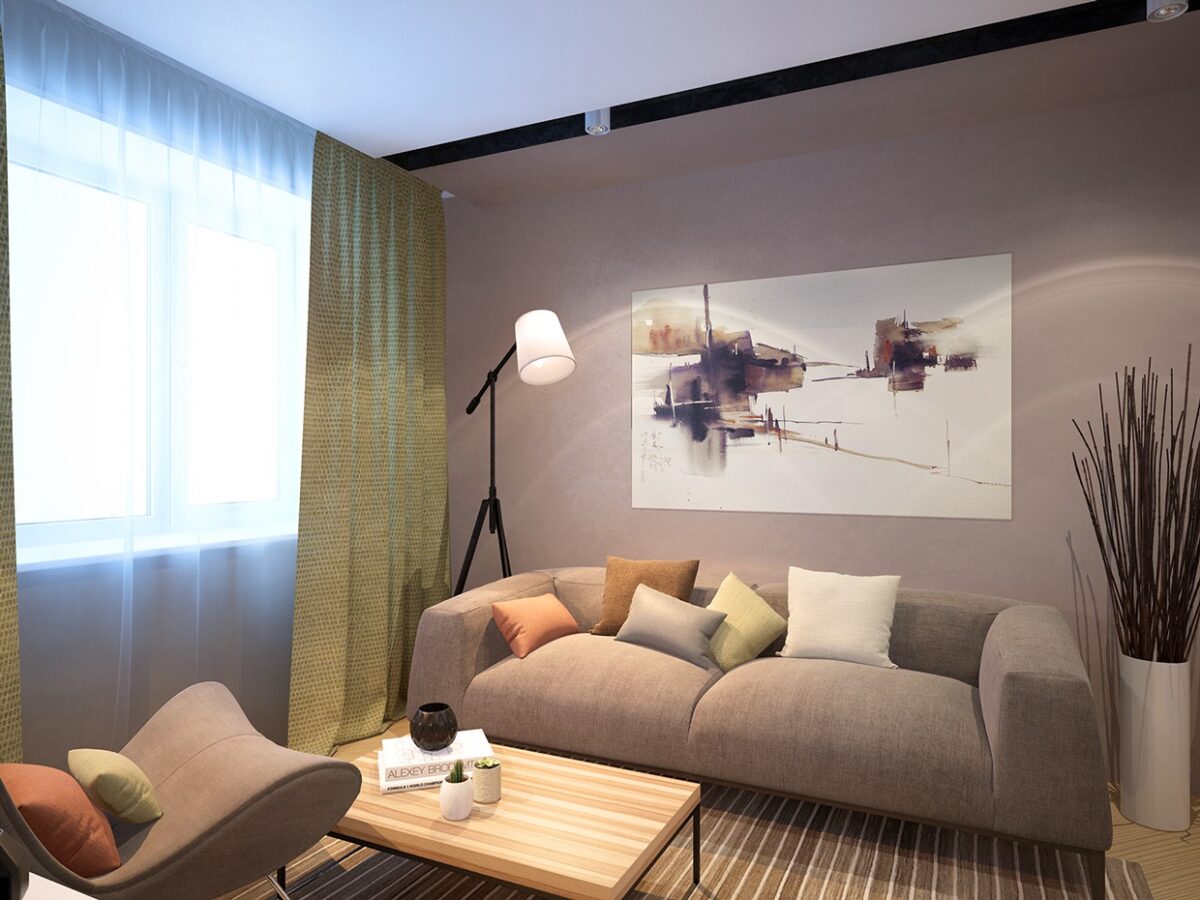
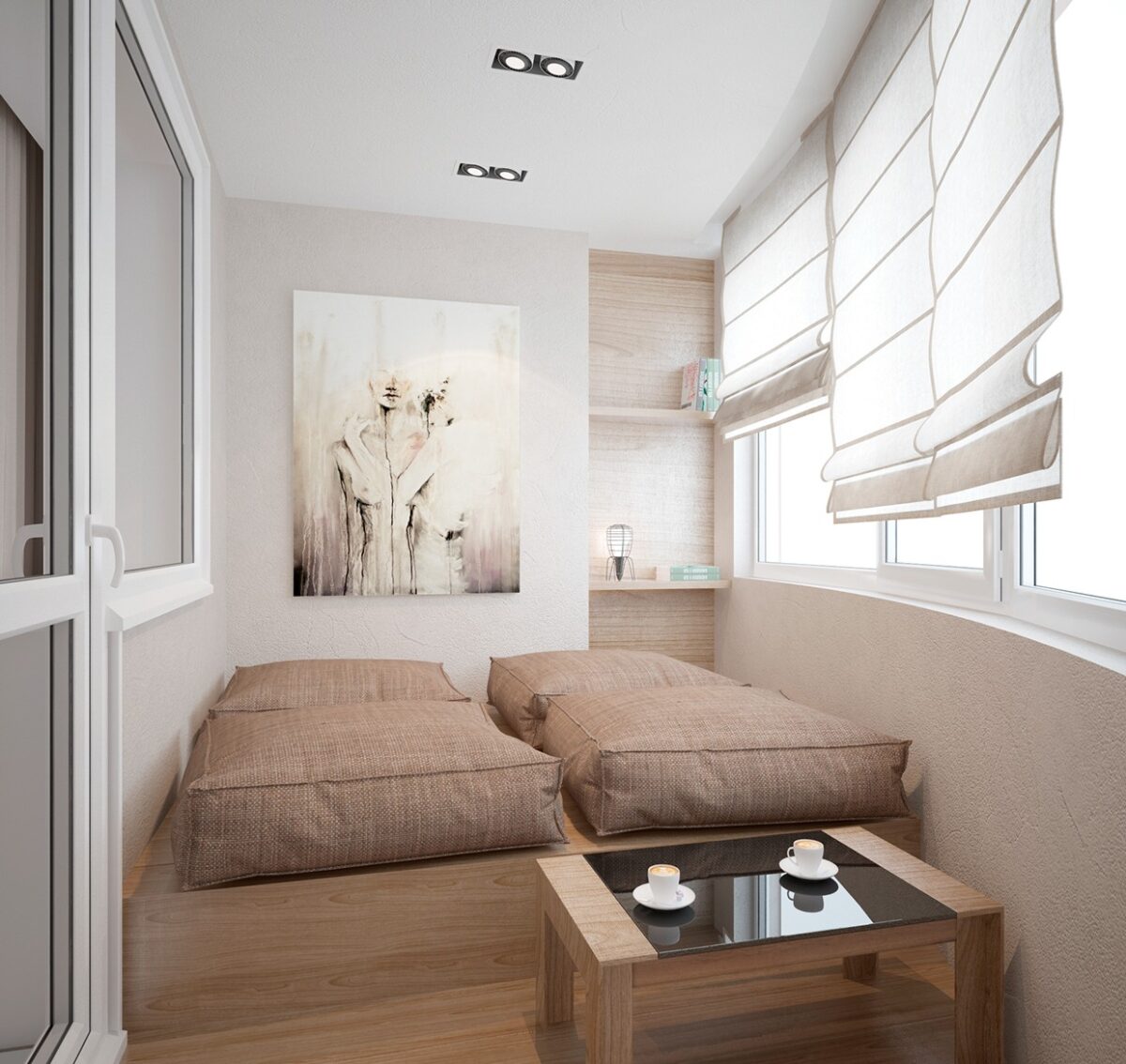
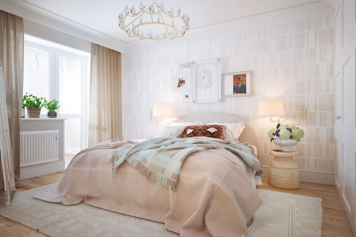
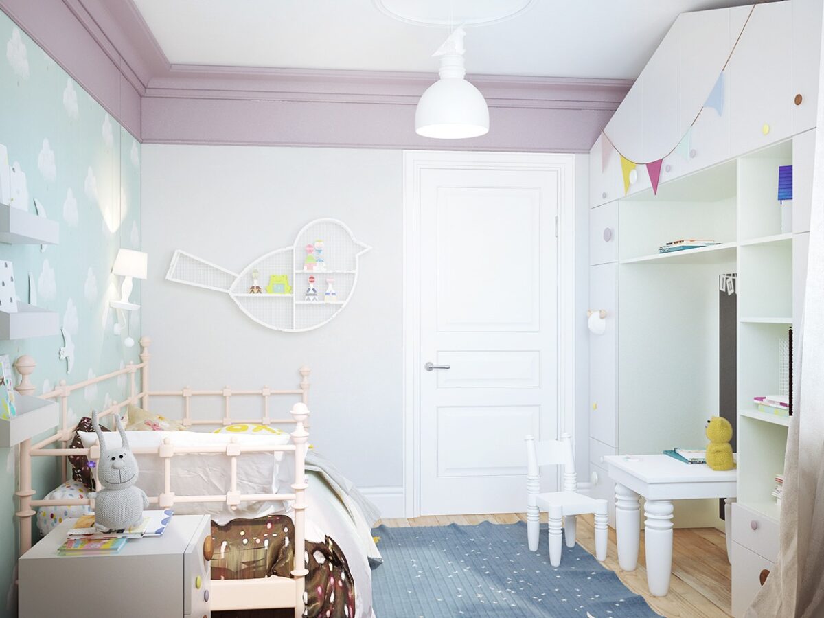
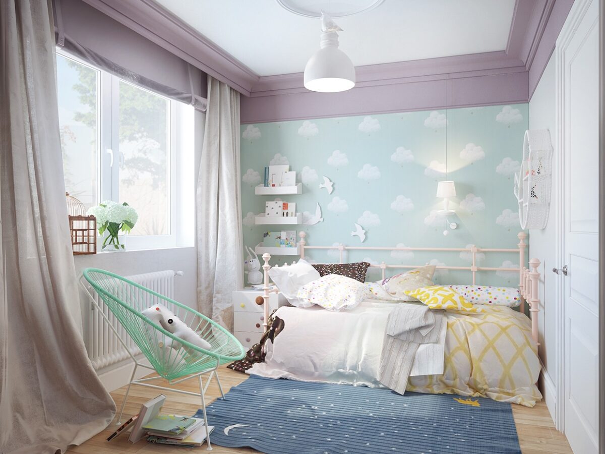
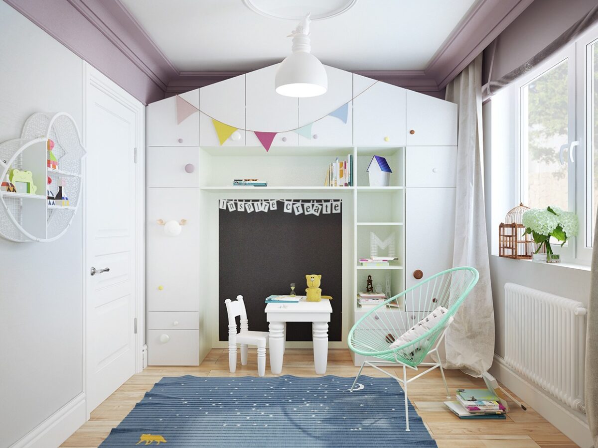
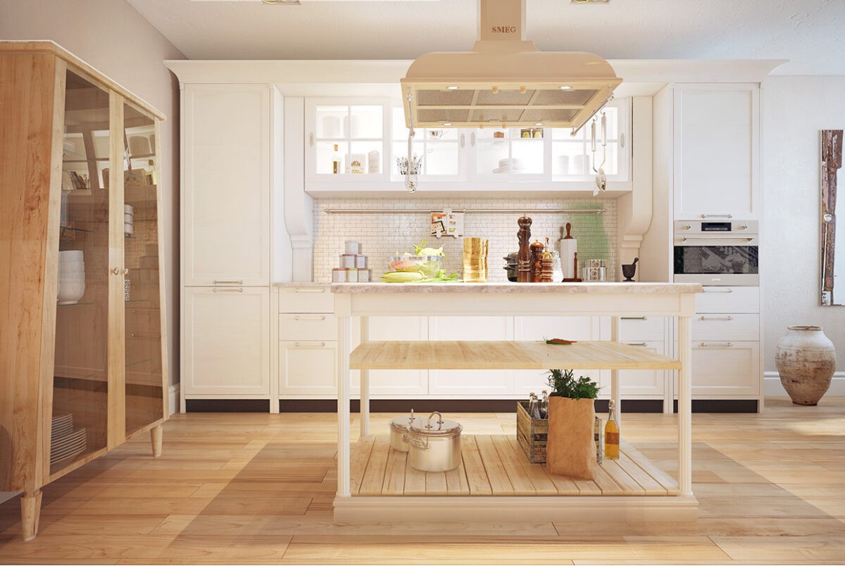
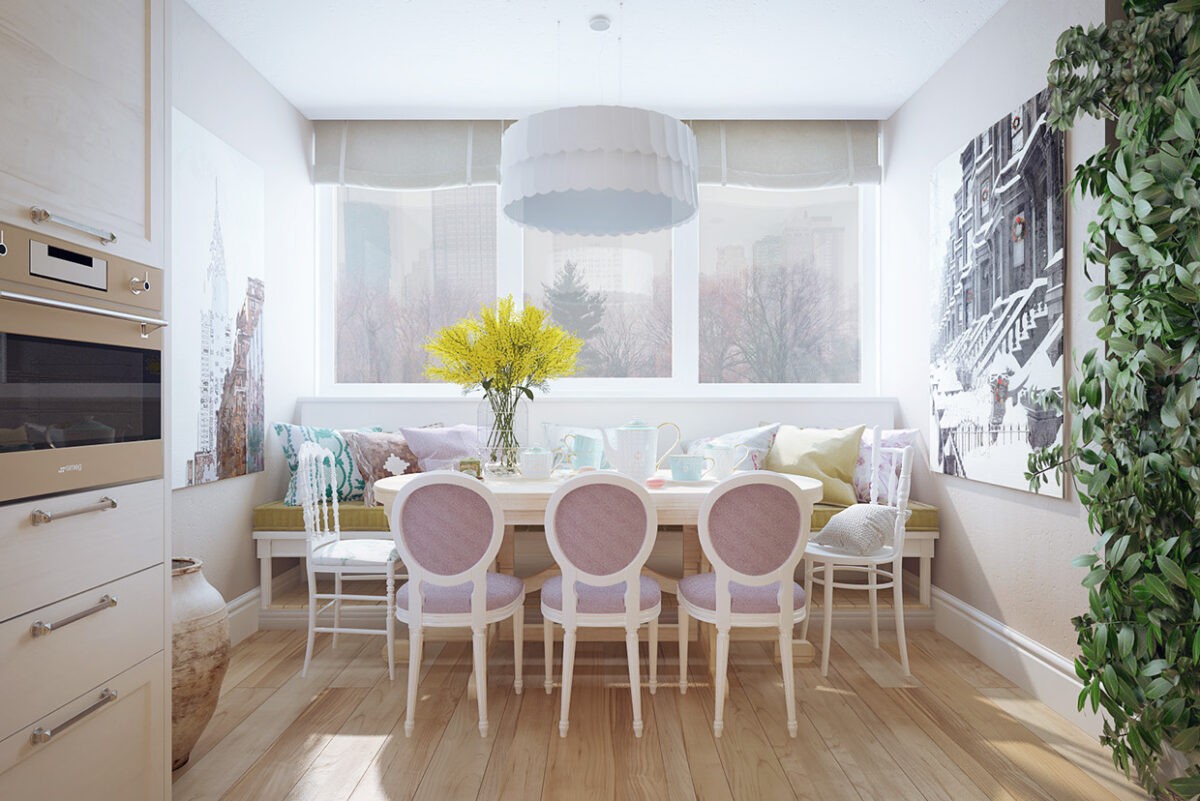
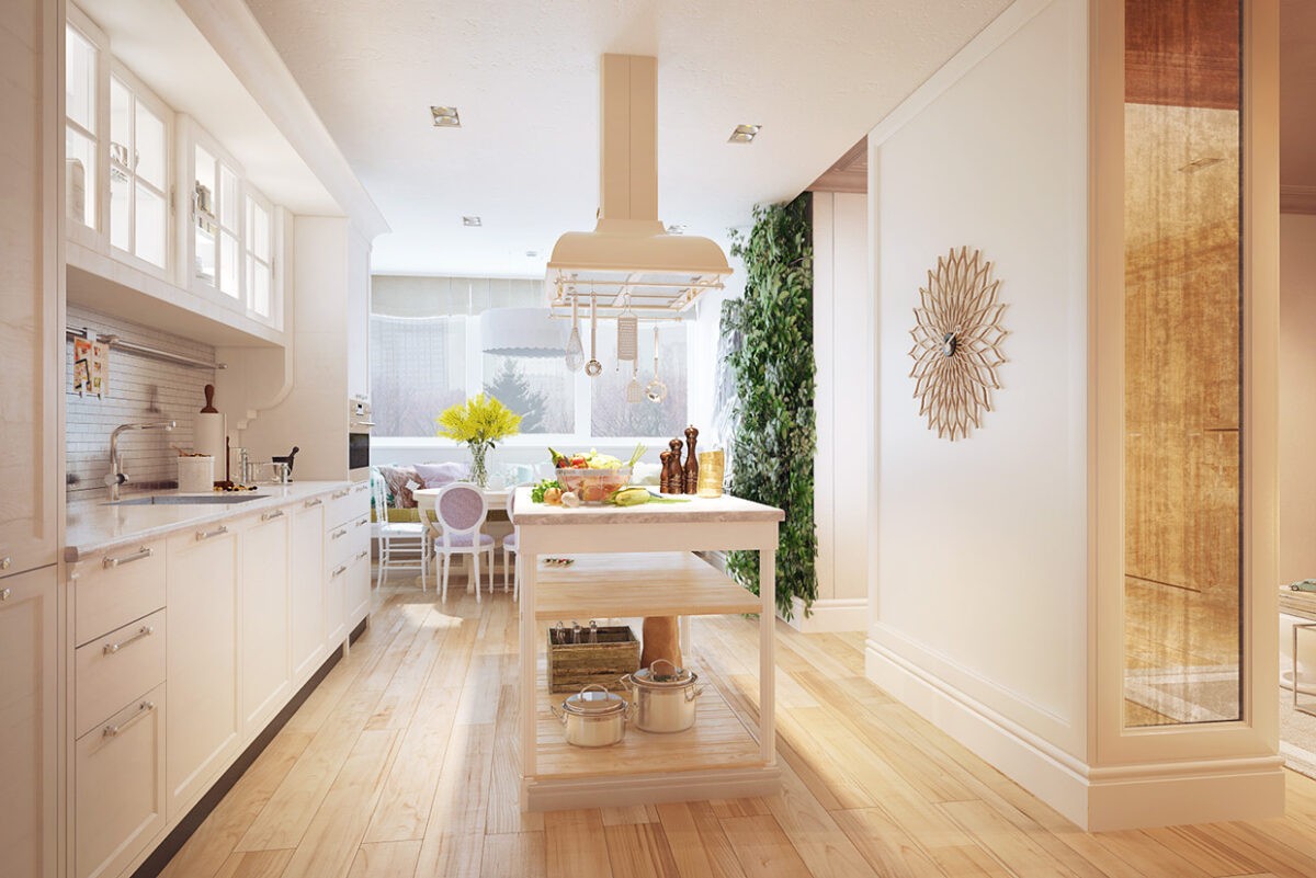
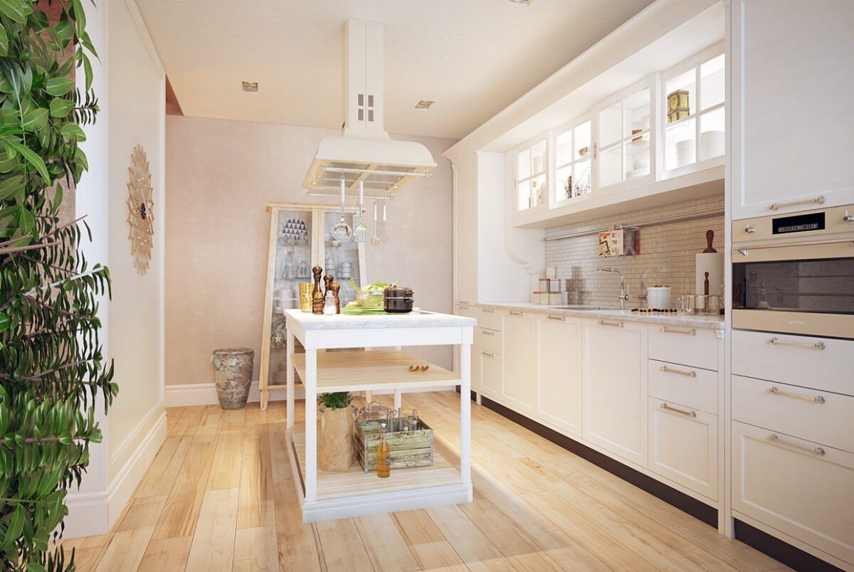
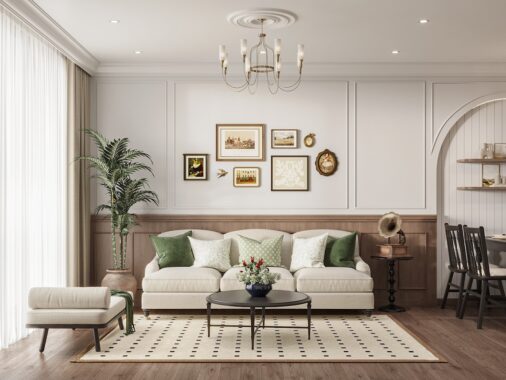
This next design is a bit different that most of Voytov's other interiors. This home is decidedly softer with many more frills, pastels, and feminine touches. There are also many more accessories throughout, from throw pillows to vases to books perched on windowsills.
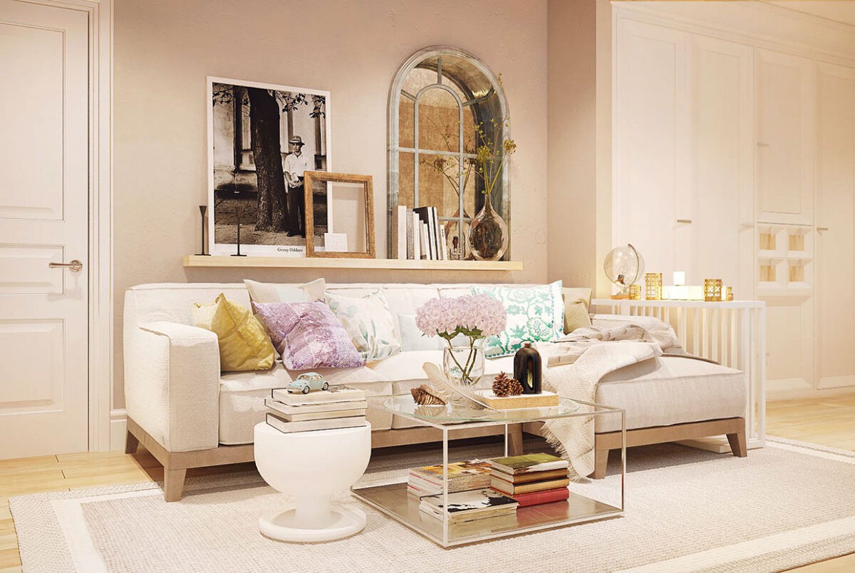
Despite the more elaborate feel overall, the home still employs the subtle colors and simplicity in the furnishings, walls, and fabrics with neutral tones and soft textures.
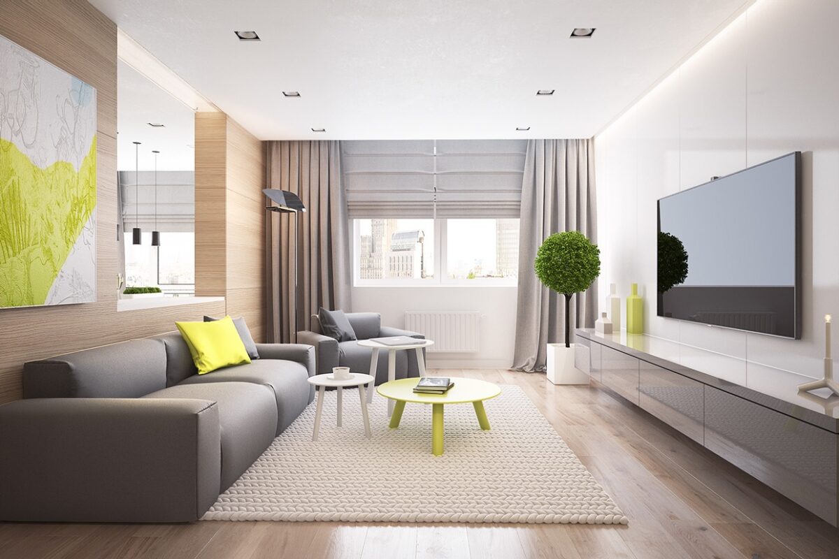
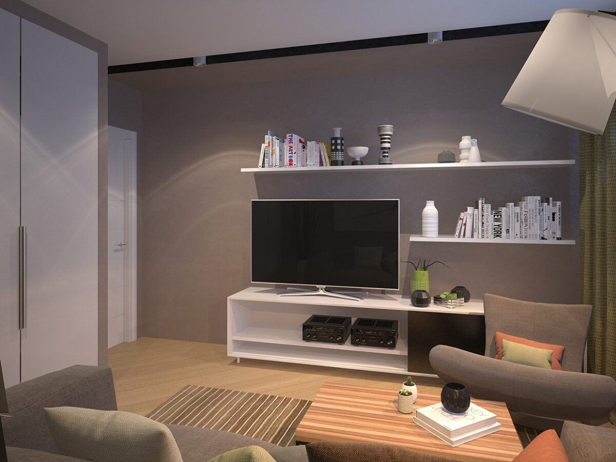
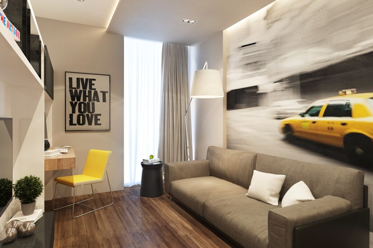
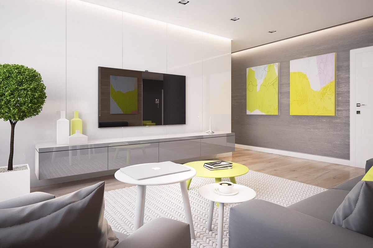
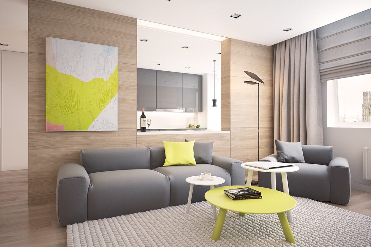
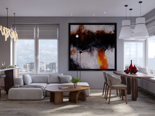
The final home is a return to Voytov's typical style, with minimal furnishings, pleasing shades and beautiful indoor plants. The cool gray theme in the living room contrasts with electric yellow paintings and other accessories.

