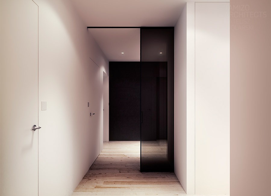
There is nothing quite so modern and cool as classic black and white design. It brings along with it vibes of the mod era, complete with go go boots and short blonde bobs. It's timeless in its stylishness and no one does it better than the designers at Poland's Tamizo, who we have featured before. In this post we have five more examples of glorious high contrast.
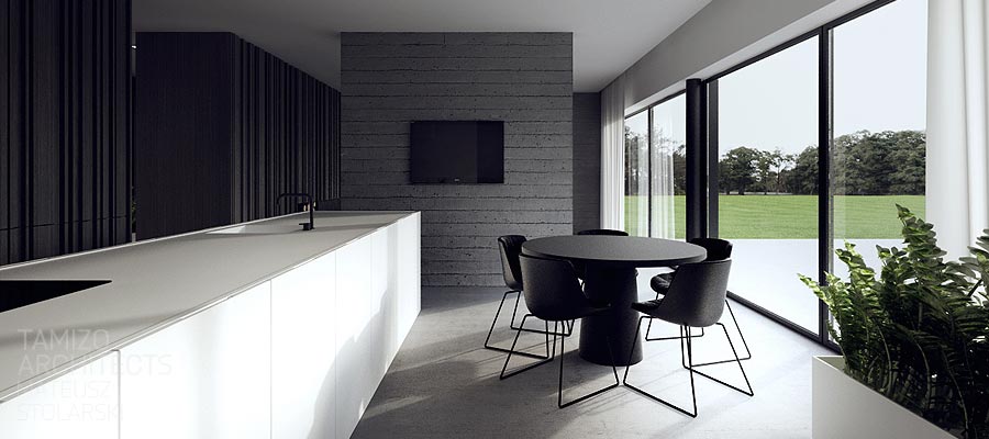
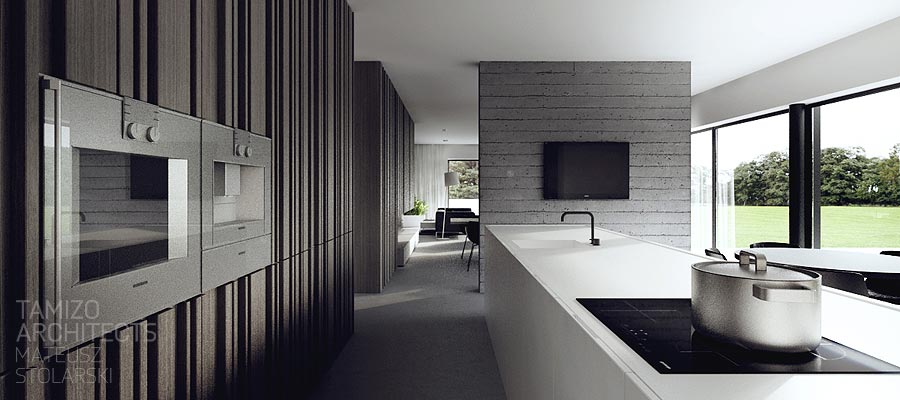
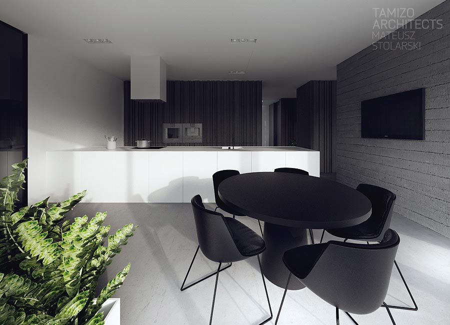
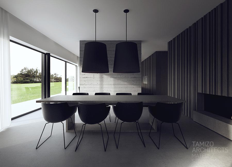
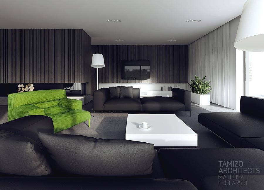
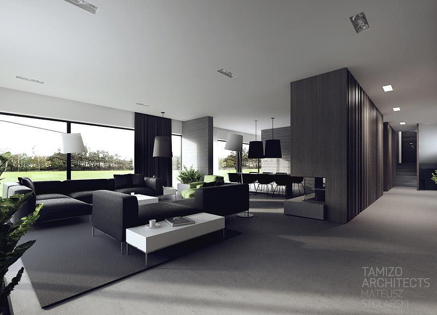
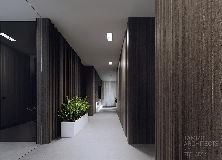
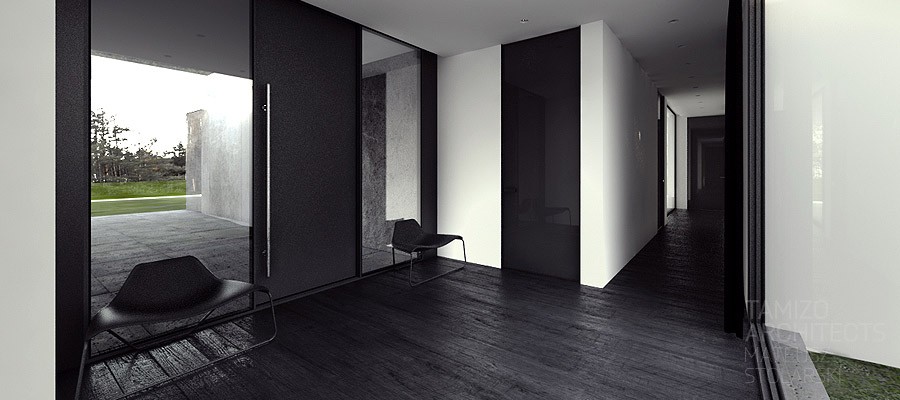
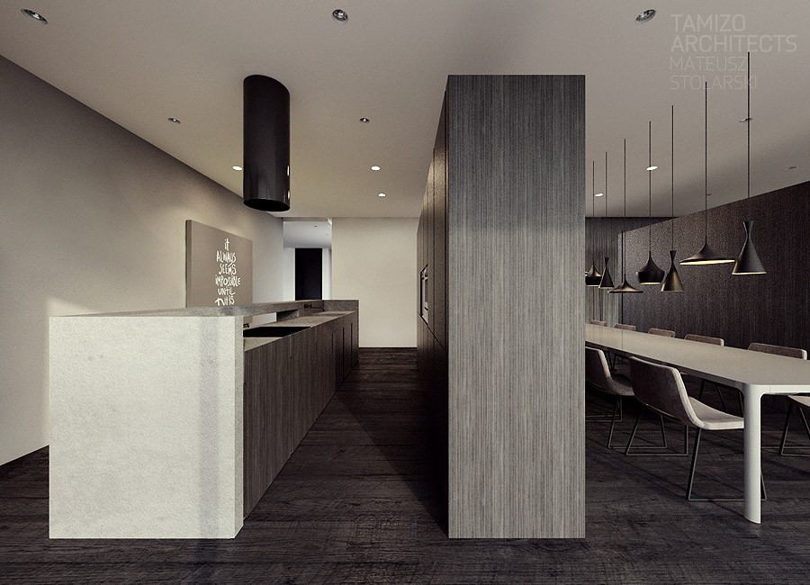
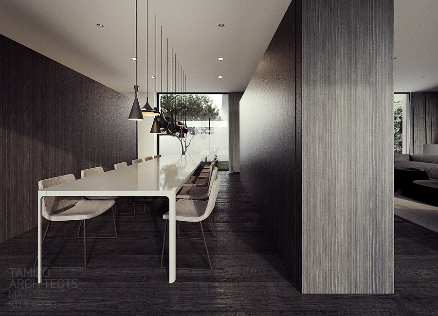
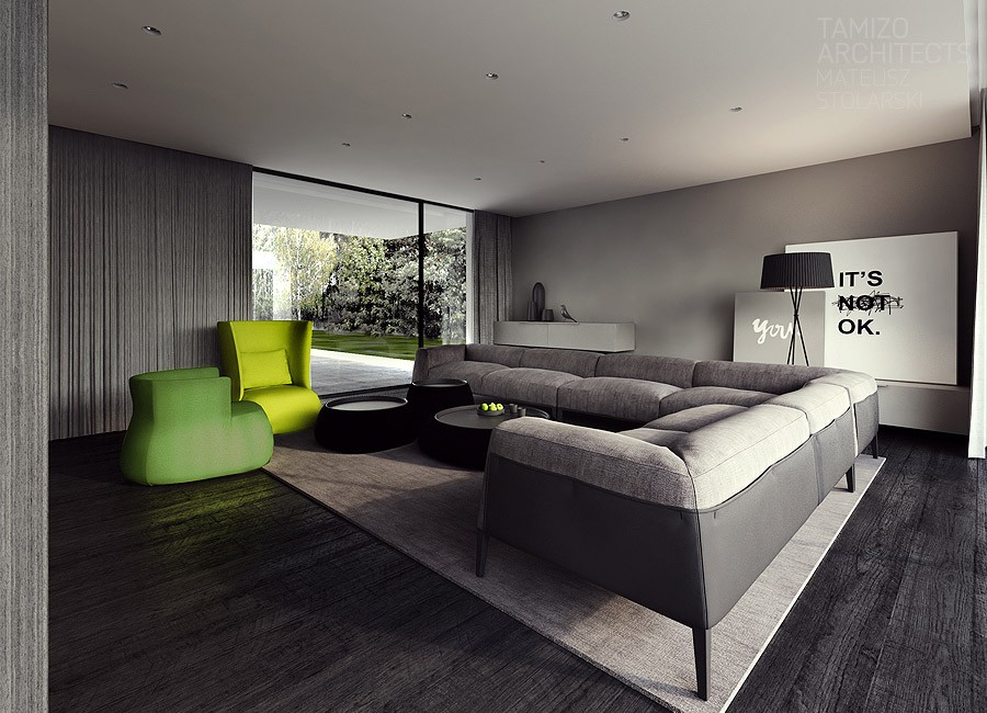
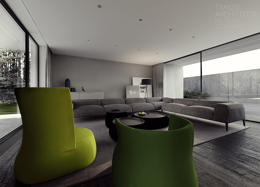
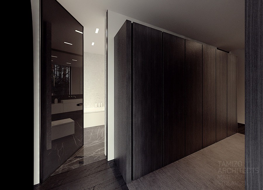
The first design is a house located in Torun, a city in northern Poland along the Vistula River. The majority of the interior is done in deep gray, black, and blinding white. The resulting space is certainly sleek but manages to create its own energy.
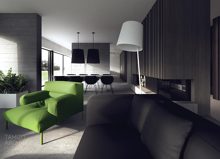
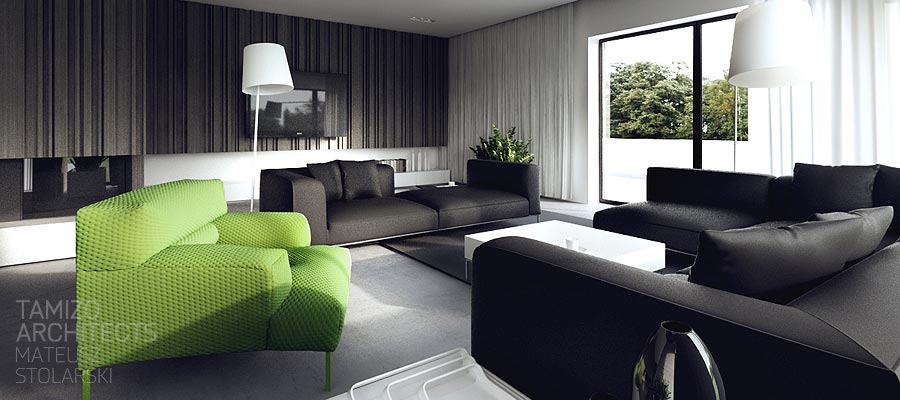
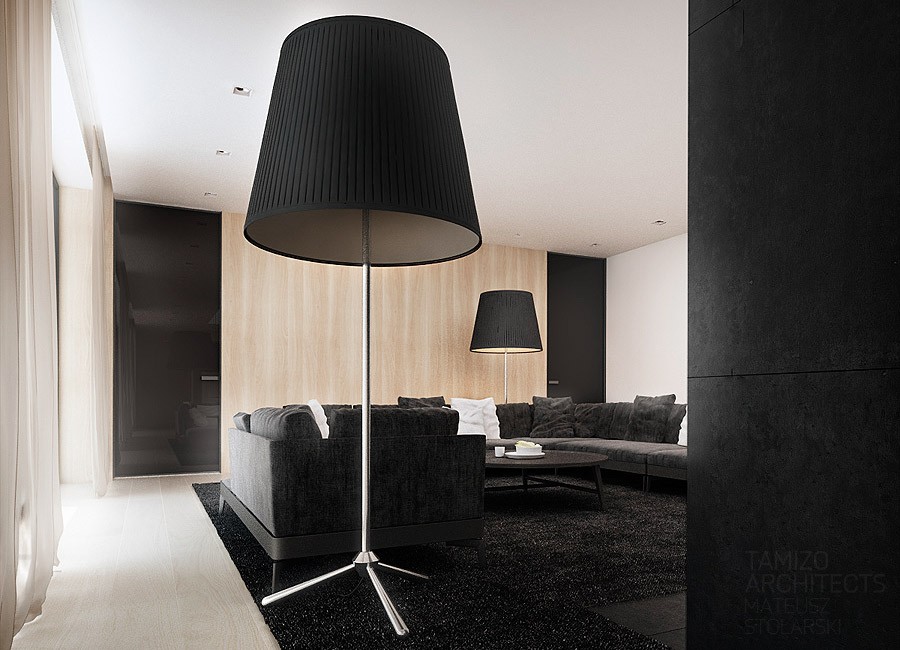
Clean lines and angular design are a focal point, but subtle textures in the brick and concrete walls create a lot of visual interest. Further, the black and white style can run the risk of feeling a bit too buttoned up as if from the dystopic future. Whimsical elements like a single electric green chair (we'll see this become a theme) and oversized lampshades give a bit of a nod and a wink to the style that could otherwise feel overbearing.
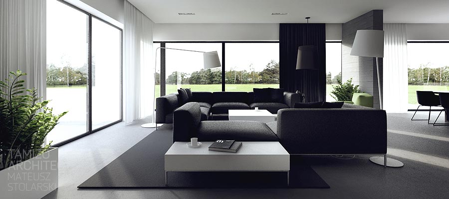
It is easy to see just how intentional every element of the design is when you glance out the windows to find a landscape that is flat and spacious, carrying through the flat, low aspects of the interior.
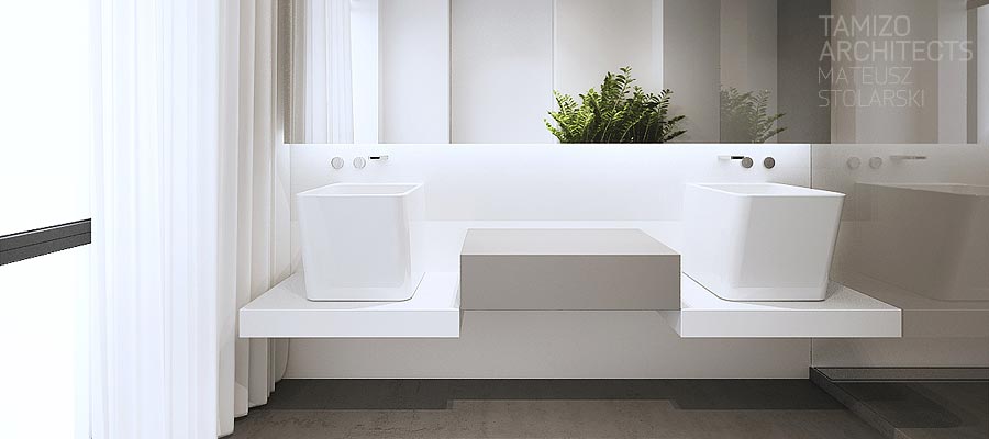
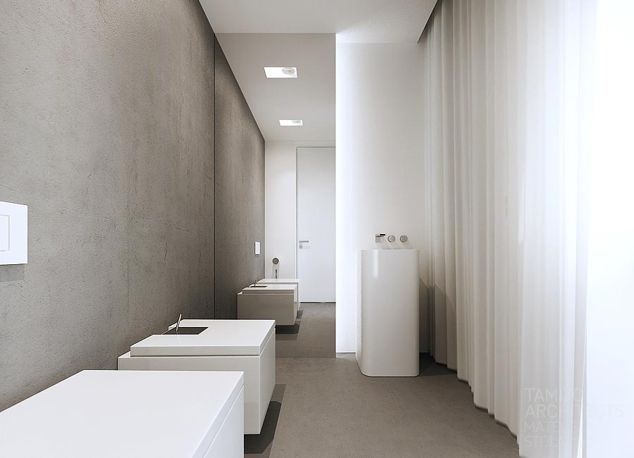
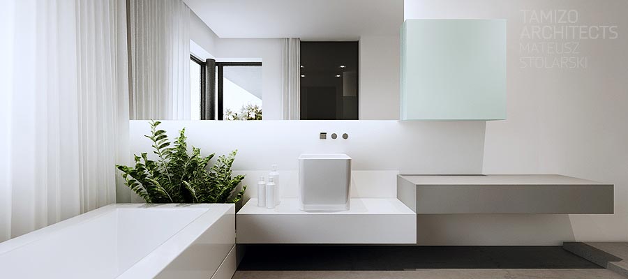
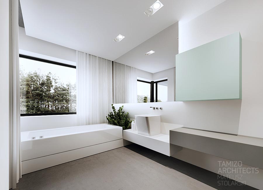
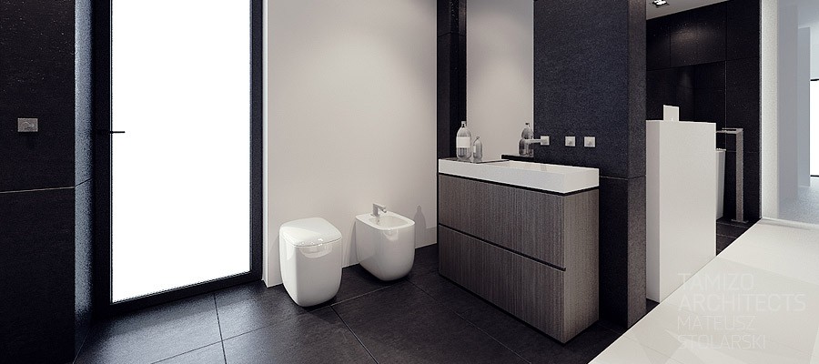
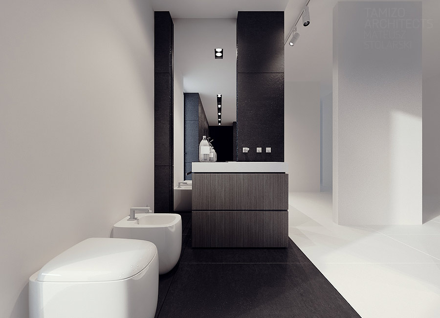
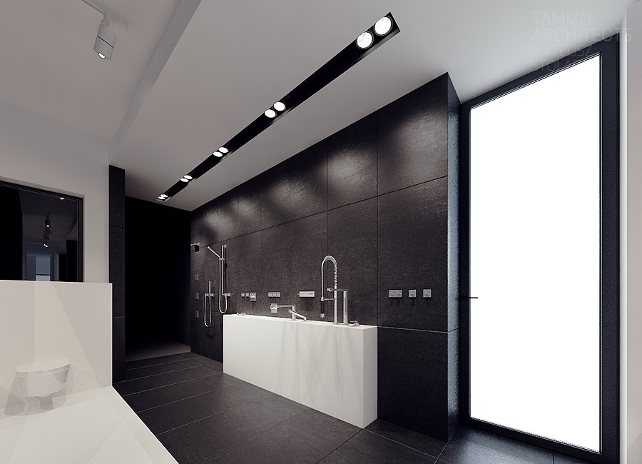
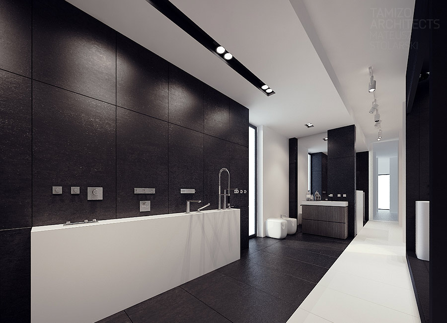
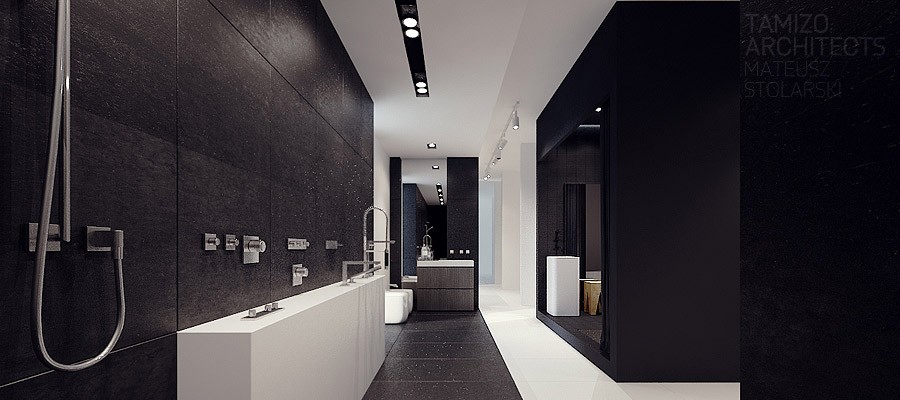
The private areas of the home, like the bathroom and bedroom, don't let up with the high contrast theme. Done mostly in white, the bathroom features unique sink basins that seem to exist apart from any plumbing systems for an ethereal and almost magical quality.
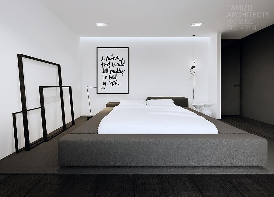
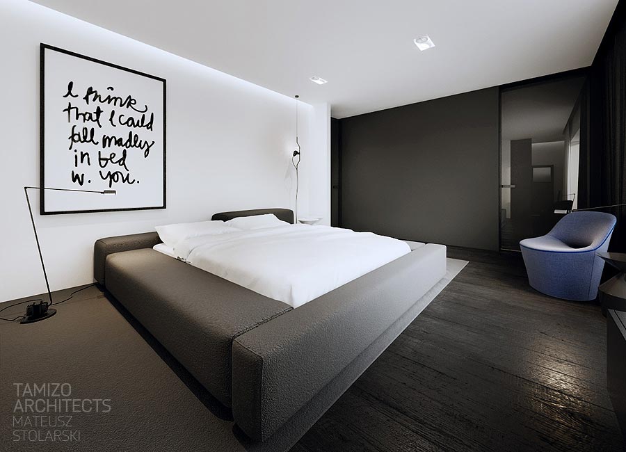
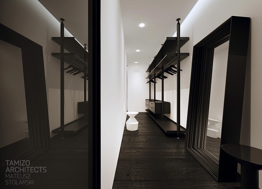
In the bedroom, we're drawn to the empty frames leaning against the wall, which are a less than subtle way to emphasize the importance of negative space in this design.
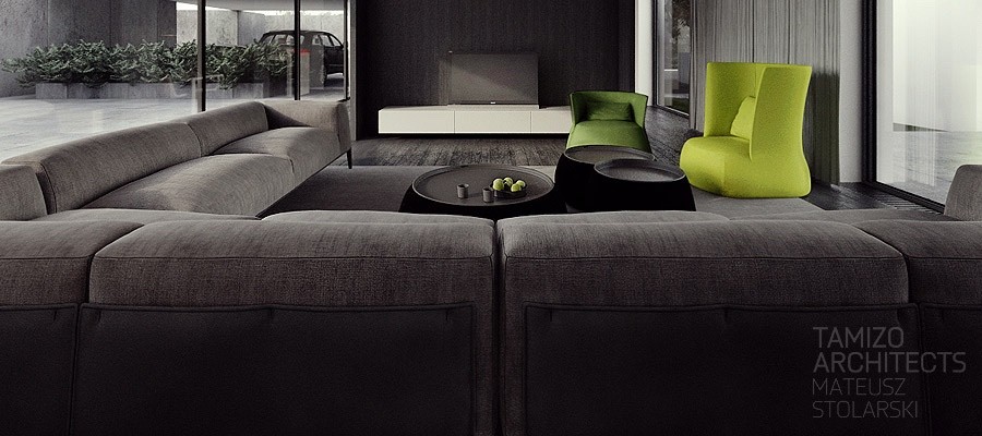
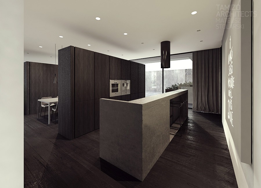
The second house is a single family home in Pabianice, a town in central Poland. Overall, this space has a bit more warmth than the first while still employing that distinctive black and white style.
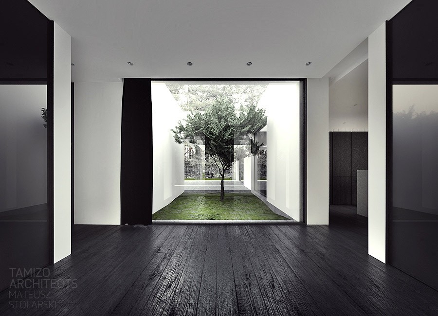
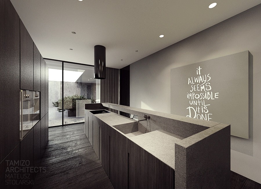
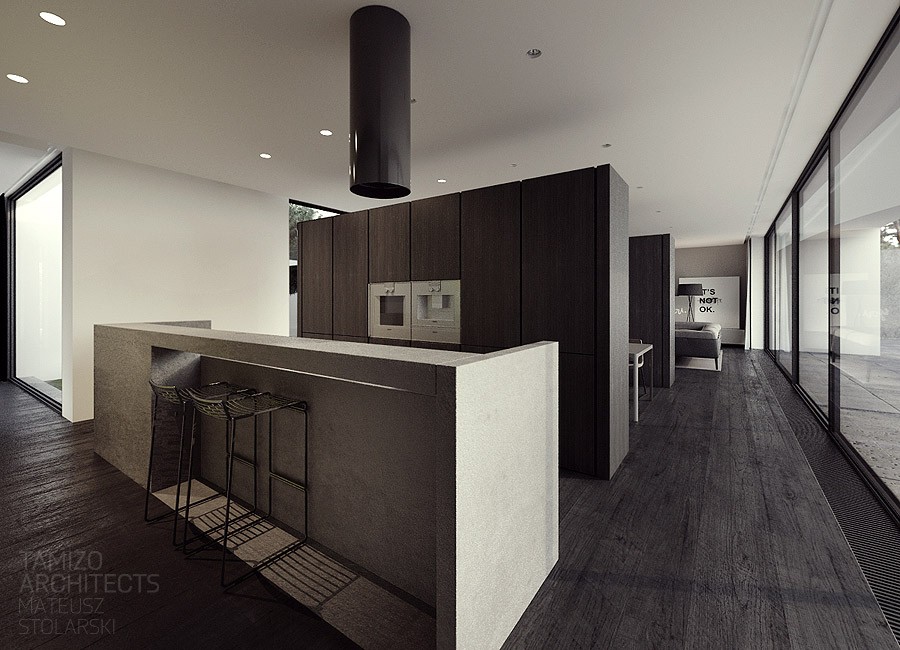
The use of natural elements in this space is also readily apparent from the dark texture wood floors and walls, as well as molded concrete and stone countertops. The design here is clearly drawing on that contrast between the industrial and that natural. In one particular view we can see how a window perfectly frames a trees just outside, hitting hard the idea that design - and man - exist only in the context of nature.
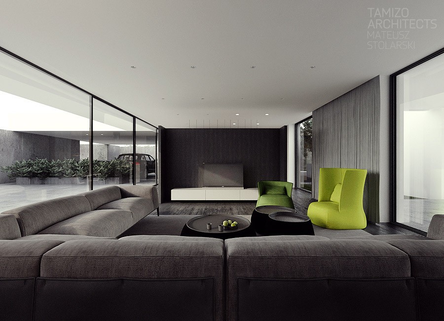
There is no shortage of seating this home either with an expansive sofa flanked by more green arm chairs along with a formal dining room.
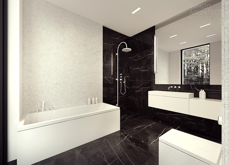
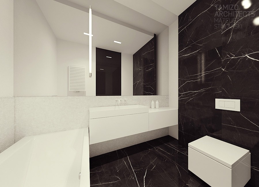
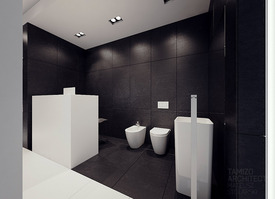
In the bathroom, simple white porcelain melts into black marble with white veins while the angular design of the fixtures is a bit jarring, but also stylish.
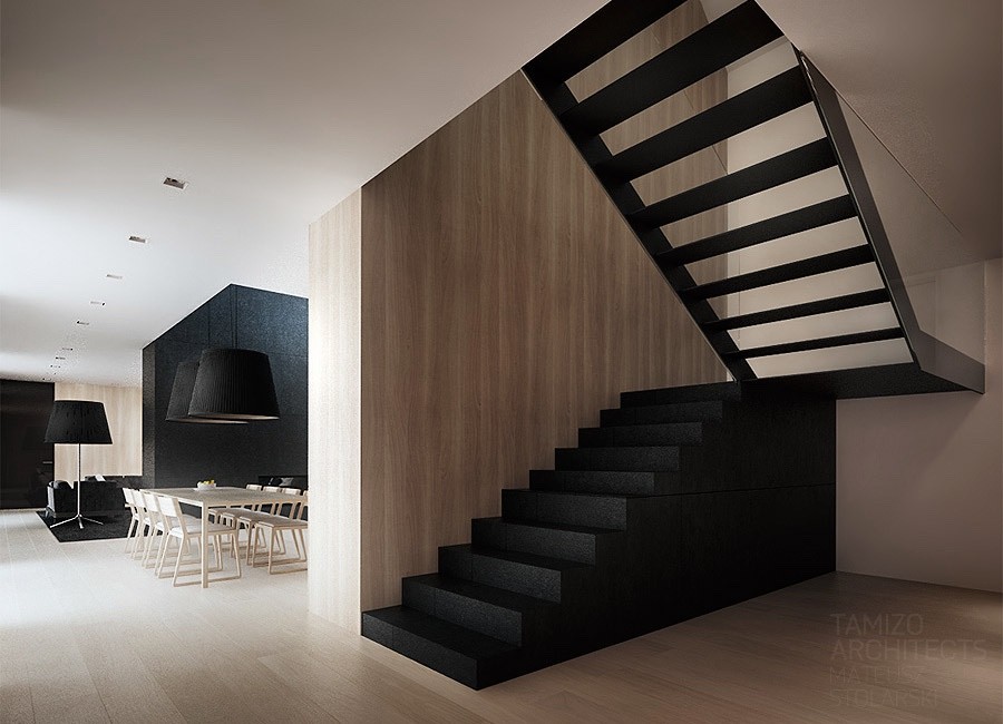
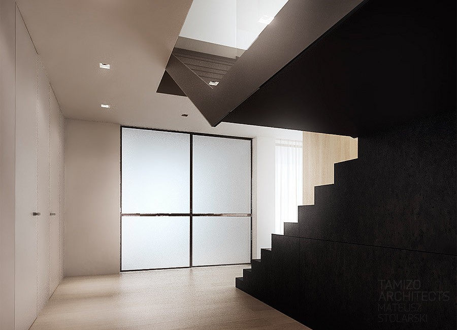
The third design comes from a single family home in łubki, in the village of Splints. The usable space in the home measures 380 square meters (4090 square feet). The home sprawls over multiple stories, each with its own answer to the black and white theme.
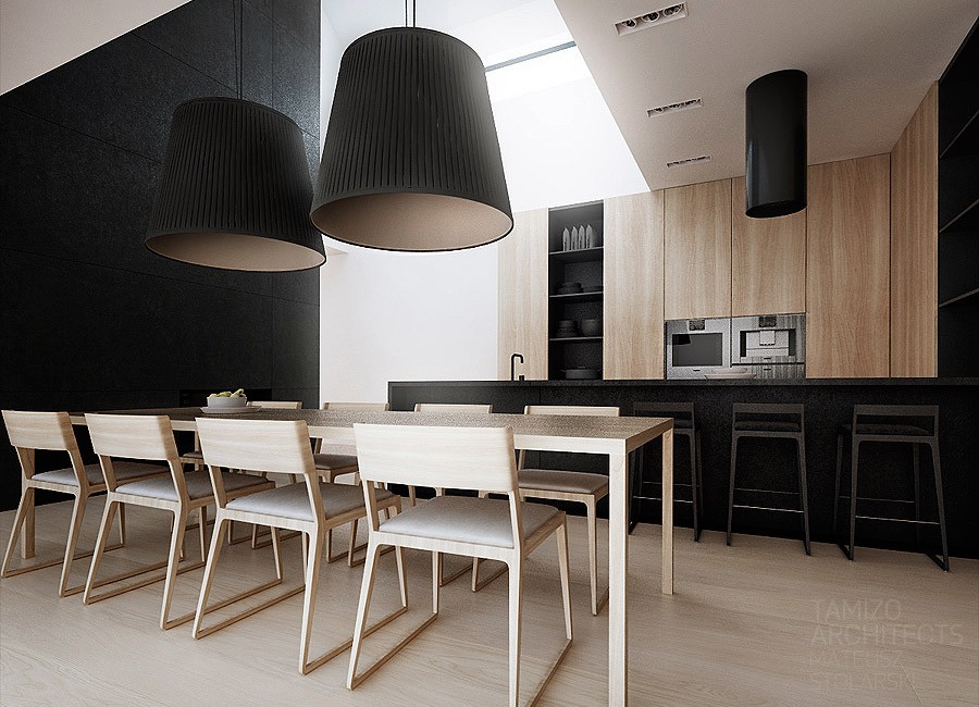
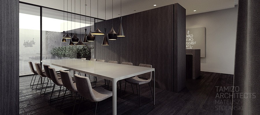
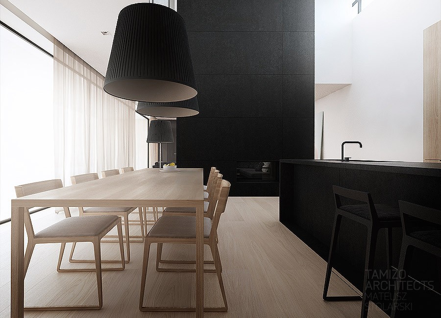
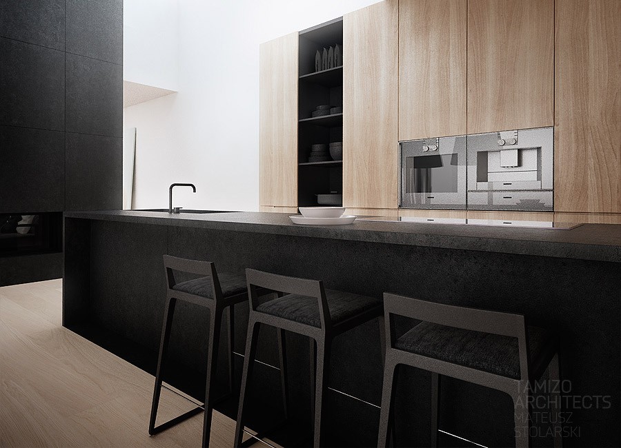
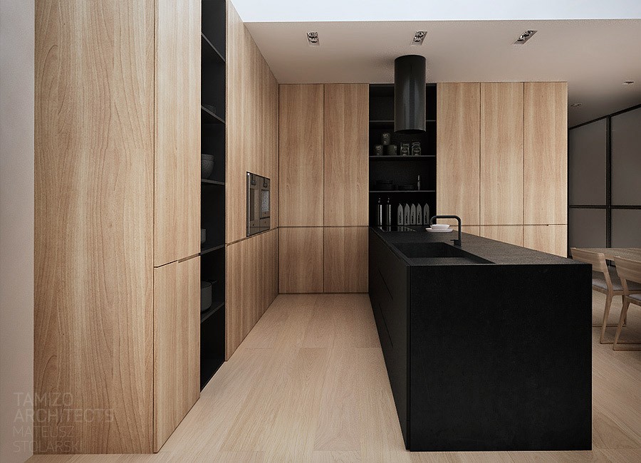
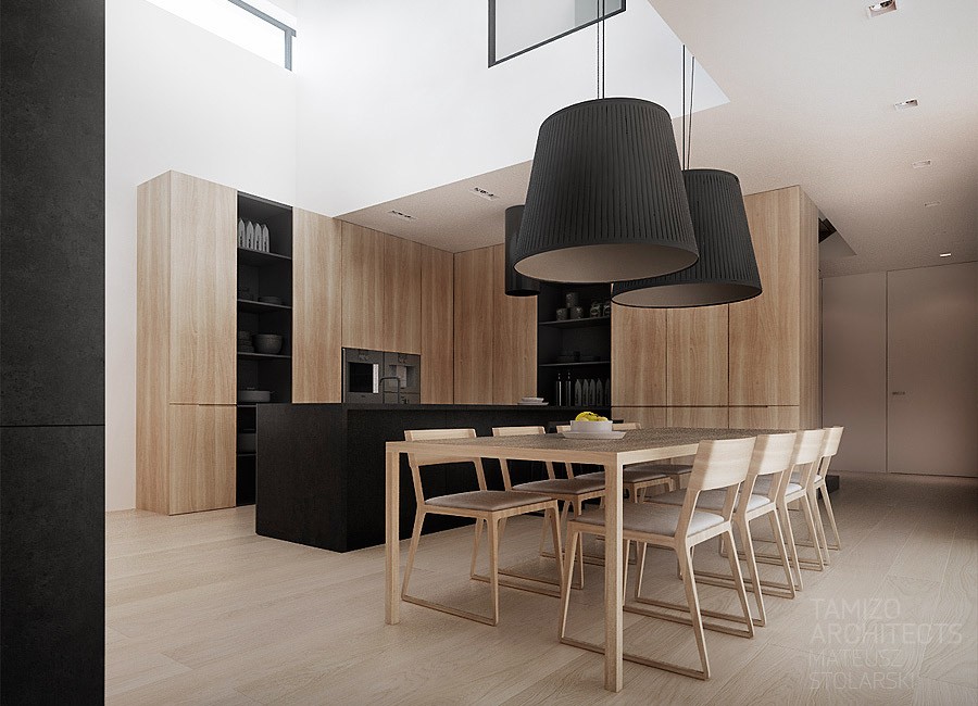
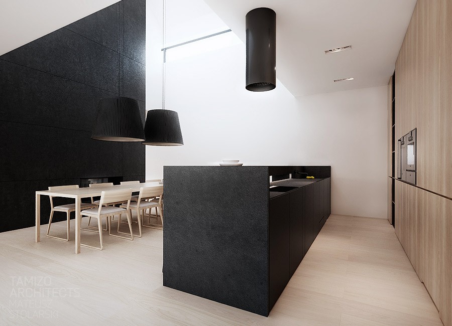
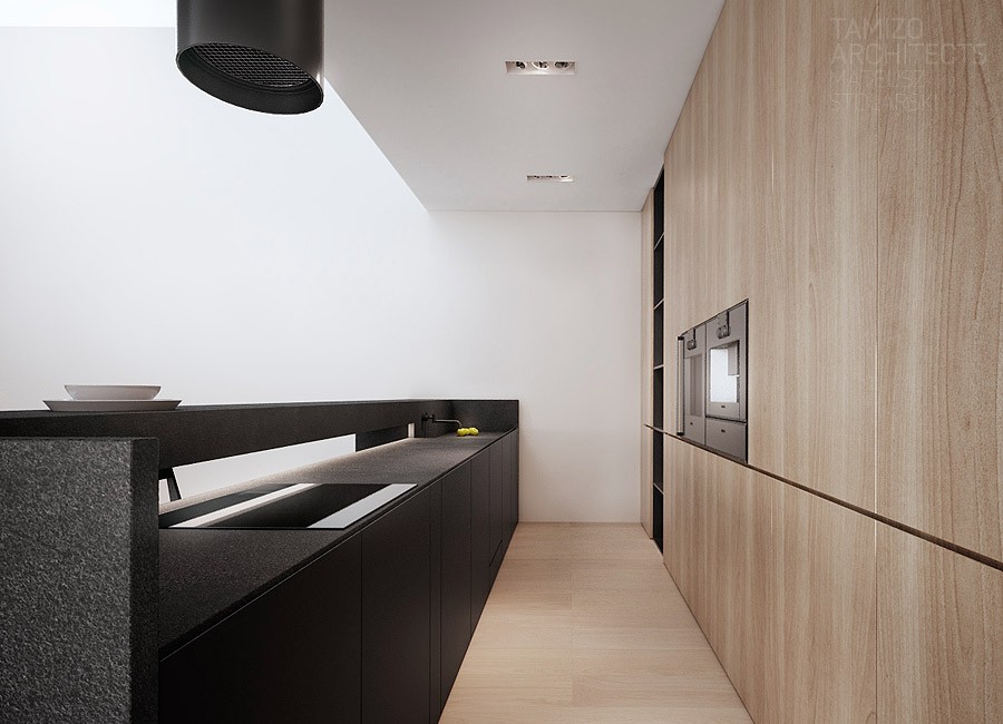
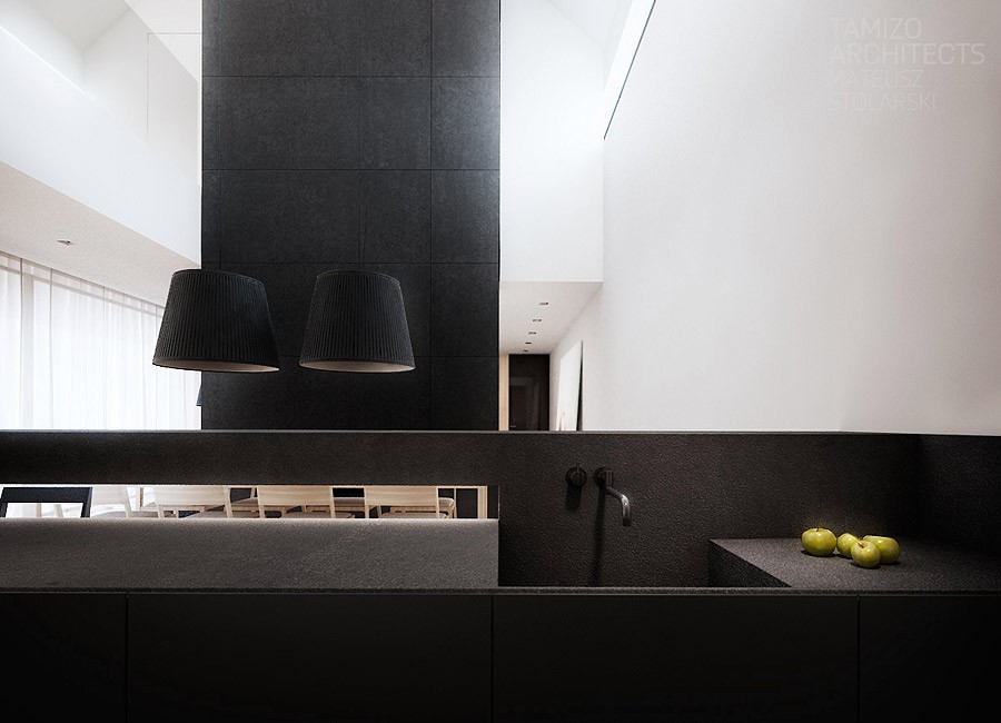
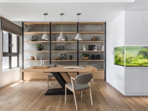
Natural wood elements, in the flooring, furnishing, and even the cabinetry contrast with black design elements including countertops, shelving and once again those oversized lampshade that look like they came from the other side of the looking glass. The two contrasting palettes create an invisible divide between kitchen and dining, work and entertainment, effort and relaxation.
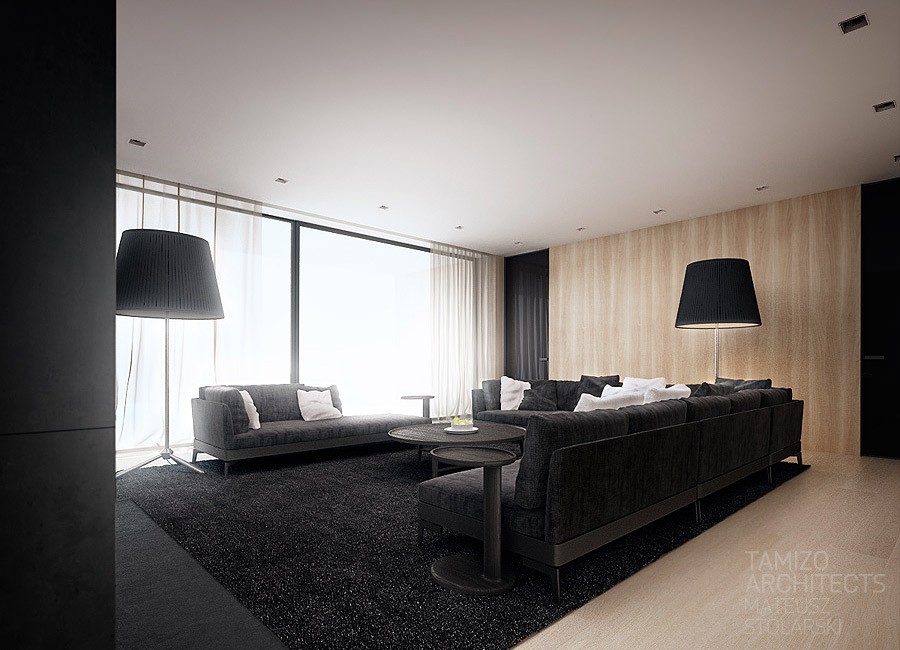
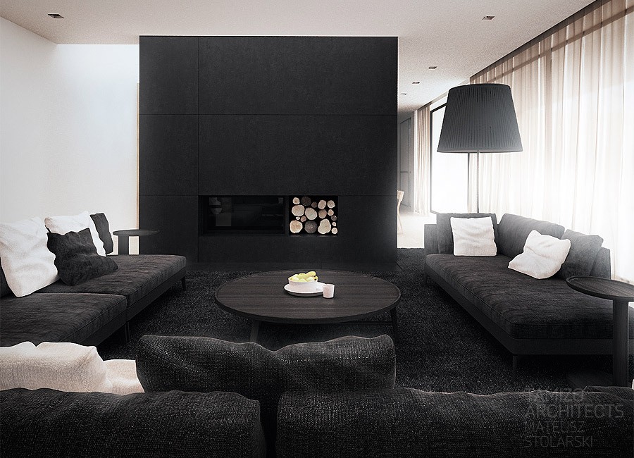
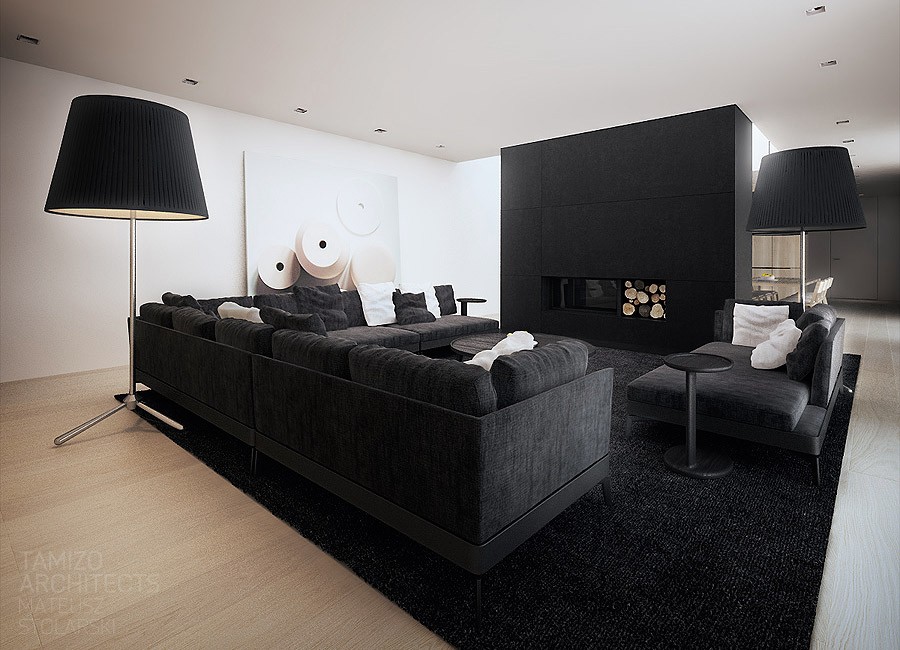
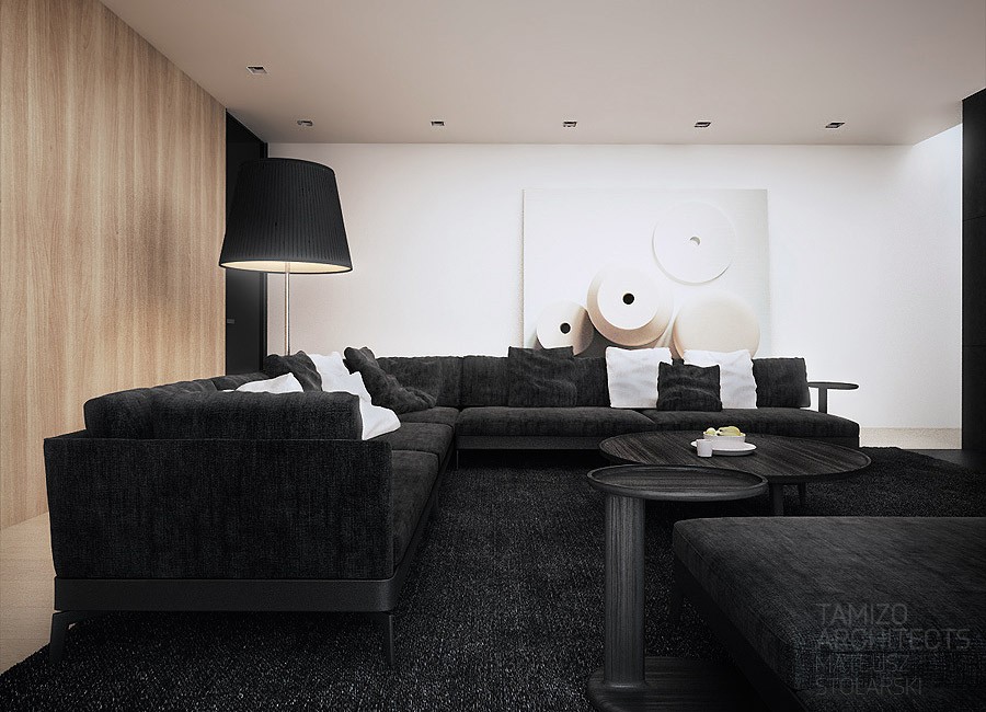
The living room gives way to pure indulgence with soft black sofas piled high with black and white pillows and a soft black rug. The combination manages to create a conversation pit that feels sunken and isolated just through the use of color.
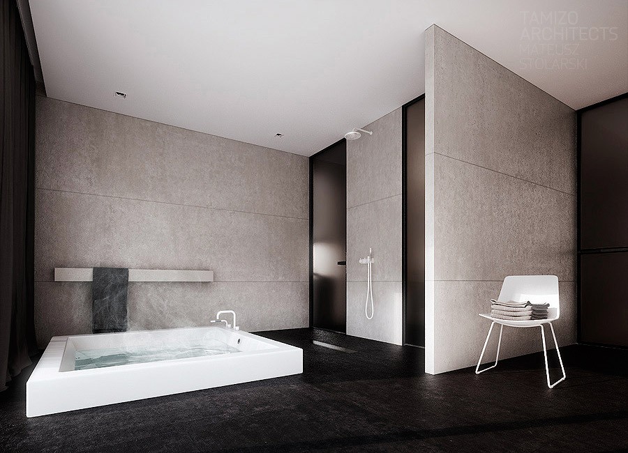
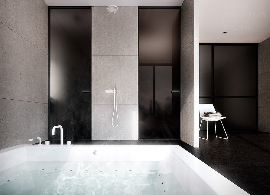
In that bathroom we witness an actual sunken pit with an oversized whirlpool built directly into the floor. Nestled right next to it is a rainfall showerhead fixed at such a height that it might actually feel like rainfall.
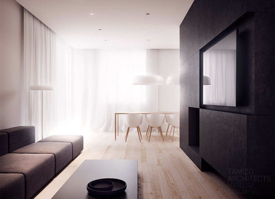
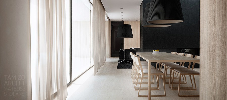
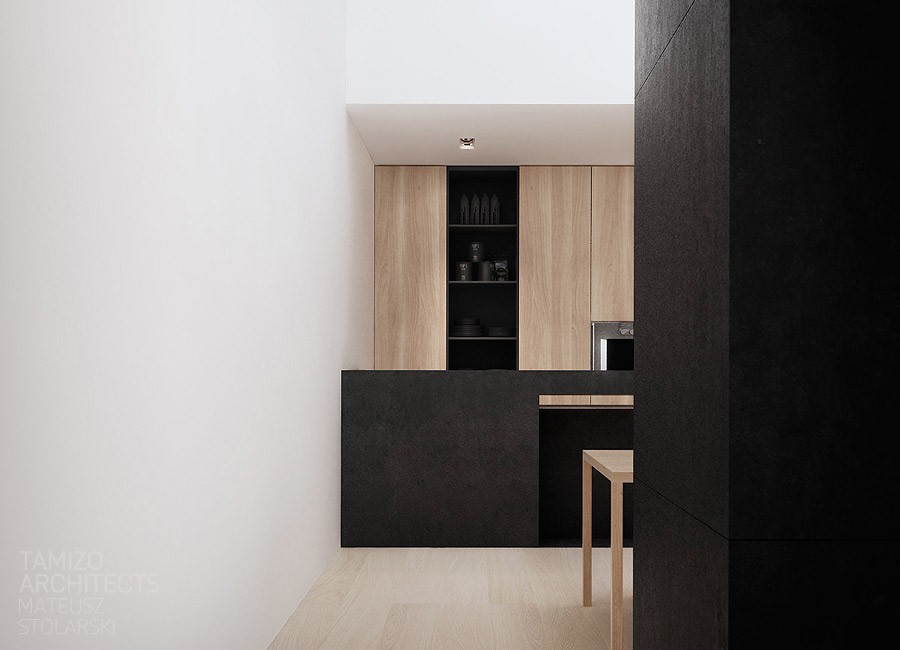
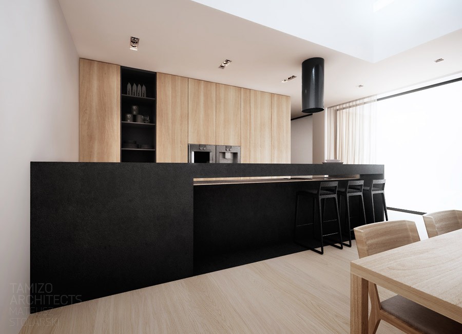
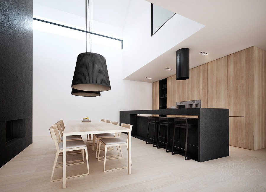
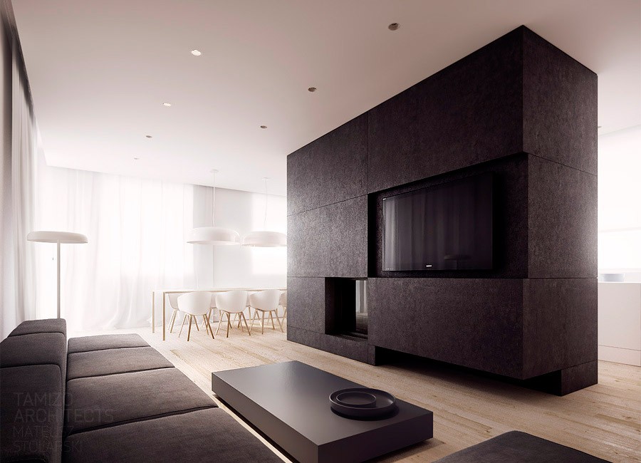
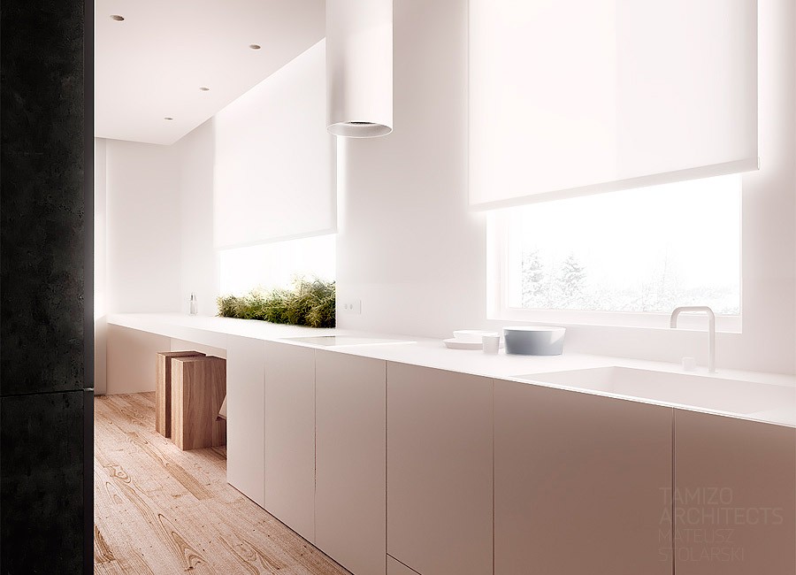
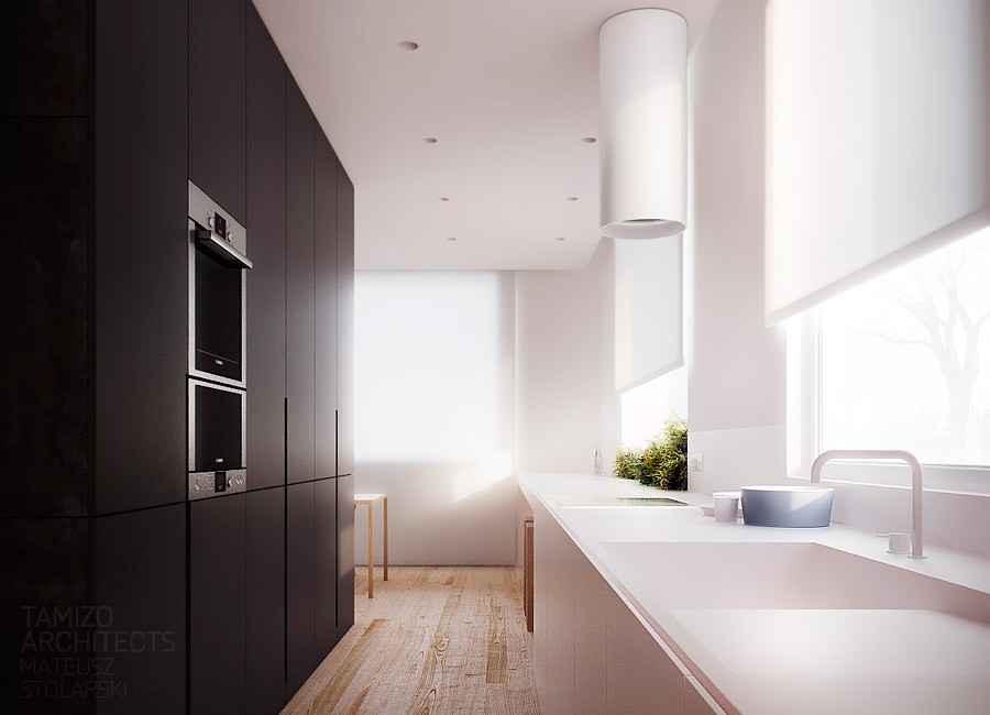
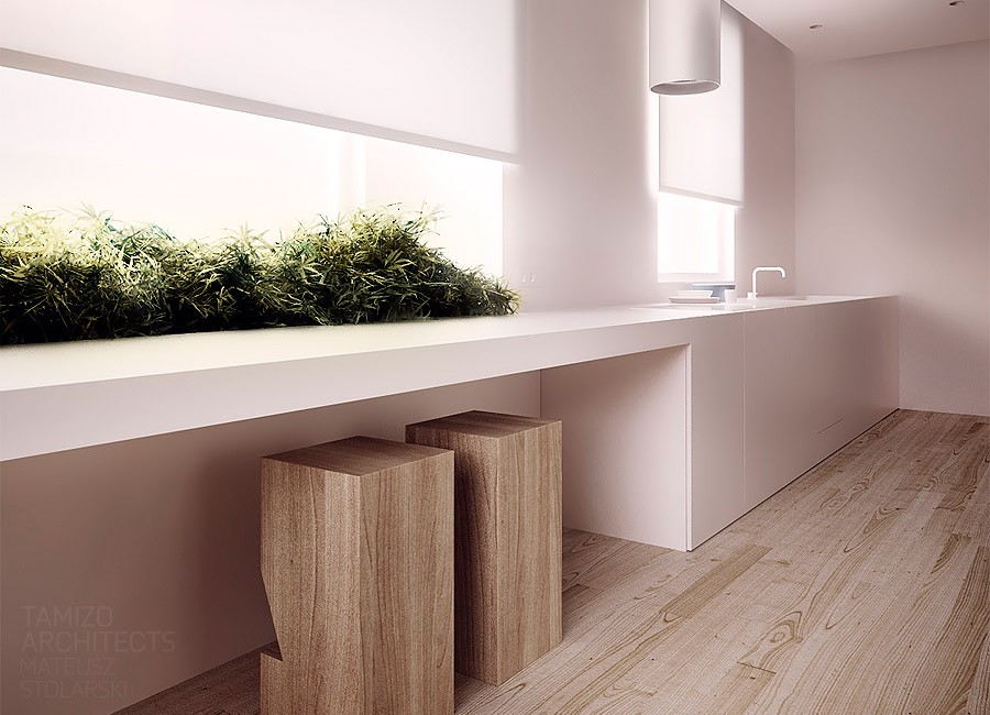
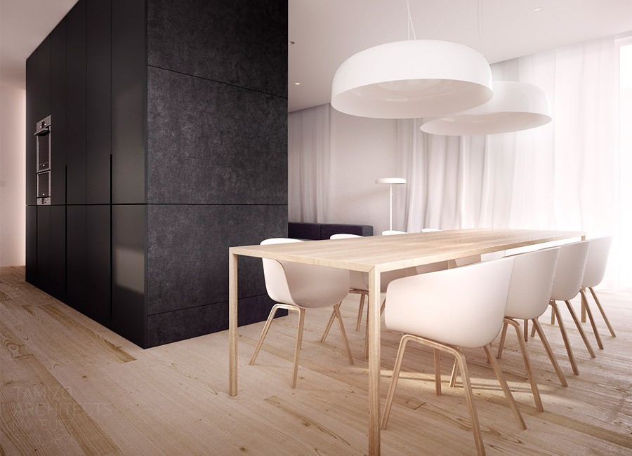
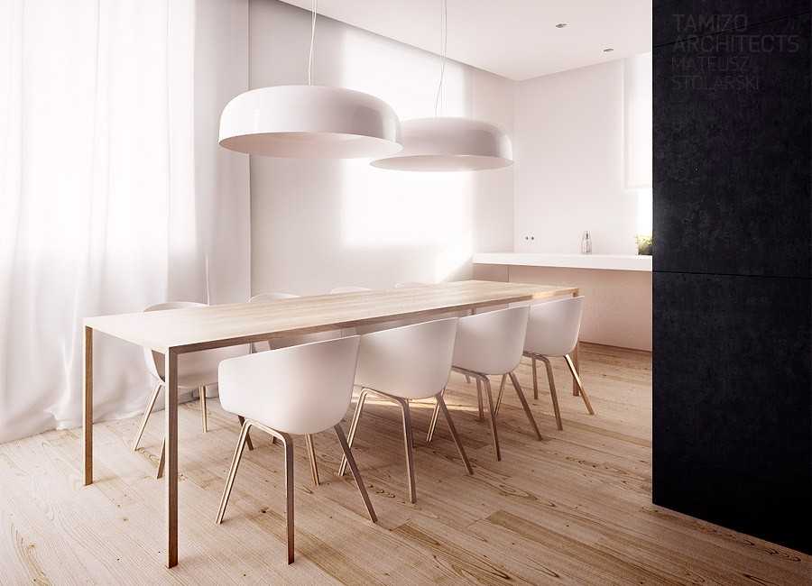
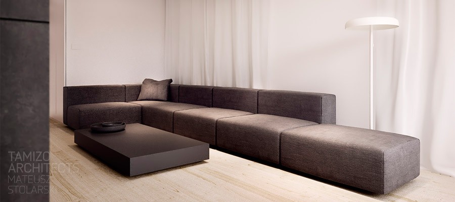
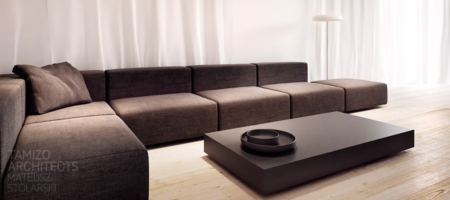
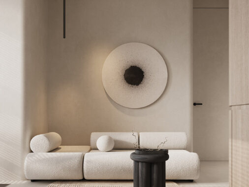
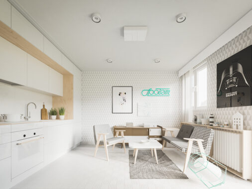
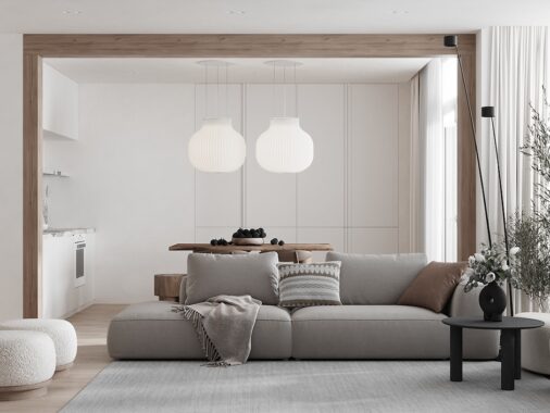
The fourth house is a single-family home in Lodz with a usable area of just 85 square meters (914 square feet). The color palette here, while remaining high contrast with plenty of black and white is made lighter and brighter by the use of light natural wood and white from the ceiling all the way down the walls, including the curtains.
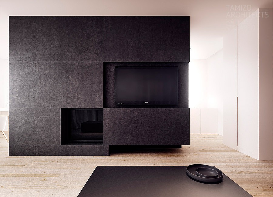
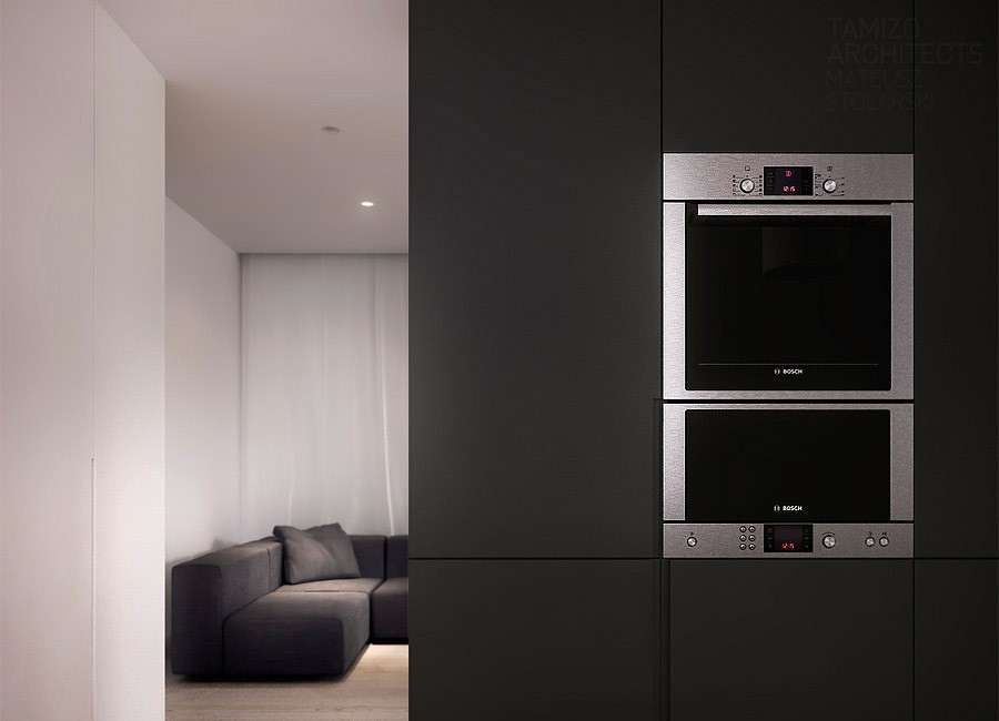
In fact, black is quite deemphasized in this particular house, forming really only the central kitchen appliance island-cum-entertainment-center and poking through in the dark gray living room in the form of a coffee table. This scheme makes sense for a family home that wants to feel spacious and warm.
