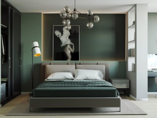
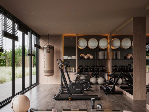
We can't help but gather great ideas on how to create practical open plan spaces from these two realistic sized apartments, that have been beautifully visualized by Artem Lazarev. With calm yet confident color palettes, flowing furniture layouts and clever storage designs.
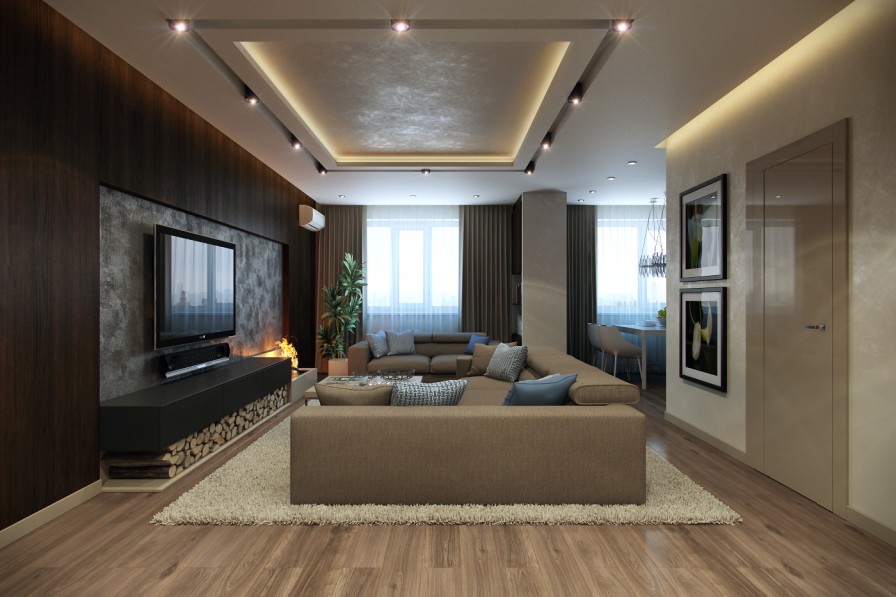
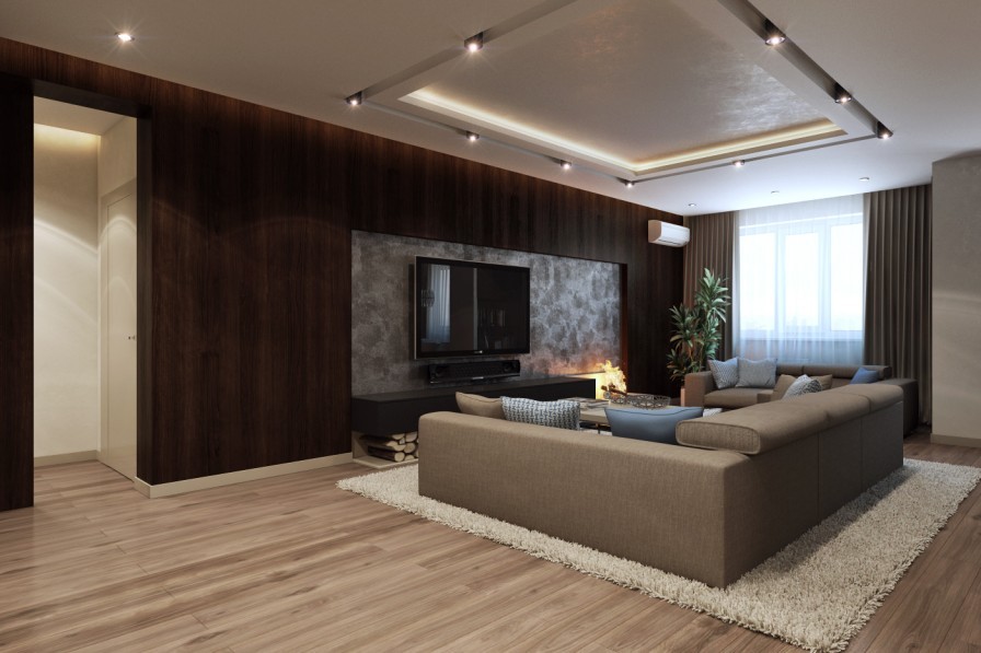
Apartment design number one begins in the lounge area, which at first glance appears to be larger than the average living room. But on closer inspection, we see that the spacious feel has been created by moving the couch into the center of the room, where even though there is not a great area left between the return of the sofa and the fireplace, the flow of space around it creates an airier design.
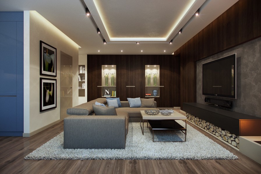
As is typical now in modern life, an entire wall has been dedicated to home entertainment-though on this occasion the design incorporates an attractive bank of wooden fuel for the fire that has been moved to a second billing position at the side. This shuffling of priorities allows the TV to be enjoyed at the optimum position whilst avoiding heat damage, but still allows the homeowner to enjoy a cozy fireside ambiance as an alternative to the hidden heating system.

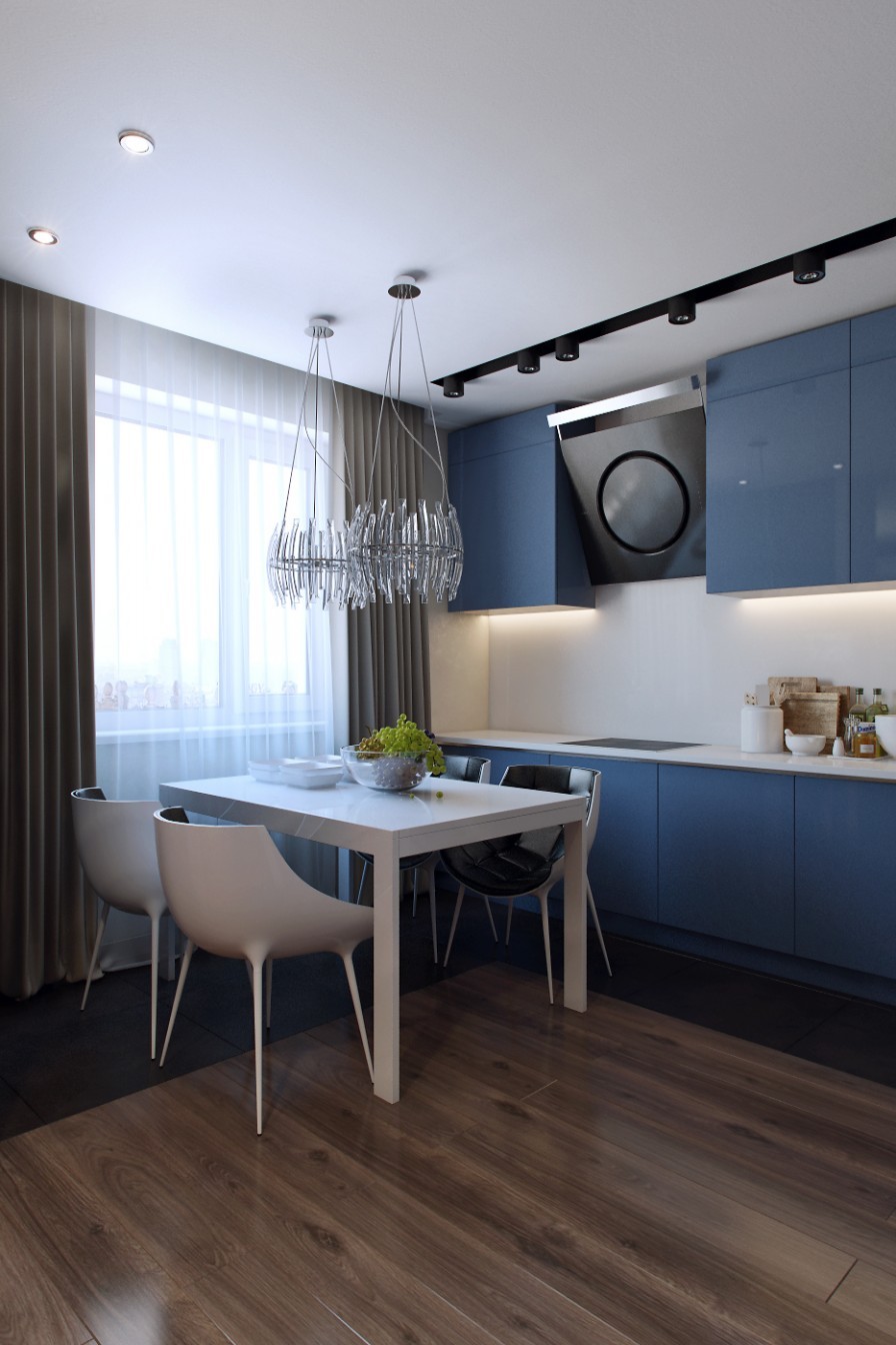
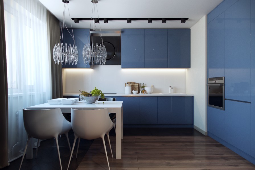
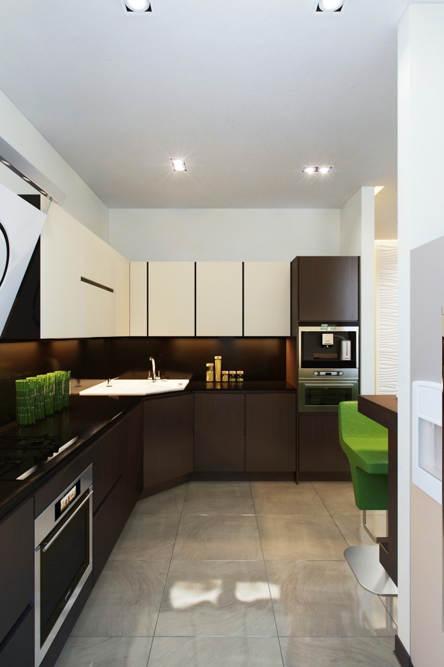
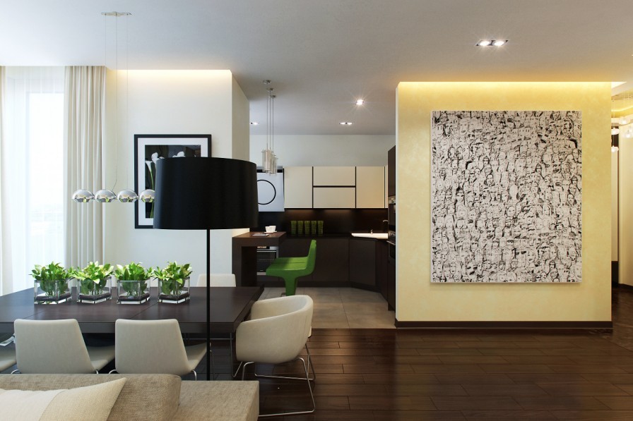
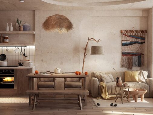
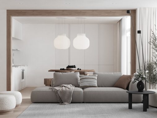
An L-shaped kitchen allows space to situate a modest dining table to accommodate four diners. The small space still manages to evoke the feeling of luxury with the help of two striking pendant lights; in terms of light distribution, one light would suffice over the eating area, but in terms of design a duo gives a greater result.
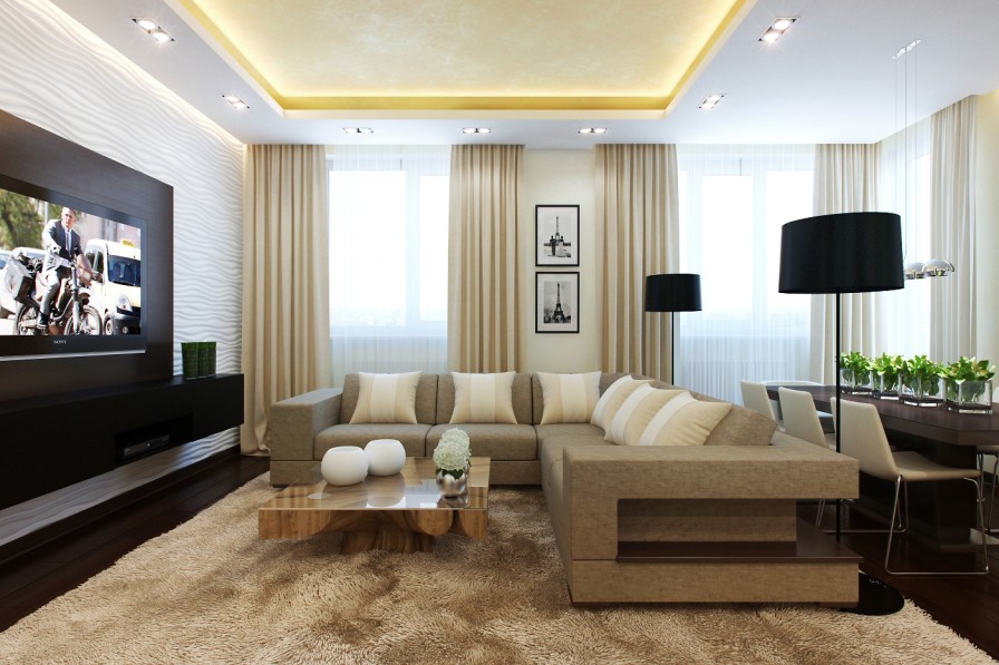
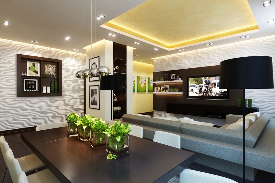
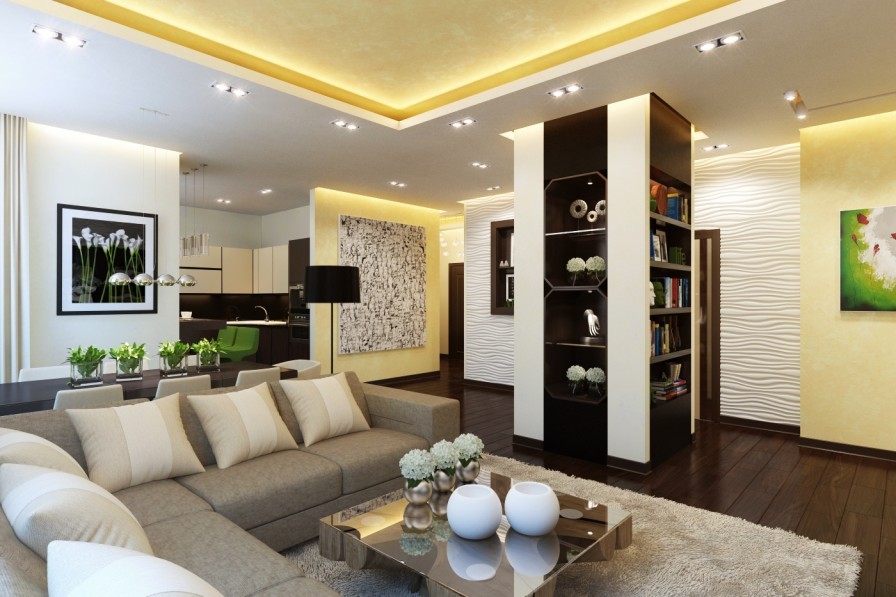
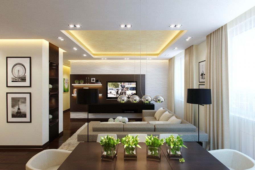
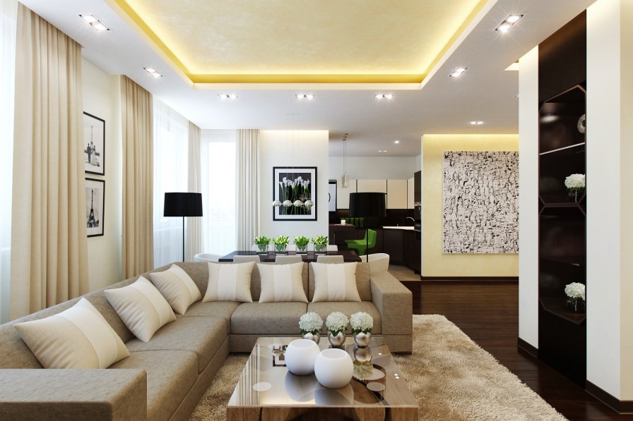
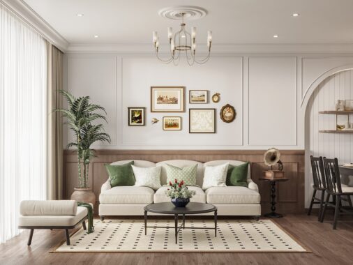
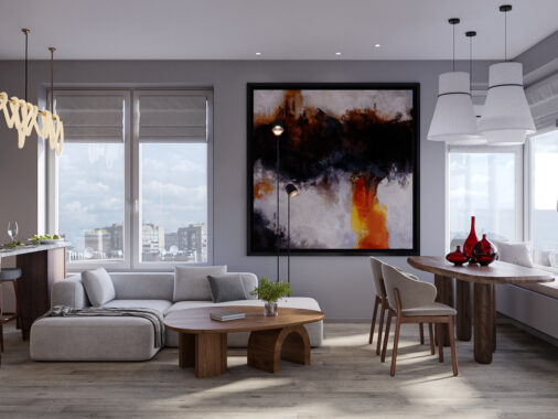
In our second apartment, an L-shaped sofa is coupled with two standing lights which create practical reading areas a swell as looking bold.

Immediately behind the sofa, an eight seat dining suite fits in the slot with just enough space around it to pull out the chairs. Try to avoid pushing your dining suite up against a wall “to create more space†if you can help it, as it will actually make your room appear more cramped.
