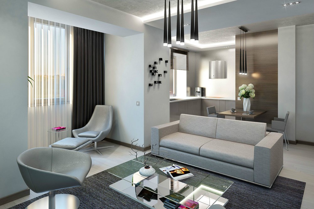
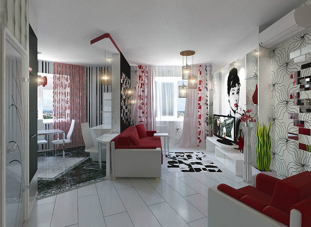
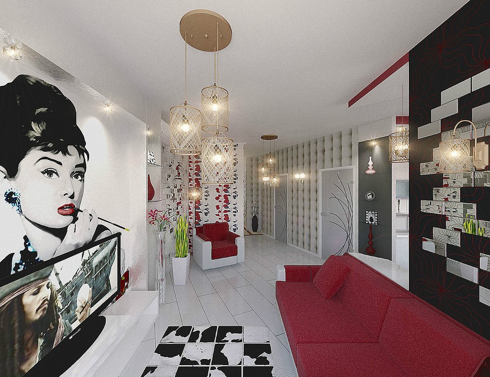
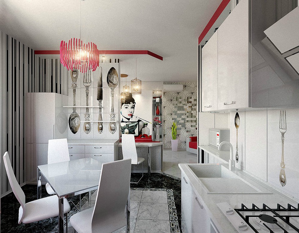
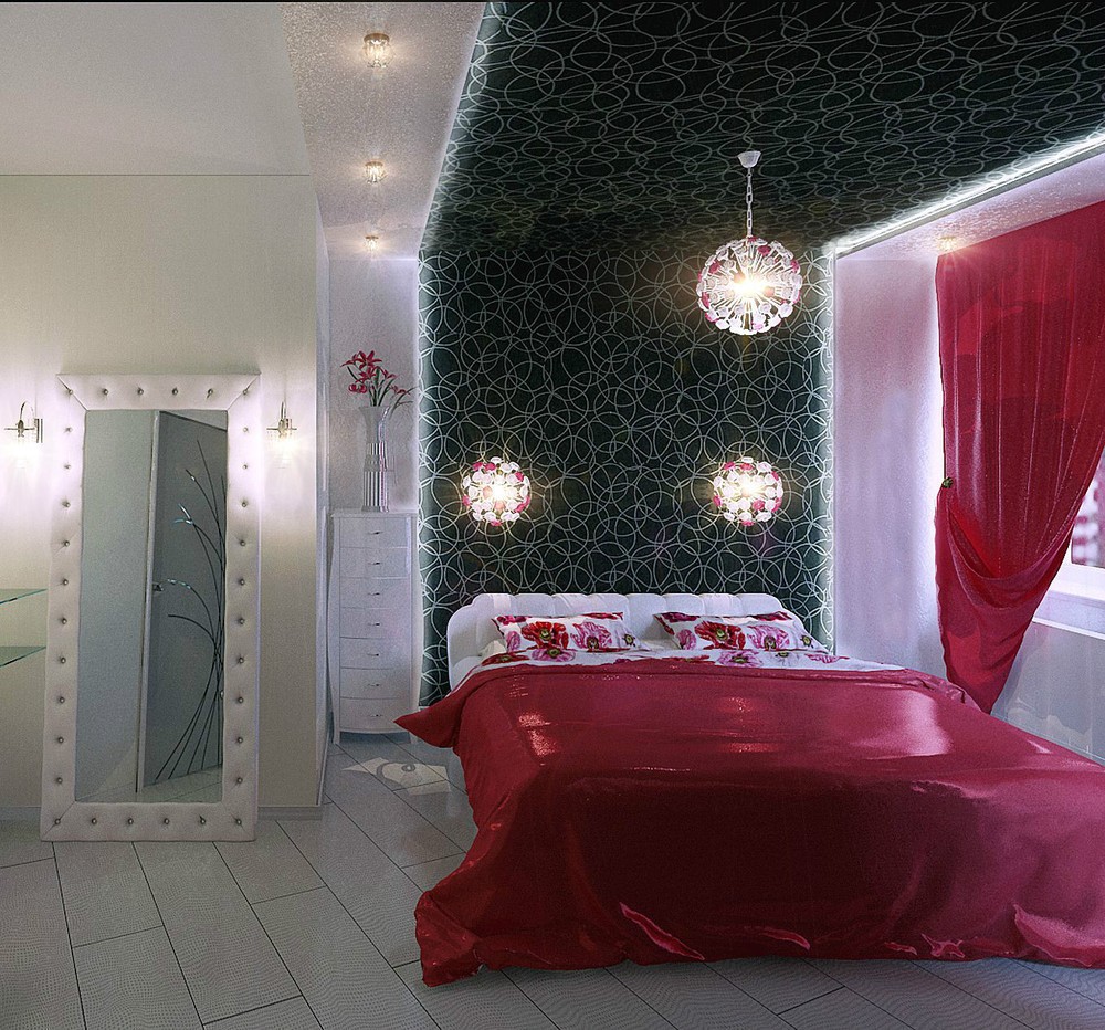
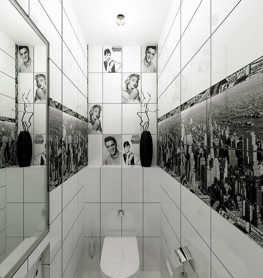
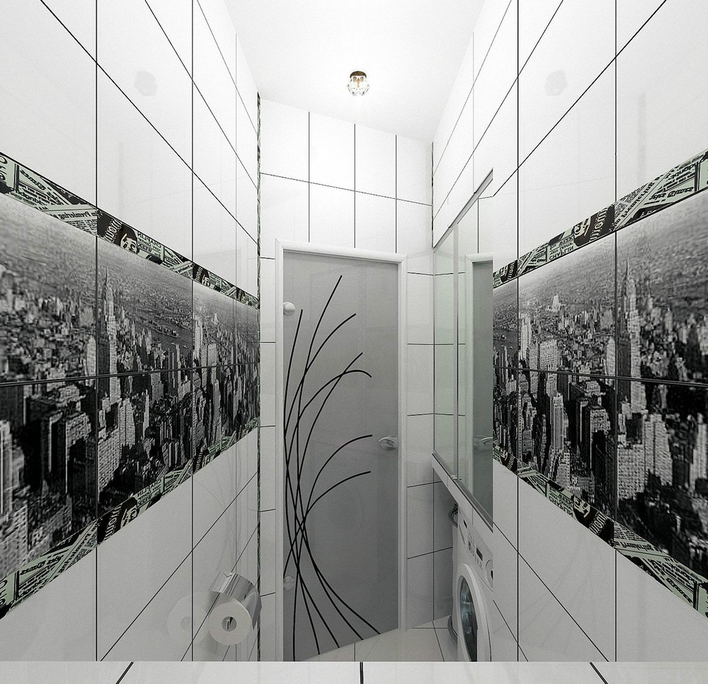
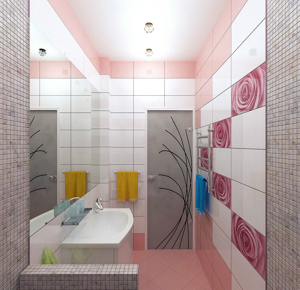
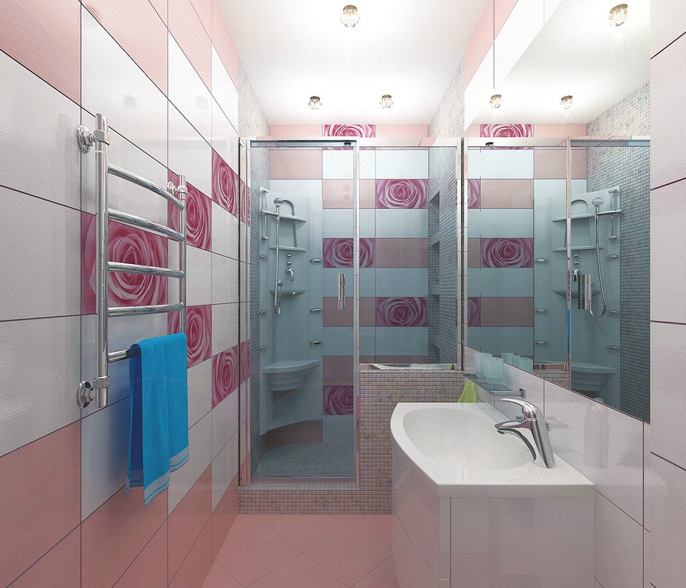
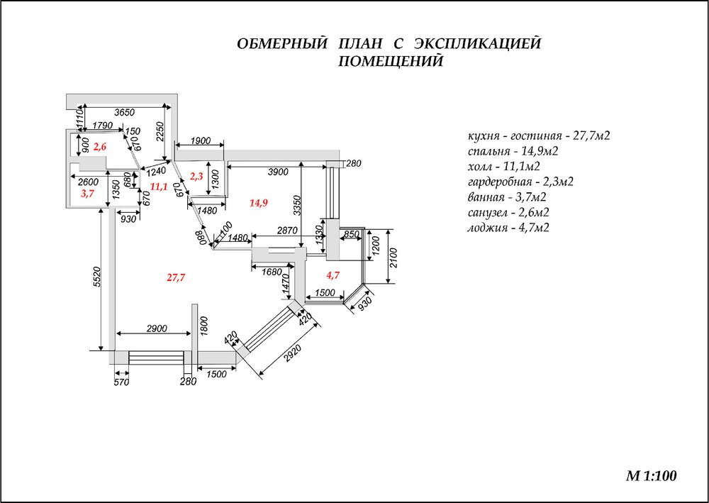
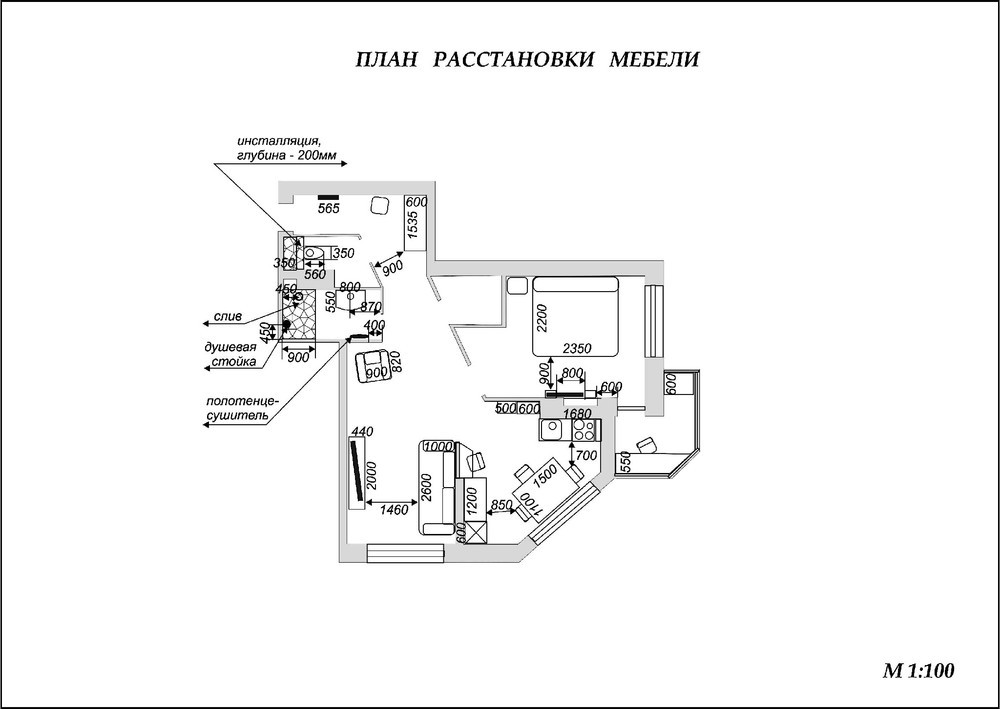
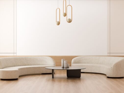
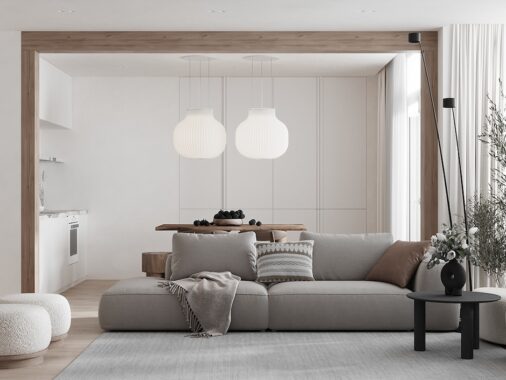
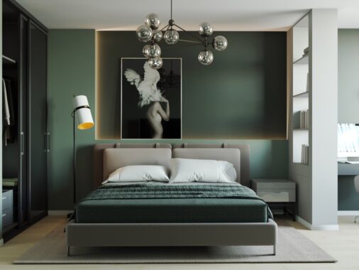
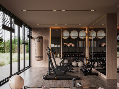
These two separate apartment designs explore décor solutions for one young bachelor and one young bachelorette. The first apartment is a chic and sleek affair that edges on the more masculine side, but overall the result is a gorgeous space that would be enjoyed by either gender. Home number two is an extremely feminine concoction that might even be too girly for some girls!
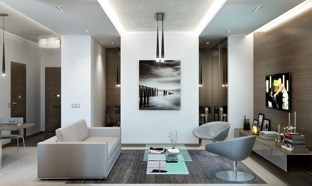
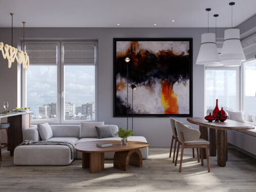
Designed by visualizer Andrey Volkov, the look builds slowly with a minimalistic living room scheme that gathers its warmth from the rich wood tone of the entertainment feature wall.
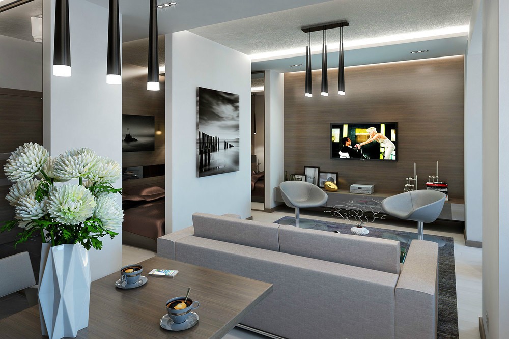
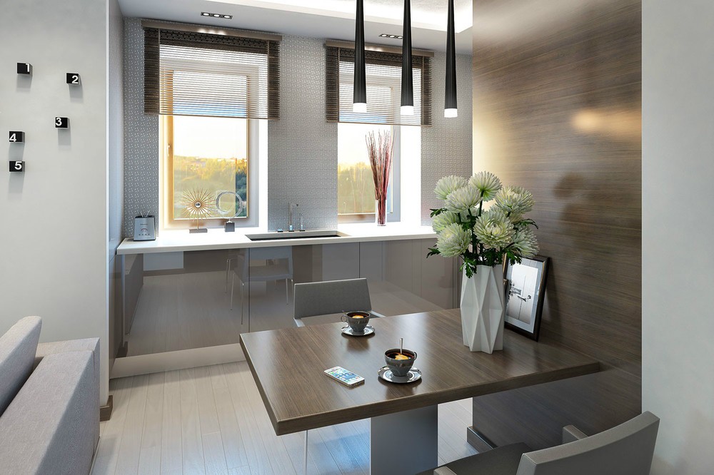
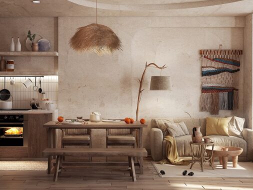
Low hanging unique dining pendant lights give the design an extra layer.
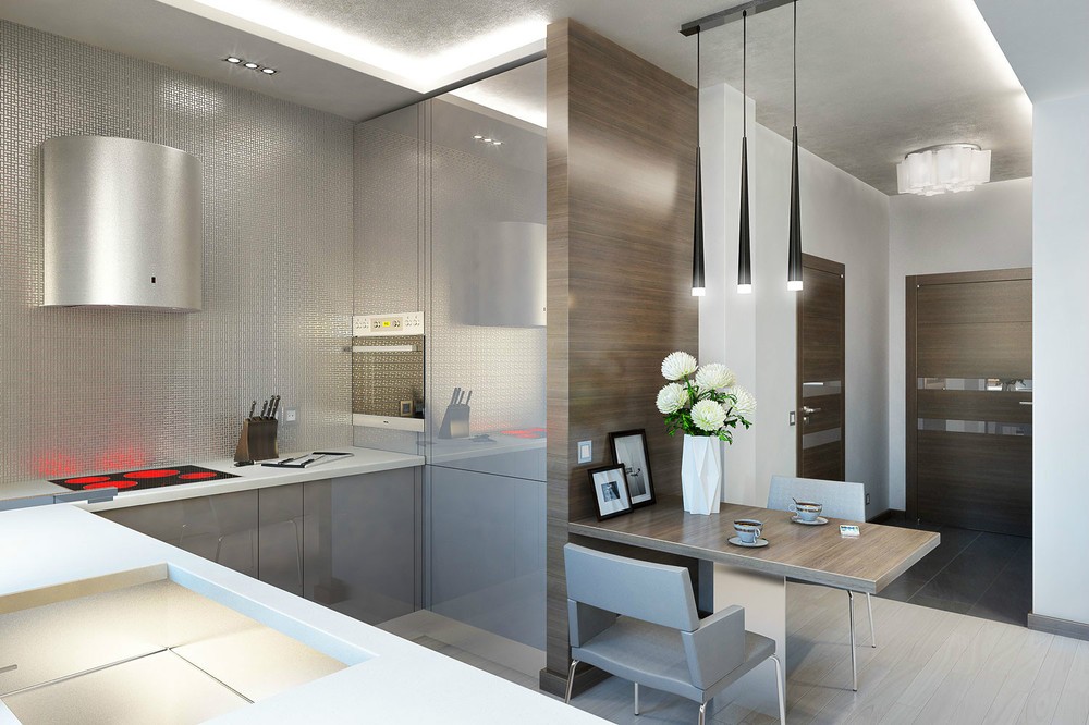
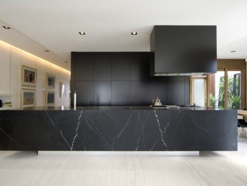
A sparse kitchen gives way to a quaint eating area, flanked with wood cladding that matches the facing wall.
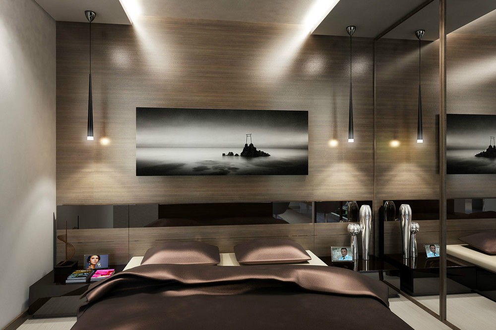
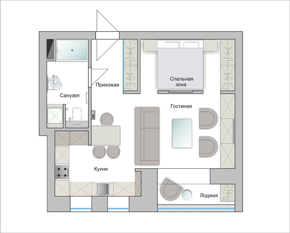
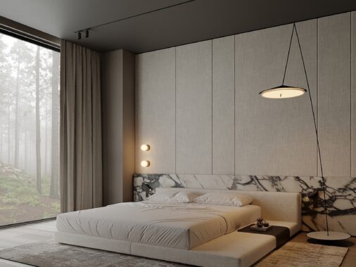
The bedroom is a little glimmer of design genius: To start, the tiny area appears luxurious with an entire wall dedicated to the headboard, where a glossy black horizon line adds an illusion of extra width to the narrow dimensions. Closet doors are mirrored to trick the eye and increase the feeling of space further, whilst also concealing clutter from view...
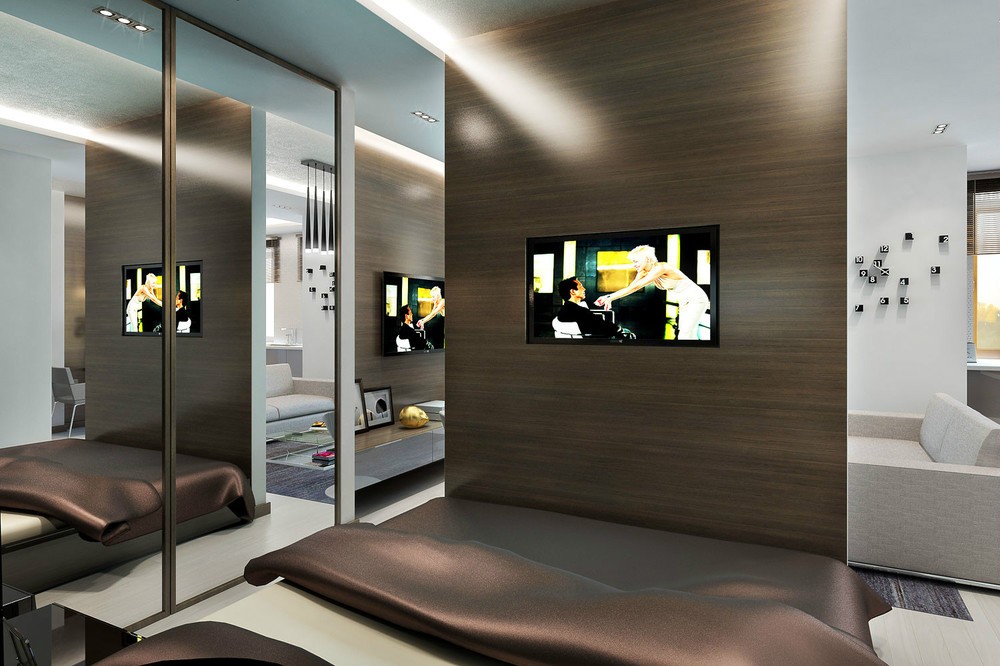
...But it's at the foot of the bed where the magic really happens; the dividing wall from the lounge of this small apartment is butted up against the footboard, and this problem has been resolved by creating double doorways from each side of the bed, and an integrated flatscreen TV that distracts from the close proximity perfectly.
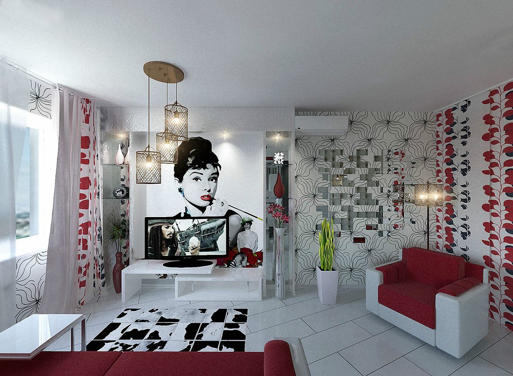
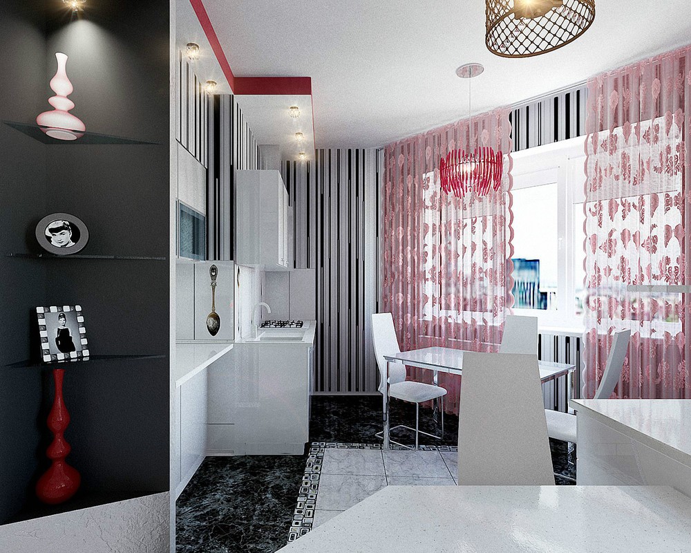
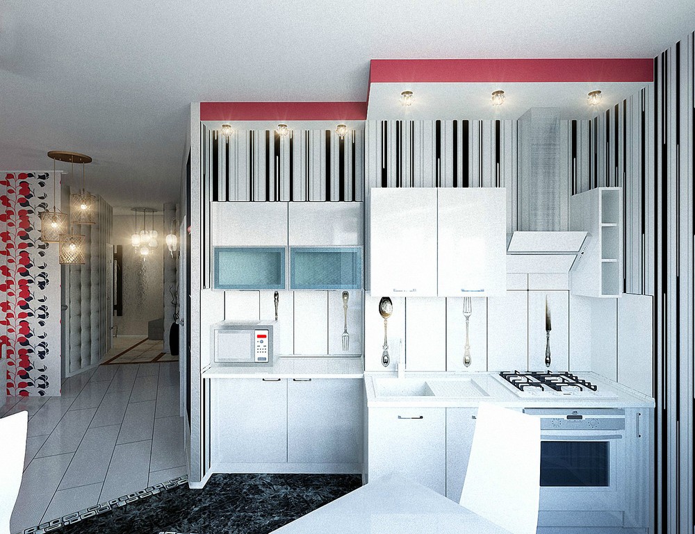
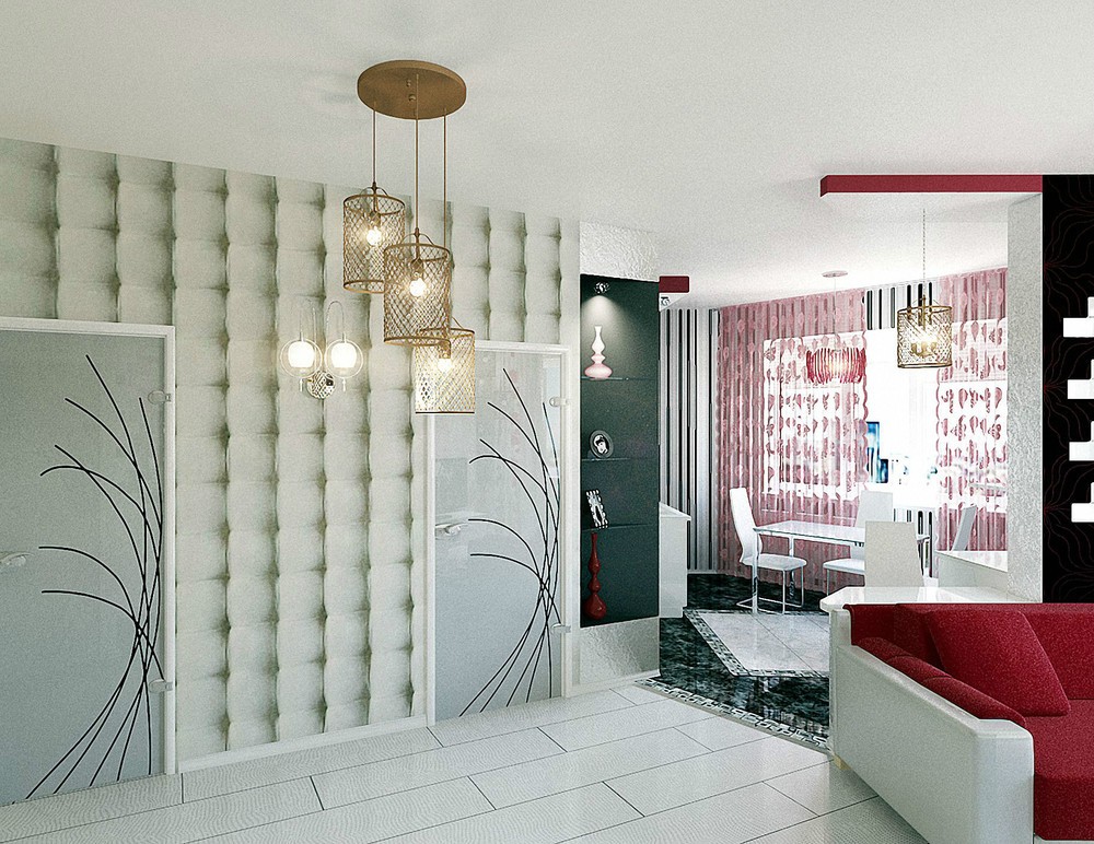
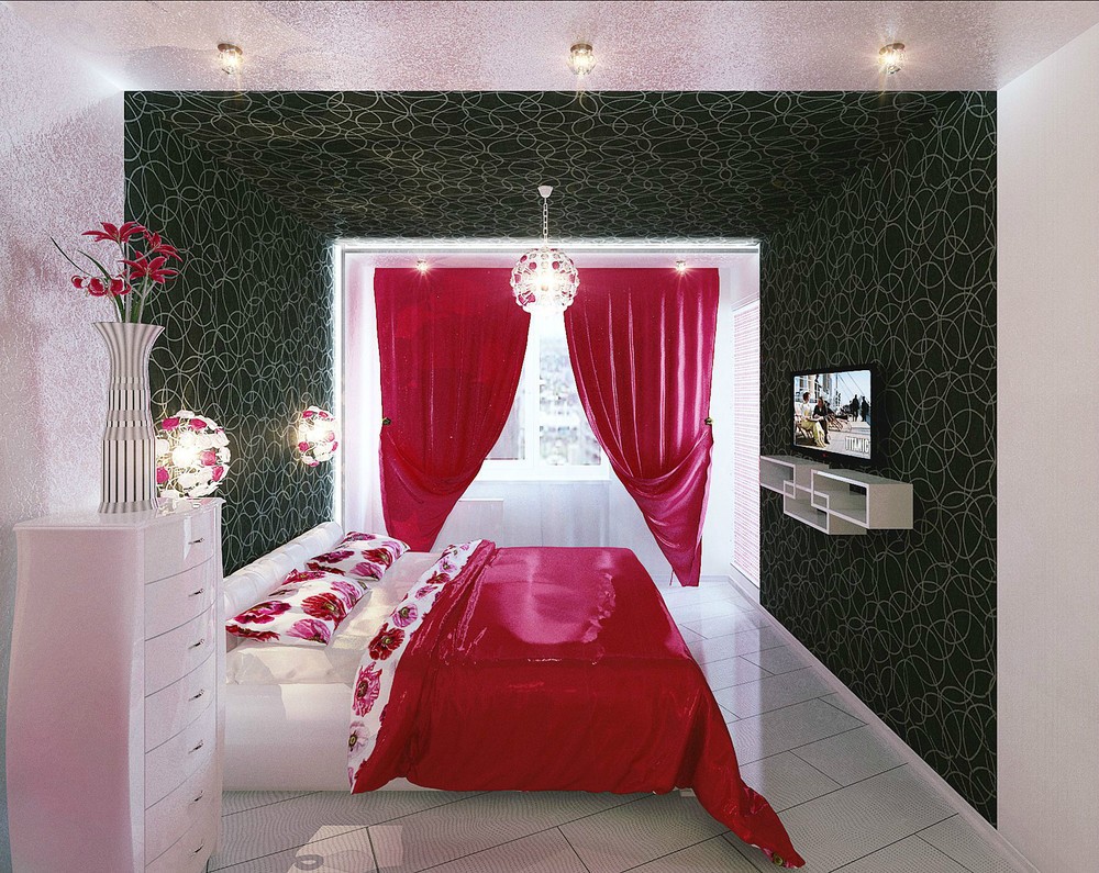
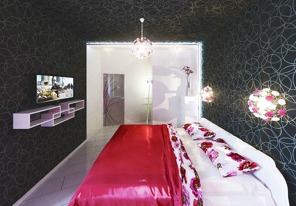
The apartment designed for a young woman, by Skripkin Elena, is a crazy clash of prints brought together in one strong color palette of red, black and white.
