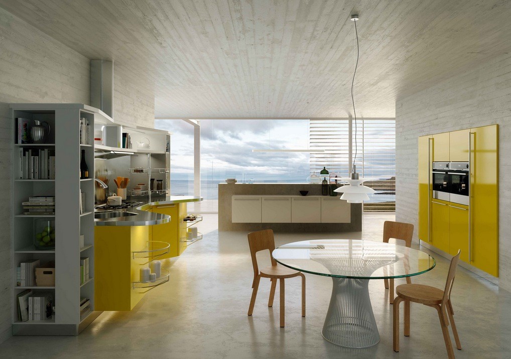
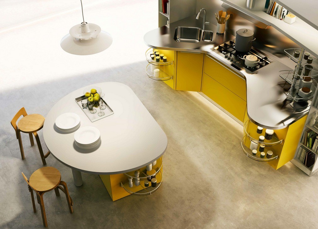
Italian designers Snaidero specialize in kitchens that cater to the needs of home chefs with every detail. Their most recent effort is the Skyline 2.0 collection, specifically intended to work logically with your movements in the kitchen for the ultimate in comfort and efficiency. Of course, we would not be featuring these kitchens on this blog if they were not also effortlessly stylish.
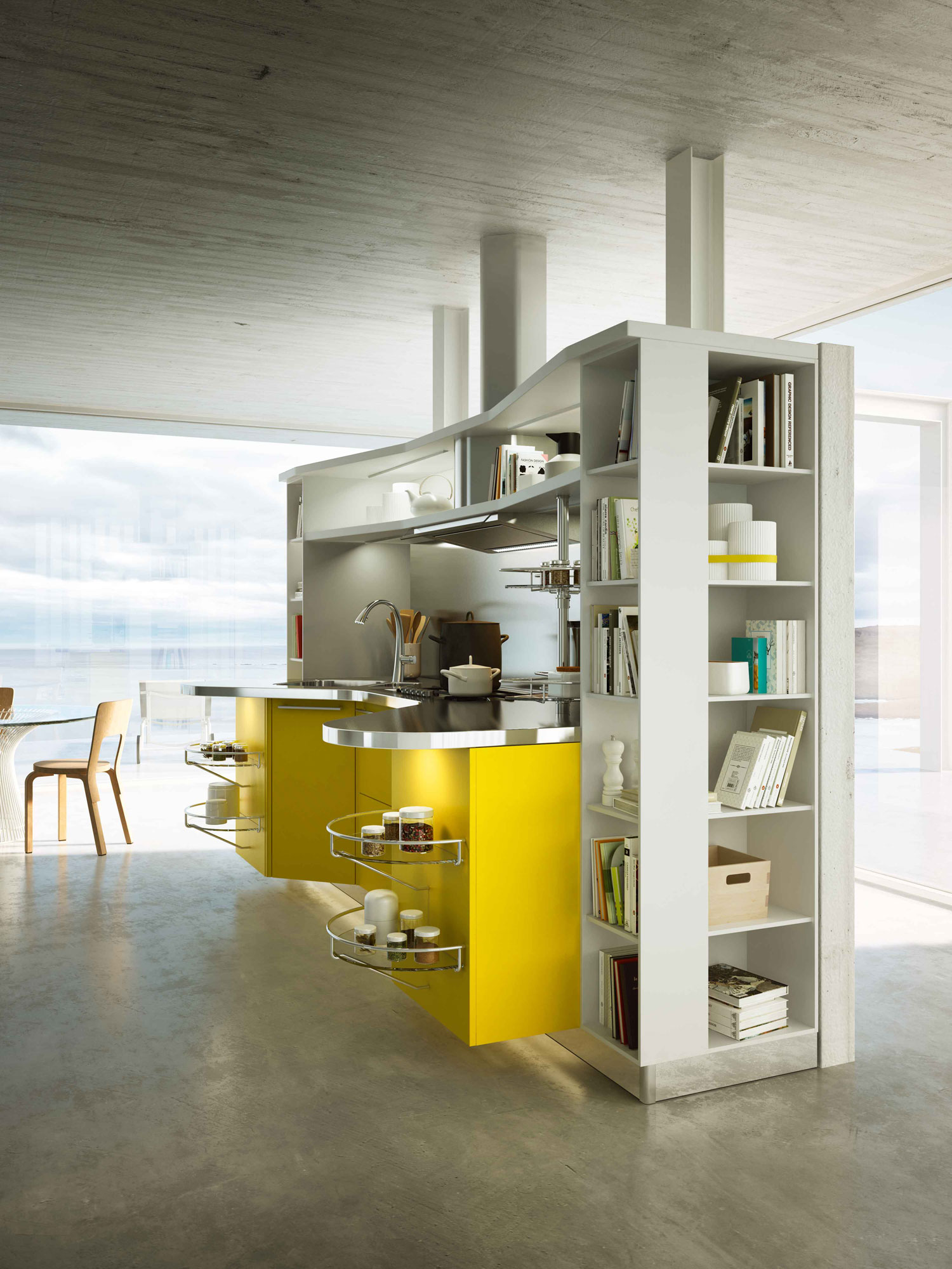
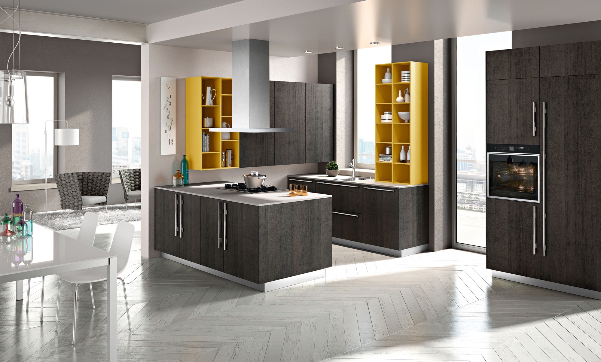
Exposed shelving also makes it that much easier to grab the next ingredient and lets your spice add color to your kitchen as well as your meals.
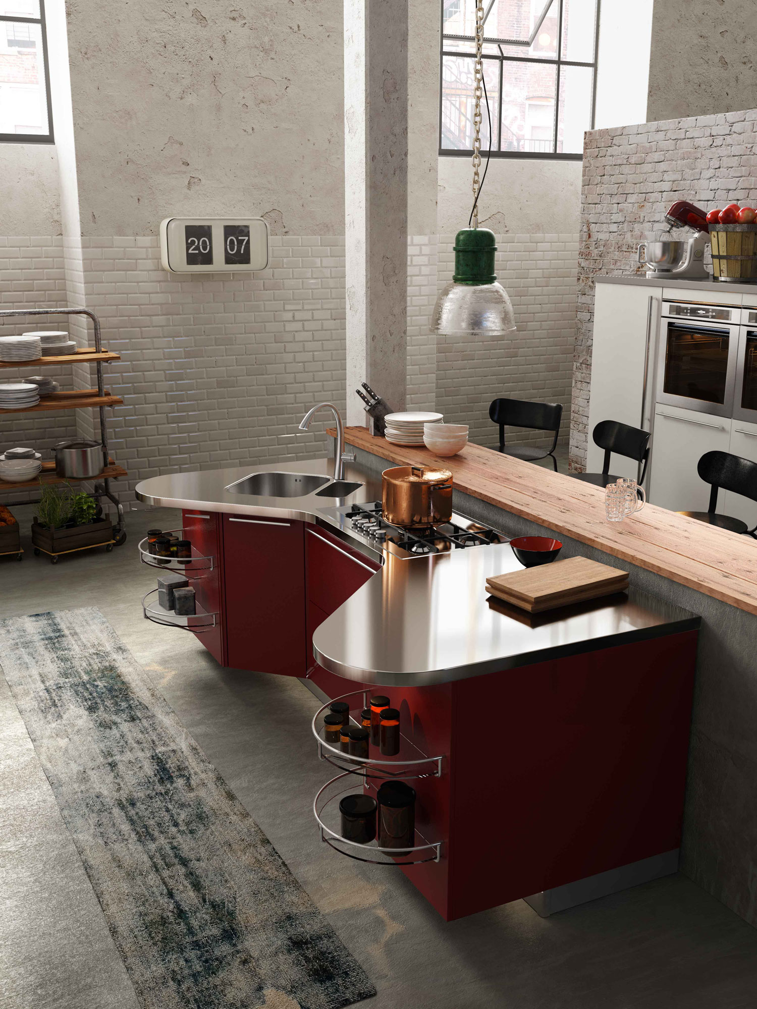
Stainless steel countertops are easy to clean and gleam in a way that standard tile or Formica never could.
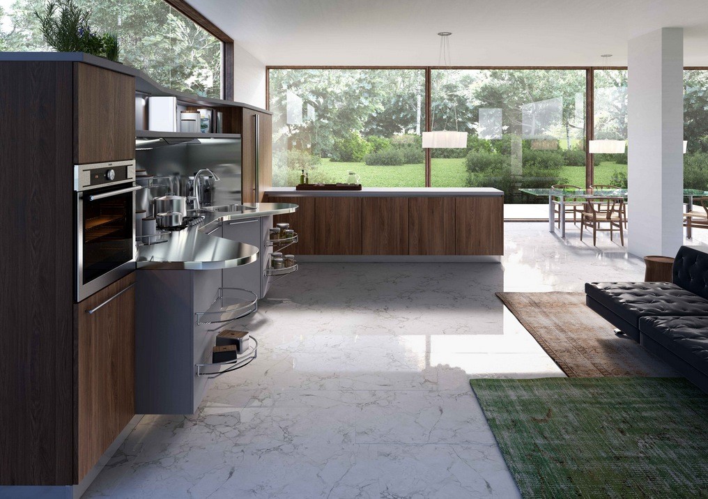
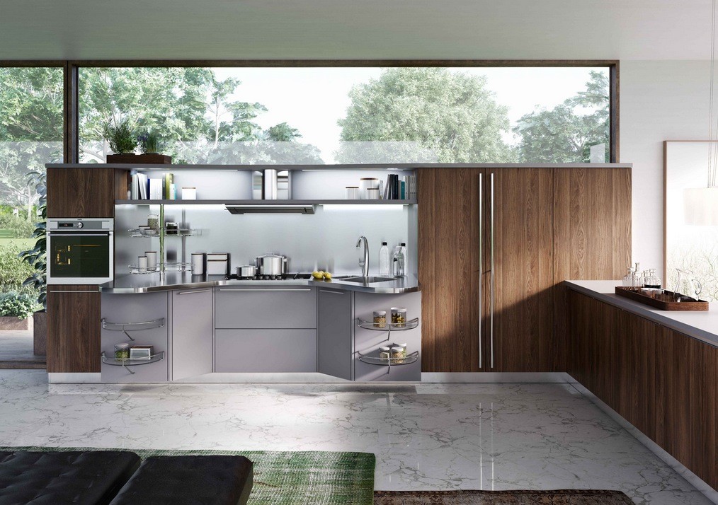
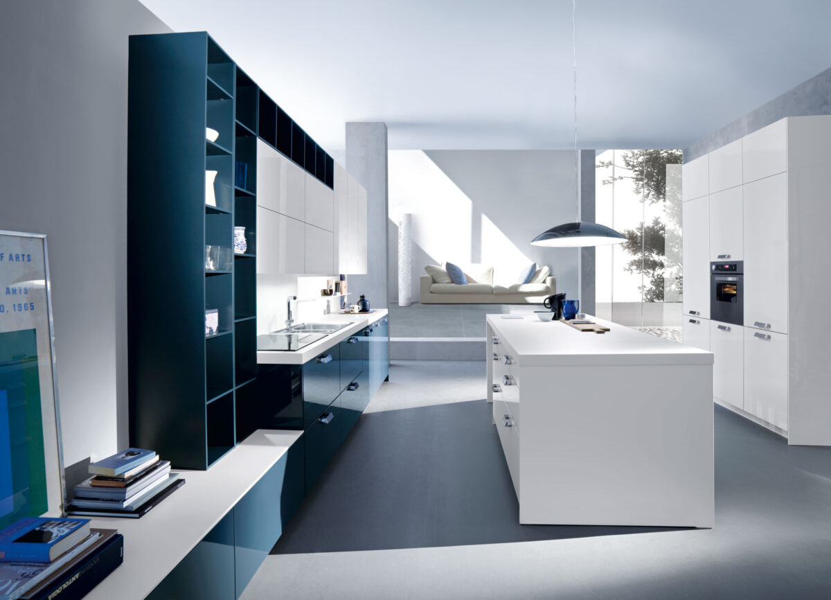
For those chefs that prefer a more subdued look, this kitchen moves away from the yellows and reds and keeps things a cool concrete gray.
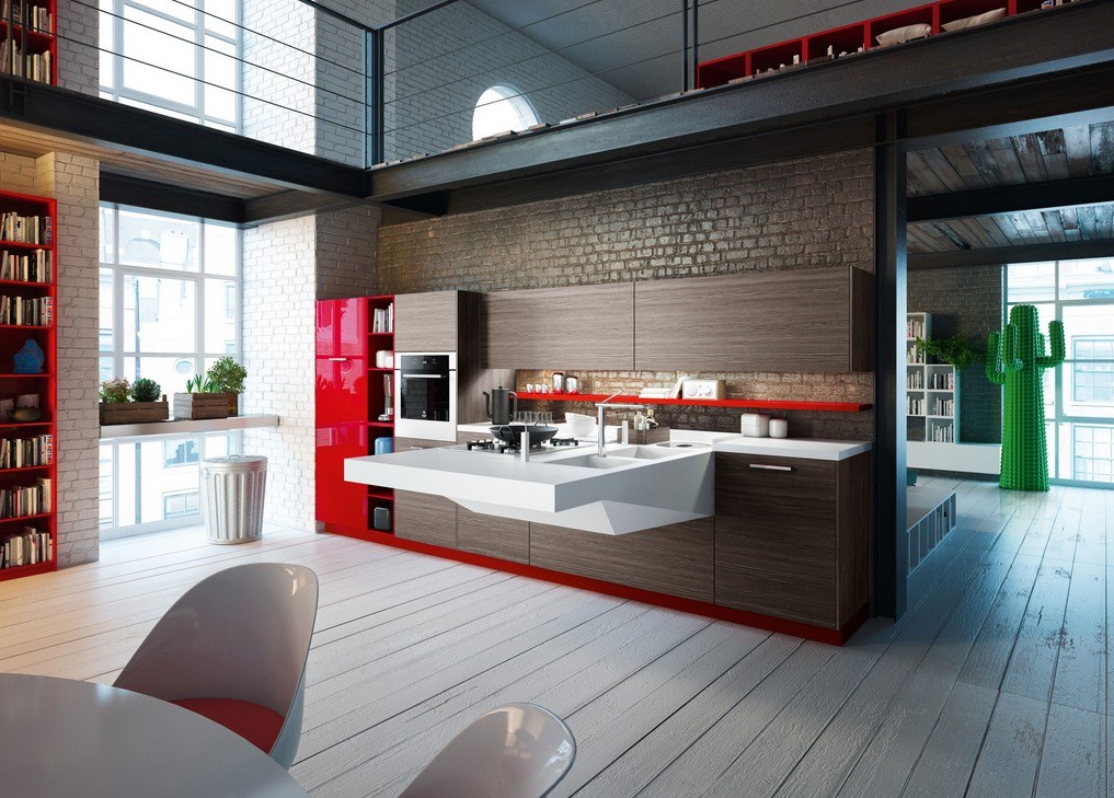
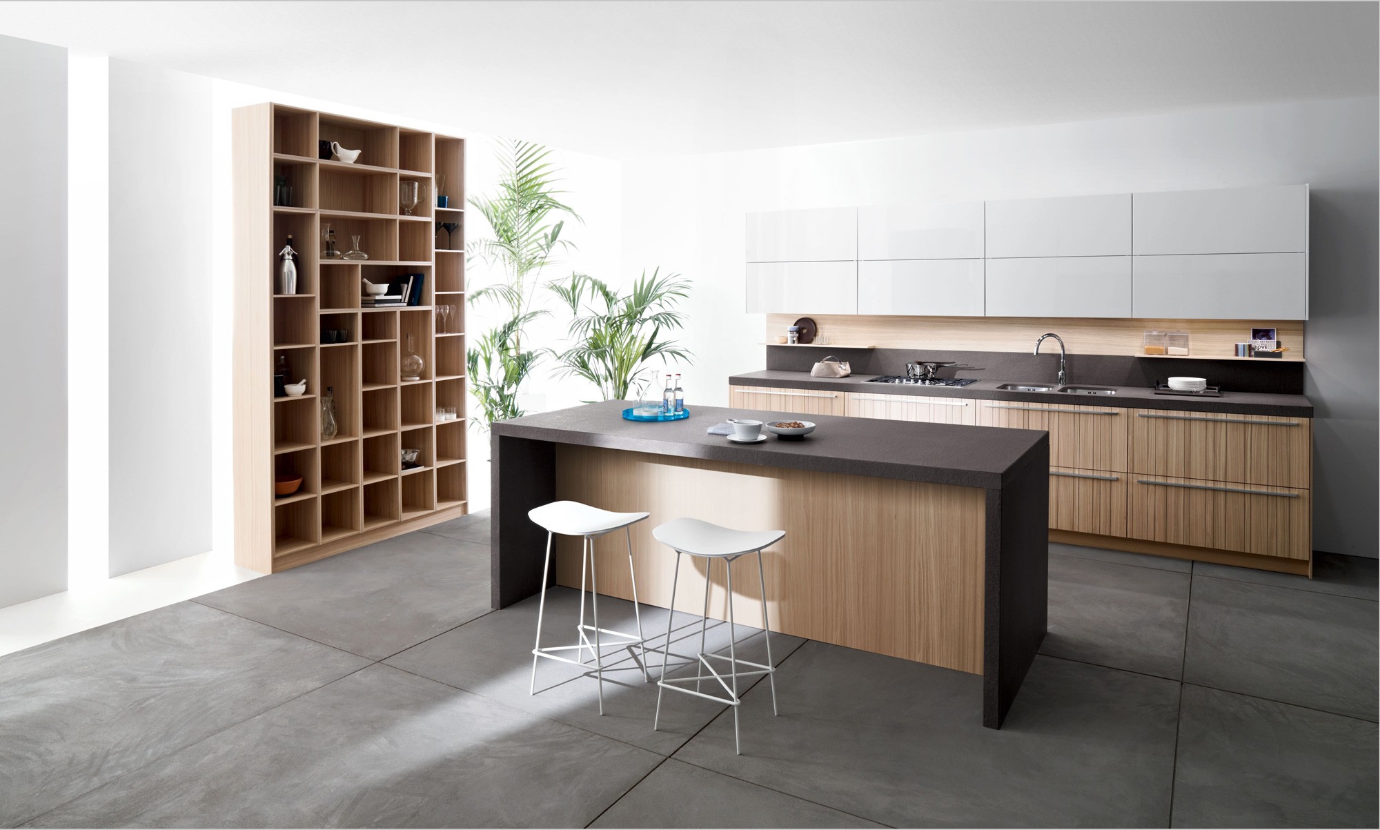
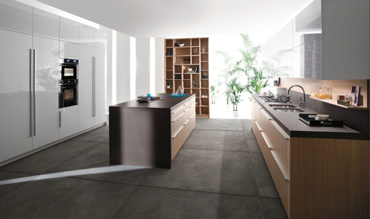
As long as we're browsing the Snaidero site, we couldn't resist posting these modern looks from the "Board" and "Code" lines as well.
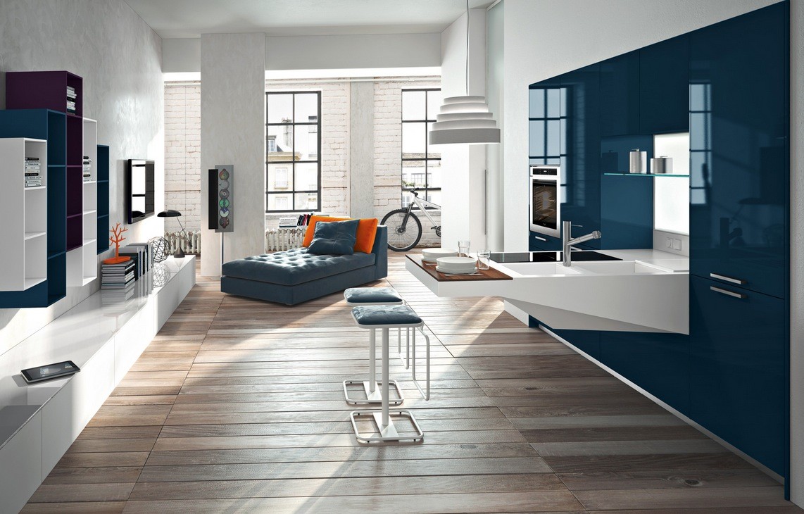
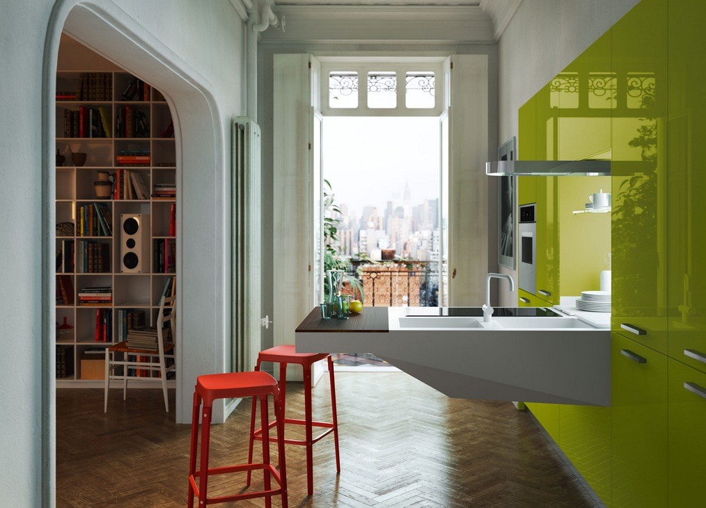
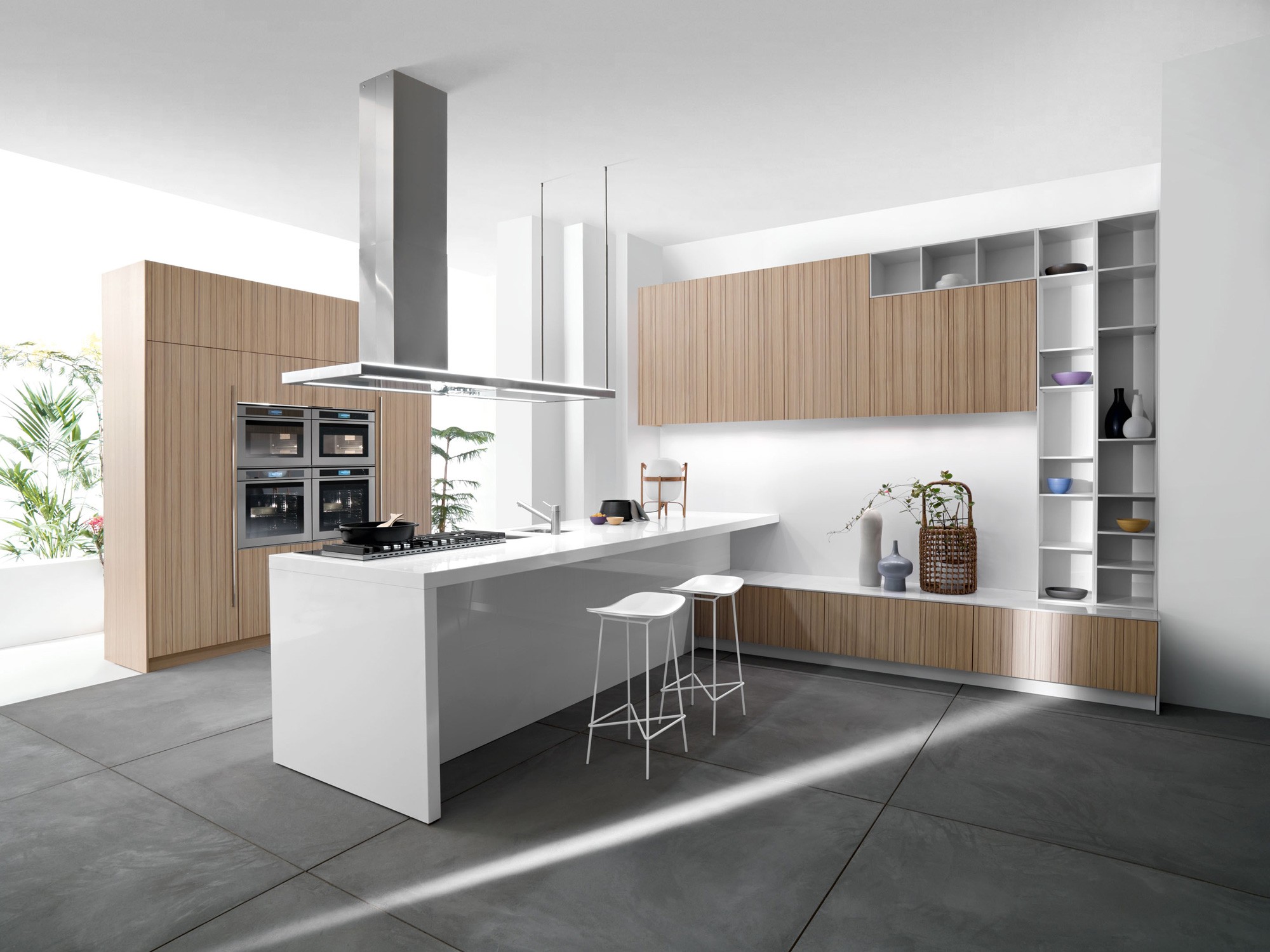
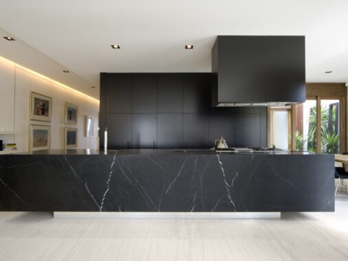
With a countertop/breakfast bar that juts out from the wall and almost seems to float, this kitchen is both modern and practical.
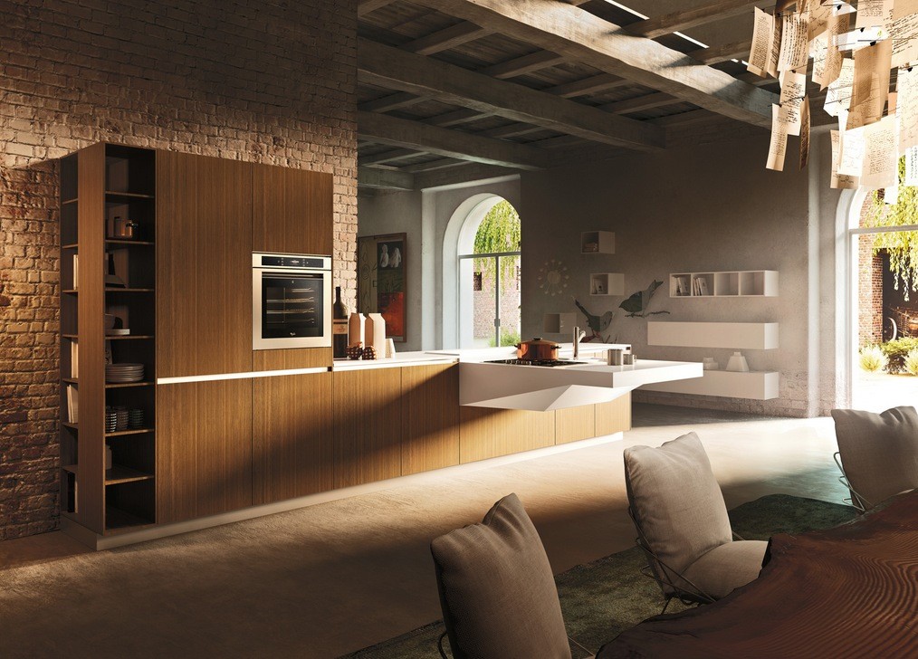
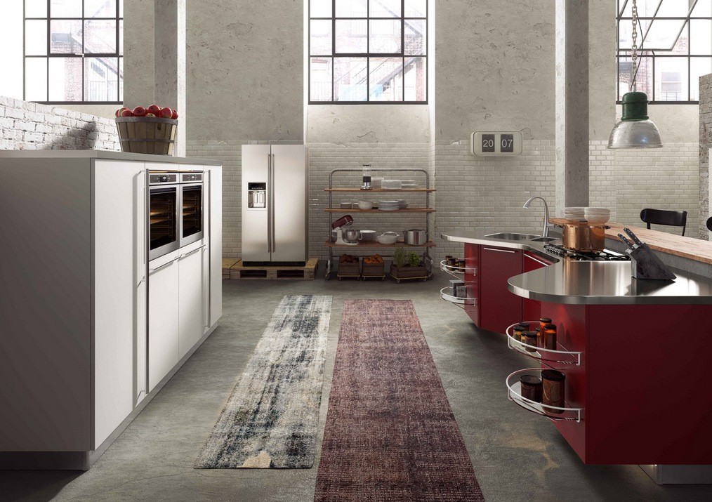
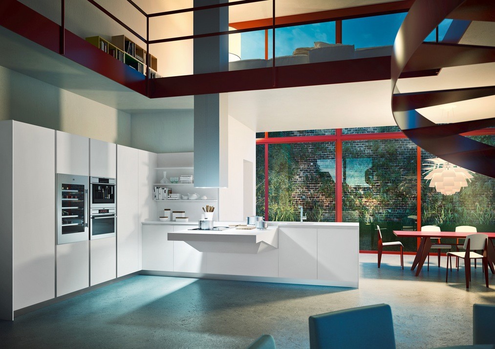
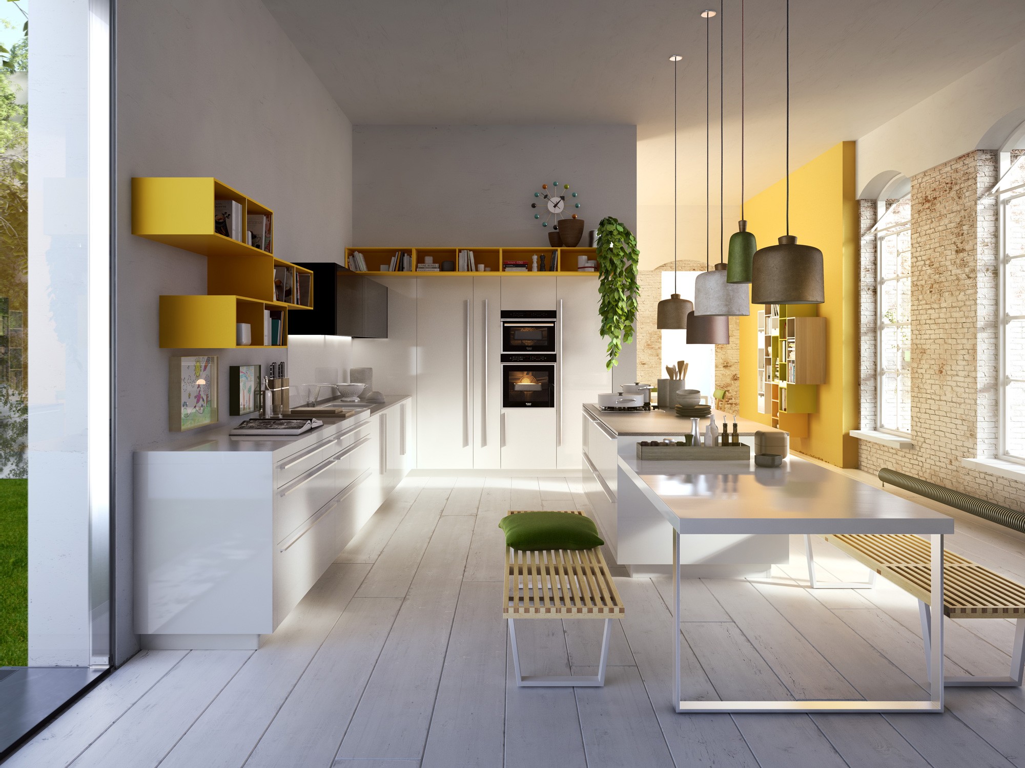
Just because a kitchen design is modern doesn't mean it can't add something to a more rustic décor, like this kitchen in this largely warm industrial loft does.
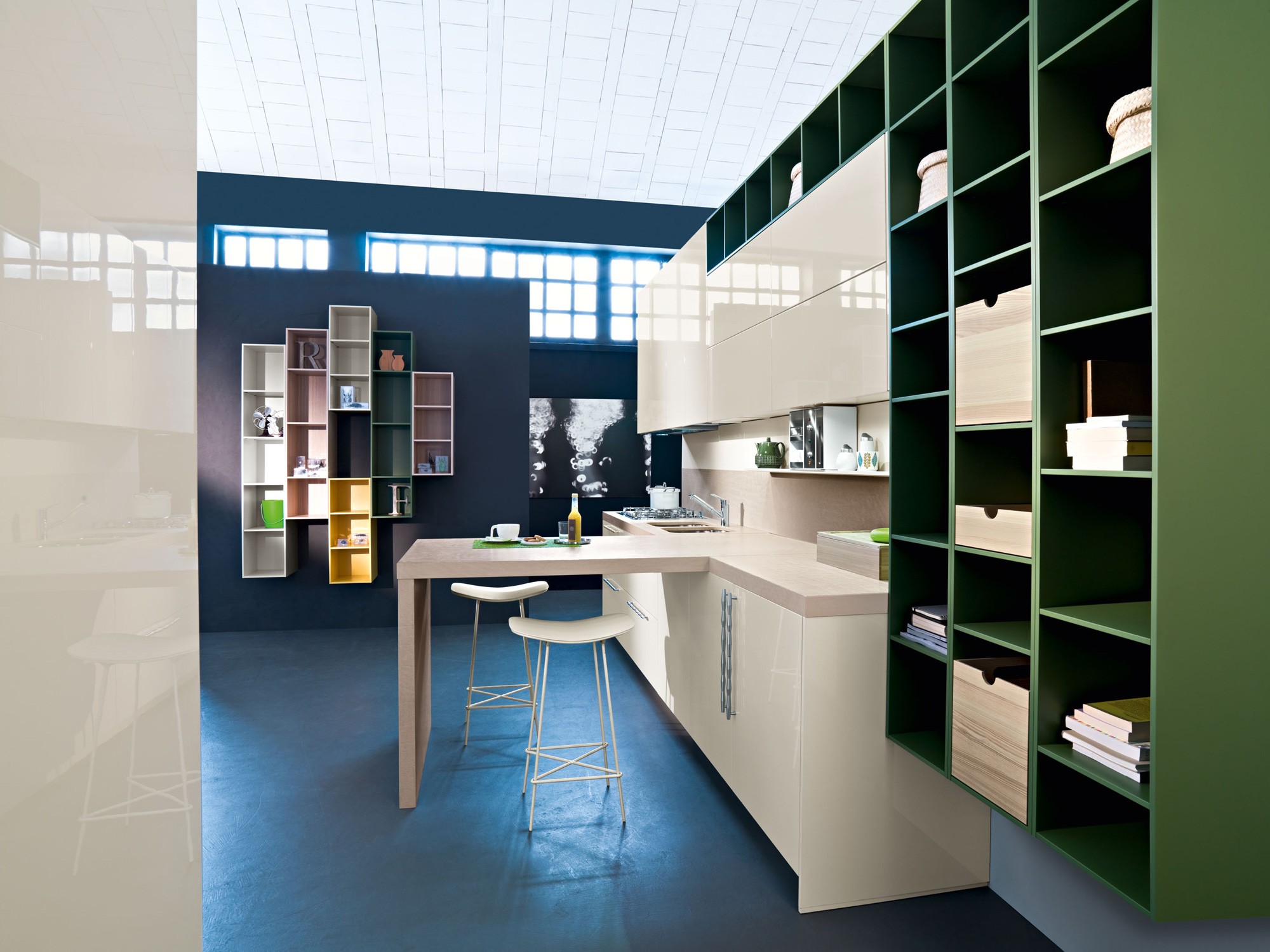
When you are looking to display your favorite dishes or keep staples within arms reach, these open shelving units are the answer.
