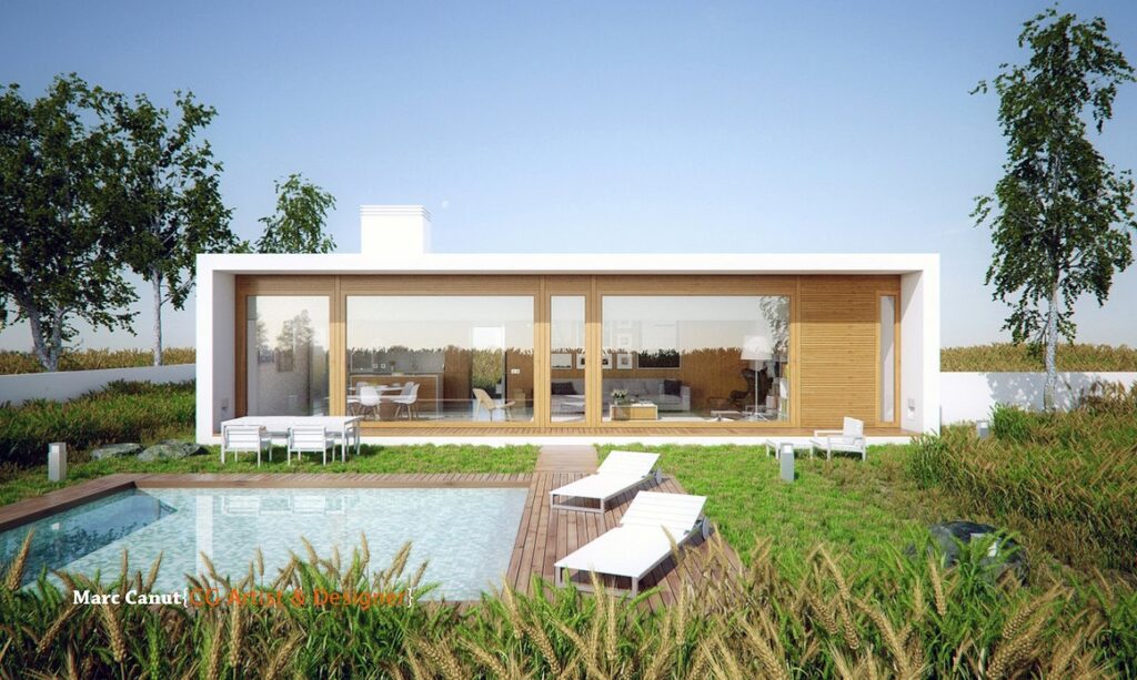
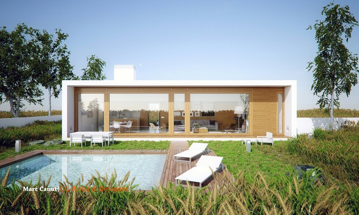
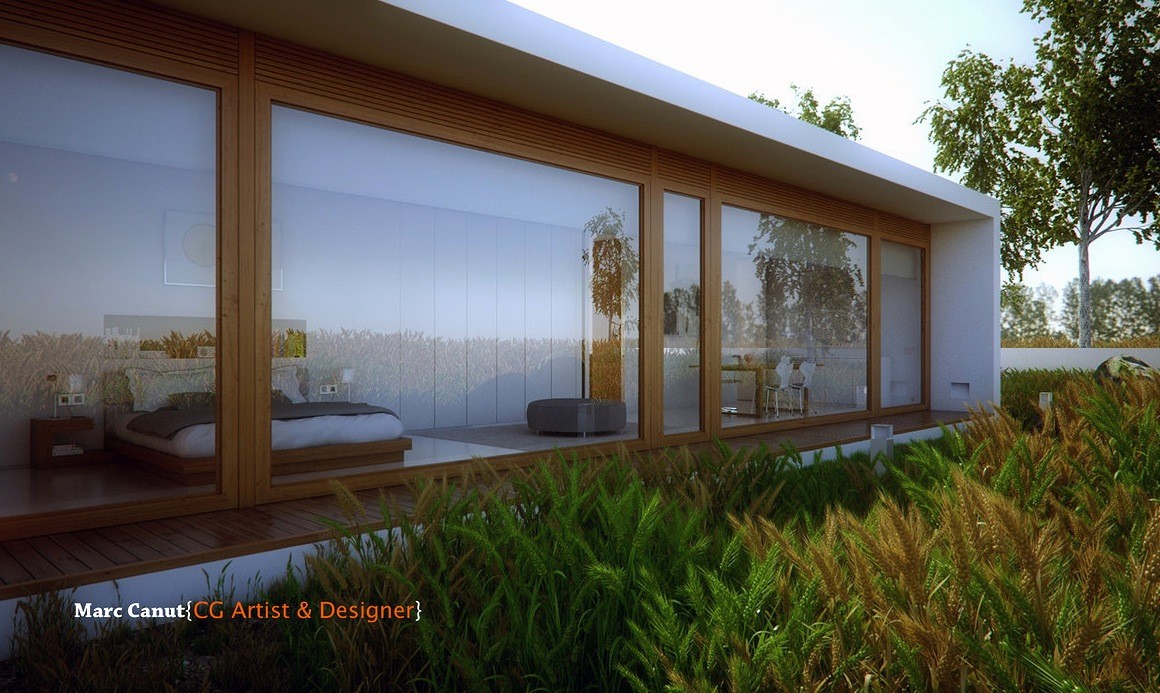
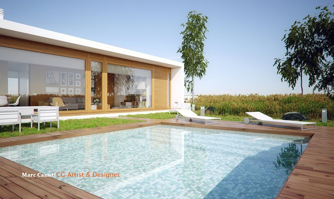
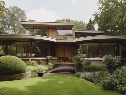
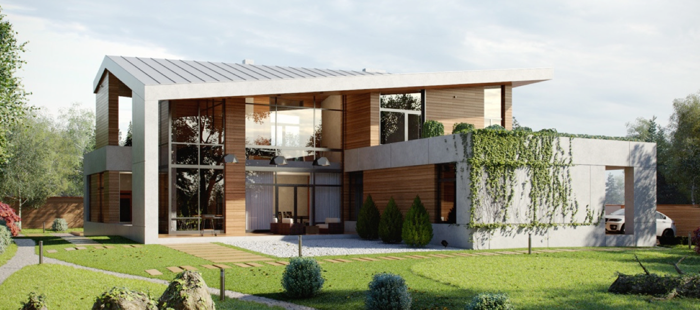
Designer Marc Canut captures simplicity perfectly in this guest house styling. Also well suited for a small, modern home, this particular design showcases plenty of clean lines accented by graphics and pops of color. We begin in the exterior, done in simple white with wood, that showcases plenty of windows for natural light along with views of the pool and courtyard. The pool is rimmed with wood - a lovely alternative to the concrete you usually see in outdoor spaces - and is just the right size for lounging. Neatly modern landscaped garden with a white wall border make this guesthouse an escape only steps away.
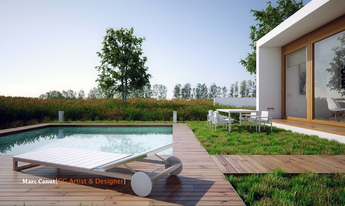
Love to entertain? This guesthouse was made for parties. Outdoor seating areas and the wood bordering the pool offer space for guests to relax, talk, and enjoy the sunshine.
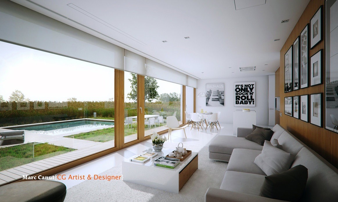
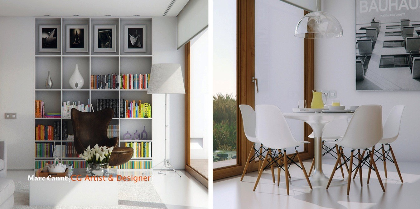
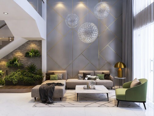
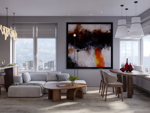
As we move inside, you'll see the crisp lines and geometric shapes that comprise the exterior carried into the living areas. A neutral color palette of lots of white, gray, and black are warmed by the wood paneling along the wall and windows. The graphic print on the opposite wall add just the right touch of personality while keeping with the palette and we love the open views of the outdoor pool.
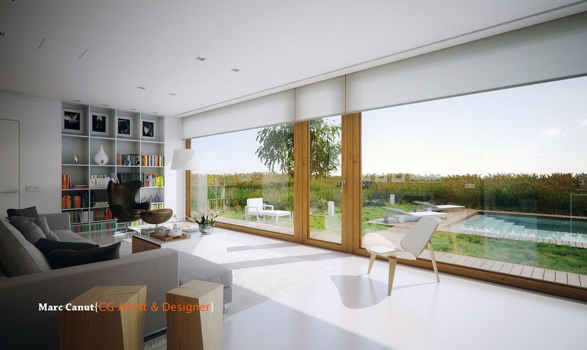
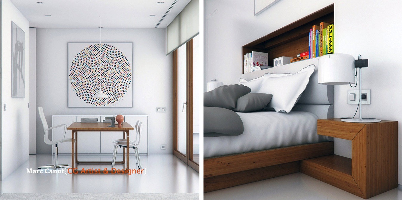
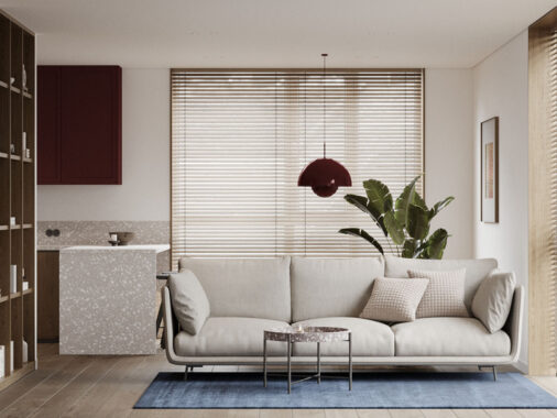
The built-in bookcase stores a rainbow of colorful books, but what we love about it is that it's so neat and tidy - it doesn't distract or take away from the real star of the show: those gorgeous windows.
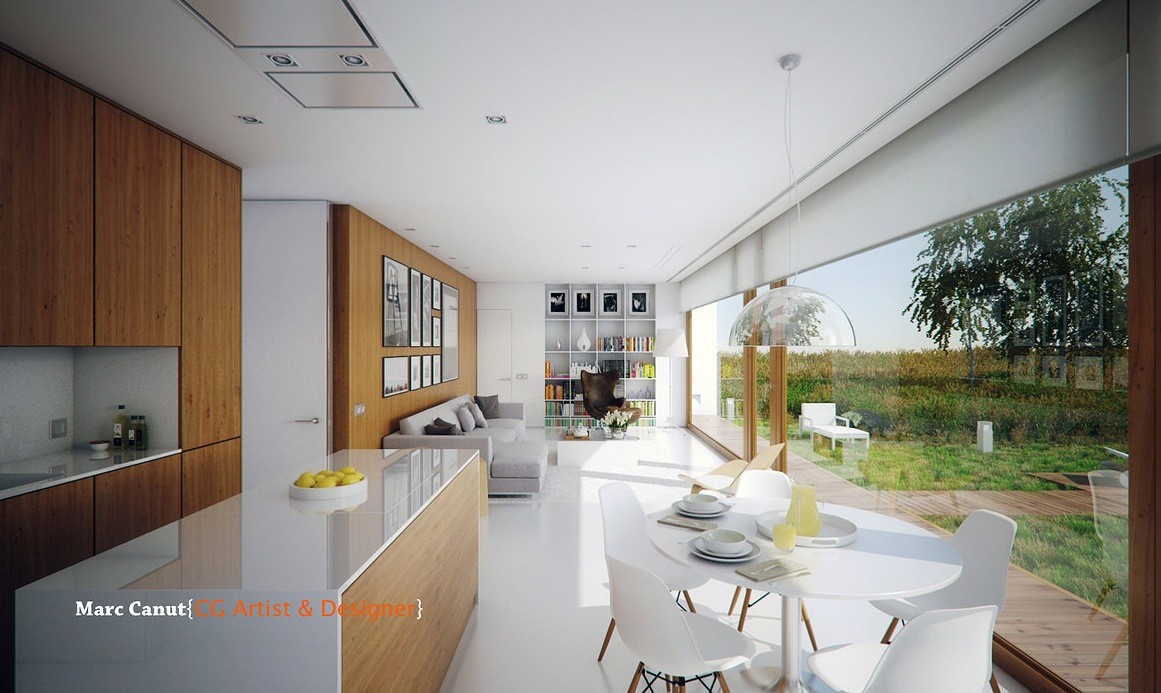
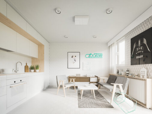
In the kitchen, smooth wood continues. This kitchen space is all about minimalism with a retro twist, shown by the shapes of the chairs and the cabinetry.
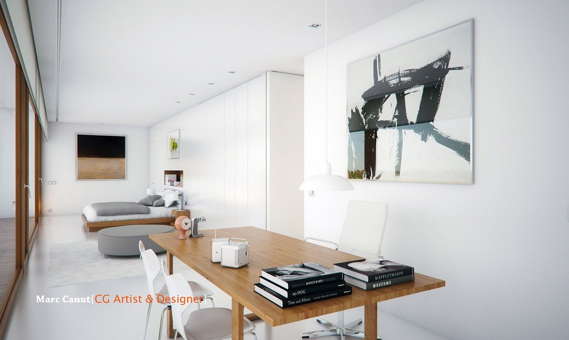
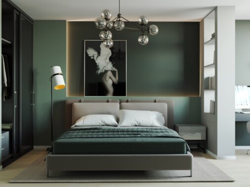
In the opposite side of the guest house, the bedroom and office space are simple and striking. A graphic print adds dynamic visual detail, while the home's palette of white, black, and gray is preserved. If you look again (sometimes more closely), you'll see colorful accents, like the small mid century modern clock on the desk, which - along with the wood - really help to soften what would otherwise be considered a sharp room.
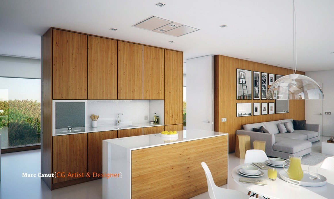
The open floor plan of this guest house really has a good flow. It's incredibly functional yet there's plenty of room to move, to dance, and to entertain.
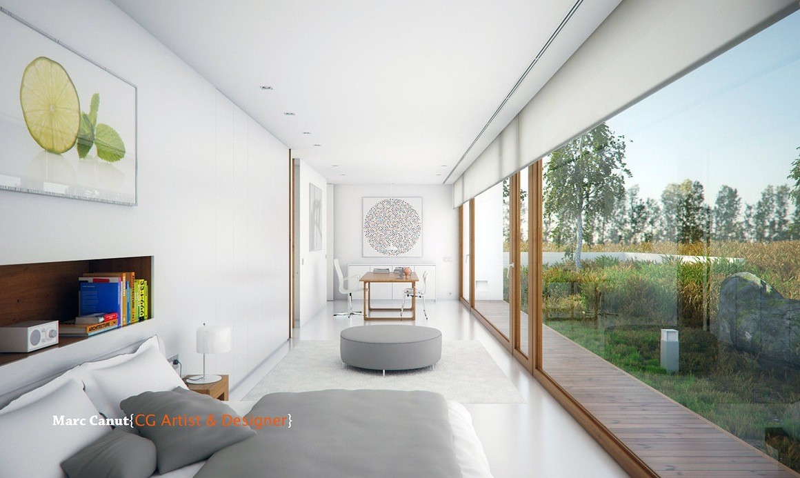
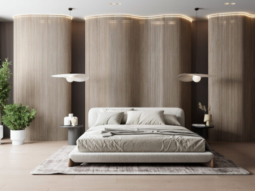
In the sleeping area, the built-in wall storage is incredibly clever and is perfect for stashing away your MP3 player or cell phone. The lime on the wall is just the right touch. Having that burst of color keeps the room from feeling sterile and instead, it just radiates freshness.
