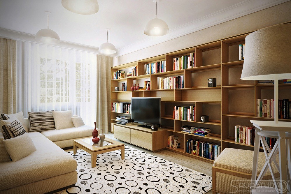
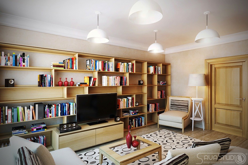
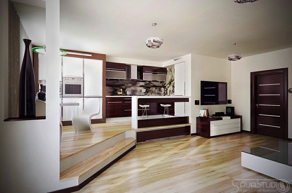
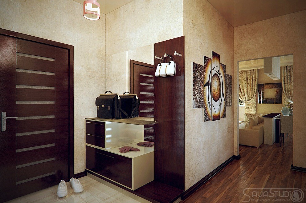
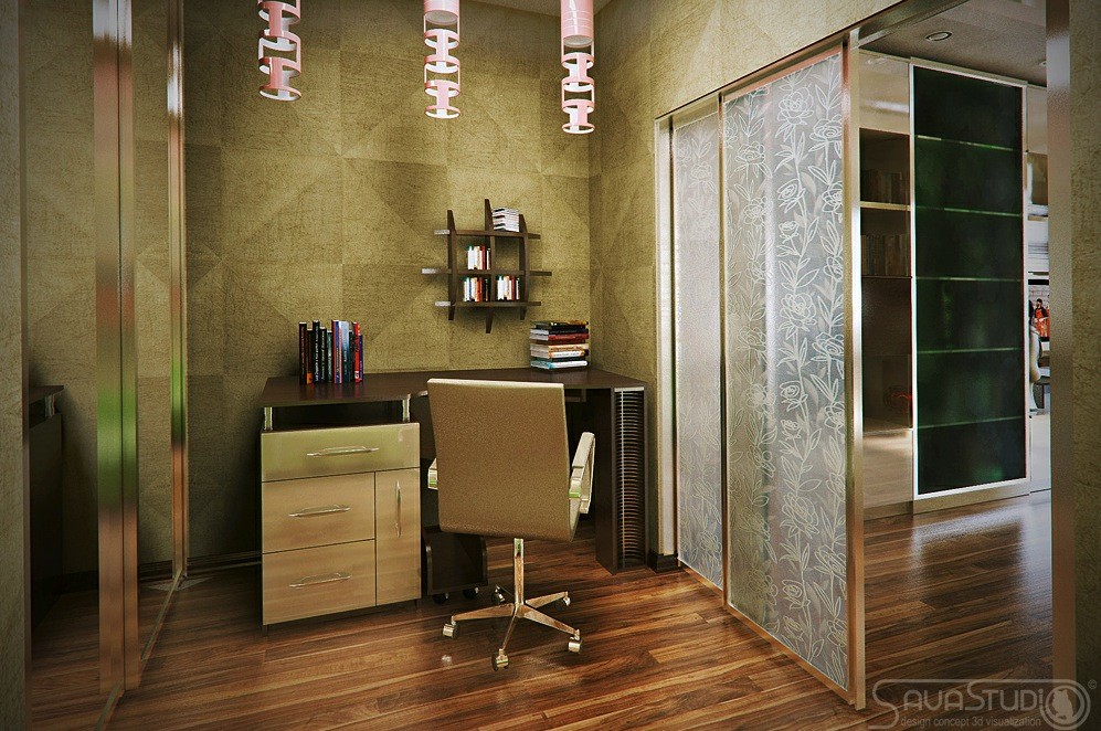
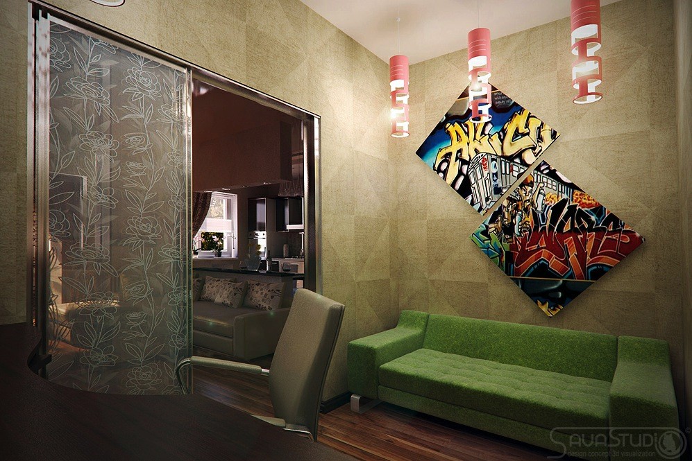
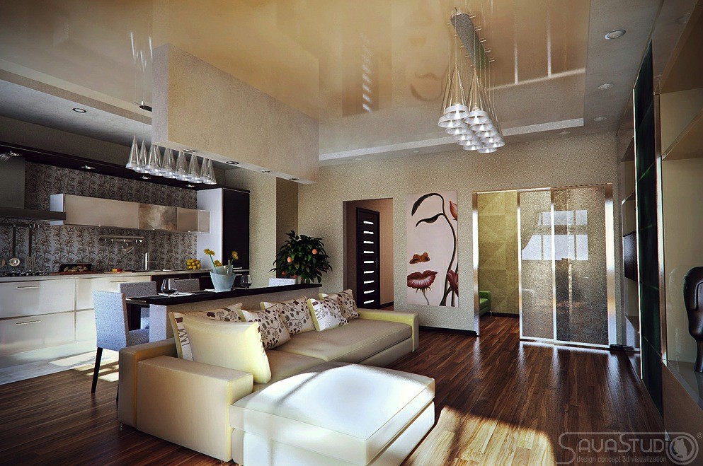
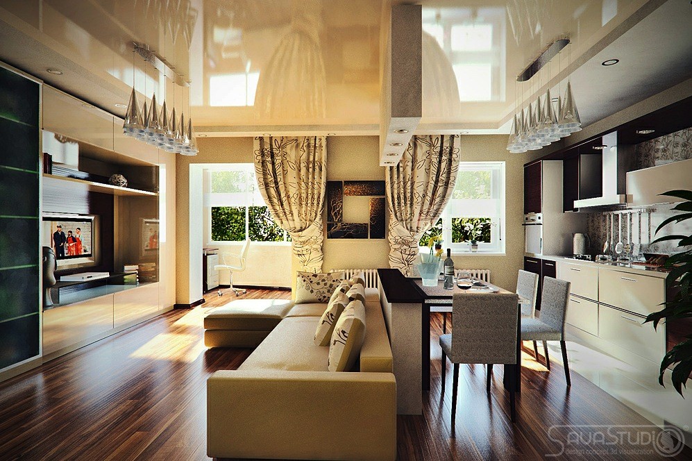
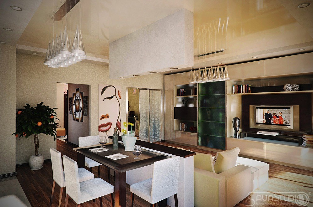
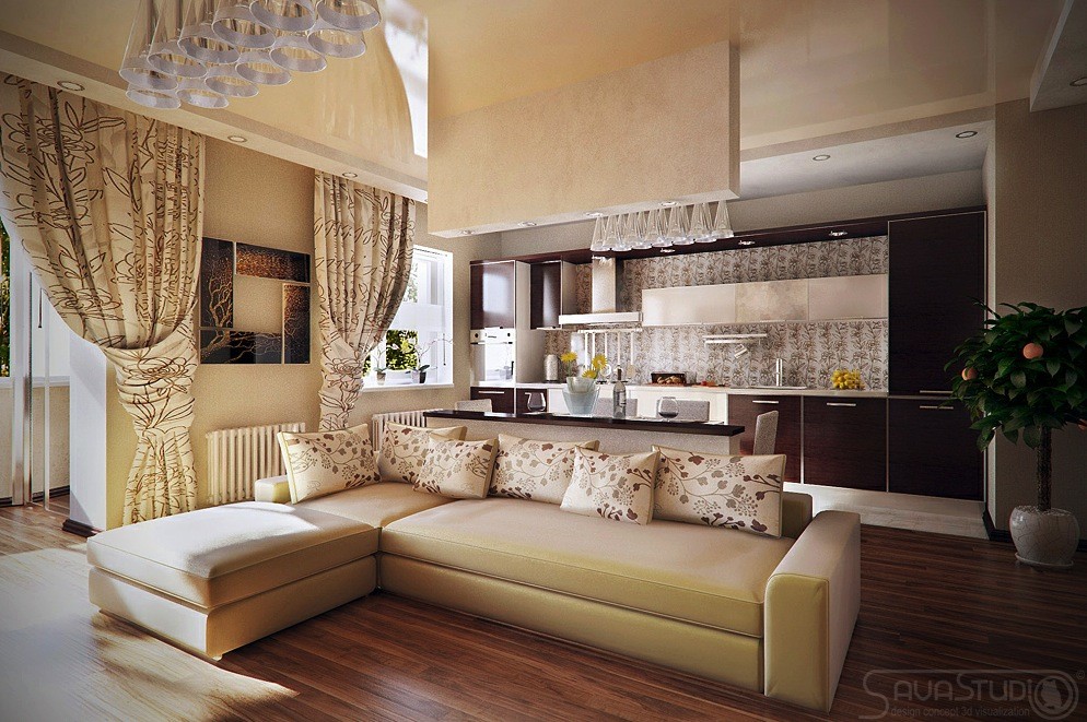
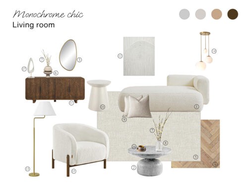
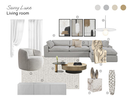
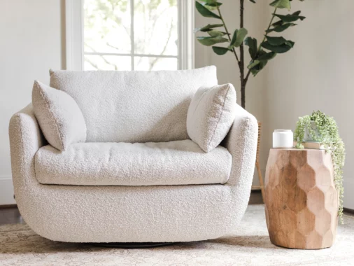
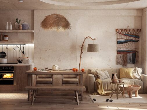
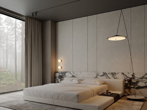
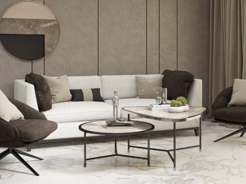
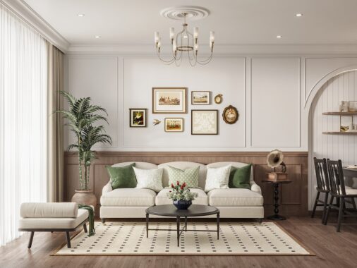
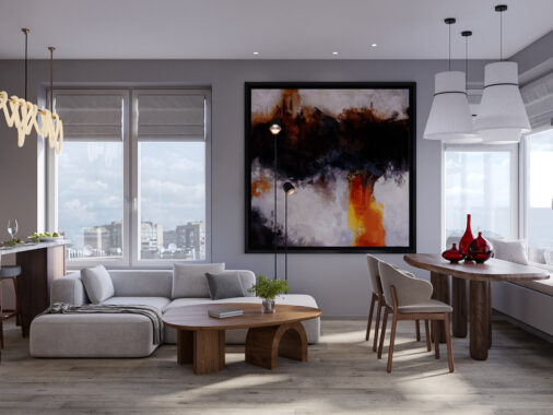
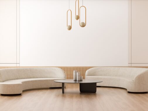
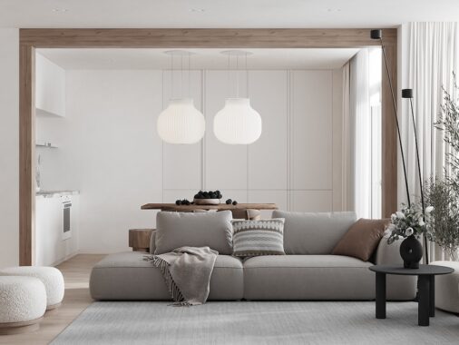
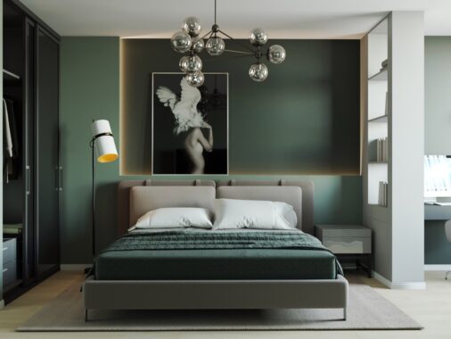
This superb work, created by the talent at Sava Studio, shows how to make a predominantly neutral scheme result in an exciting finish; cream and brown, or gallery white, don't have to appear plain and bland. It is by no means an easy feat to achieve an interesting look within neutrals, many have tried and failed, but the secrets are all revealed in this collection of beautiful visualizations.
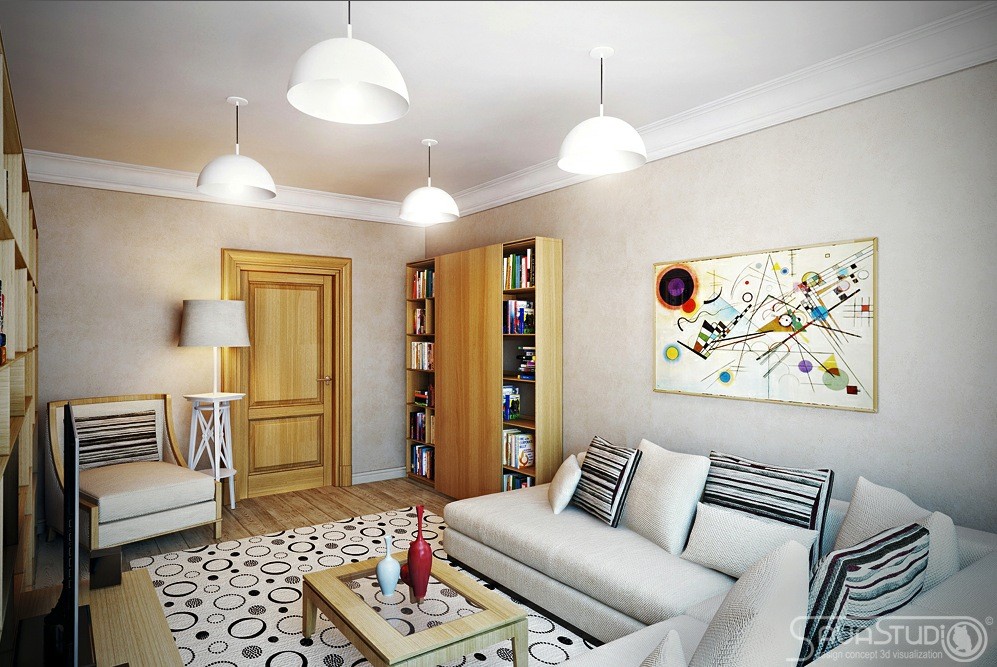
A black and white pattern always gives edge to a décor scheme, especially when presented as stripes or spots; the contrast is so simple but invariably works well. A monochrome design looks fantastic when teamed with unexpected pops of multicolor; this example uses a piece of artwork to draw out the colors in the vivid book collection to great effect.
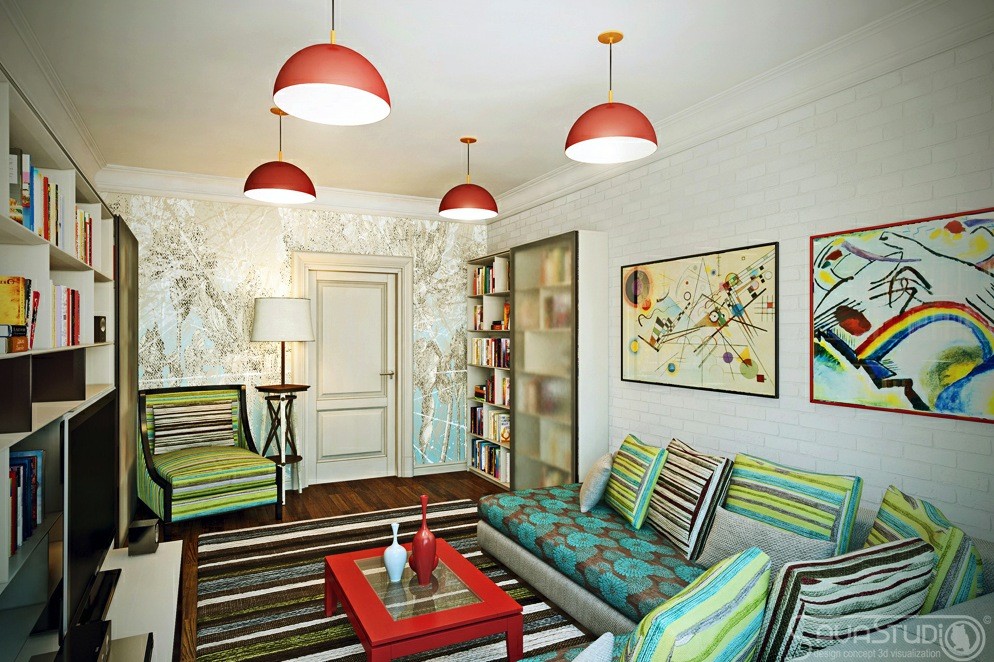
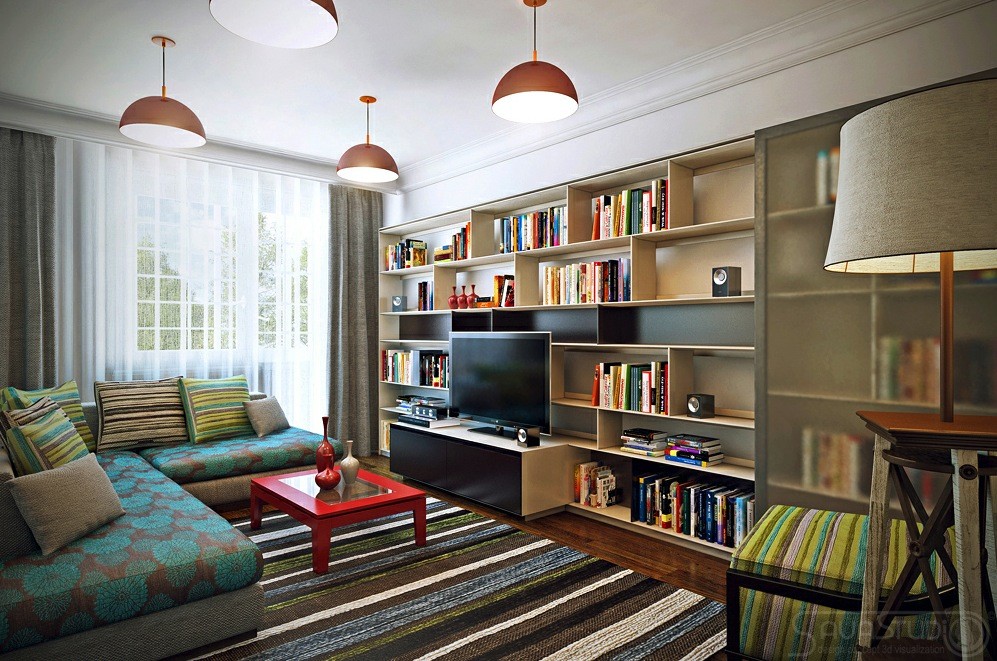
This version of the same room takes things a little further, providing inspiration of how to push on those boundaries a little harder by introducing colored pendant lights and sofa slipcovers.
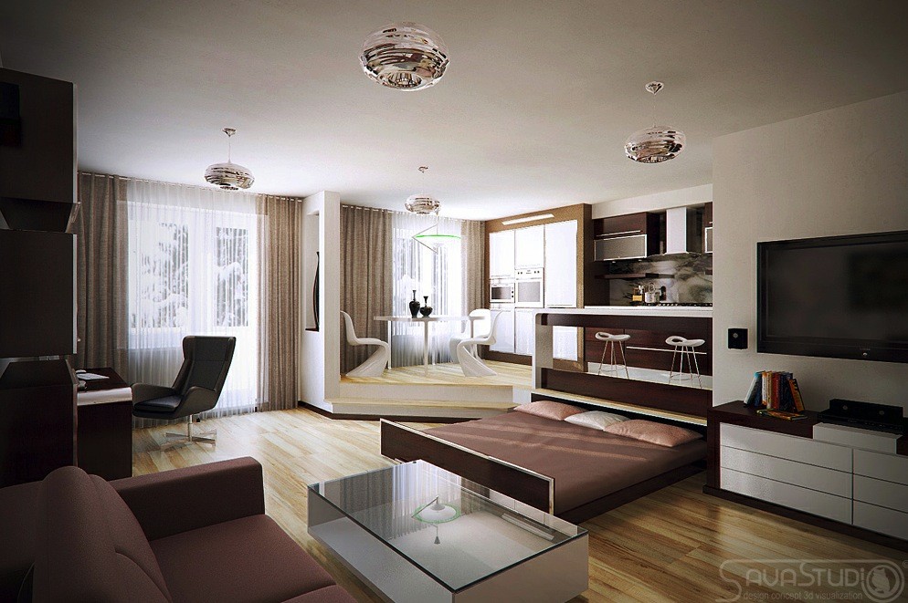
Sava also have superb space solutions like this pull-out bed; if you like this then take a look at Saving Space at Home - Some Ideas.
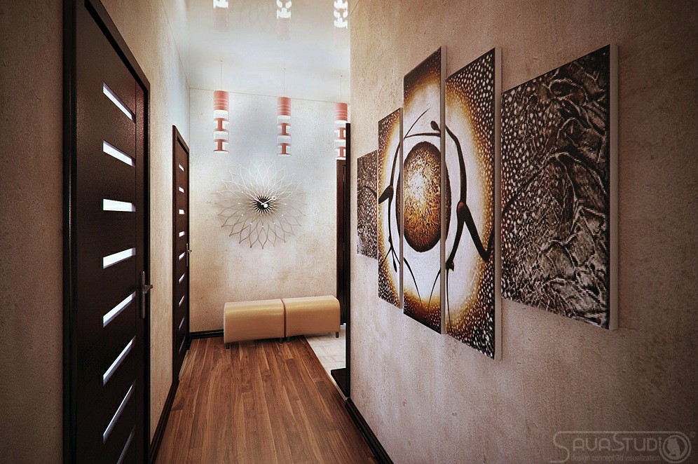
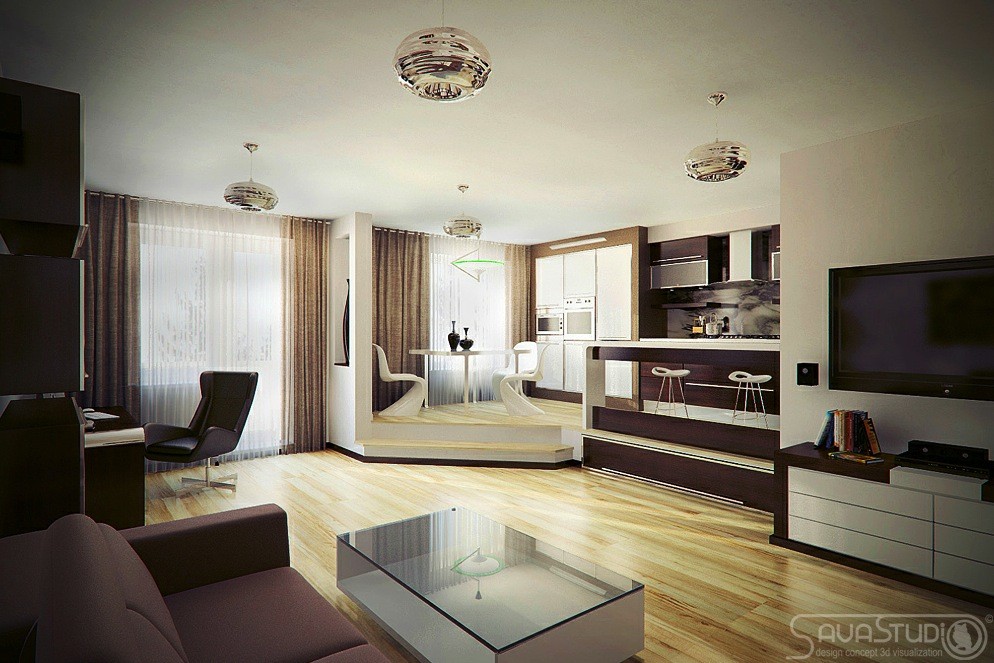
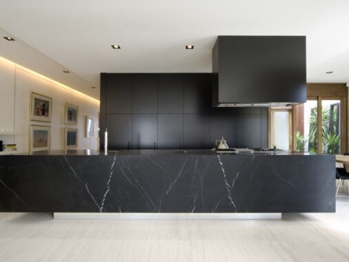
This pure natural color story avoids mundanity by playing on the darker earth tones, causing drama and intrigue.
