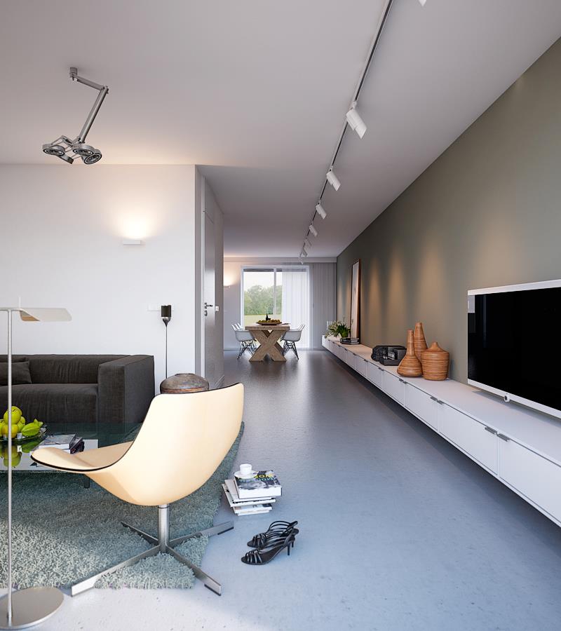
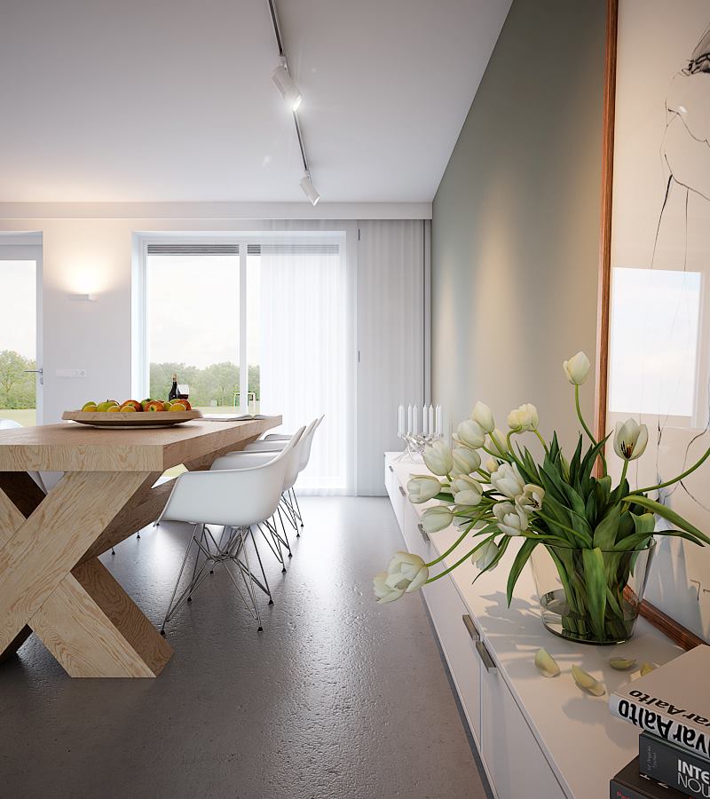
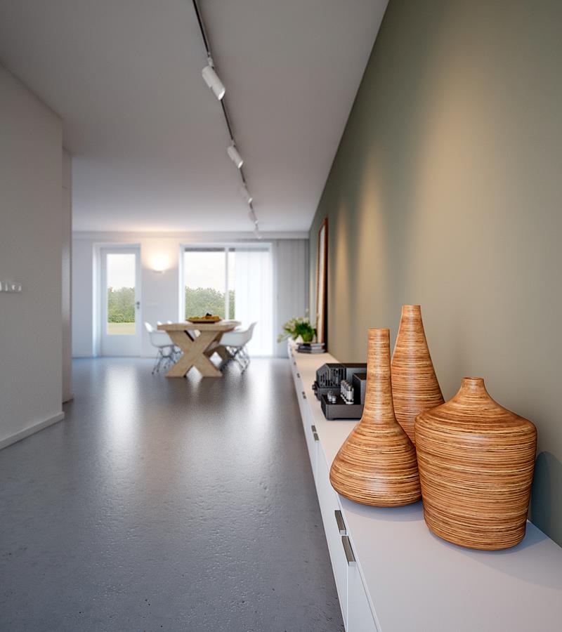
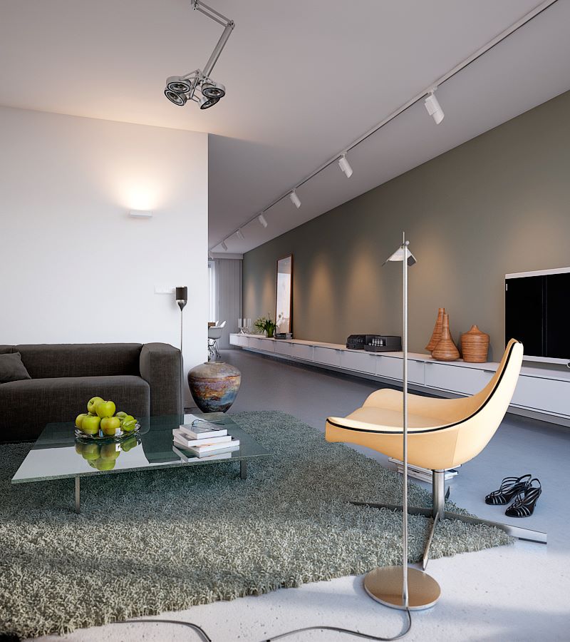
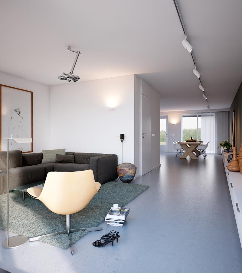
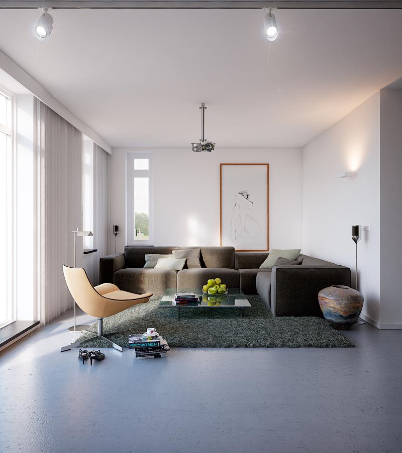
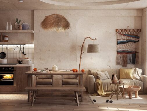
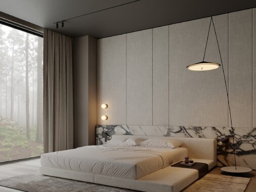
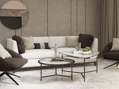
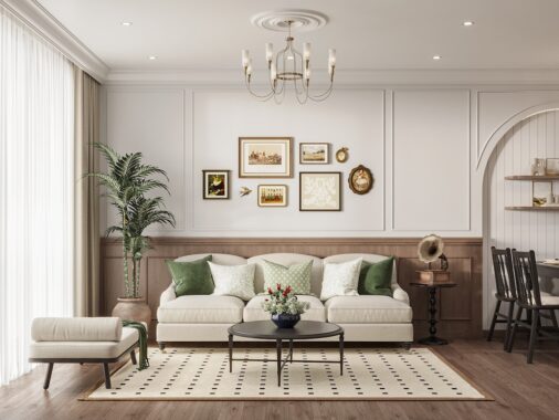
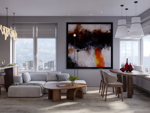
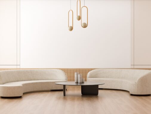
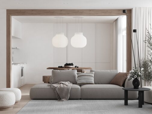
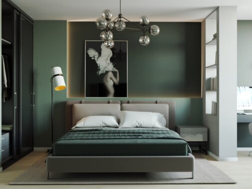
This airy open plan living, kitchen and dining area is the visualization work of Triple D, and we love the bright white décor accented by an earthy run of clay gray along one side of the space. The accent wall illustrates how gray can be used to add depth and even unexpected warmth to a pale design scheme.
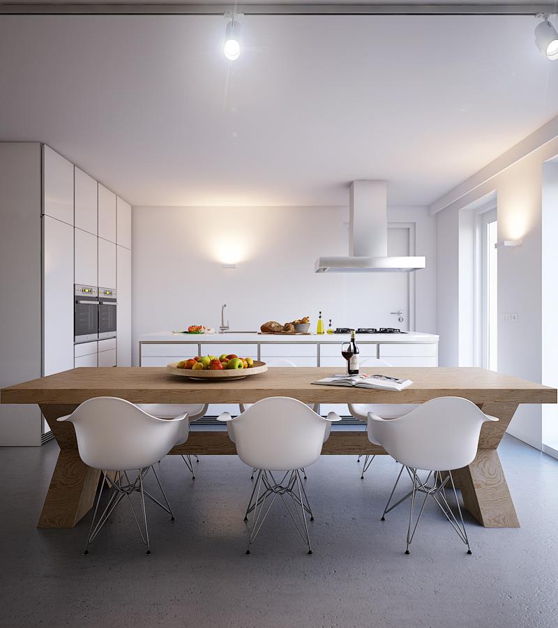
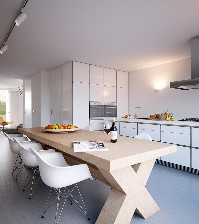
In the kitchen-diner a chunky wooden table adds another element of neutral warmth to the palette, but is flanked by modem white dining chairs so that the eating area remains in keeping with the rest of the culinary space.
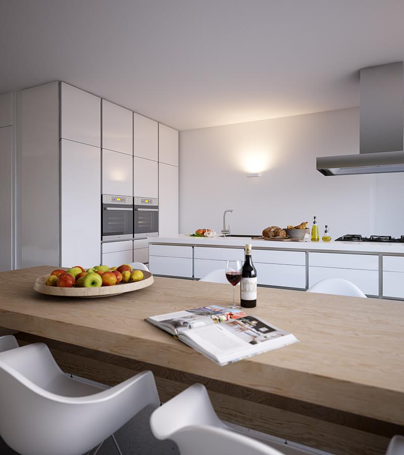
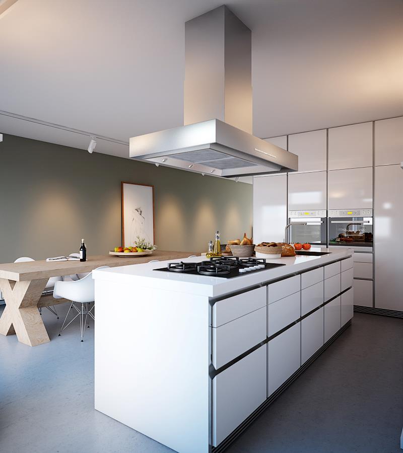
The faces of the kitchen cabinets are glossy white, which bounces the natural light around the area, but are defined perfectly by gray framing that help tie in the tone of the feature wall.
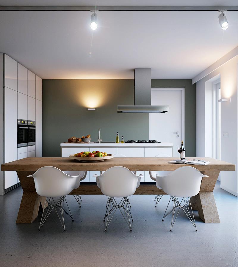
Here we see an alternative design that brings the earthy gray tone over onto an adjacent wall, making the ice white kitchen units stand out more crisply.
