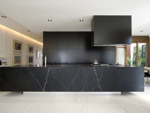
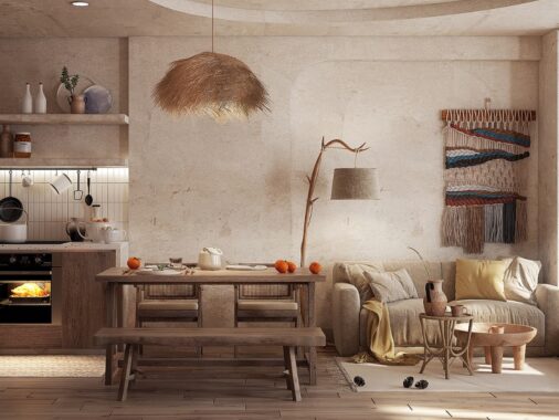
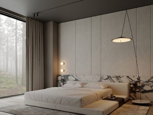
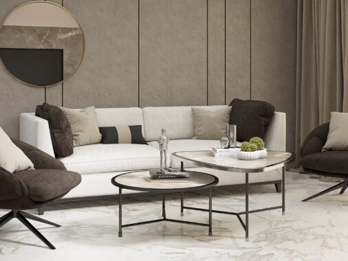
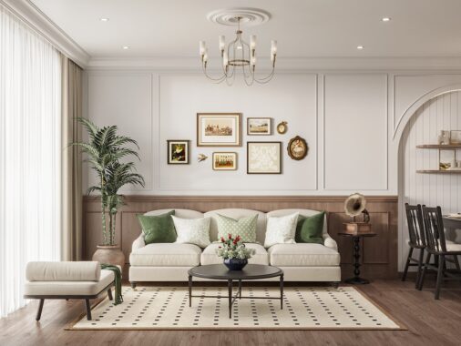
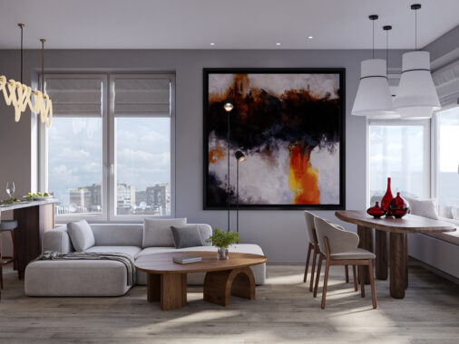
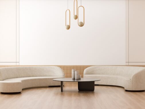
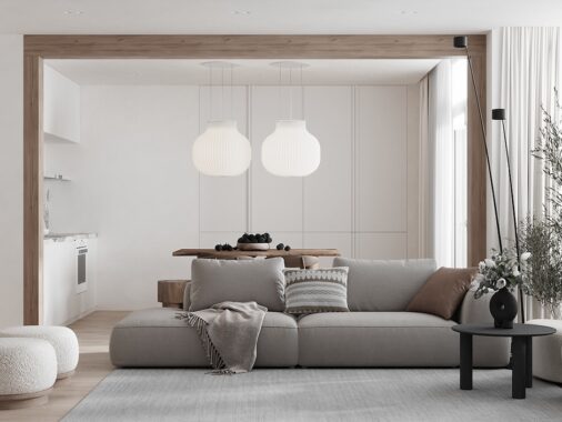
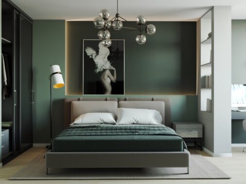
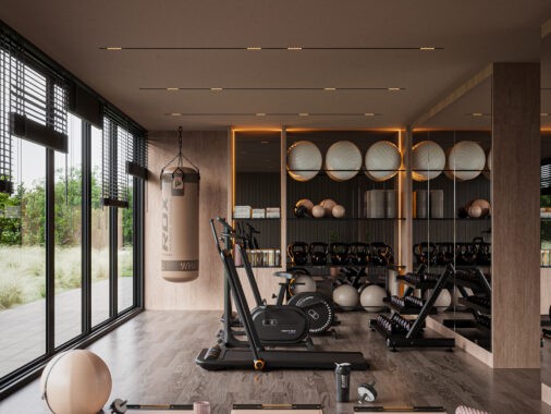
We've encountered these wonderful images on Viz-Art blog, written by a Russian architect under the nickname Boom named Artem Evstigneev (Artem just popped in by the comments, so we now know his real name!). The style of his interior designing is quite recognizable - even after only glancing over a few of the pictures, you begin to see the pattern of his work. Not in a way that he repeats himself, of course, it's just as if he has a theme which he profoundly pulls through each of his works seen on these photos.
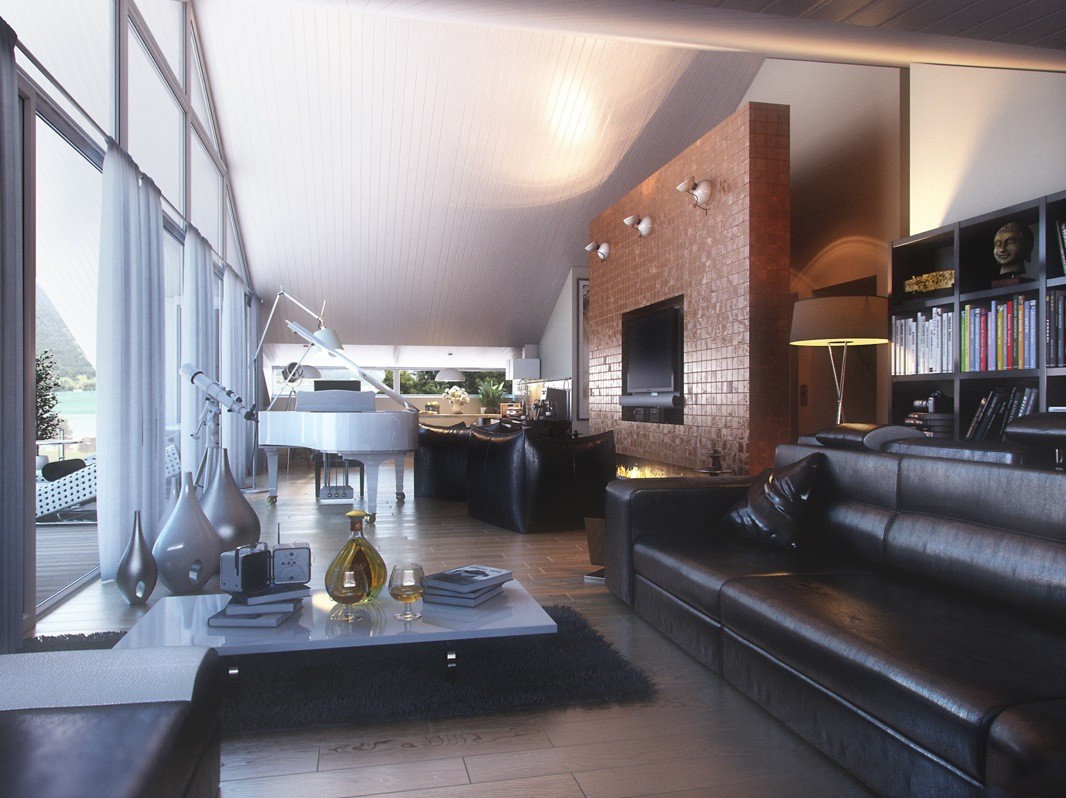
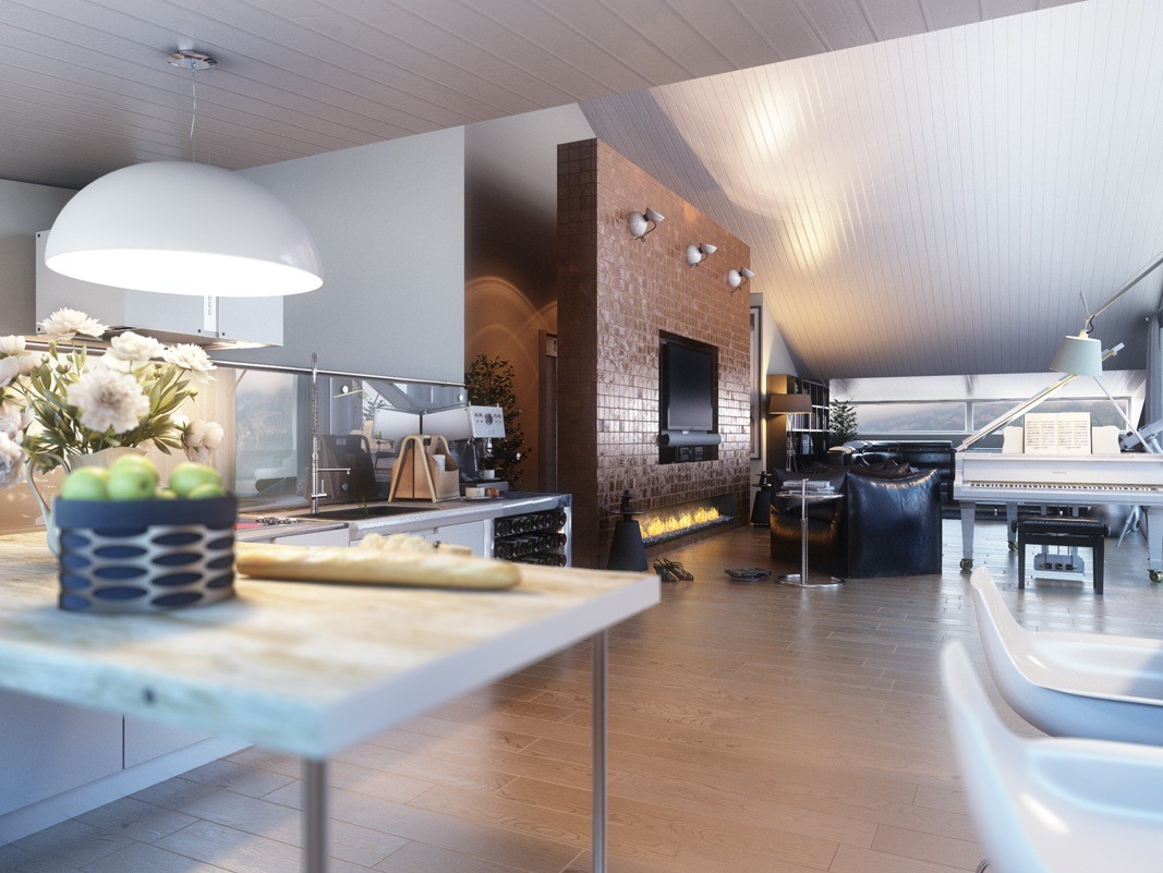
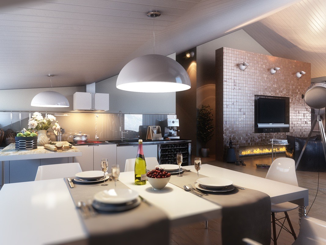
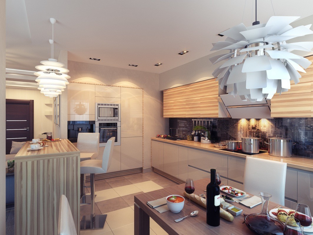
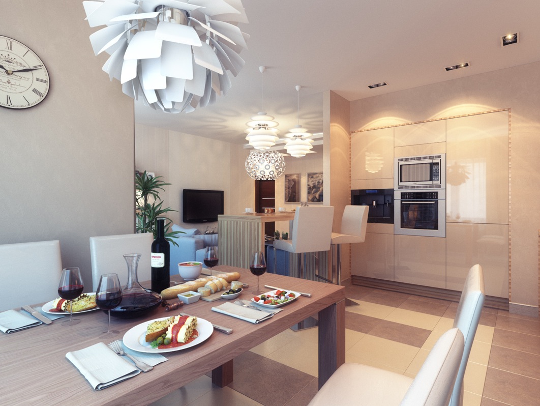
He has created warm spaces with lots of light that ooze with luxury. In the first series of photos, the living area is combined with the kitchen and dining area, but in a way that none of the mentioned areas conflict. Considering the fact that the room is elongated, narrow, with not much width, it is equally divided into three sections - the kichen/dining area, media area and reading area.
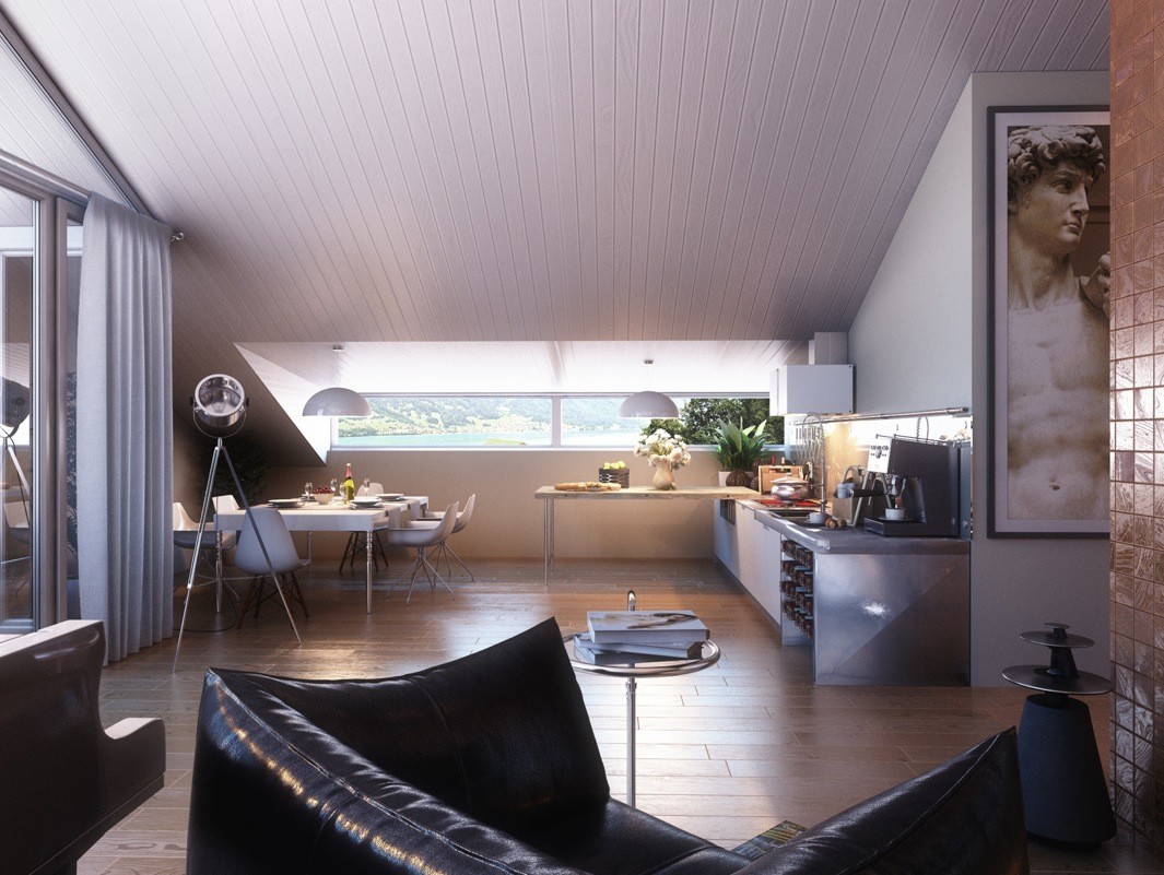
On the other side of the sofas lies the kitchen, which is barely there, since there aren't a lot of cabinets on the walls. It flows with the rest of the room, not standing out, but still there, and cleverly designed. Simple textures and straight lines make it look clean and neat, but there are details like these creamy coloured flowers that just warm up the space, and the light distribution is even. Even when the night falls, there is light built into the underside of the cupboards, which provide good task lighting. But, when it comes to light, this space may be a bit too sharp and cluttered with shadows during the day.
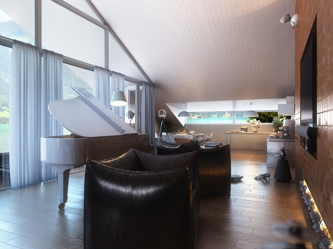
Considering the fact that one of the walls consists of windows, and is basically a glass wall, there is a lot of natural light in daytime. That can provide a sharp, direct lighting, which can create dark shadows, since there are no means of lighting on the opposite side of the glass wall.Especially in the focal point of the room, since the feature wall is a chocolate brown colour and doesn't reflect much light. But, we can just imagine how this space looks in the night-time, when all of these ambient lights are on, and the (quite unique!) fireplace provides a soft, reddish pool of warm light. Must be a pleasure to be sitting on one of those sofas, or maybe playing a slow tune on that magnificent piano!
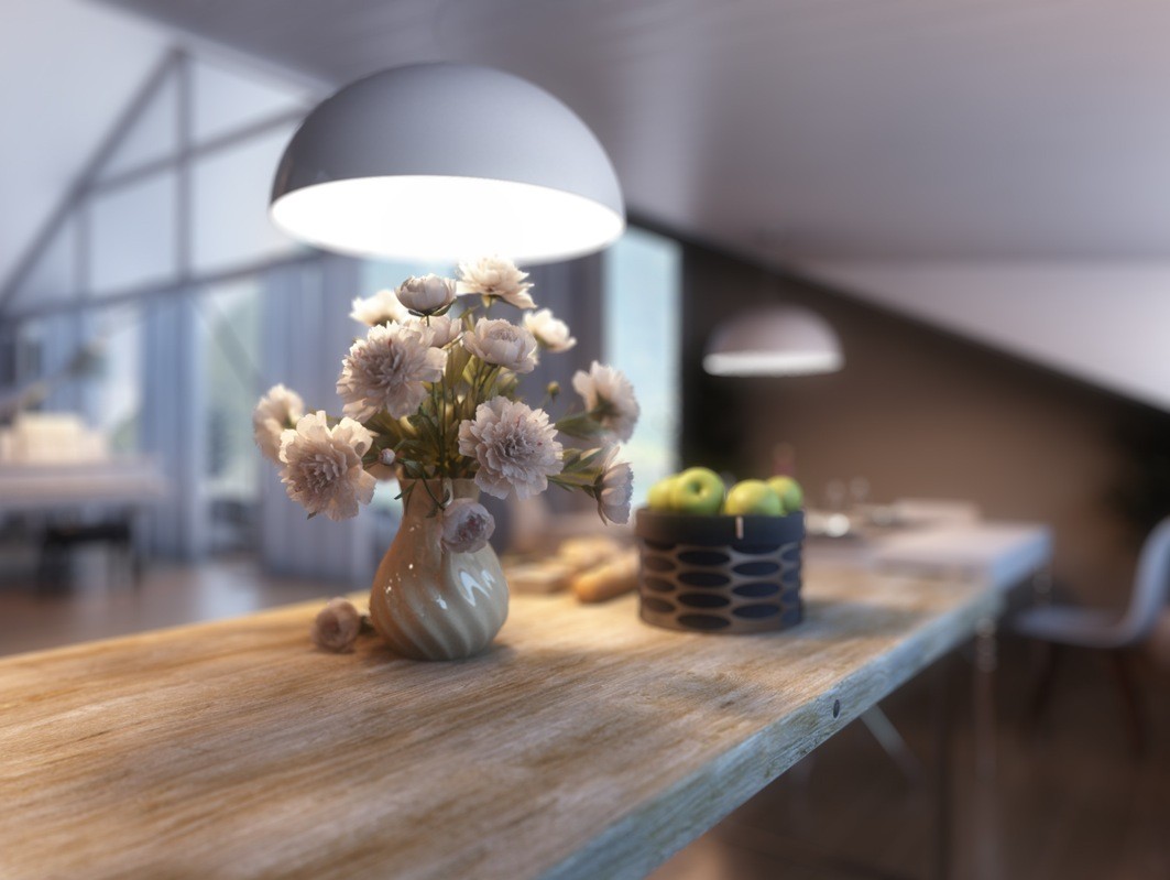
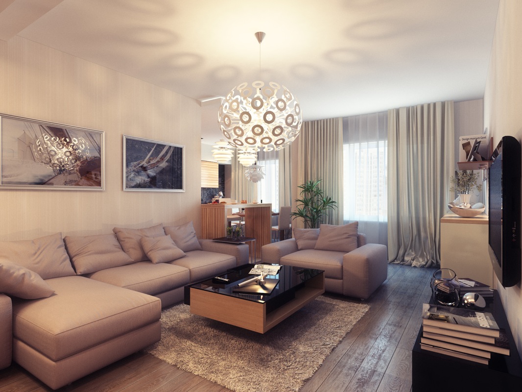
In one of his other projects, he stays faithful to using warm, creamy tones to add dimension to the space. This space is a lot smaller then the first one, but he cleverly used low furniture for the sitting area, so that the room has a wonderful flow to it, and it doesn't look cluttered or small at all! There aren't a lot of dark colours, just hints of black or darker brown, mixed in with the soft lighter brown. Curtains create an omni-distributed light, that makes the space appear bigger. The kitchen is again neat and clean looking, with decorative lights on the ceiling. Also, there is a bar, which is quite practical for eating breakfast or sipping on a cup of coffee during the morning news, which you can easily watch from over there!
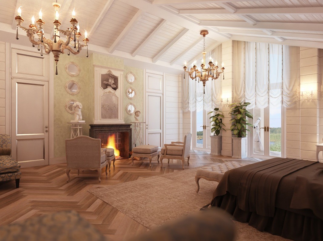
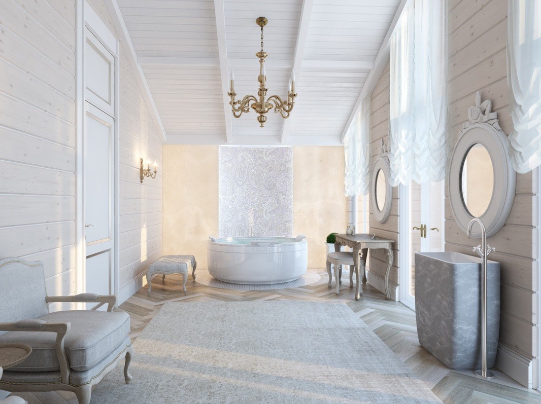
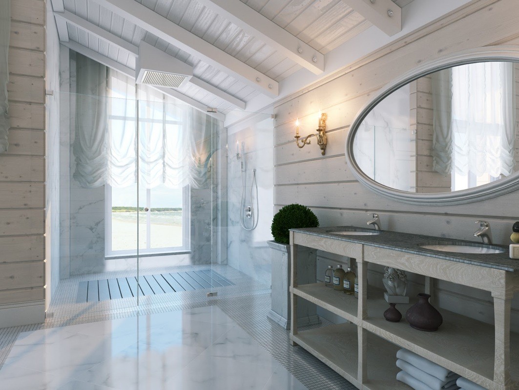
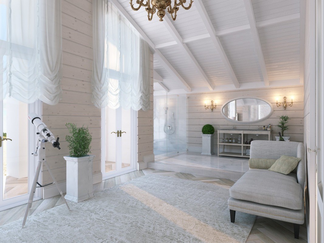
The third series of photos are showing a luxury bathroom and a bedroom of a much bigger apartment or house, we suppose. He has yet again used warm toned hints of colour in the white bathroom, but this time with cooler toned details (the plants on each side of the sink), that compliment the warm tones and the clean looking white in a wonderful way. Considering the fact that the first bathrooms mirror is quite far away from the window, the designer solved the lighting problem by putting two light units on each side of the mirror, that distribute light equally on the person standing in front of it. Overall, the bathroom looks really inviting... Well, who would want to lounge on that chaise long?

