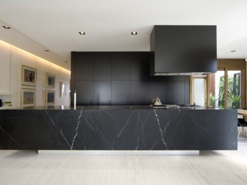
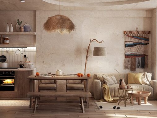
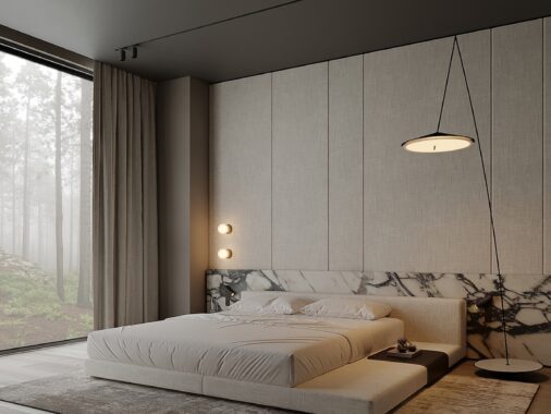
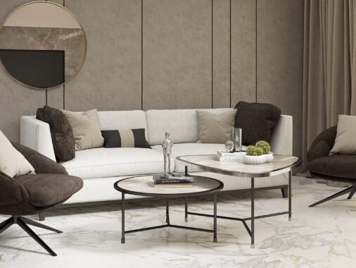
We love to showcase homes that use color creatively. From an electric pink kitchen backsplash to a gilded mirror or a playfully patterned area rug, color can bring a drab living space to life. But it is also important to look at how a more neutral, subdued color palette can be both beautiful and inviting. The two homes featured here, the first from Yael Perry and the second in collaboration with Dafna Gravinsky and architect Amir Navon, both photographed by Itay Benit, show just how spectacular white can be when used in the right proportion with black and grey. By limiting the use of color, the designer has created clean, minimalist looks that are instantly soothing and incredibly chic.
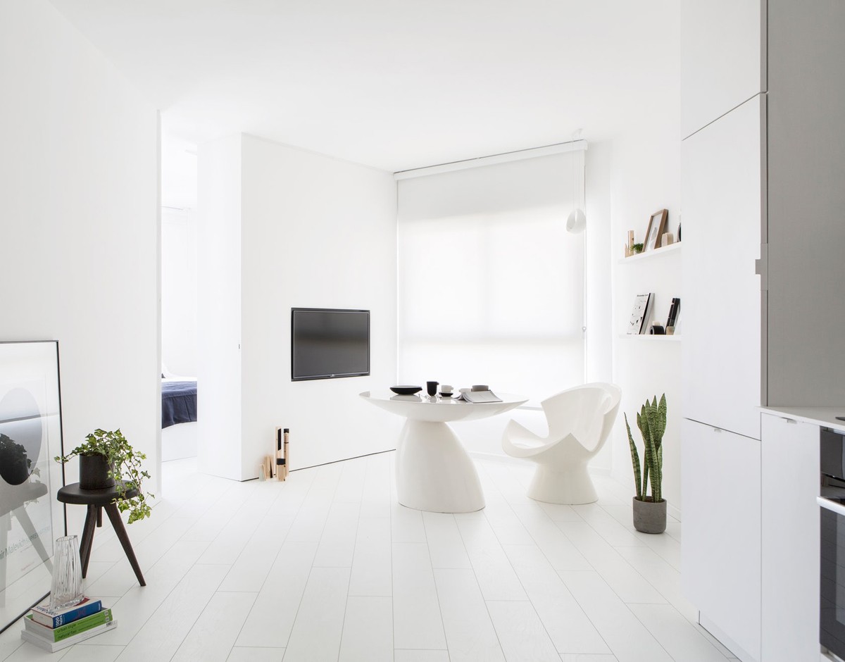
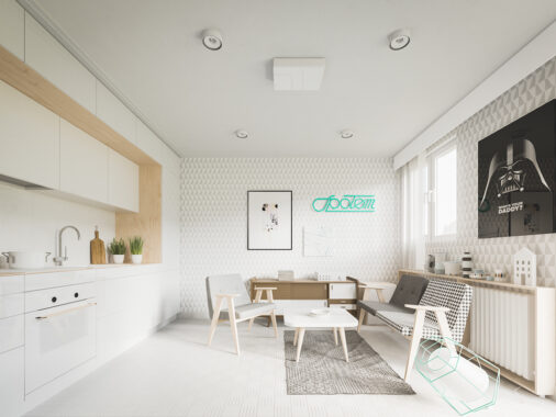
The first apartment, a dazzling white design, is the S|H Apartment, located in Tel Aviv.
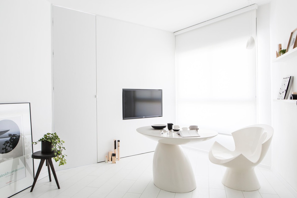
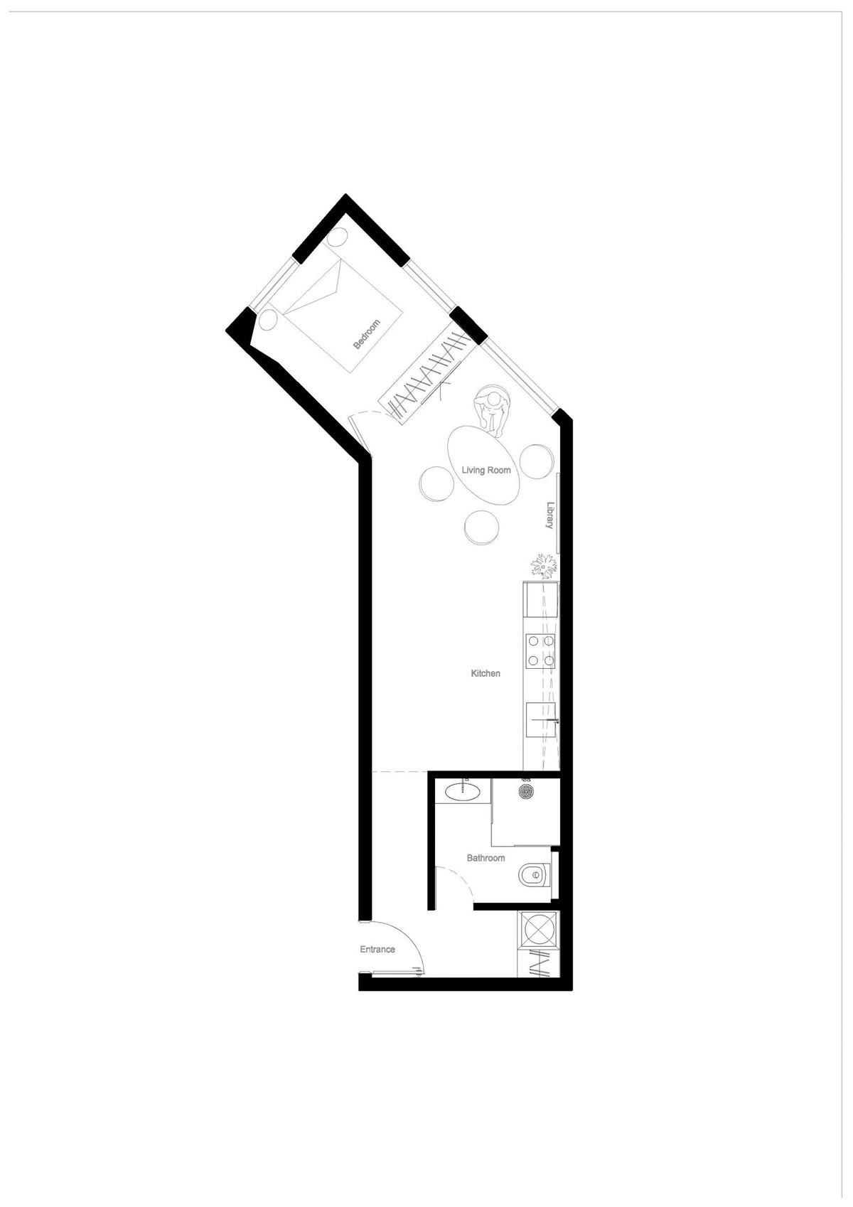
The budget for this minimalist design was between $50 - $100k for the 42 square meter (452 square feet) 'skinny' apartment.
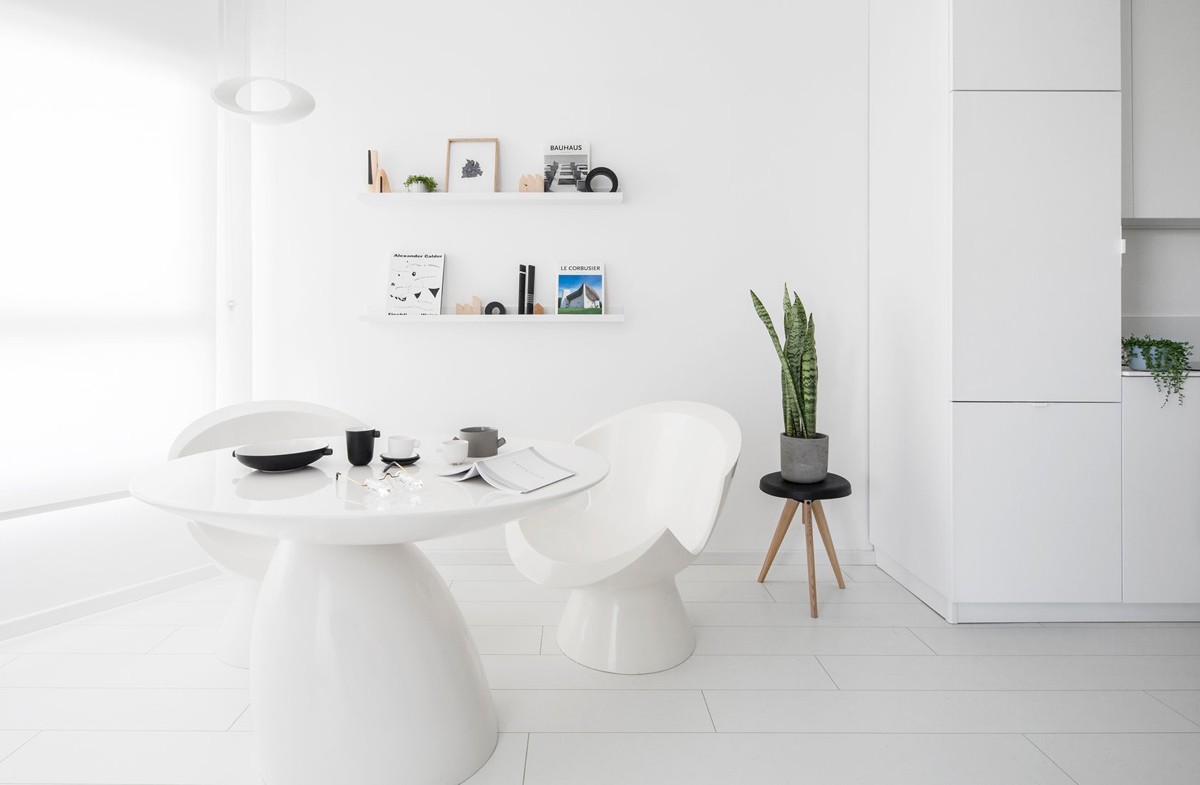
The apartment was designed as a holiday home for a family that likes to entertain. While bright white is certainly the dominant color, some pops of life, such as a snake plant do make an appearance.
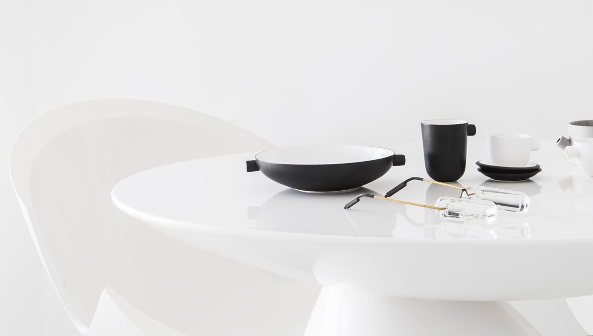
When the designer took over the space for this new family, there was no storage, no bedroom closet, and a very small bathroom.
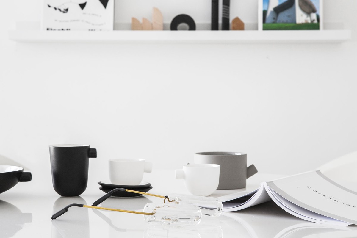
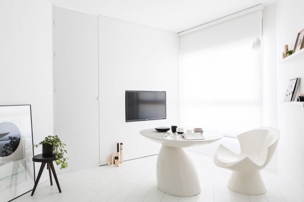
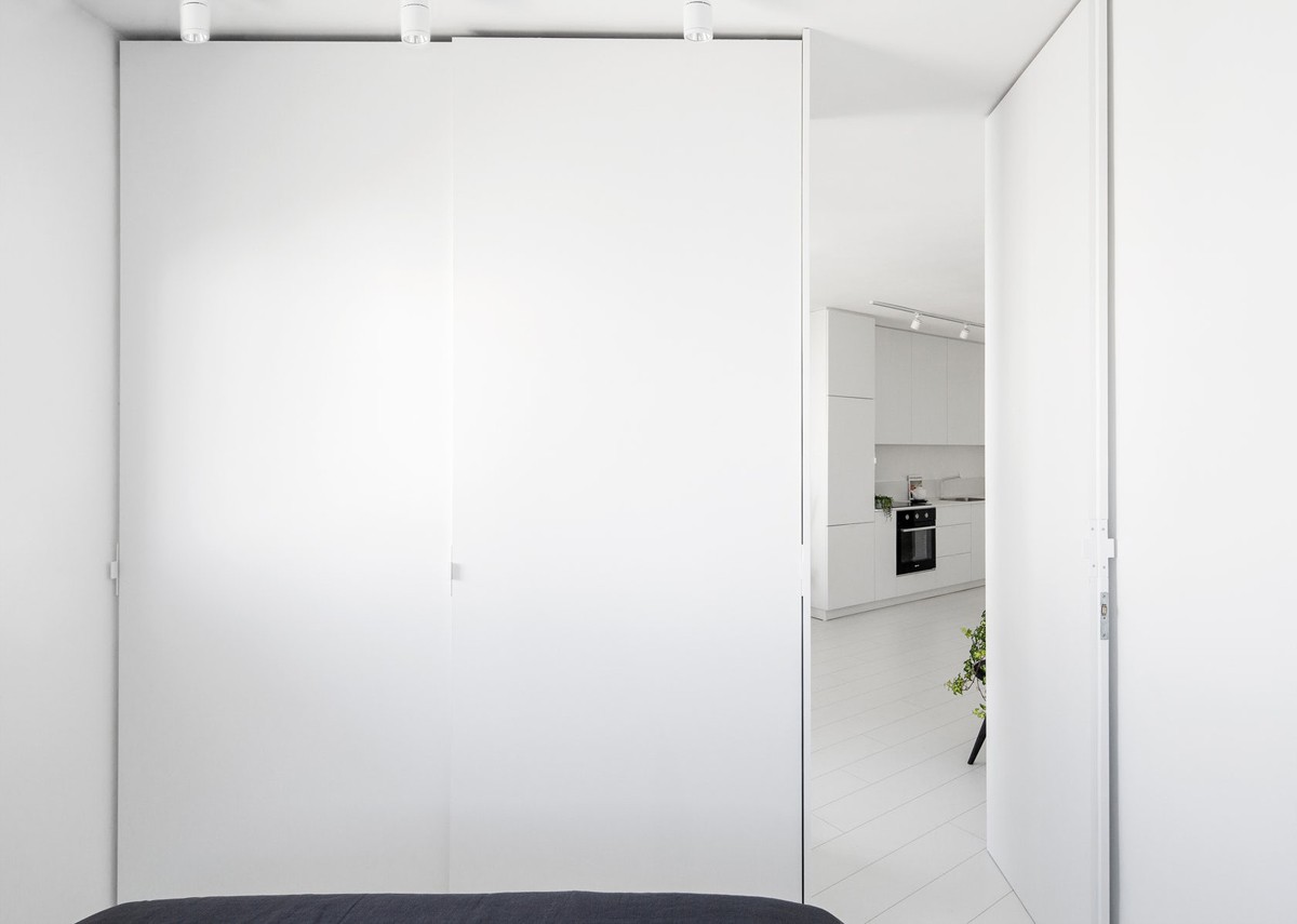
To make the home feel bigger, despite the main living area measuring just 11 meters by 3.3 meters, white was chosen.
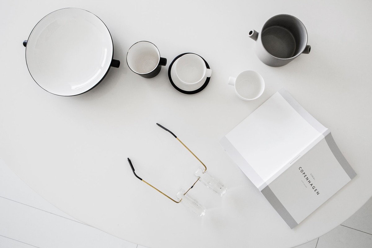
White furnishings like this dining table melt right into the design of the rest of the space, as if they were meant to go togther.

The Parabel table by Eero Aarnio was already owned by the new homeowners, and used along with four Kite chairs, from designer Karim Rashid in the final design.
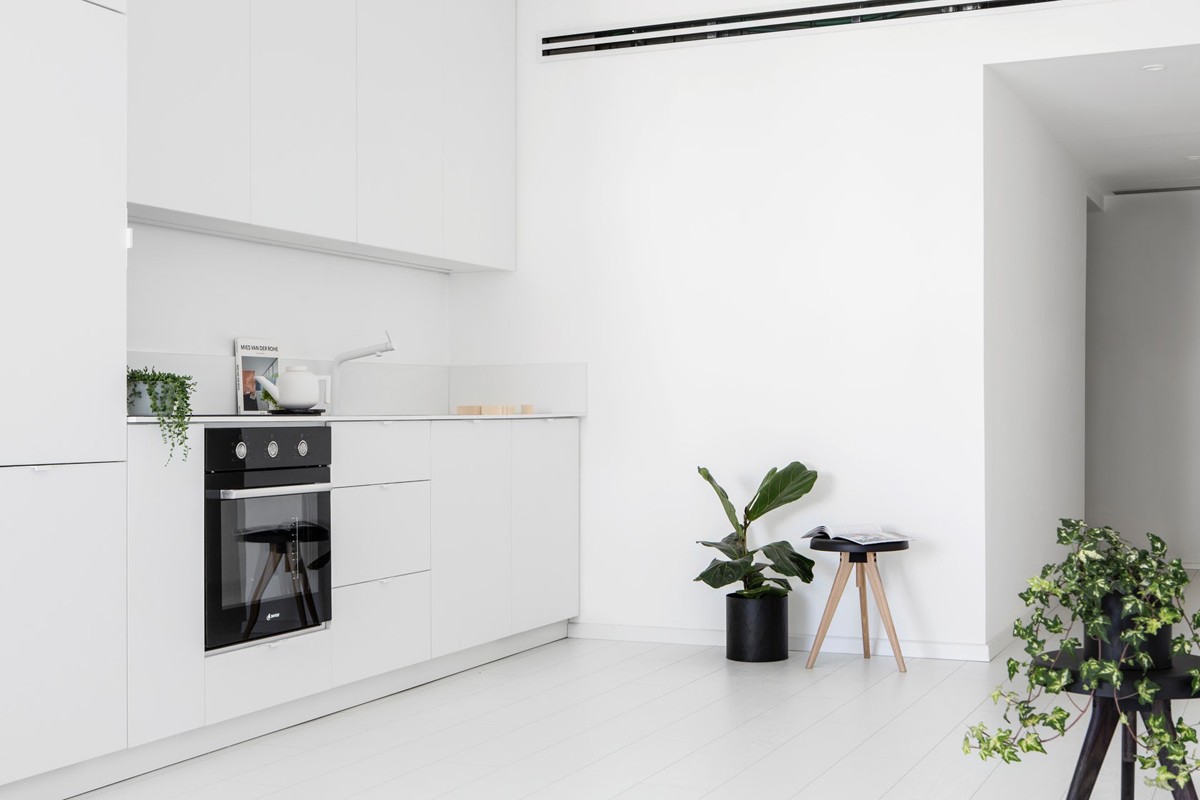
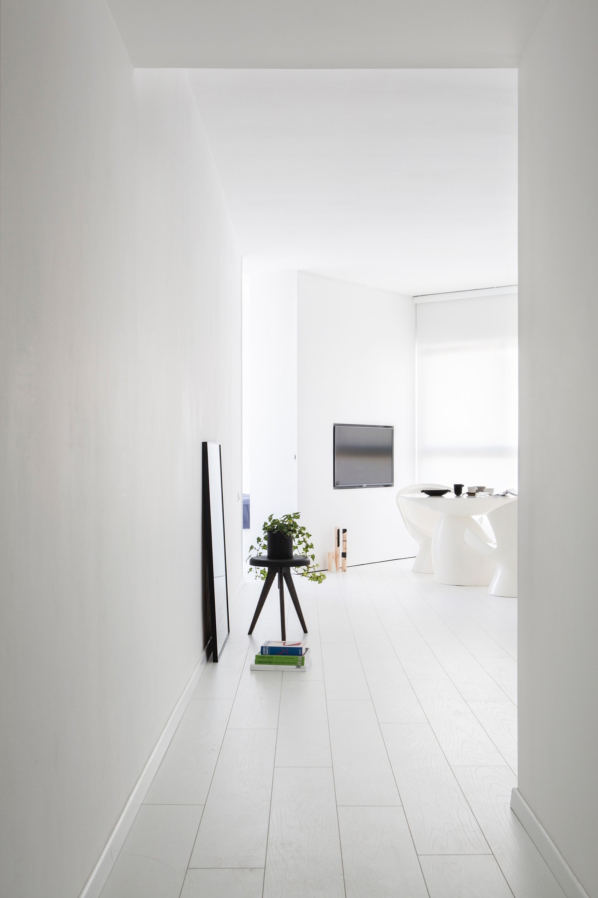
To carry the white throughout the design, white parquet was added to the floor and the walls were painted white.
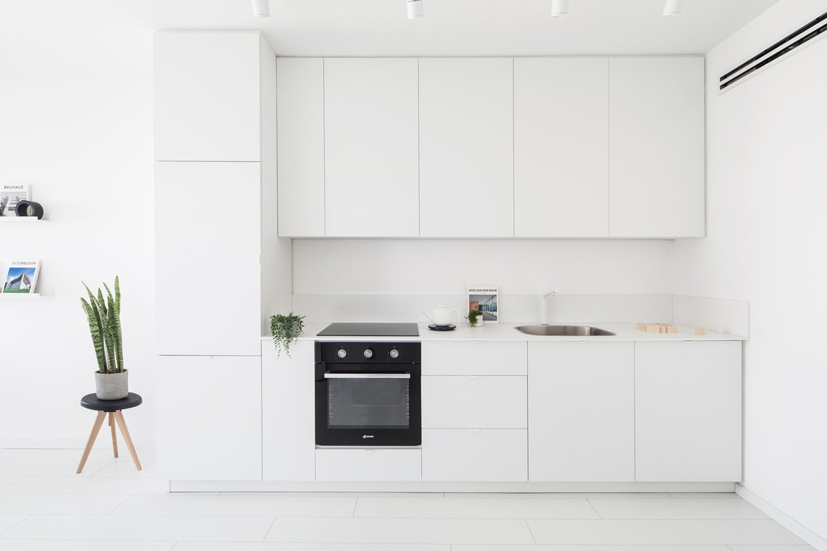
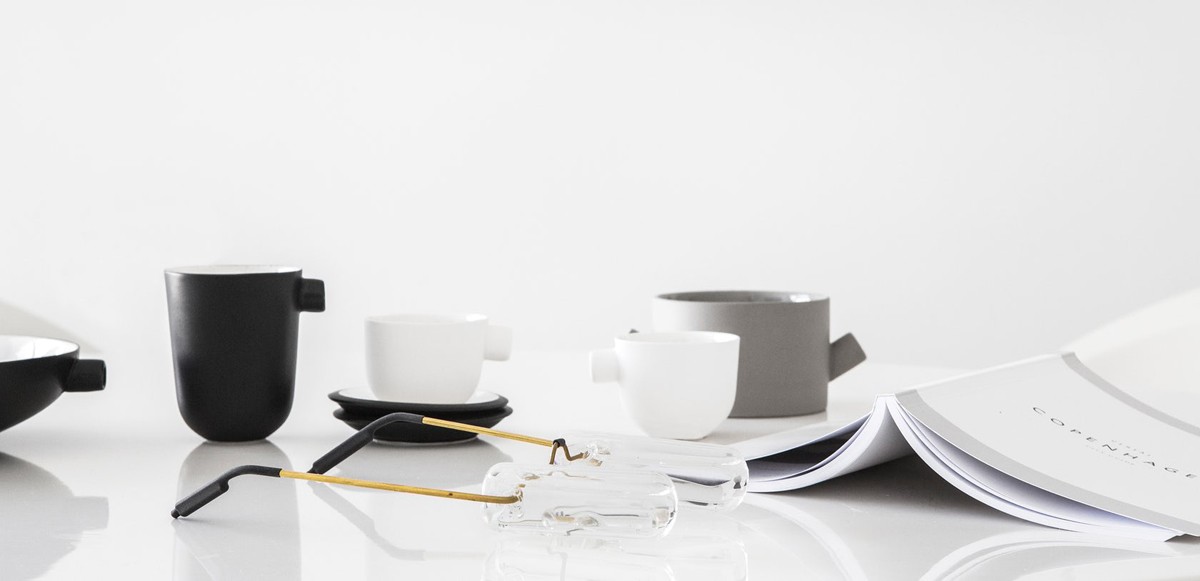
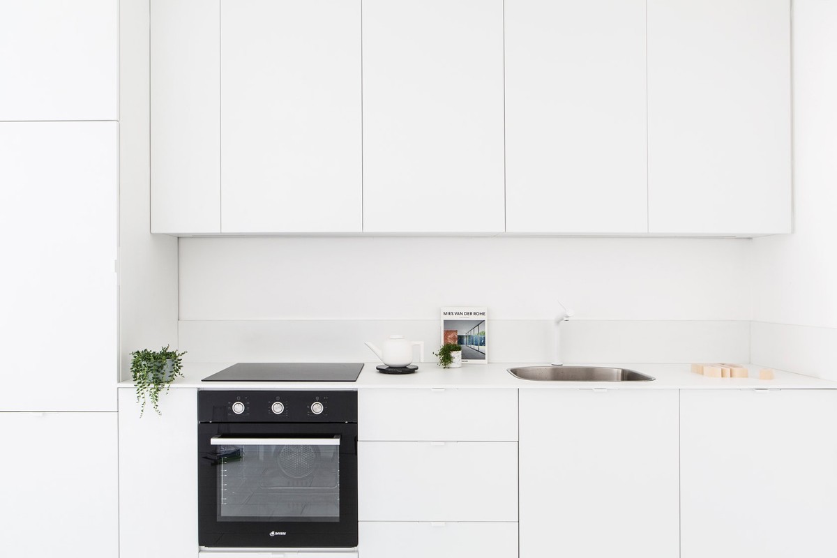
The kitchen makes use of the narrow space with integrated appliances, but still makes room for unique teapots.
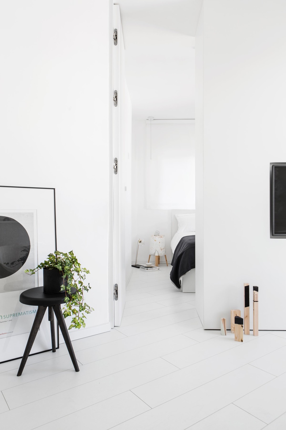
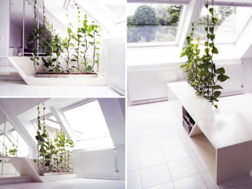
An ivy plant is another opportunity to bring a bit of natural beauty into the stark white home.
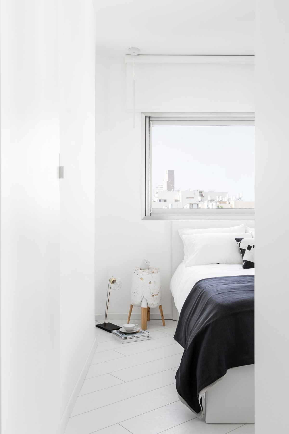
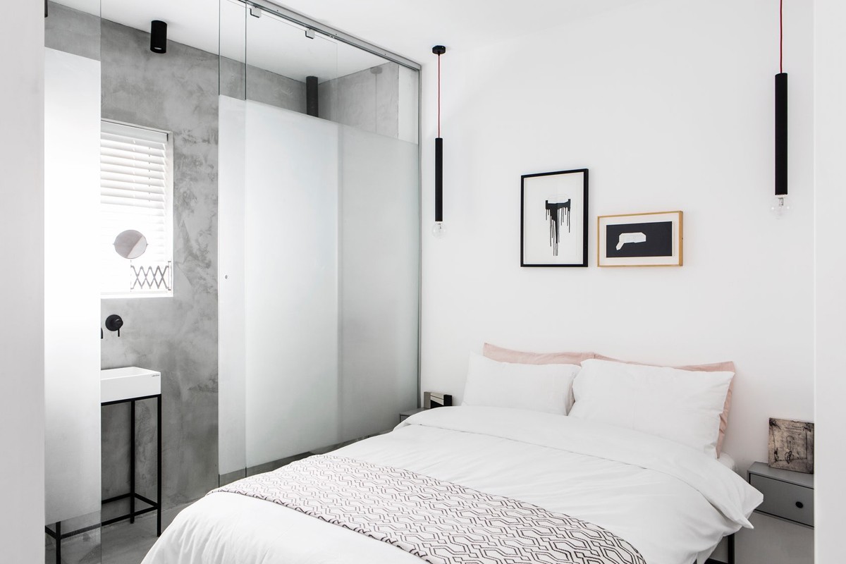
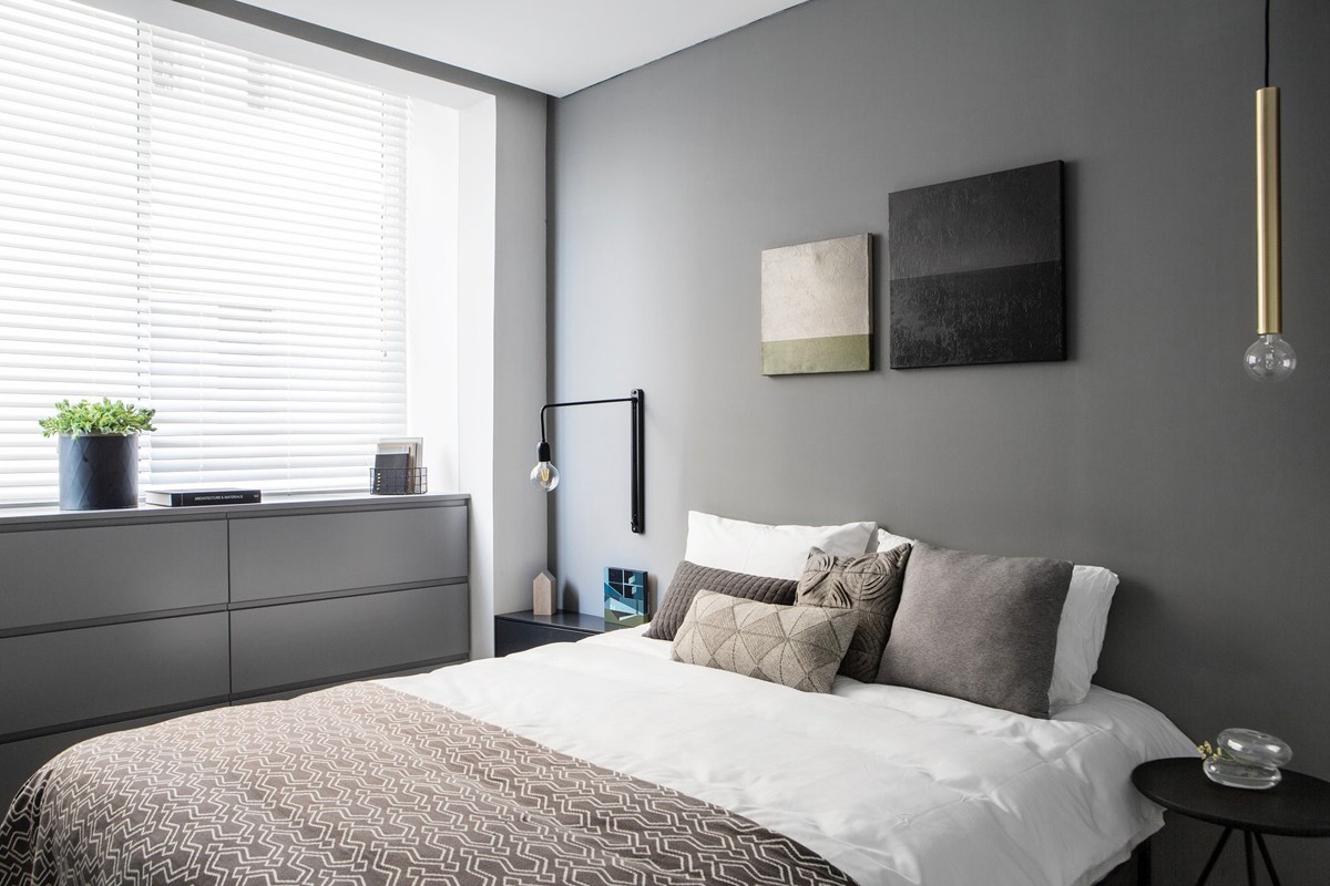
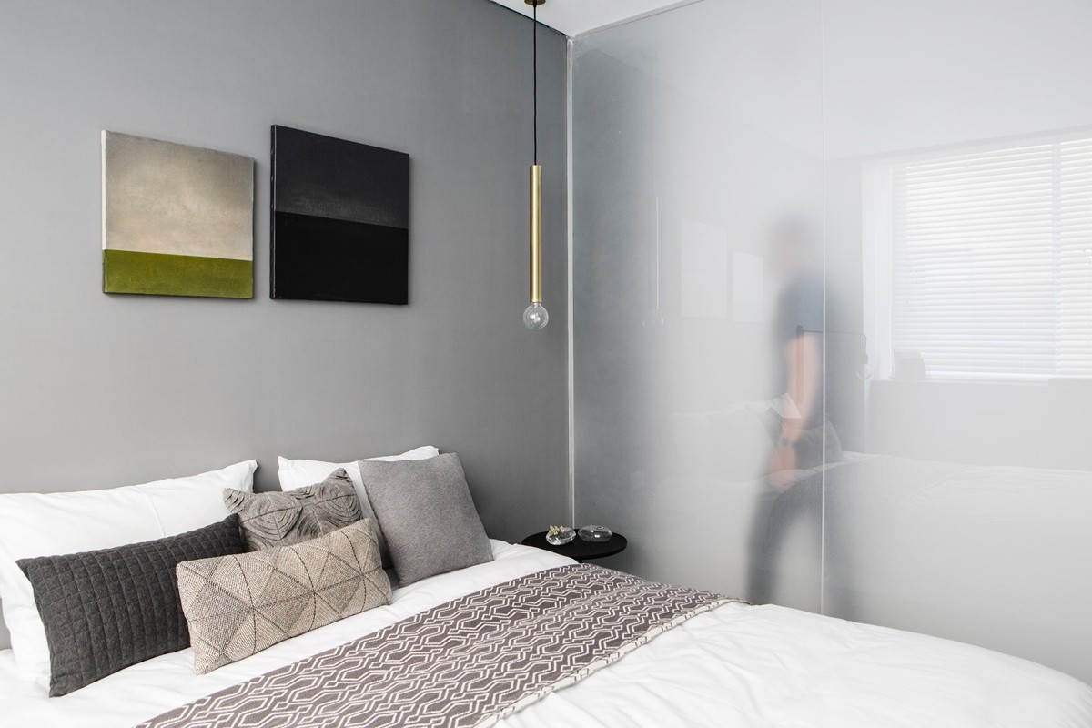
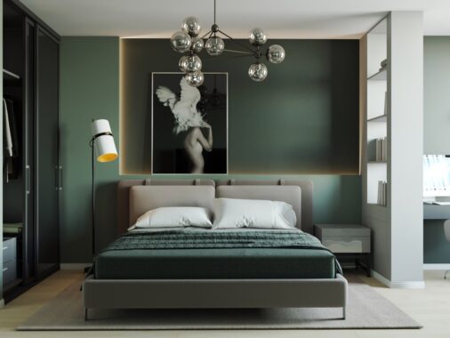
In the white on white bedroom design, a subtle bedroom pendant nearly goes unnoticed.
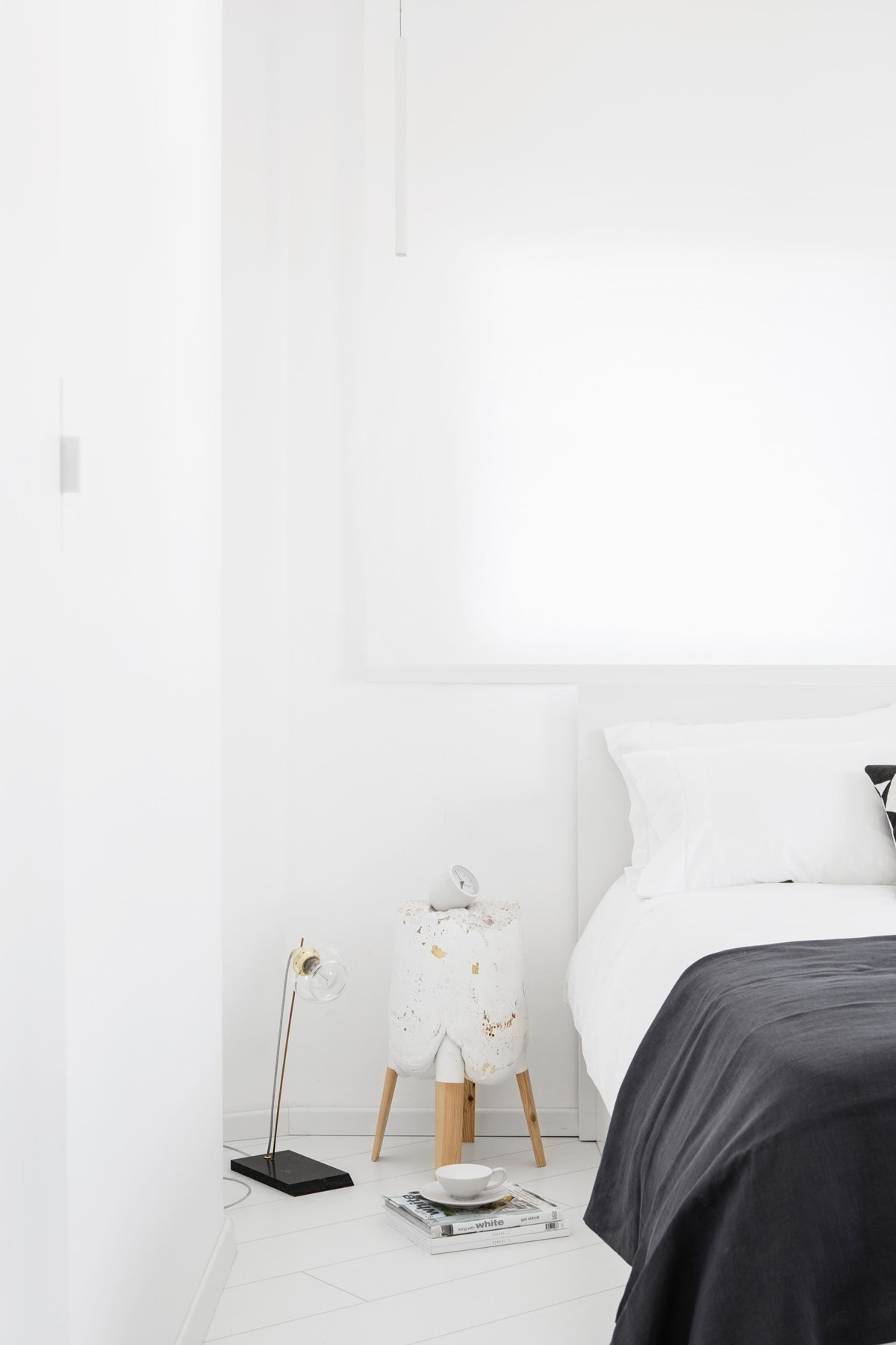
The Tumbler alarm clock by Menu is another unique accessory that melds well with the design.
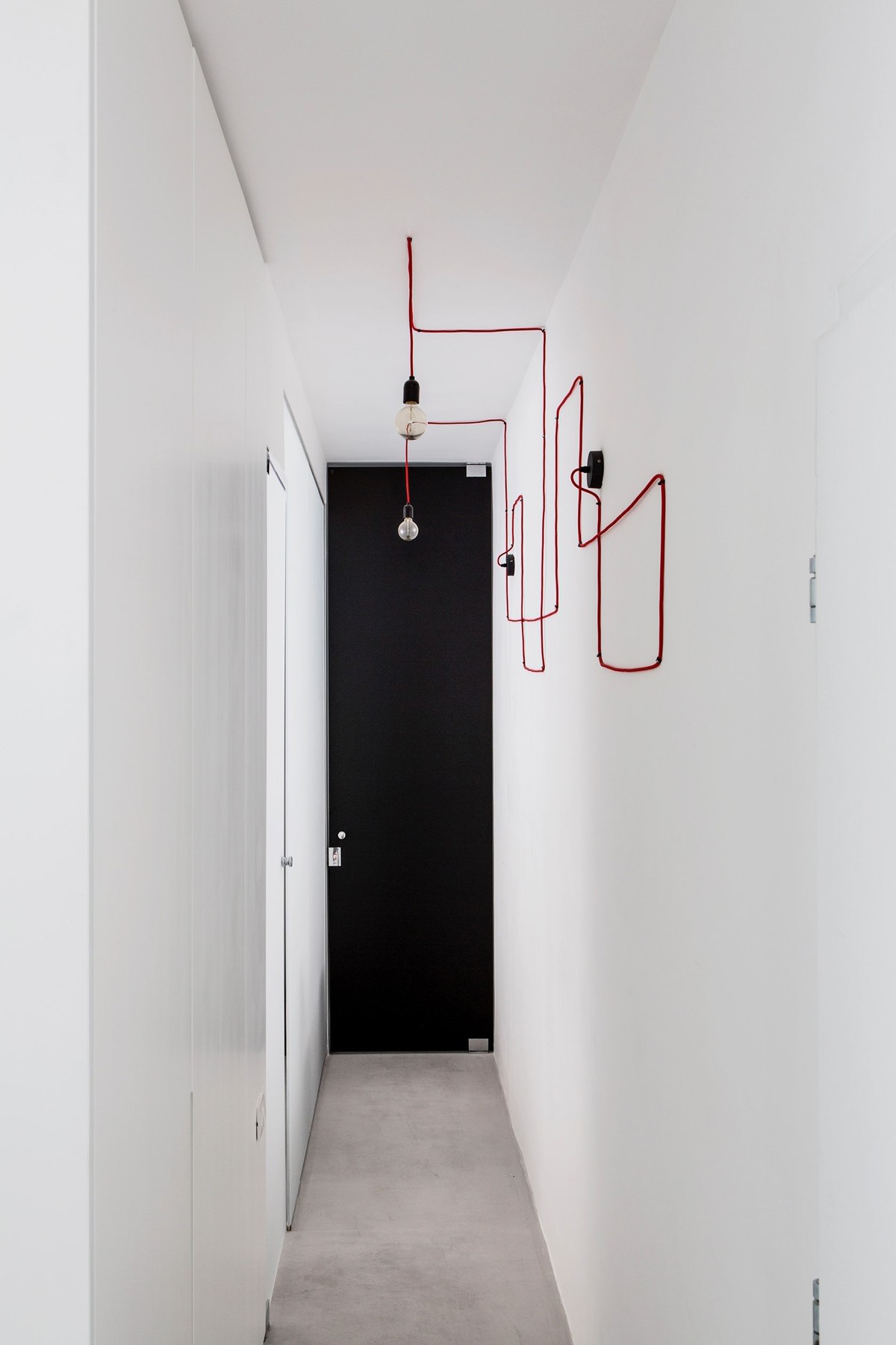
During the course of the design, the existing internal walls were destroyed and new entryway created for more space.
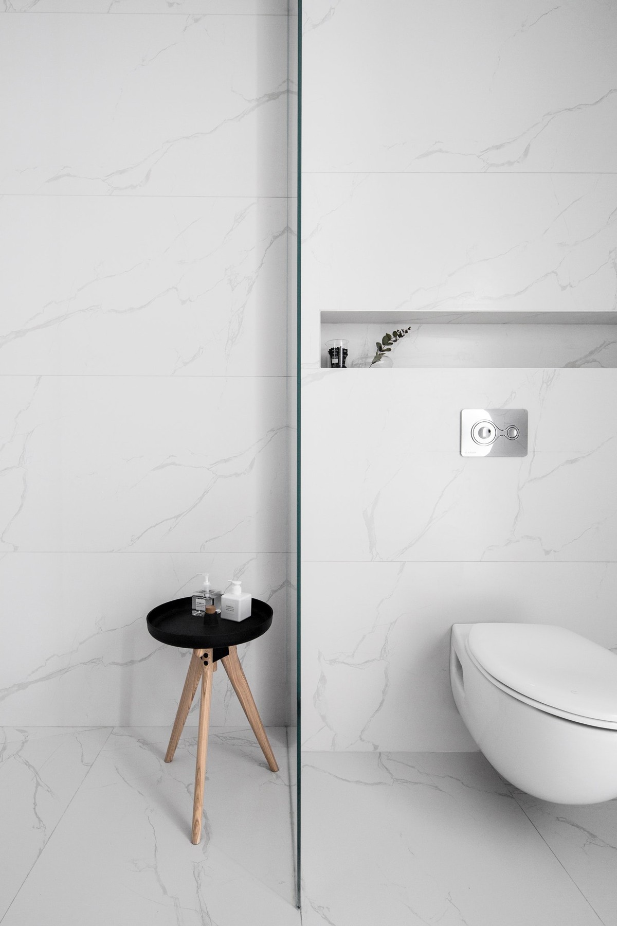
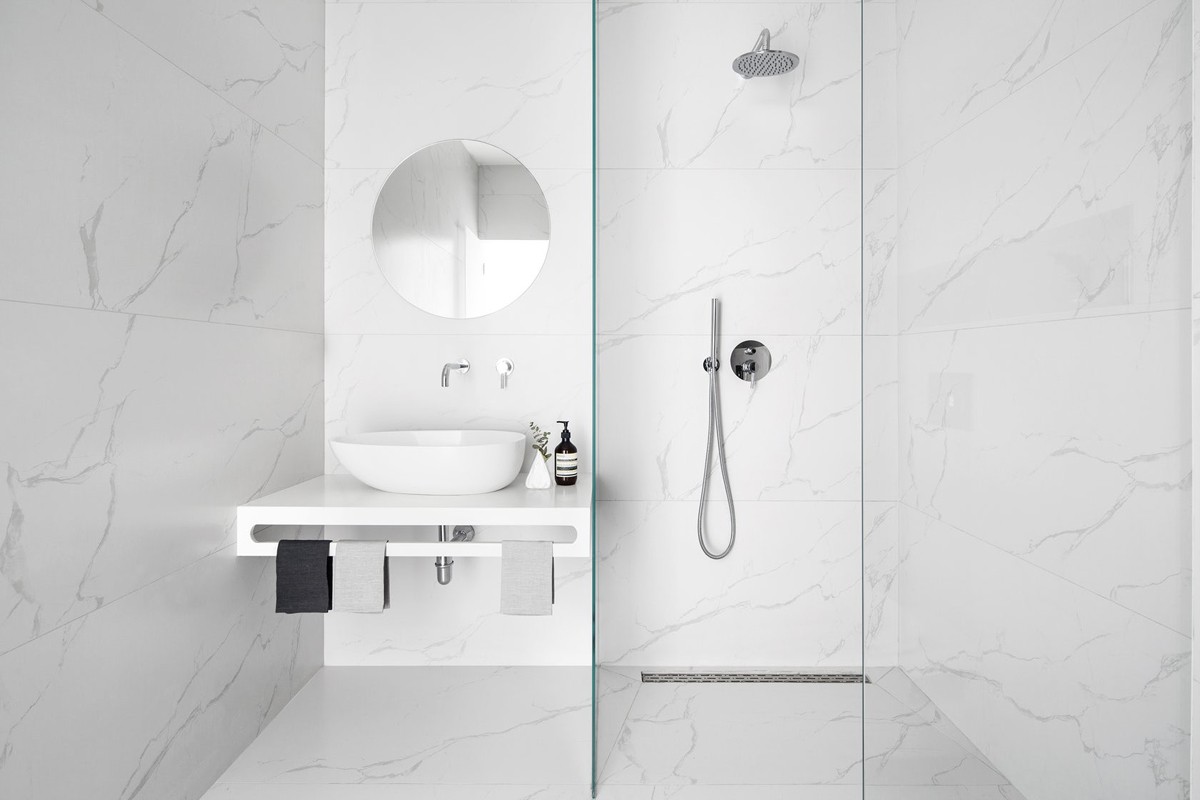
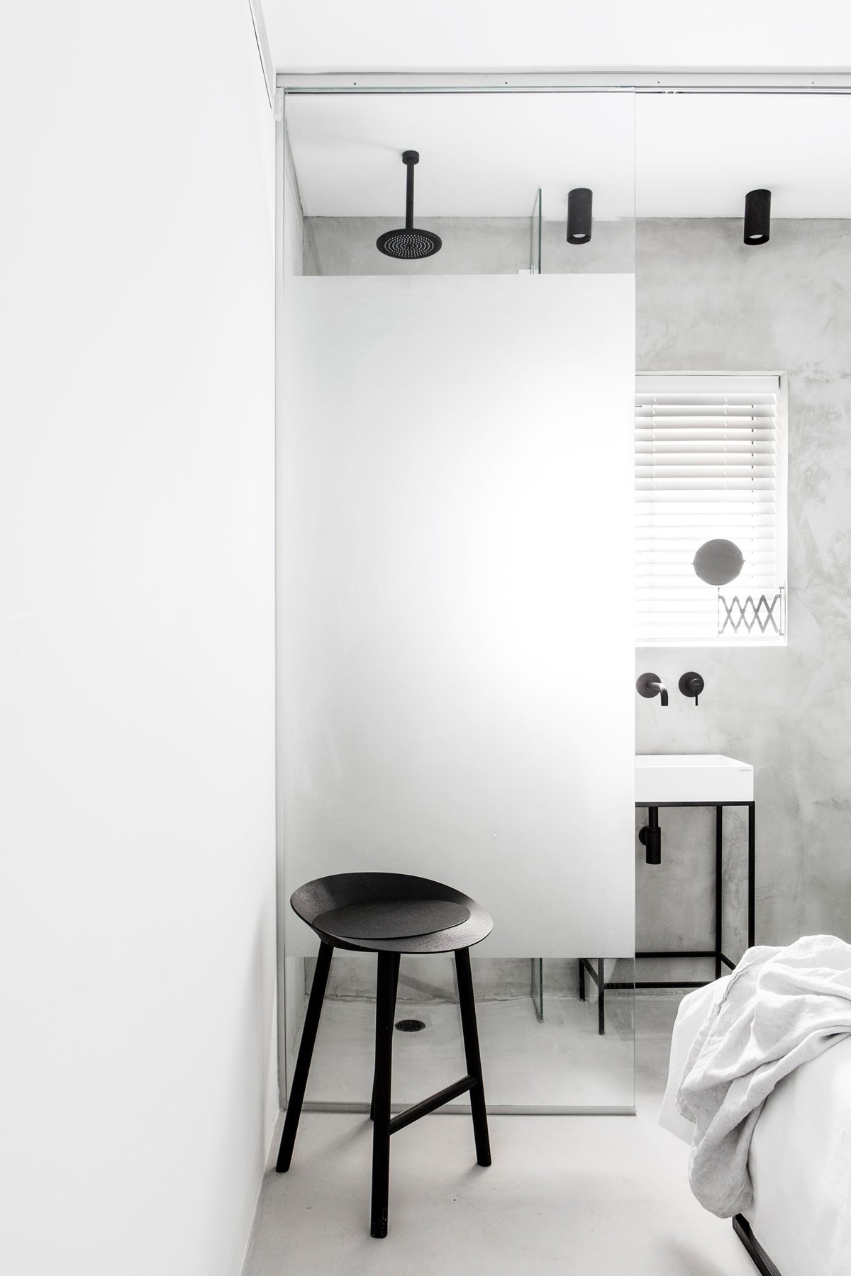
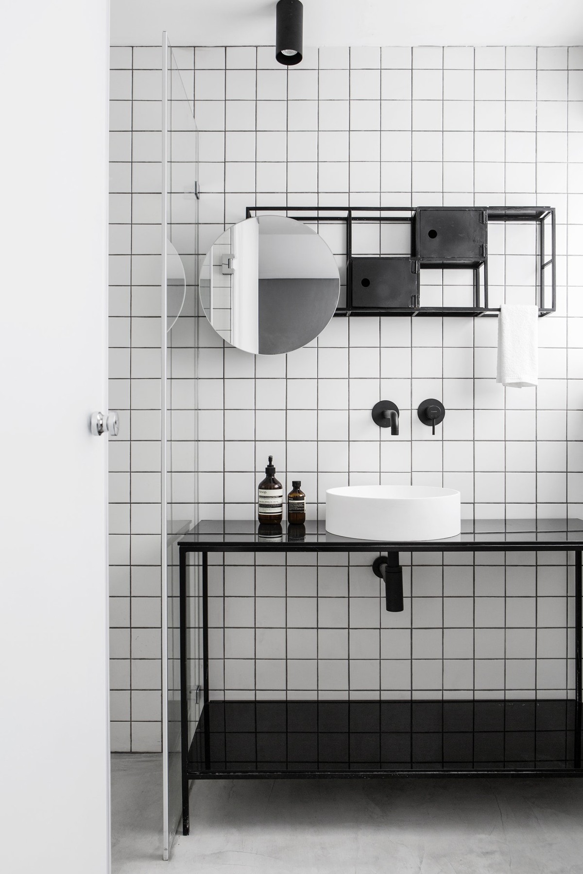
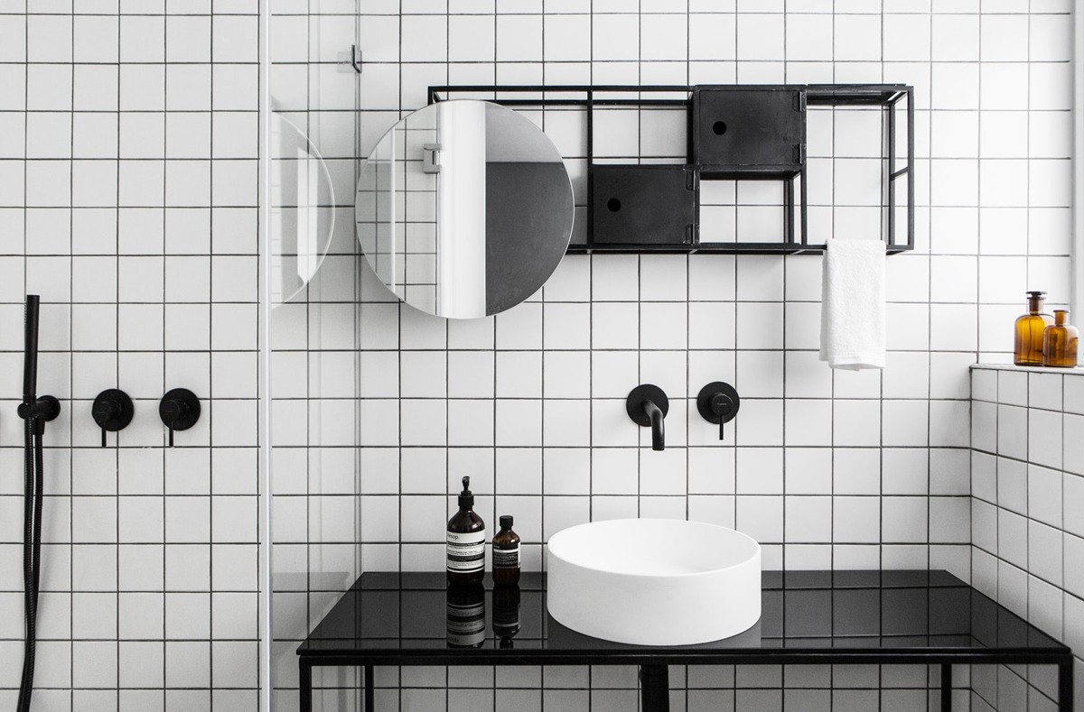
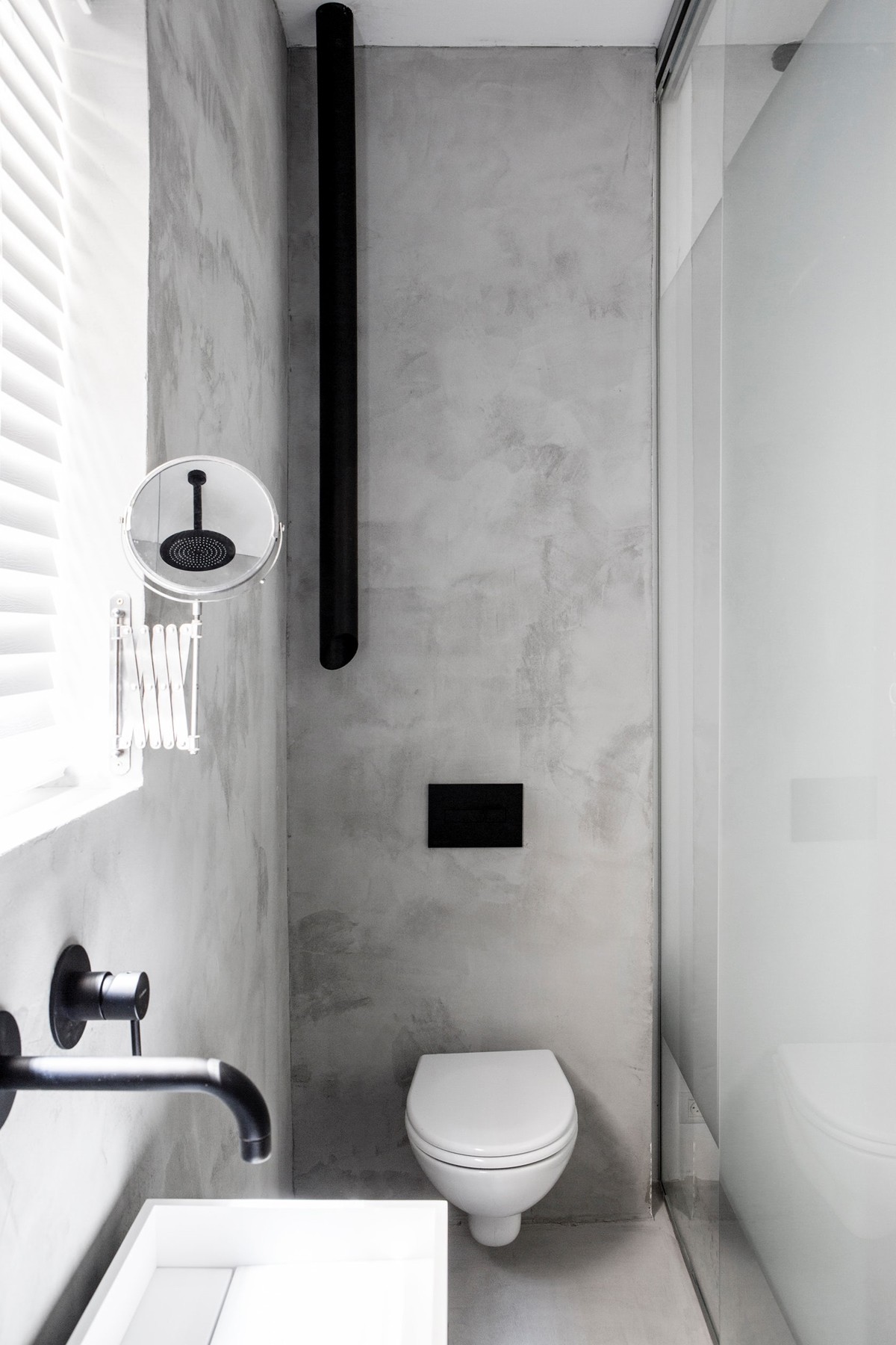
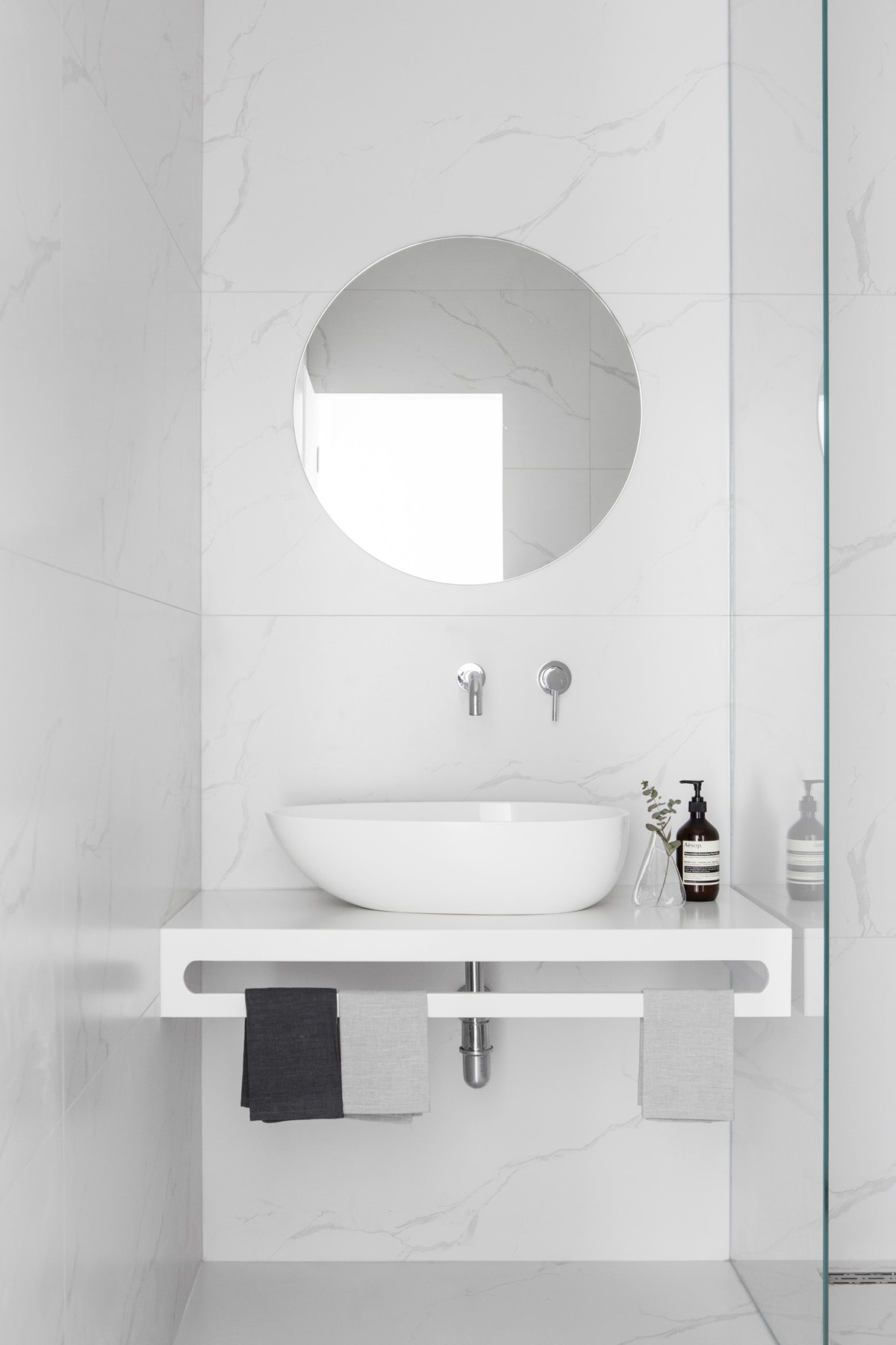
For accessories in the bathroom, soap and lotion dispensers make their own minimalist mark.
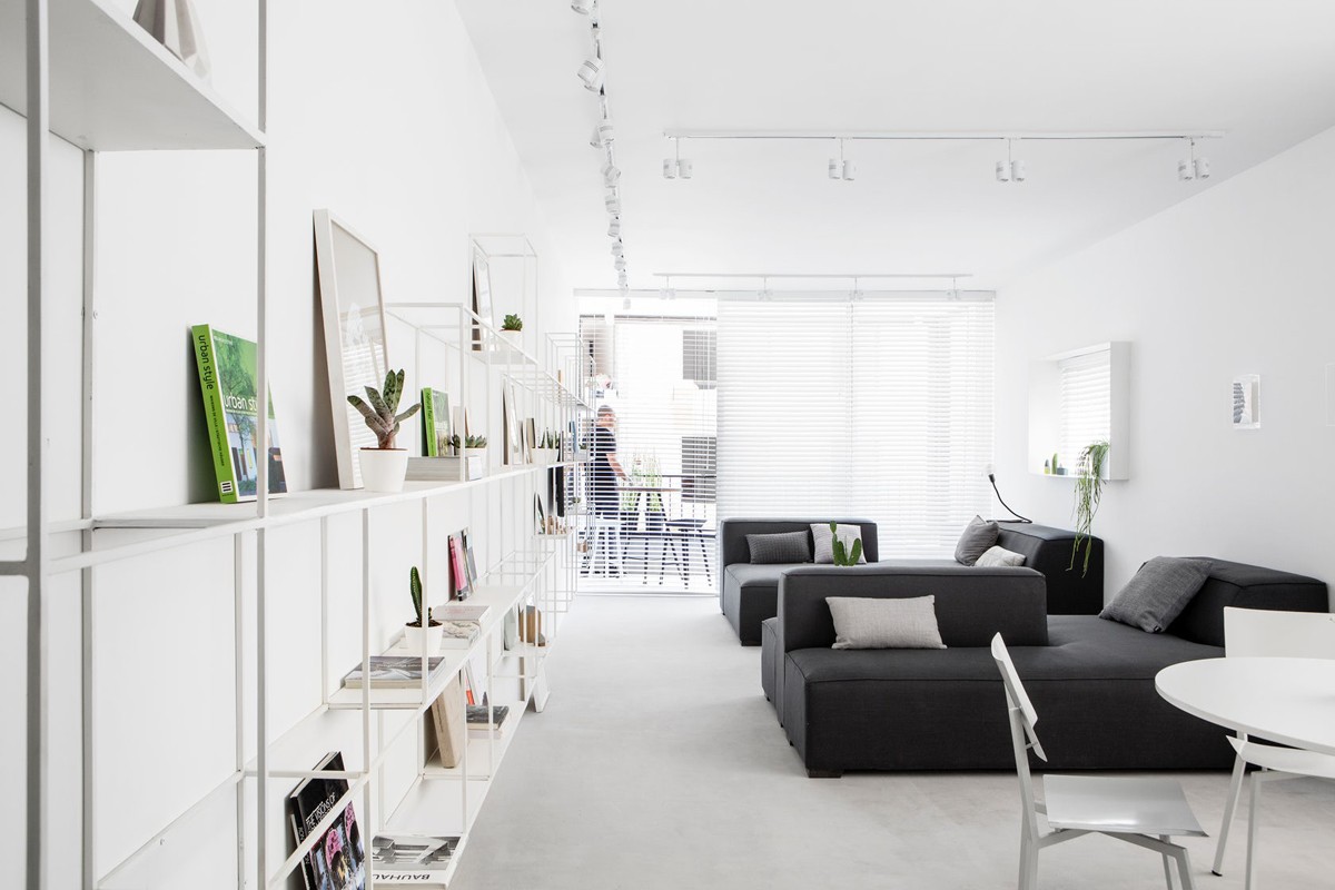
The second apartment, is different in its design, but still utilizes a number of the same theories.
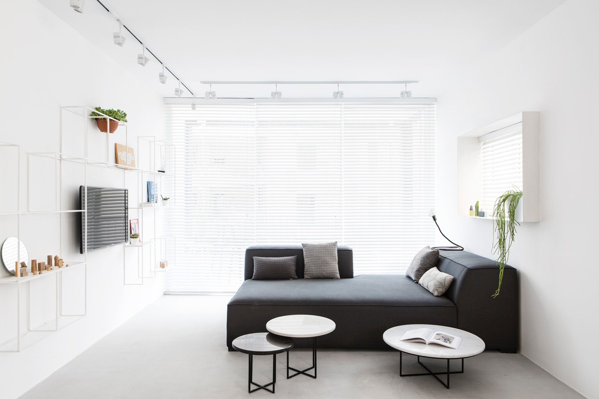
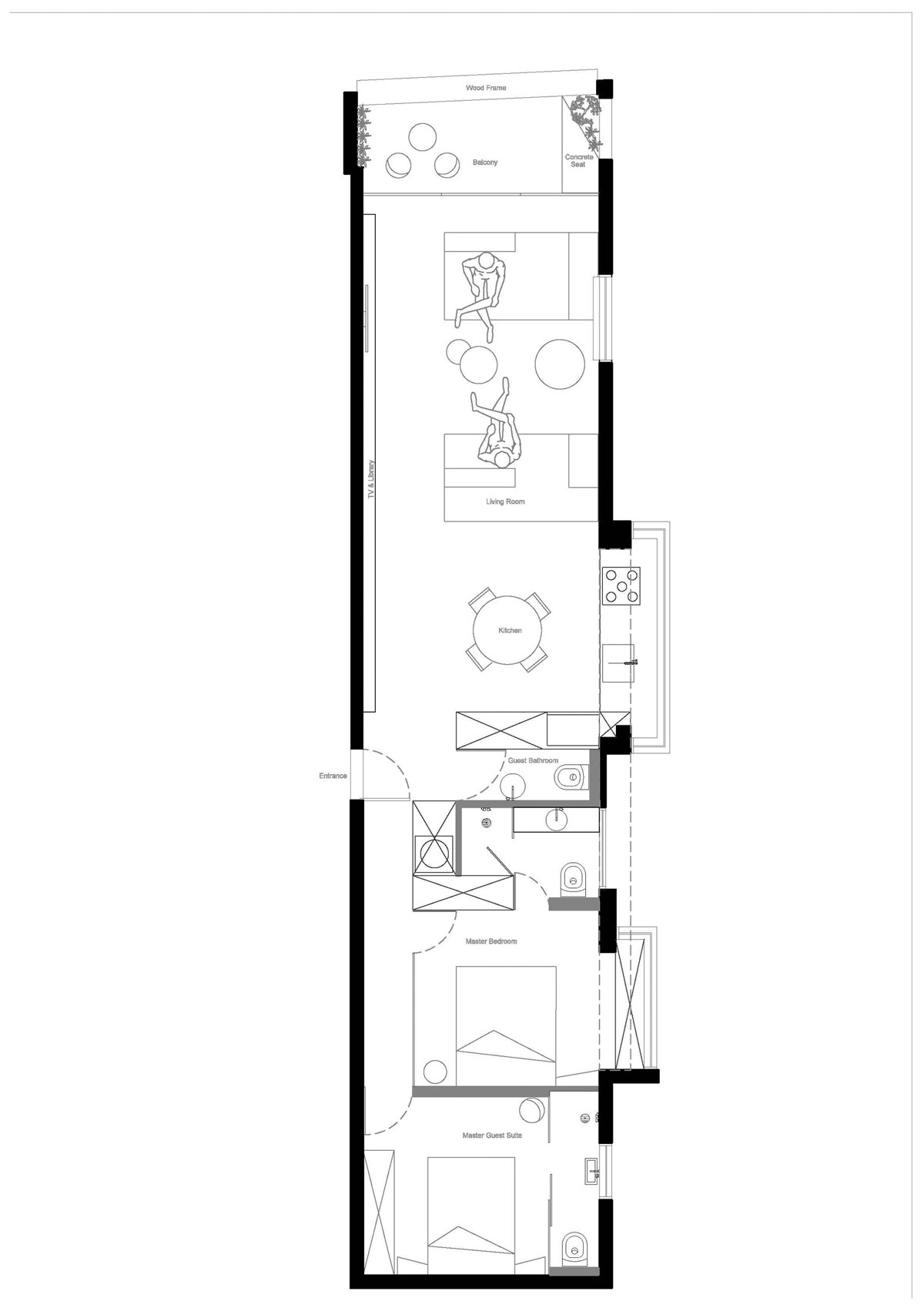
The use of unique coffee tables in the living area of the 80 square meter (861 square feet) give this home a bit more practicality.
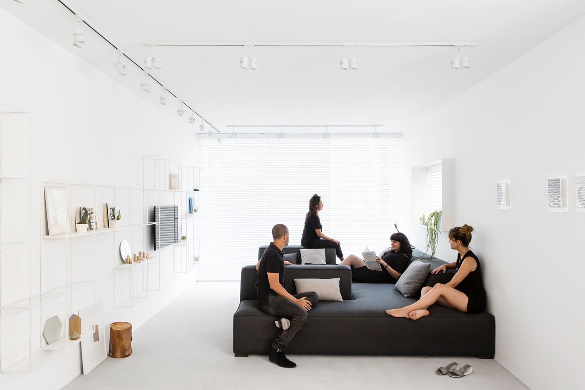
Again, this Tel Aviv home was designed as a holiday home for a family that likes to entertain. Luckily, this apartment has the space for a bit more seating.
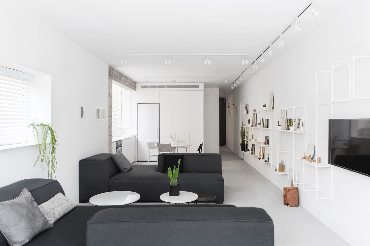
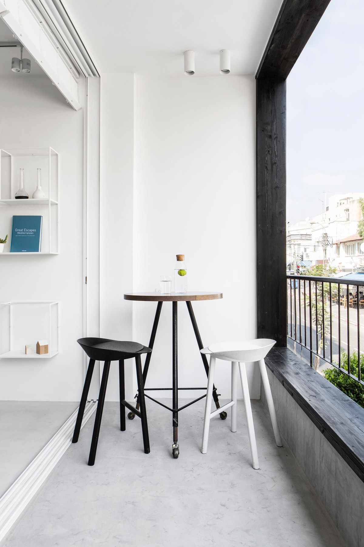
The main living area includes a kitchen, living room, and terrace with carefully chosen furnishings adding important dimension as well as practicality.
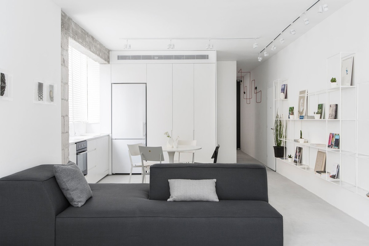
The custom sofas, in dark gray, are functional in that they are modular and can easily be rearranged for different events and moment.
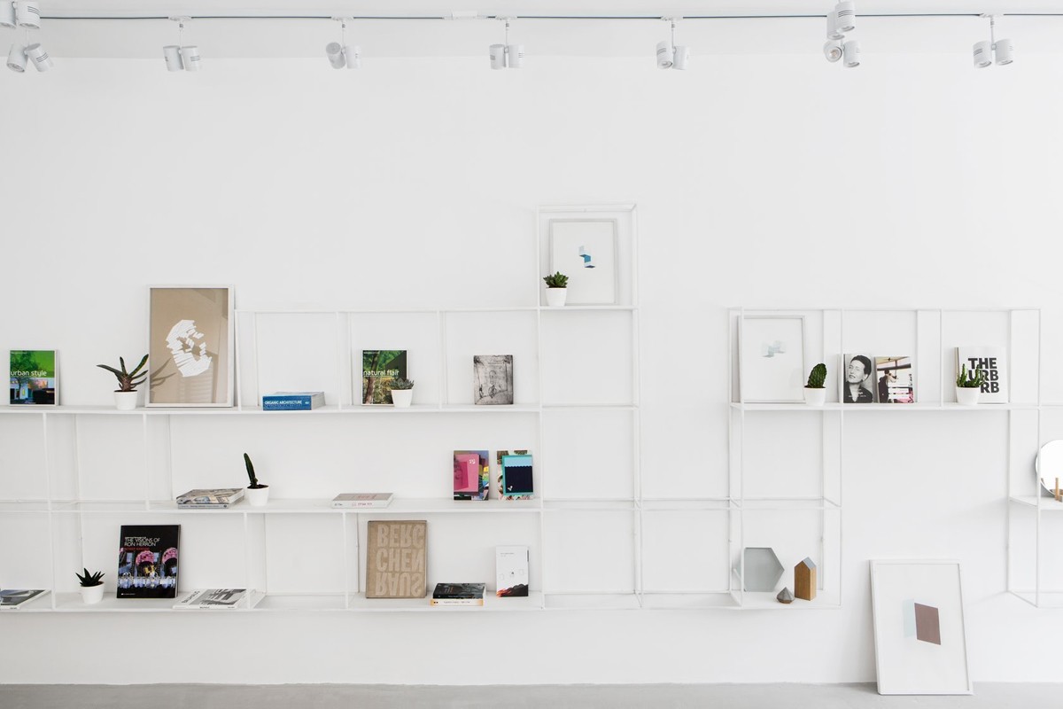
A grid of unique wall shelves fits perfectly with the grid design of the apartment.
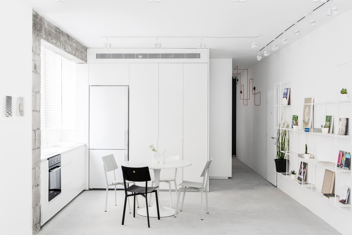
A black and white dining area with modern dining chairs is situated so that diners can still interact with people in the kitchen or living room.
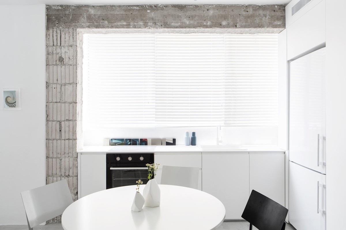
White unique vases are a simple addition to the minimalist aesthetic.
