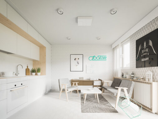
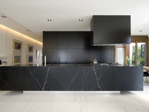
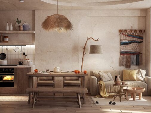
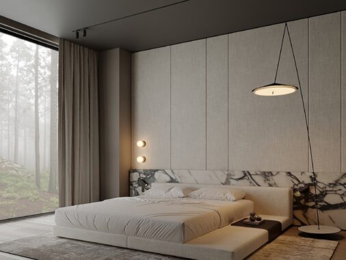
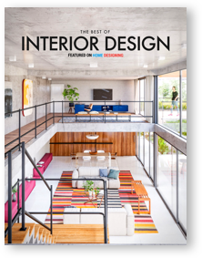
Both of these beautiful apartments make great use of open living areas to maximize the usability of their floor plans, each measuring up at under 100 square meters. Each one feels spacious, bright, and leaves plenty of room for family activities and entertaining guests. Another benefit of this layout style is that the architects were able to integrate extra rooms, like a fully equipped study in one and a nursery with a small office desk in the other. And if you love natural interior design themes, you're sure to find some inspiring decor choices throughout these tours.
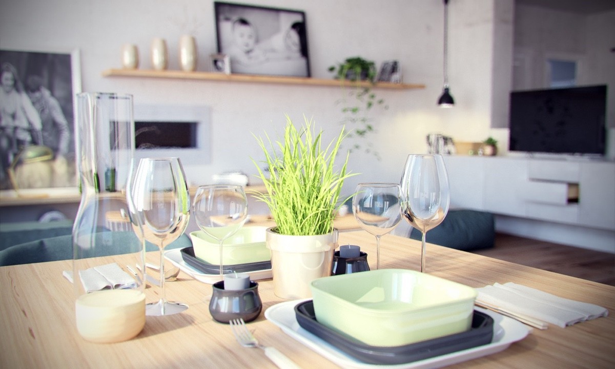
Even the lovely wine glasses make a sophisticated statement.
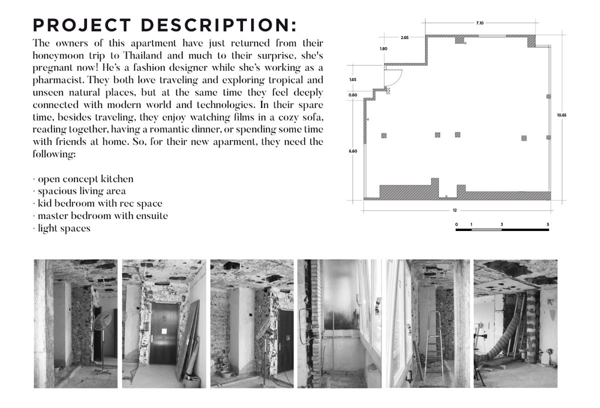
As described in the project description, this home is a solution for a young couple expecting their first child – the design is intended to leave space for everything a growing family needs, from recreation with the children to romantic evenings for the parents and entertaining weekends with guests. Roughly half of this 100 square meter home provides space for family relaxation and social events, while the other half is set aside for private time.
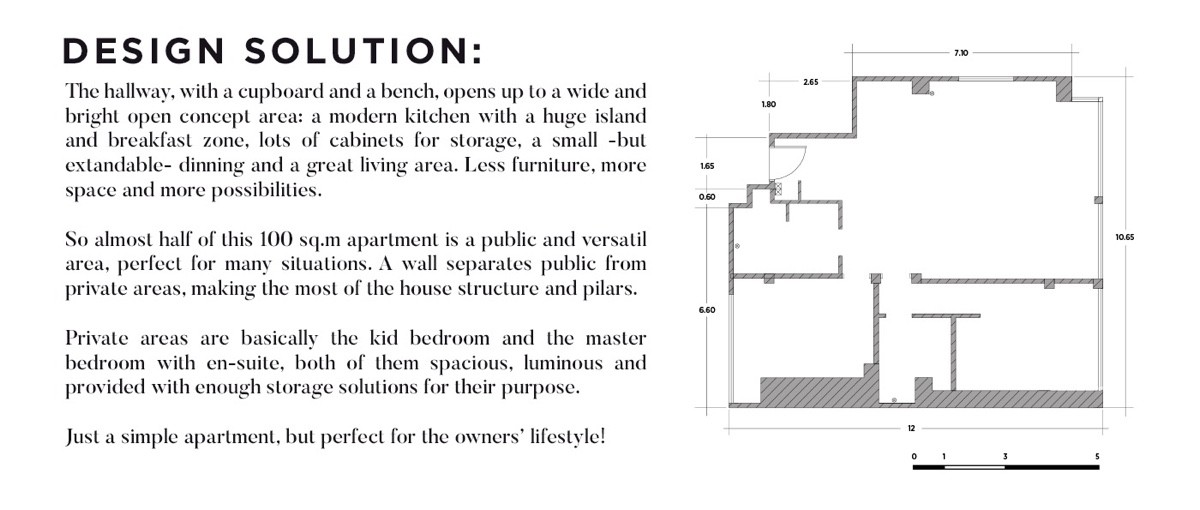
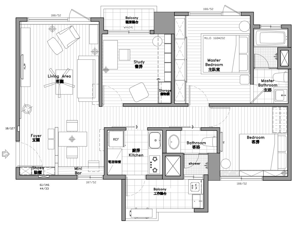
The included graphics not only include measurements, but also offer a general ideal of the home's layout as it relates to functionality.
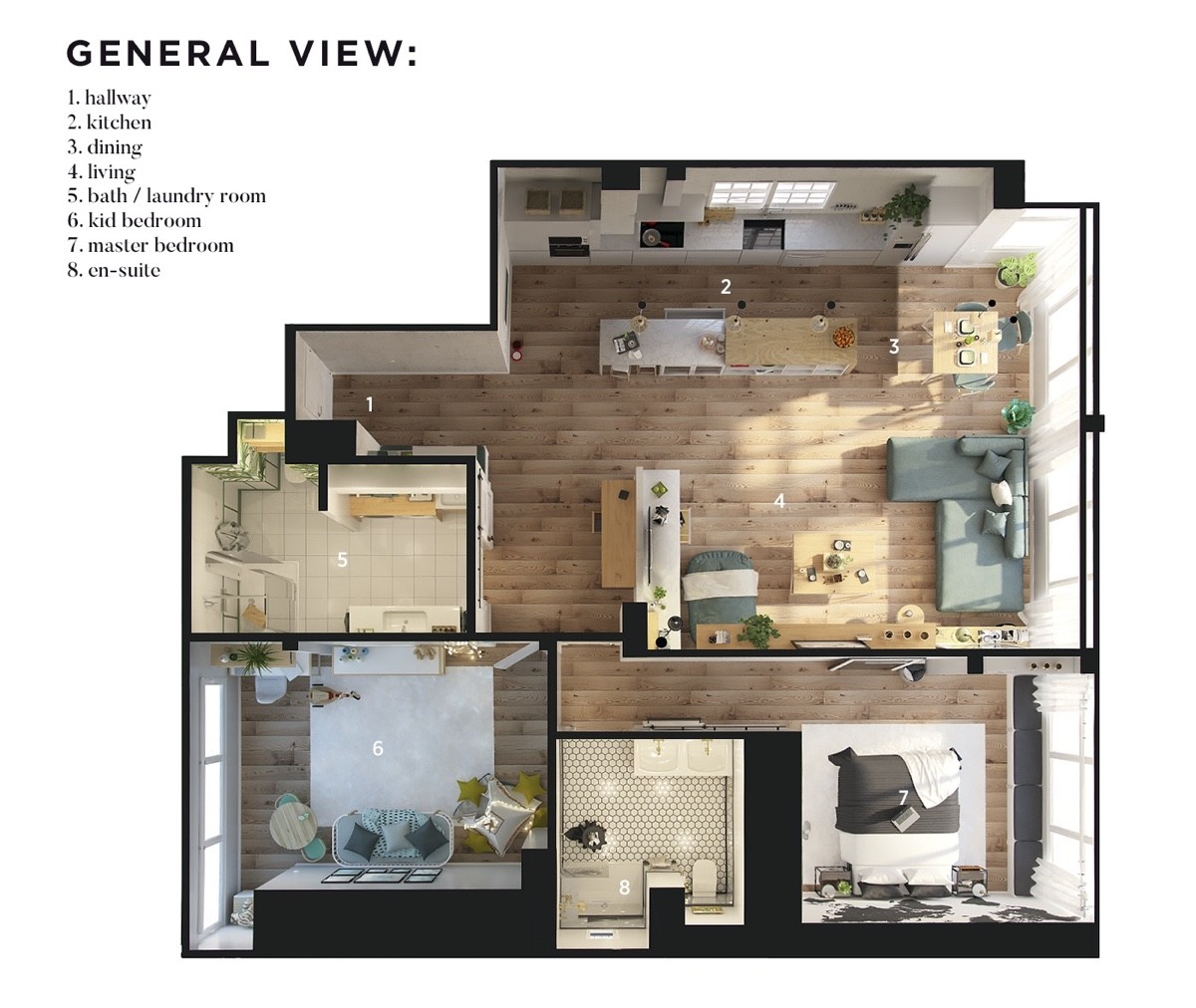
From this angle, it's easy to see the divide between public and private spaces. The open layout living room transitions to a master bedroom that sits adjacent to the nursery.
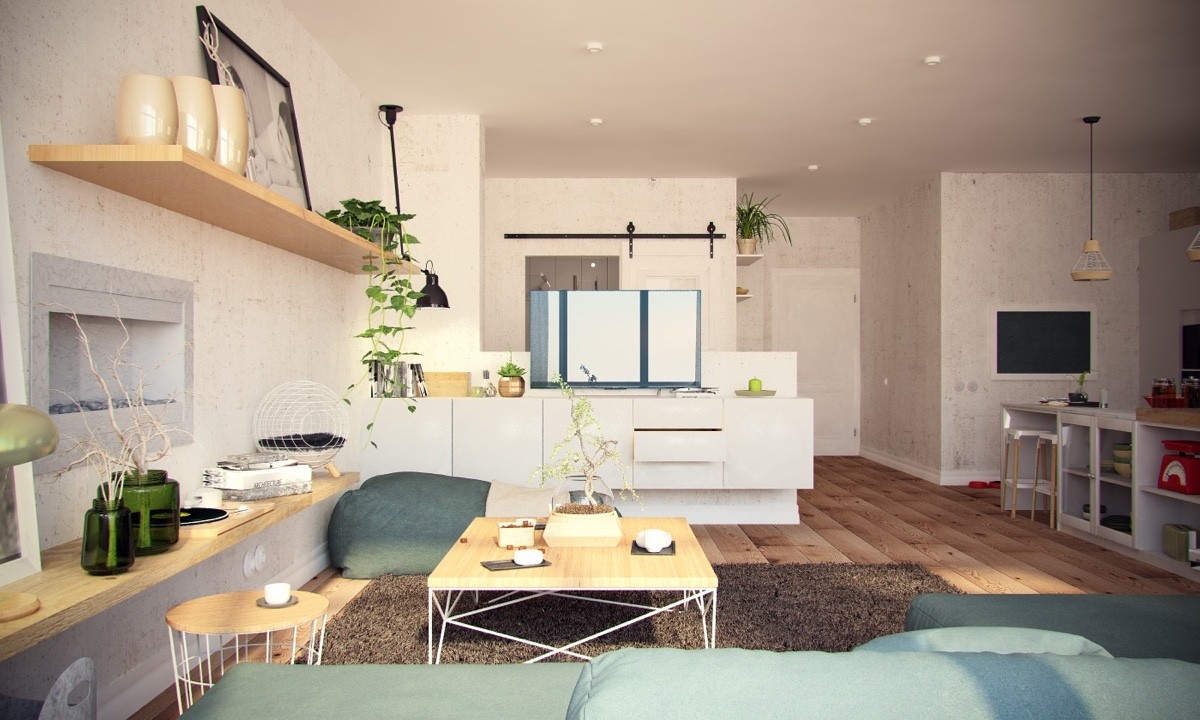
Natural decor keeps the space feeling light and fresh. Houseplants and natural wood are the perfect complements to the breezy blue-green upholstery that makes up the living room.
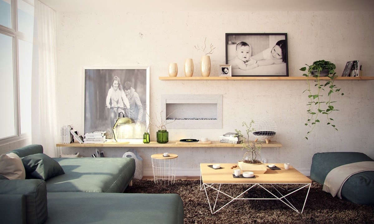
Of course, the plants and upholstery aren't the only sources of color. Tinted decorative vases bring out the most important surrounding hues.
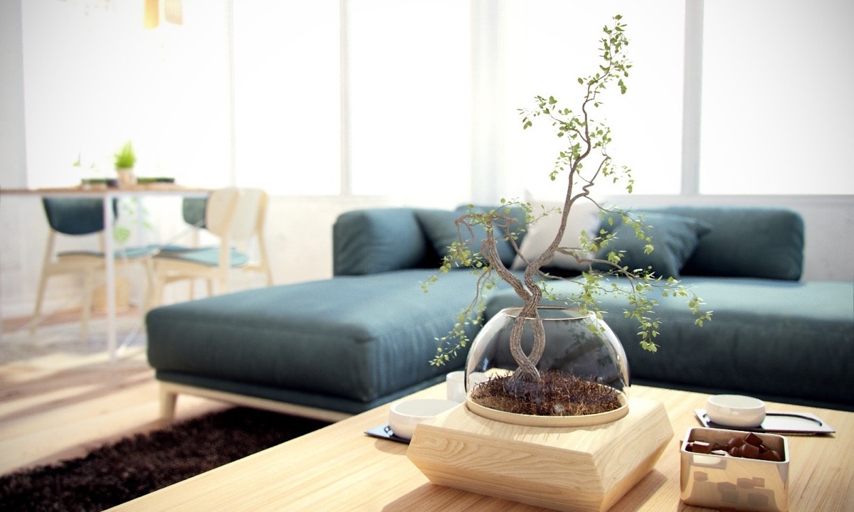
Because this home doesn't rely on extraneous decor for its character, every little detail matters. The effort that went into each choice is hard to overlook.
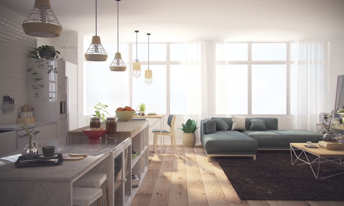
Thanks to the open layout of the living room, it's easy for parents to watch over the newest member of the family while preparing meals or snacks. And they can interact with guests the same way!
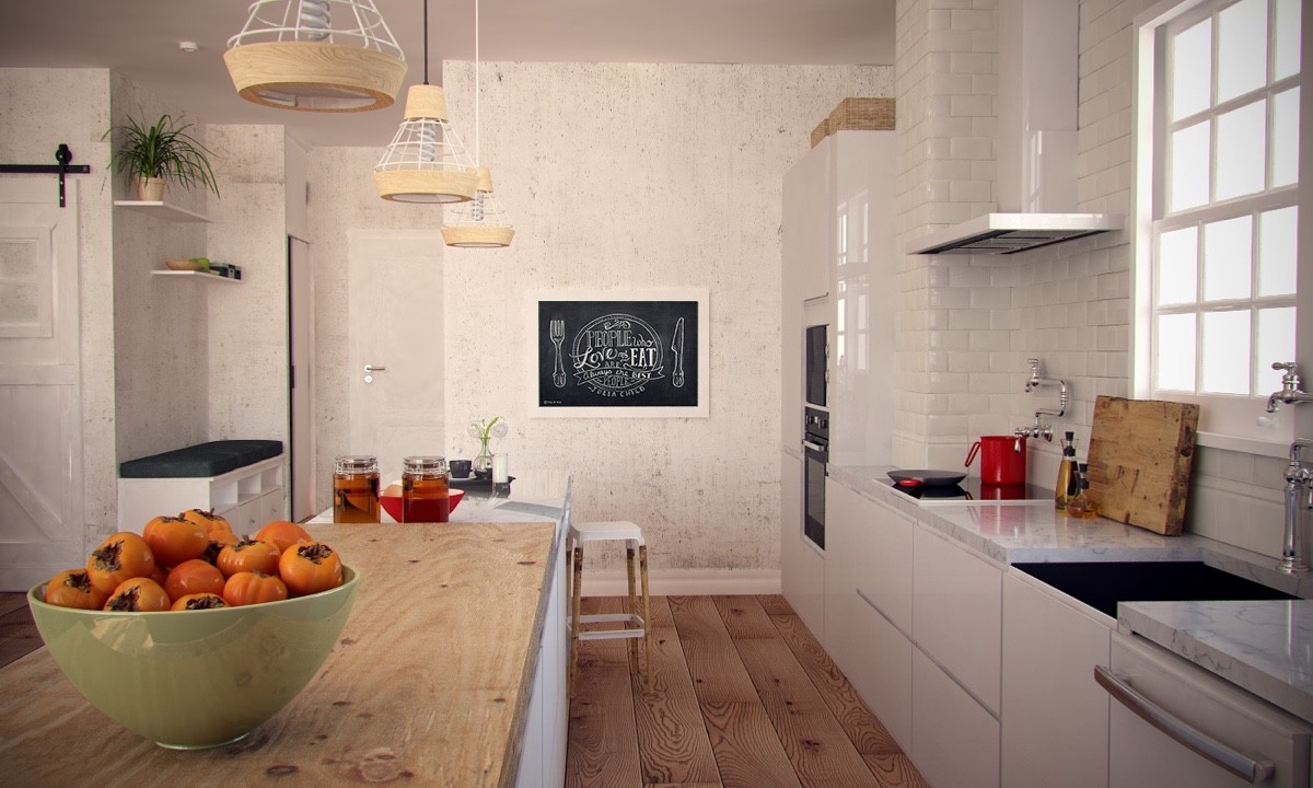
While the living room focuses more on organic materials, the kitchen integrates plenty of marble and ceramic for a sleek and sharp appearance.
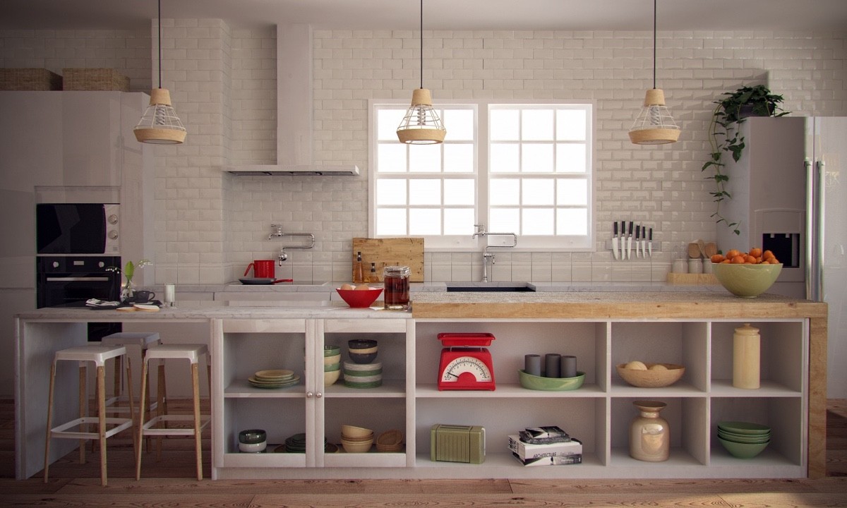
While the living room focuses more on organic materials, the kitchen integrates plenty of marble and ceramic for a sleek and sharp appearance.
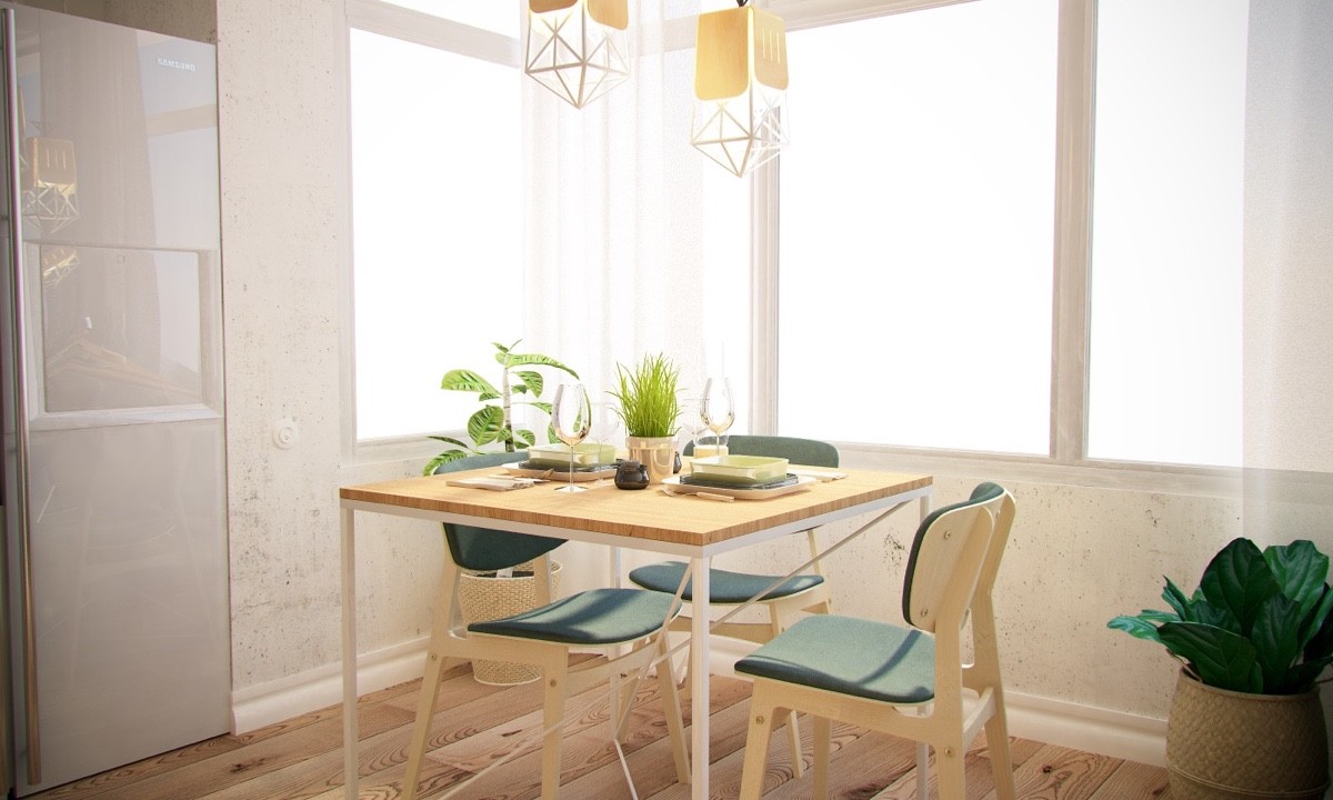
The dining arrangement is simple, with an emphasis on family and the view that surrounds. Above, geometric dining pendant lights center the view.
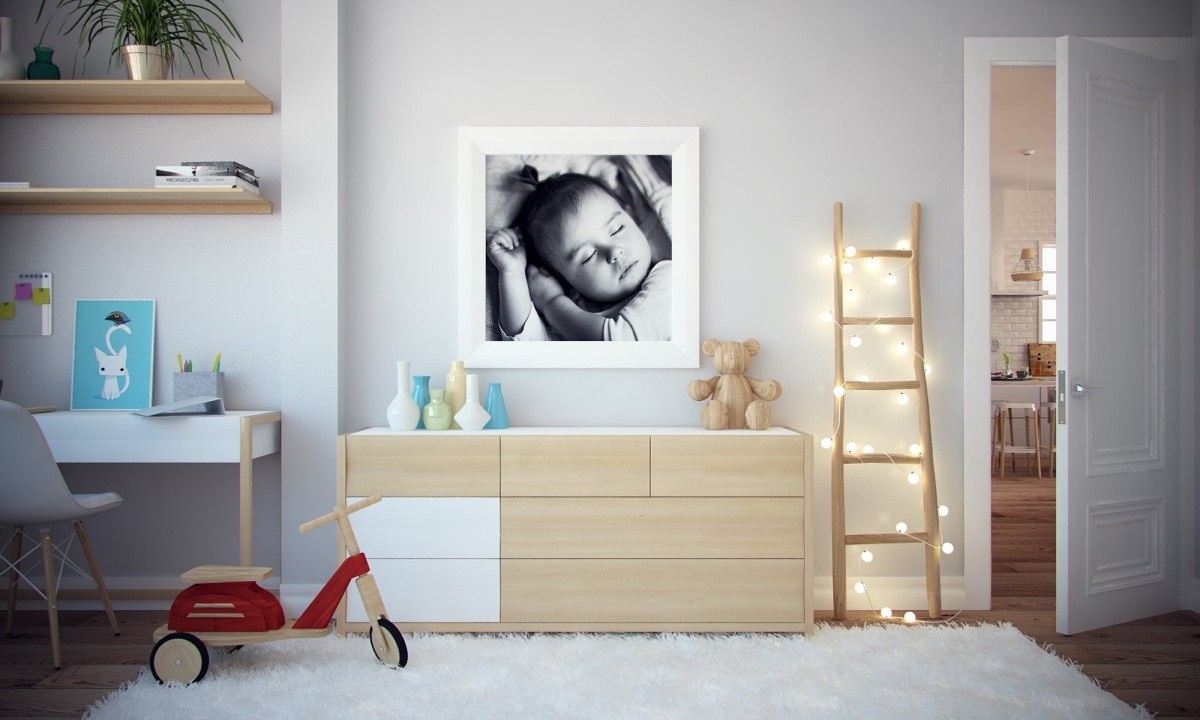
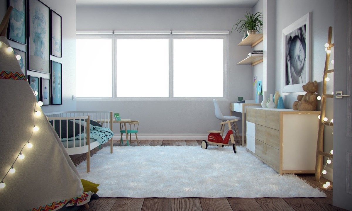
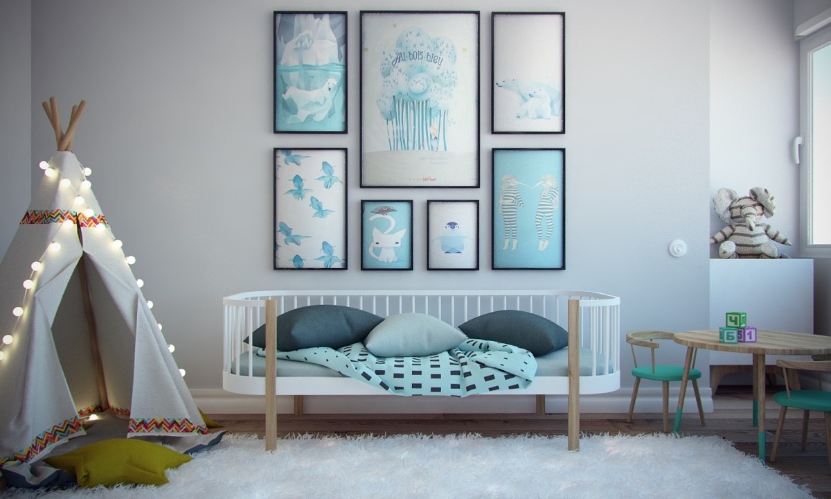
And here's a look at the inspiring and endlessly magical child's room! It goes beyond the ordinary with designer kid's decor that look sophisticated enough they could be put away for the child to use once they're well into teenage years or even adulthood.
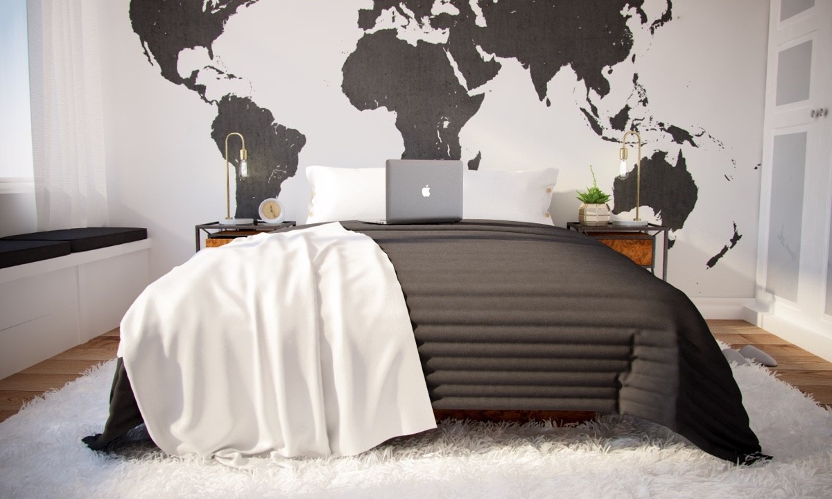
Although it has fewer natural details, this room does enjoy a bit of the outdoors with a stylish little succulent planter.
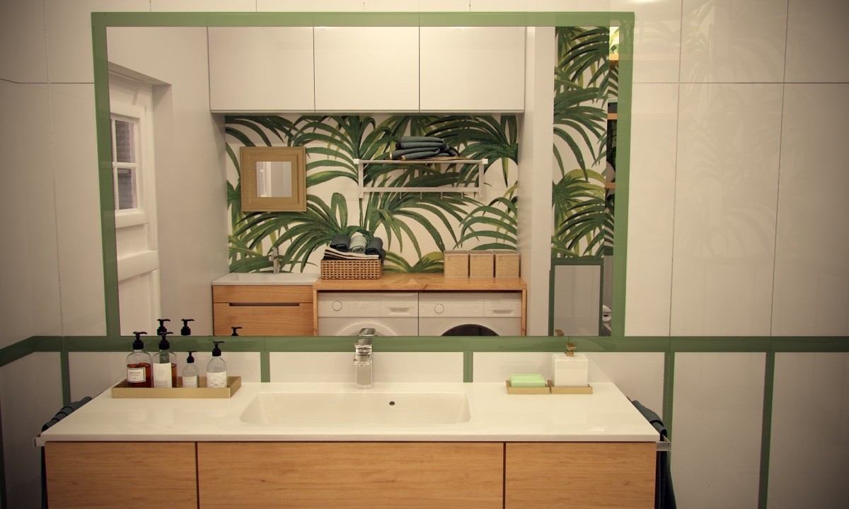
Closing out the tour is a quick look at the tropical-themed bathroom, a refreshing place to begin or end a day.
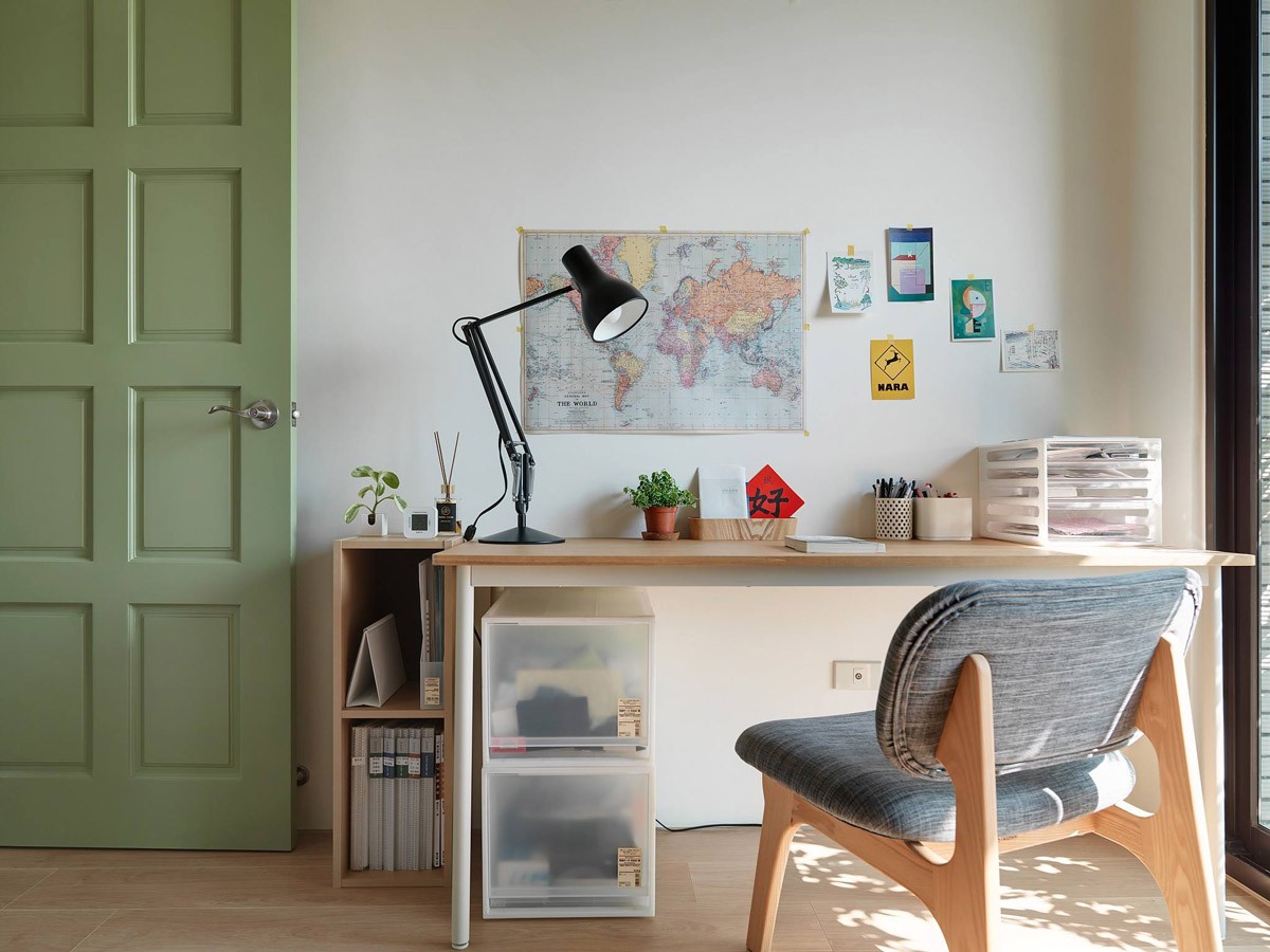
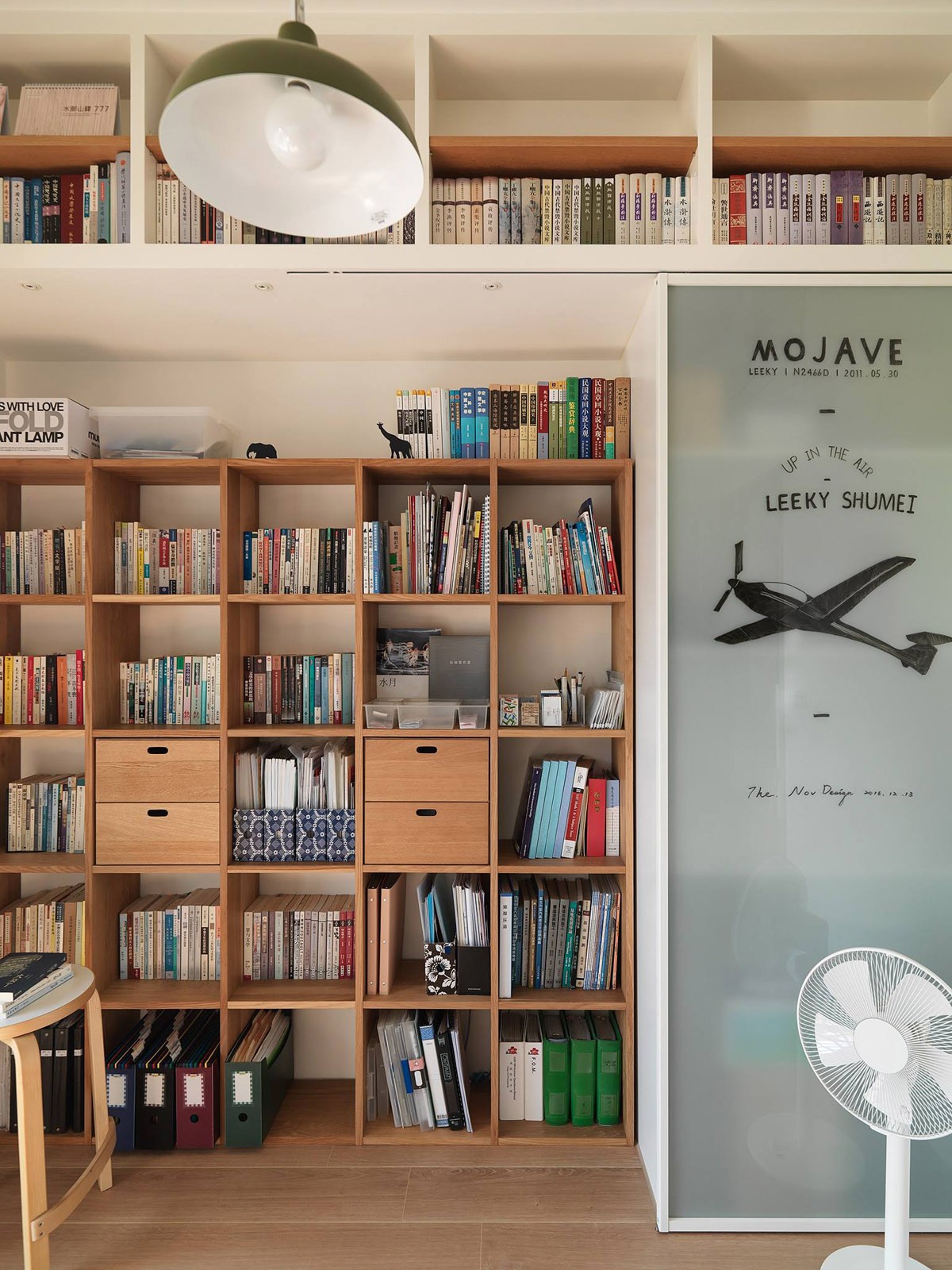
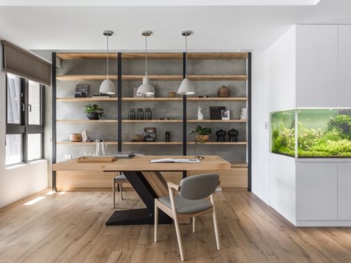
A little more storage surrounds the desk for items the residents require on-hand. The adjustable table lamp can provide focused task lighting or general ambient light as needed.
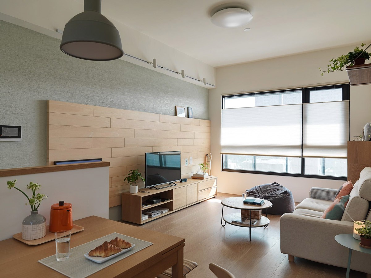
It's a versatile look. The use of natural wood and neutral upholstery makes it easy for residents to change color complements on a whim, the simple furniture remains easy to rearrange.
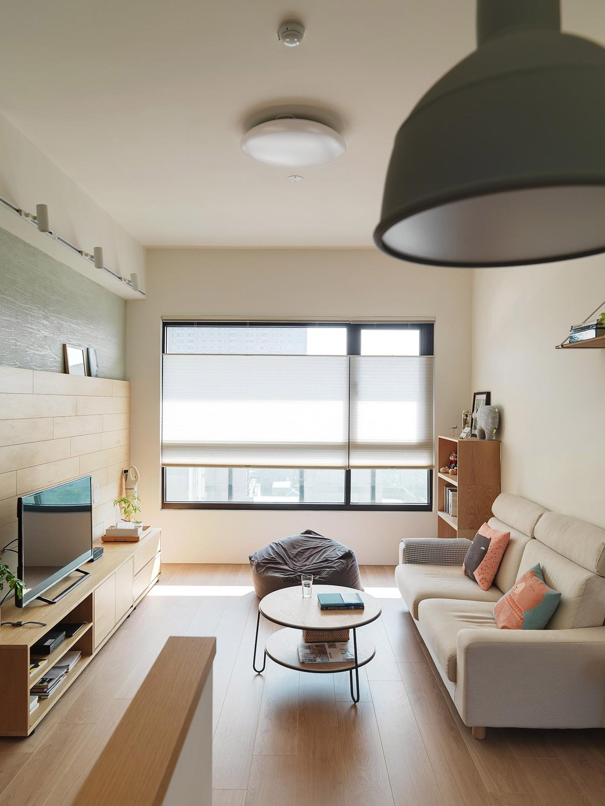
Sunlight floods the interior. Rather than opting for a neutral white, the designer chose a soft warm hue for a comfortable calming effect.
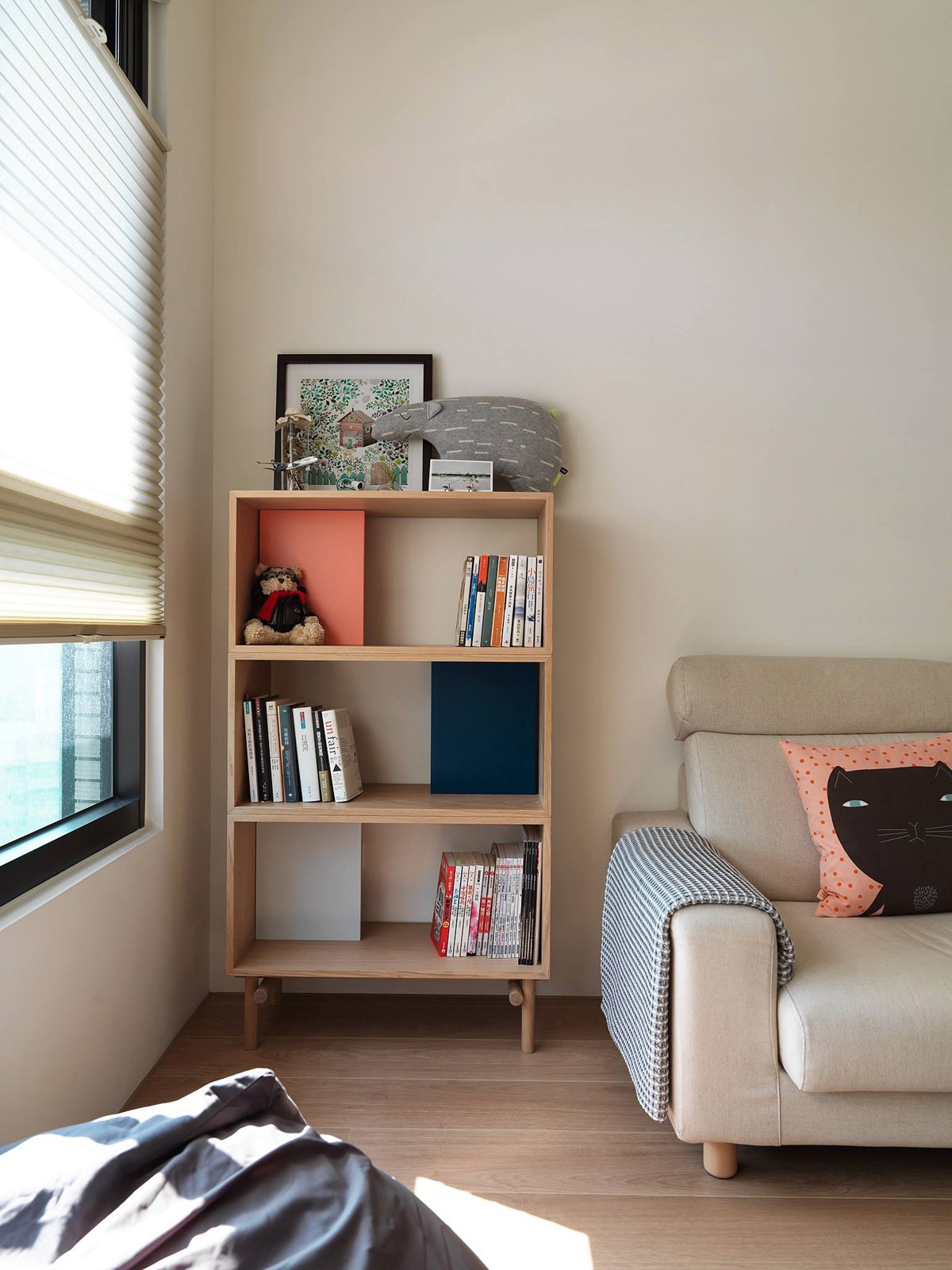
Despite its simplicity, the residence definitely doesn't lack character – stuffed animals, playful prints, well-read books... This space looks and feels like home.
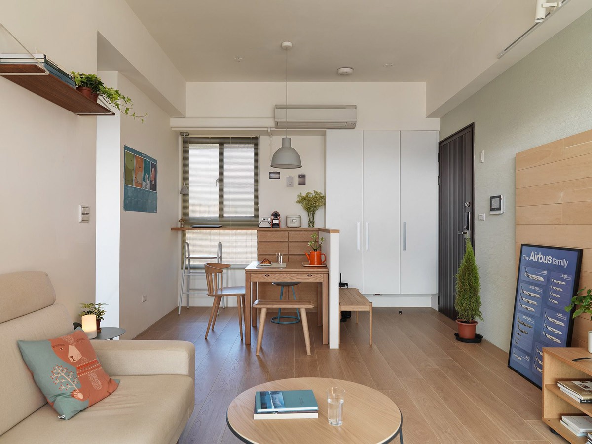
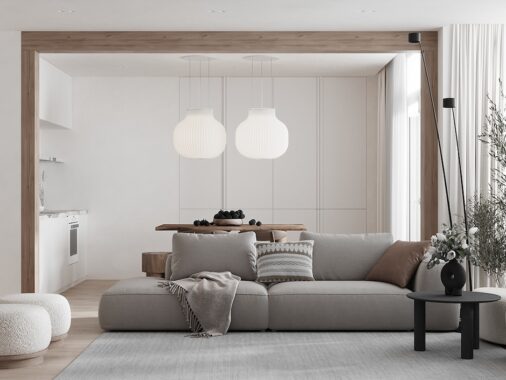
While half of the open living space is occupied by the media area, the other half includes the entryway and a handsome 3-person dining area. A high office desk doubles as a sideboard.
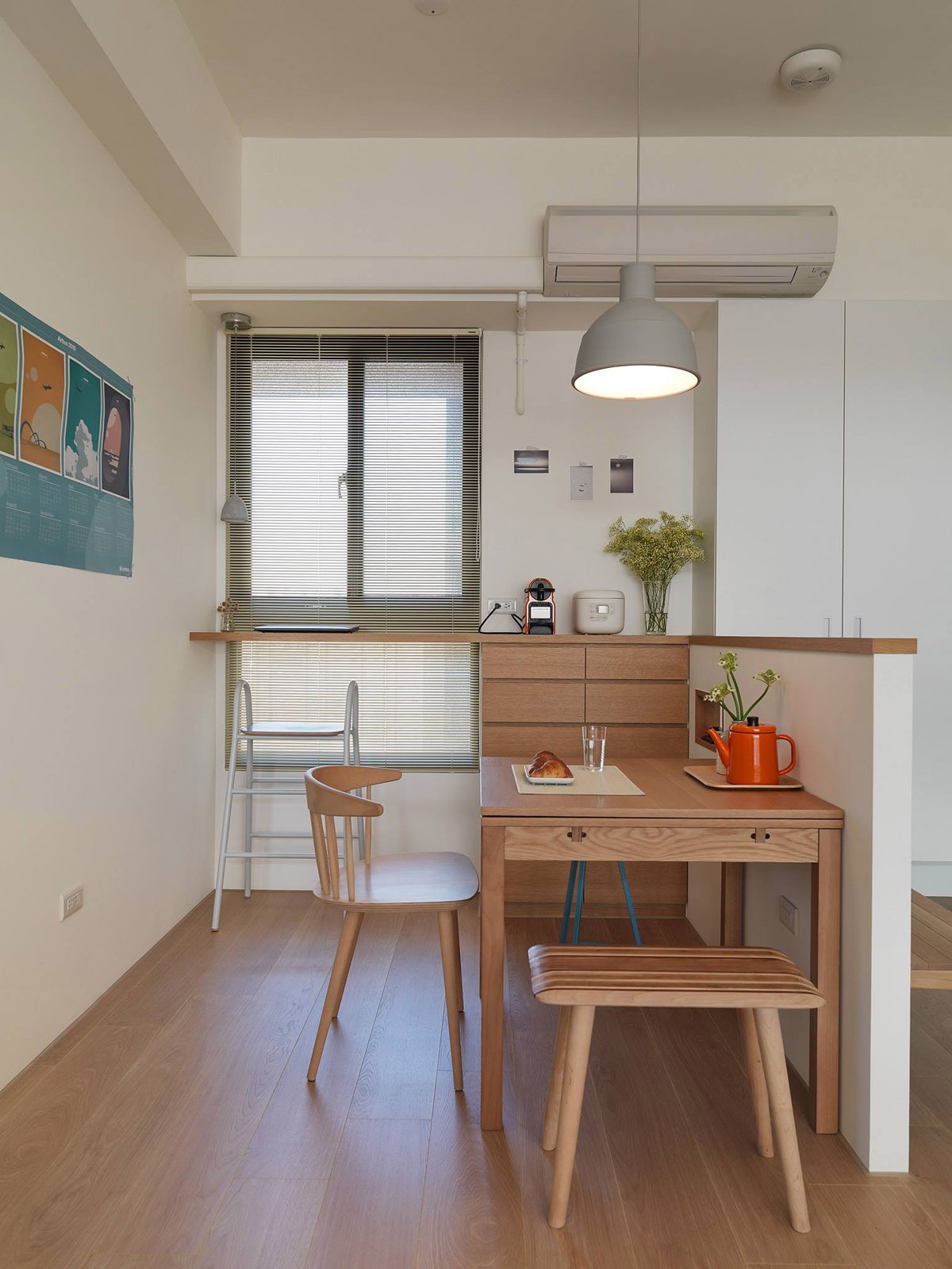
The dining pendant light used here is the Muuto Unfold Pendant and the Scandinavian style chair is the J104.
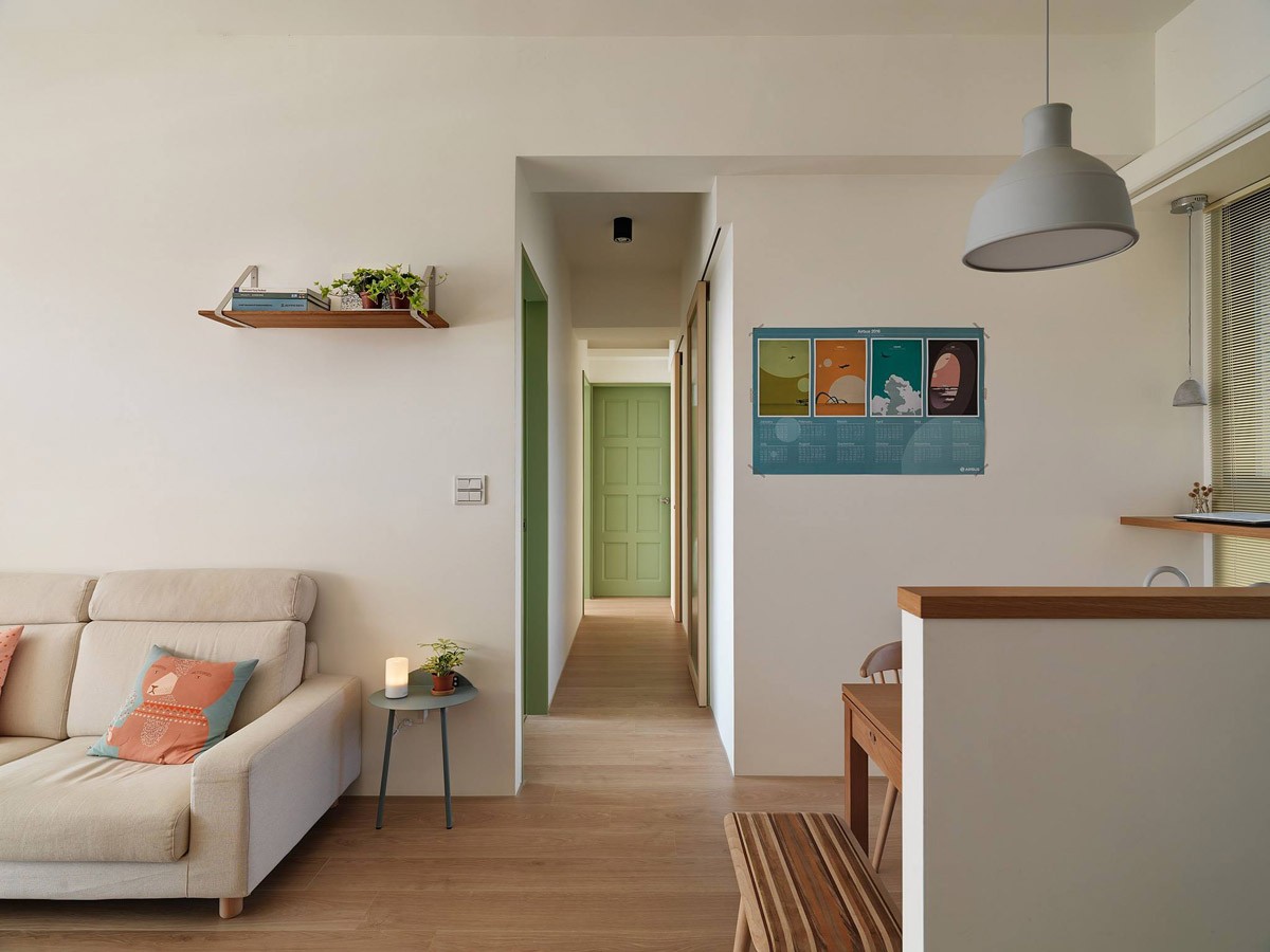
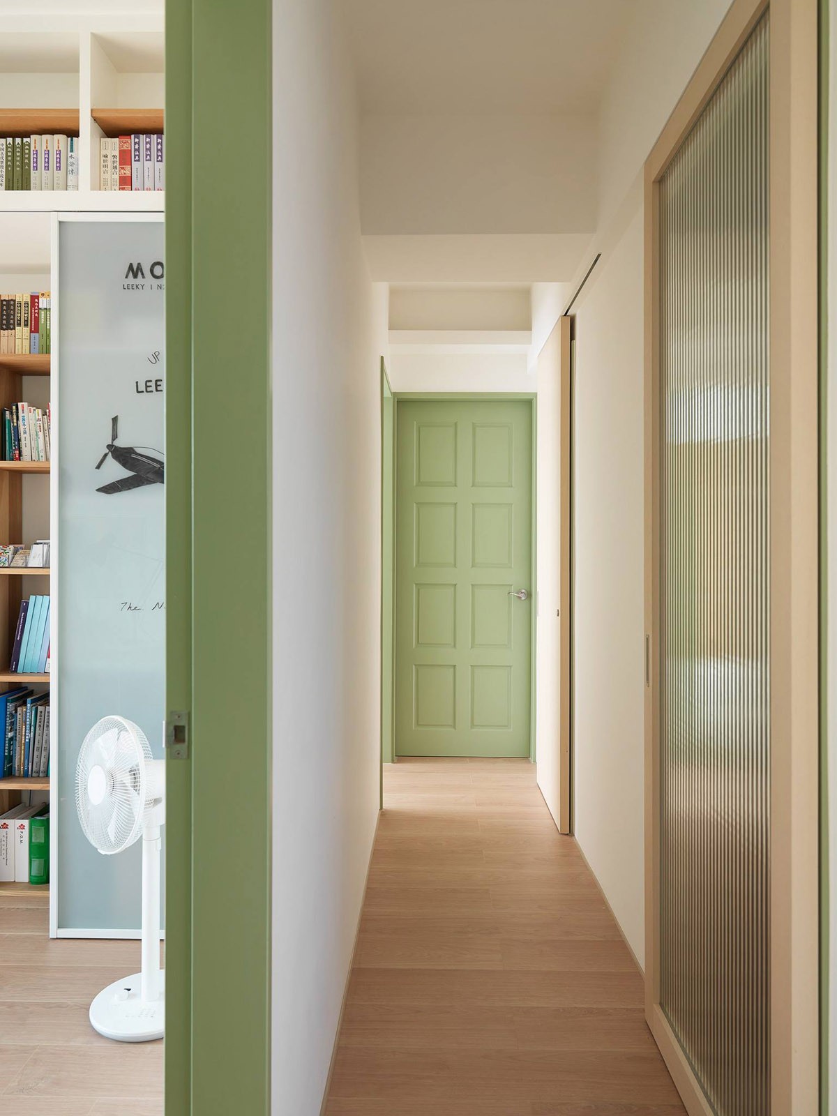
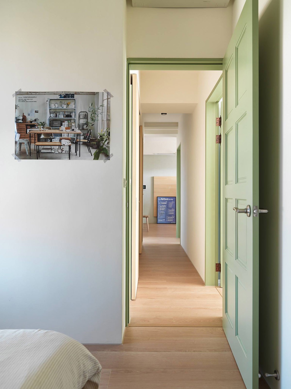
Private spaces like the study and bedrooms enjoy the quiet and privacy of their location down the hallway.
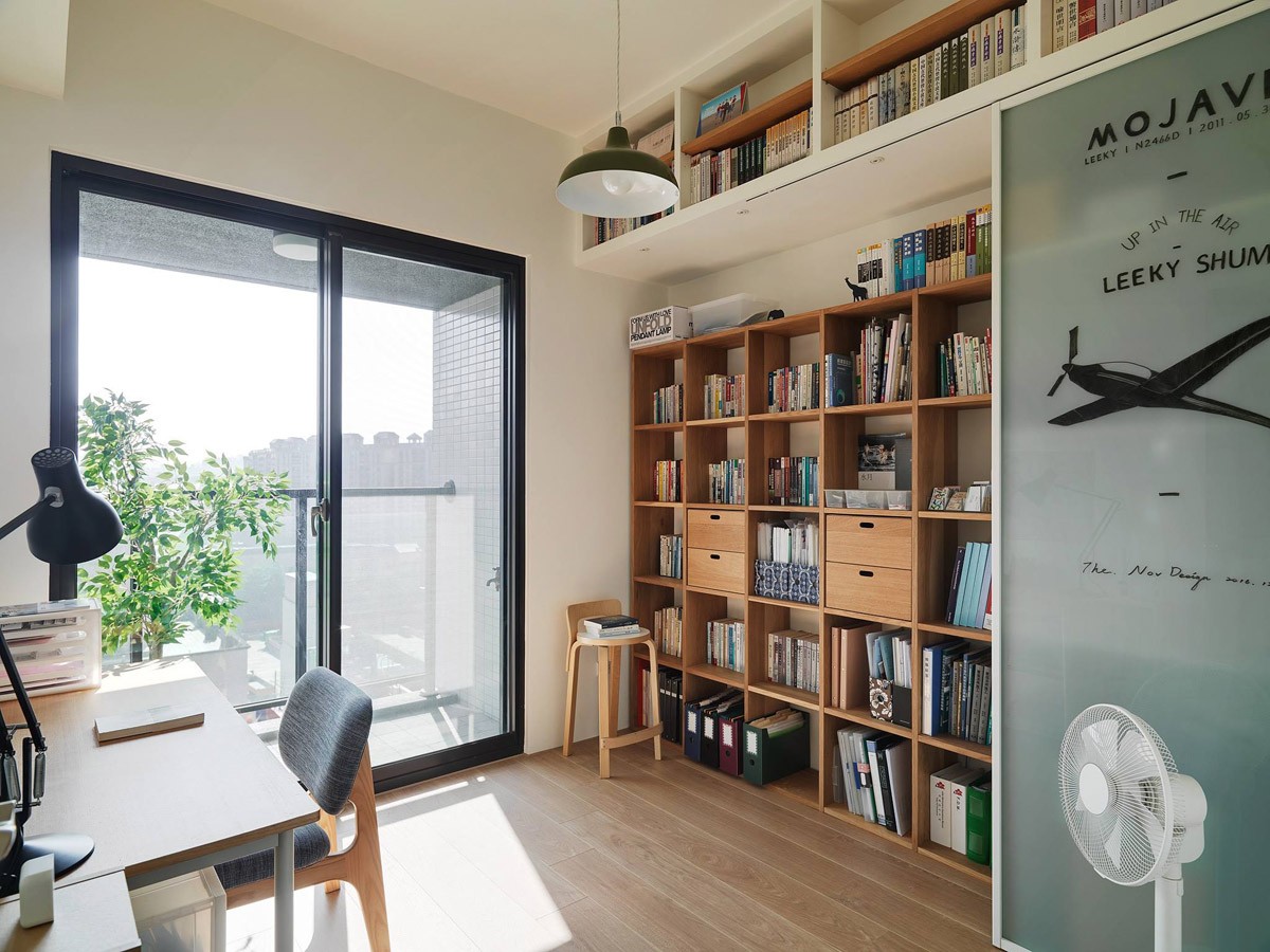
It's the perfect contemplative retreat. When the residents tire of working, they can step out onto the balcony for a little fresh air.
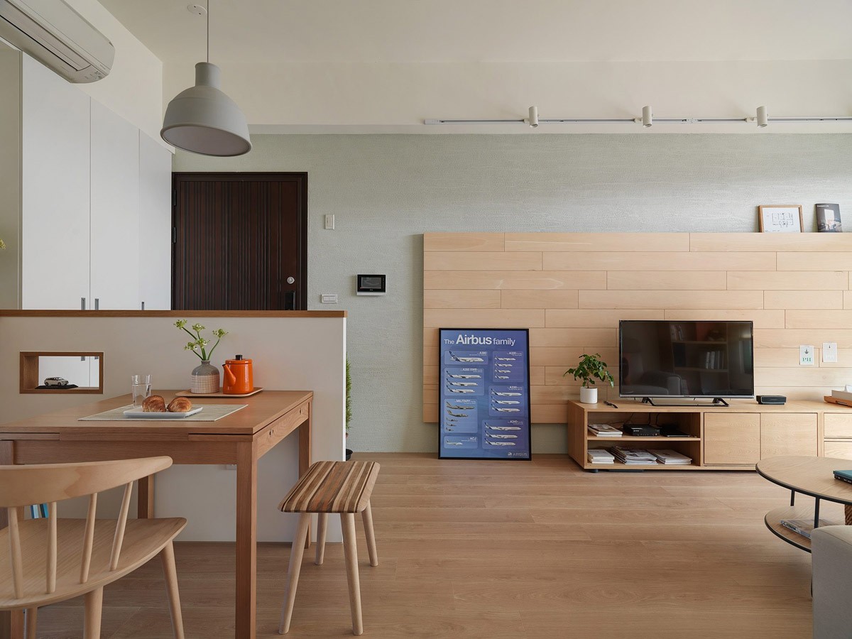
Located in Taoyuan, Taiwan, this 80-square-meter apartment makes use of clean lines and an open layout to foster an atmosphere that feels friendly and wide open. The residents often fly to Japan for work, so they chose a decor style inspired by Japanese minimalism – a practical as well as beautiful choice for this 2 bedroom 1 study home.
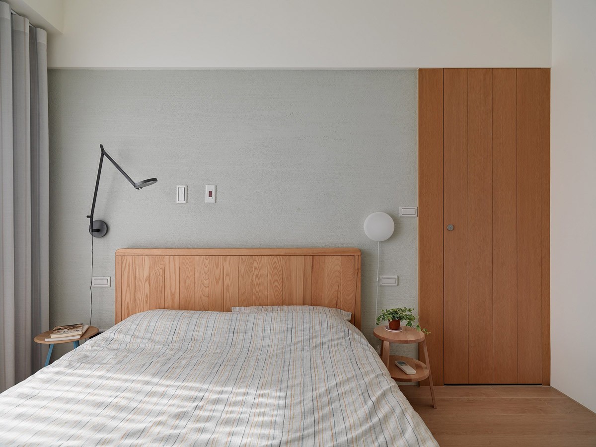
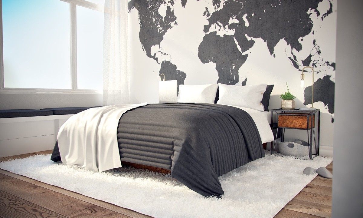
Now let's take a quick look at the bedrooms, featuring the same cozy minimalism as the rest of the home.
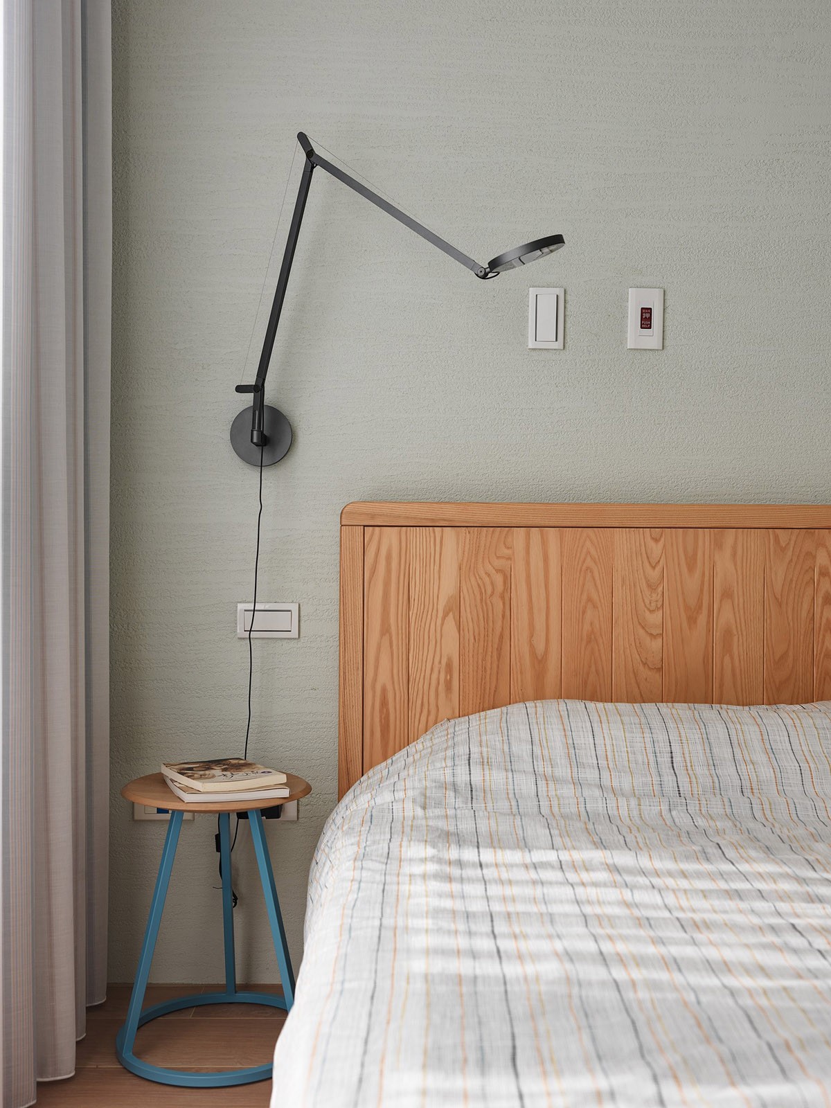
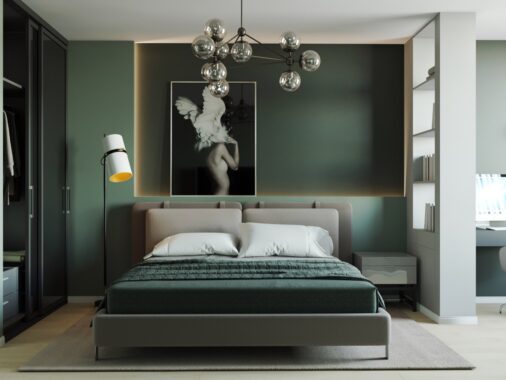
The master bedroom arrangement is functional and scaled-back, with very little to distract from the purpose of the room: rest and relaxation.
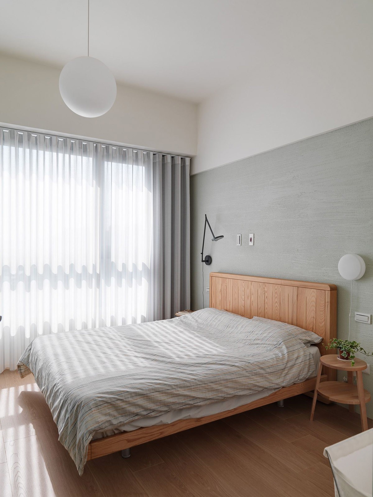
Like in the office, lighting plays an important role here. A spherical bedroom pendant provides general ambient light, with a choice between a diffused wall sconce and an adjustable task light for reading.
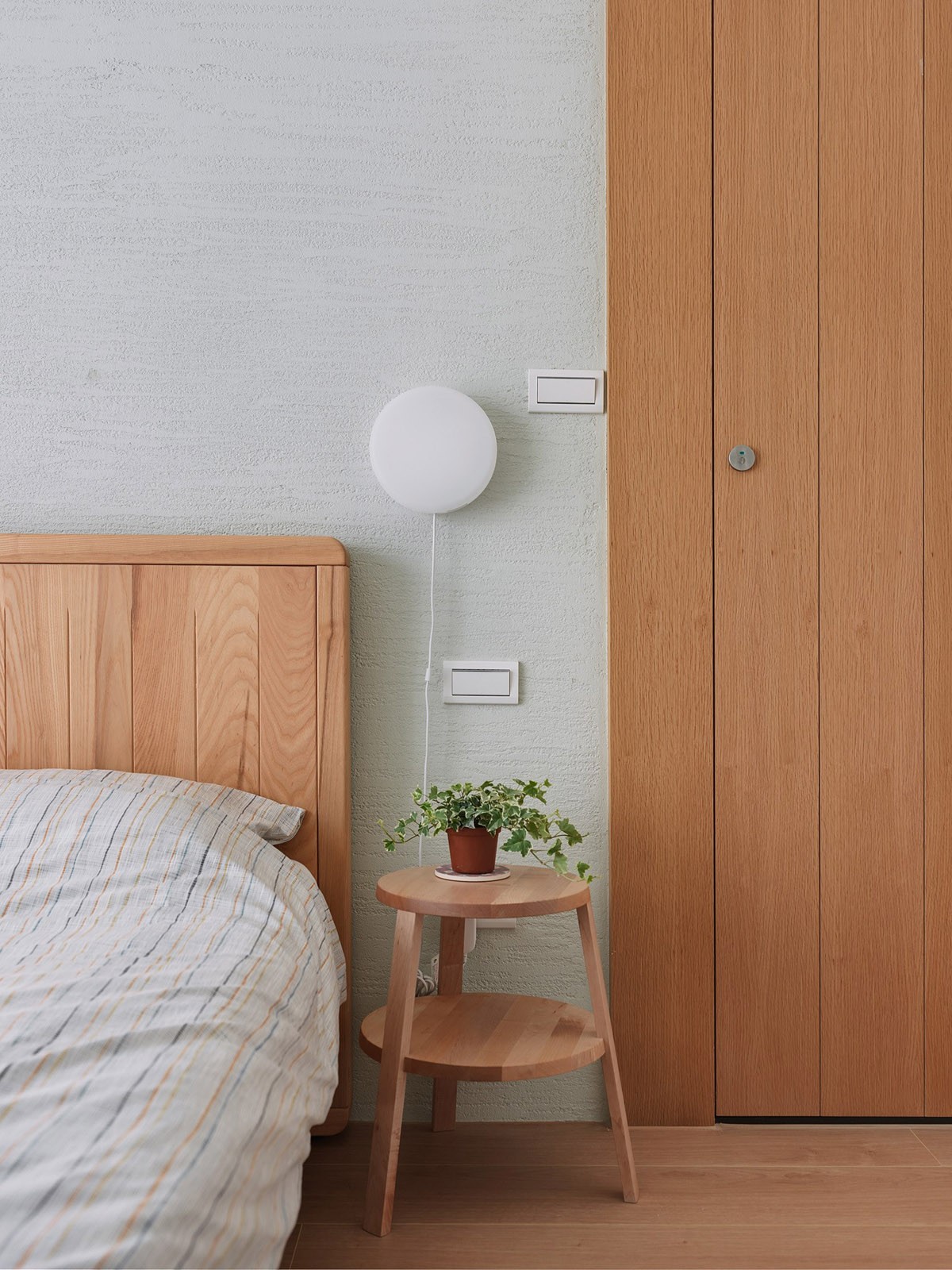
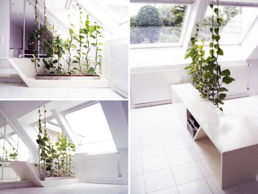
In the absence of decor, indoor house plants offer a lively stand-in. This handsome little ivy plant is a hardy low-maintenance choice.
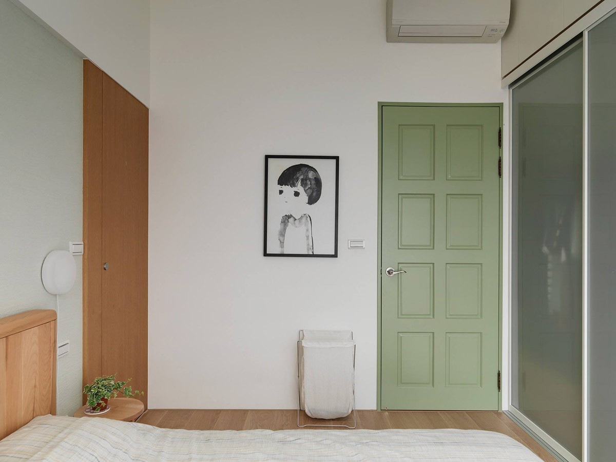
Even the purely utilitarian additions, like this laundry basket, don't distract from the room's minimalism.
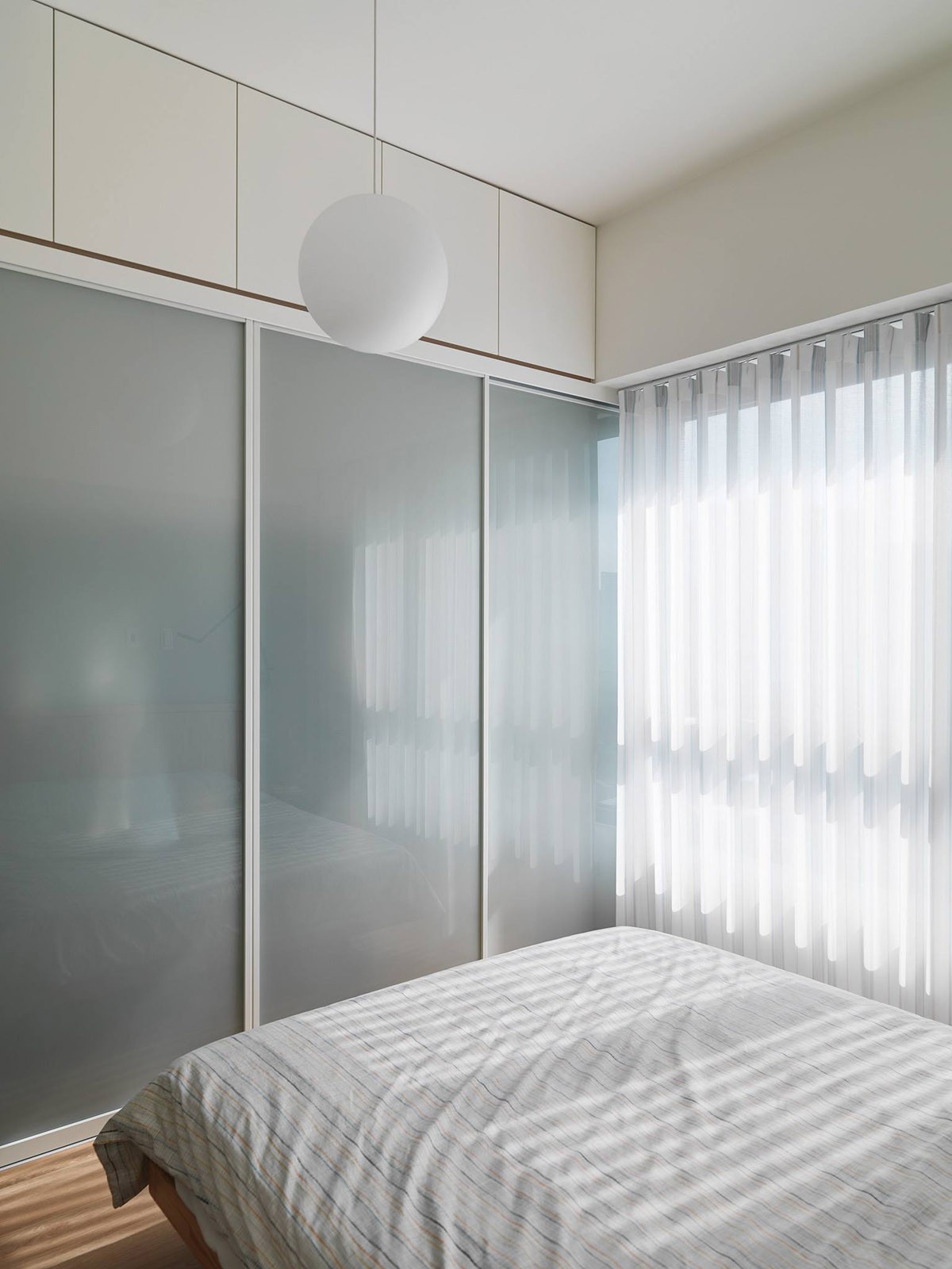
Storage remains simple as well. These frosted glass panels allow the room to enjoy a little added depth without cluttering the visual field.
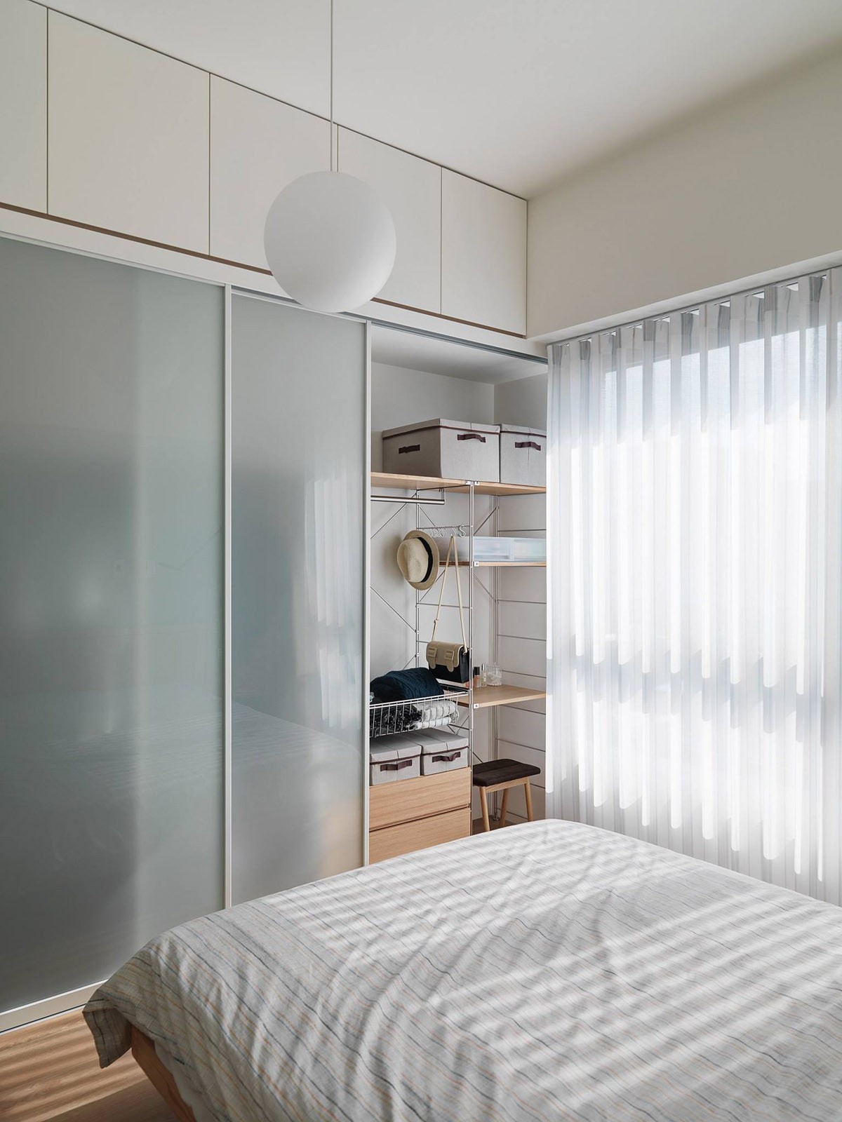
Shelves, boxes, and drawers keep the inside organized. There's even a handy little vanity tucked in on the right.
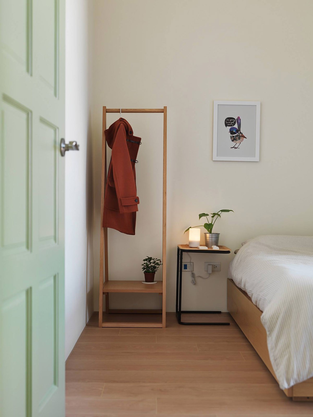
The secondary bedroom feature some style inspiration as well, like the candle-like unique bedside lamp atop the side table.

